Use The Principles Of Visual Hierarchy In Your Presentations To Impress Your Audience
According to Gestalt, the human brain is programmed to “structure individual elements, shapes or forms into a coherent, organized whole.” This theory allows you to be in control of your audience’s perception, during the presentation. You have the power to decide the flow in which your audience looks at your presentation, hence controlling exactly how your information is absorbed by them. Do you want to know how? Let me tell you about Visual Hierarchy – the most important aspect in presentation design to help you mesmerize your audience.
What is Visual Hierarchy?
Visual hierarchy is the order in which the user processes any written information. This order is created by the visual dominance of one element over the other. You give more dominance to different elements, in the order of their importance. There are several ways in which you can provide that dominance like using colors, contrast, spacing, typography, etc. Let’s talk about Visual Hierarchy in the context of Professional Presentations.
Visual Hierarchy Elements in Professional Presentations
7 minutes is the average attention span of a typical audience before they start looking at the clock. If your topic is of interest to them, then you might get 10 minutes; or maybe 5 minutes if your presentation is the last thing before everyone gets to go home! Hence your PowerPoint slides should be able to convey your message to the audience right away in the most logical sequence. To do so, first agree on what message you want the audience to take from your presentation slides. And more importantly, how exactly should they absorb that message. You should be perfectly clear on what you want the flow of a viewer’s eyes to be. Once you isolate the elements and their sequence, use the elements listed below, to emphasize the sequence visually.
COLOR
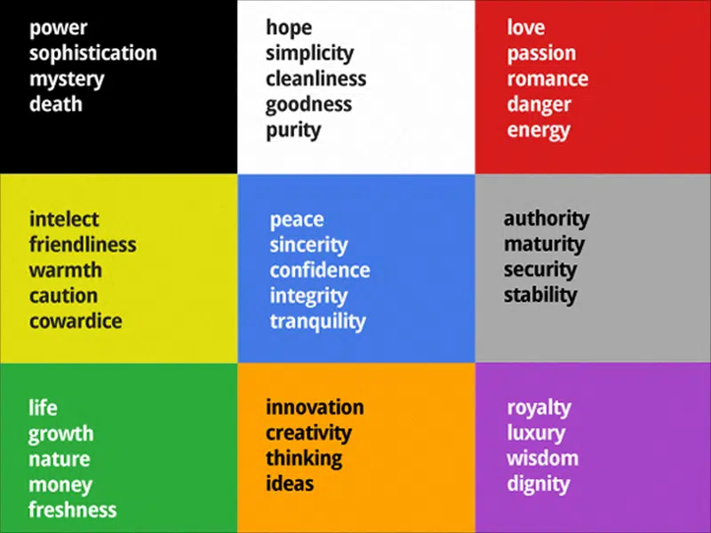
Colors are the most intuitive way of drawing emphasis in presentations. Different colors evoke different emotions in the audience.
For a business pitch; red, grey, and orange are often used. They convey a sense of energy, innovation, and maturity while for a presentation on company rules and regulations, you want to seem authoritative yet peaceful. Hence a combination of teal, gray, and dark green works amazingly. Look at the matrix below to learn about the different emotions colors evoke in a presentation.
To choose color combinations, contrast is the key. There should be enough contrast between the background and foreground (text and graphics), otherwise, they will blend into each other, compromising legibility. This immediately classifies color themes in two broad categories:
a) Dark Background – Light Foreground
b) Light Background – Dark Foreground
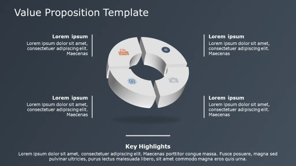
In the example below, notice how the parts with a darker background, have the foreground of white text and icons. This creates a contrast, making the foreground prominent and non-competing to the background. But interestingly, when the background in the middle part is of a lighter shade, the foreground has a mix of gray. Hence making the foreground slightly darker, maintains the contrast and prominence of the foreground.
Source: Value Proposition Template by SlideUpLift
Below is an example of a color combination that works well for professional presentations:
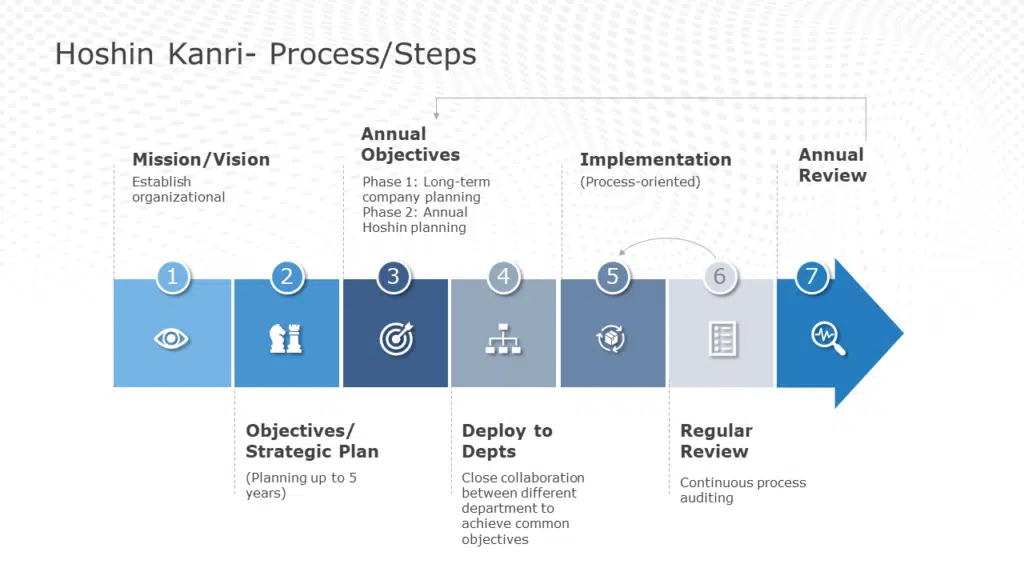
The higher the color contrast, the more the audience is drawn to that part of the slide. Below, the darkest shade of blue contrasts best with the white foreground, making it the most prominent and important, while the different shades of blue, indicates progress and sequential flow.
Source: Hoshin Kanri Strategic Planning by SlideUpLift
It might be compelling to use a lot of colors, to make the presentation look vibrant. However, colors should be used strategically and wisely.
A Few Pitfalls To Watch For:
1) When you use too many colors on a slide, no single color stands out. Hence you negate any impact the color might have had in creating a visual hierarchy.
2) Similarly using colors that contradict the intent of a business presentation, can negatively impact the morale of the audience. For example: using gray and black, might appear classy. But for a training seminar for new recruits, this could indicate boredom and dullness.
CONTRAST: Creating contrast is the foundation on which visual hierarchy stands. While creating contrast through colors is well known, and often used method; a number of alternatives can be used to achieve the same. A few are listed below:
SIZE: One of the most intuitive ways to create contrast. For example, three different sections of texts can be given three different sizes; largest for the title, smallest for the content. The reader will automatically know where to look.
SHAPE: Simply put, in a field full of circles, a square grabs immediate attention.
SHADE: Another way of creating contrast is by varying the saturation of elements. Saturation refers to the intensity of color in an image. It can vary from 0 percent (no color) to 100 percent (completely filled). Without using a different color, you can use shades to create subtle yet noticeable contrast. Based on the context, you can increase or decrease saturation to highlight or fade an element resulting in an increase or decrease of its visual dominance to the reader,
PROXIMITY: Keeping related elements closer will indicate a close relationship between them to the audience.
SPACE: Leaving more space around a graphic, will give a sense of scale, and enhance perspective. Before we show you a few examples of how contrast is used in PowerPoint presentations,
A Small Tip About The Contrast:
To create a contrast, you first need to create similarities. Similarity basically means, different elements blending together in a theme, and having similar visual dominance. Without similarity, any contrast you impart on the element you want to highlight, will not pop out enough to create a difference for the audience. Rather too much variation can cause strain and confusion. You need to remember that contrast grabs your audience’s attention to the important parts of your presentation. Other than stirring up interest, contrast also aids in organizing the information presented.
Let’s Look At A Few Examples:
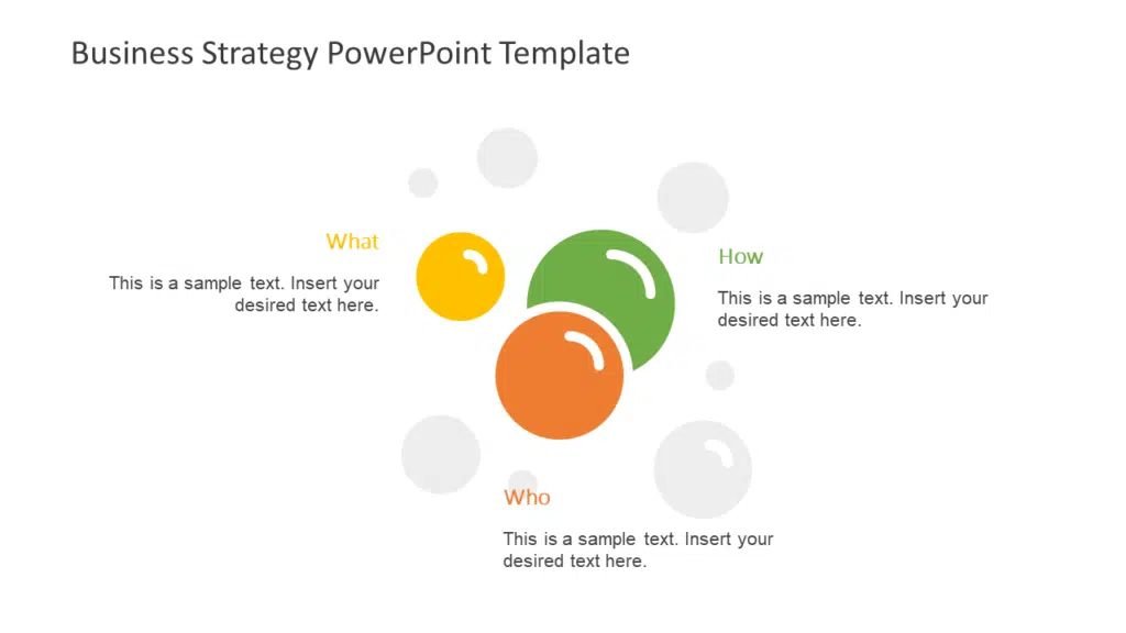
In the example below, the size of the circles separates the content for the audience, giving them a sequence to follow (either increasing or decreasing size).
Source: Business Strategy PowerPoint by SlideUpLift
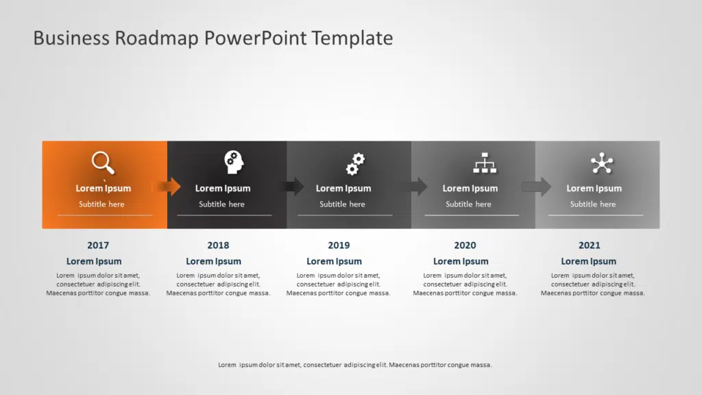
Source: Business Roadmap Template by SlideUpLift
The gradient of gray in the above example signifies step-by-step progression while separating the individual tiles. This makes sense as the content talks about subsequent years. Further, the orange contrast makes it clear that on this slide, you will be specifically focusing on information related to that tile. This is a great example of using contrast efficiently, to create flow and logic.
SPACE
Space is underrated, albeit powerful element to create visual contrast. Space can be used to show perspective, draw emphasis, or simply scale. We’ve all seen a PowerPoint presentation that’s so jam-packed with information, text, and imagery that you don’t even know where to start looking at it. Don’t create one of those designs that turn away visitors because it’s impossible to read it.
There Are Two Types Of Spaces In The Design World:
1. Passive White Space: This is the white space that occurs naturally, such as the area between words on a line or the space surrounding your content in the presentation.
2. Active White Space: refers to the deliberate placement of the space itself to emphasize a particular design element or content of the presentation. As you would have figured, Active white space is preferred, which makes the design look more dynamic and active. To create impact using business presentations, you should always actively plan for the unused space. It is essential for things like:
- Giving the viewer’s eyes a place to rest and a path to travel through the design.
- Separating your layout into sections (the flip side of this is proximity — reducing space to place related items closer together — also an aspect of good spacing)
- Isolating focal points.
- Creating an asymmetry by changing element placing, which draws more attention than symmetric designs.
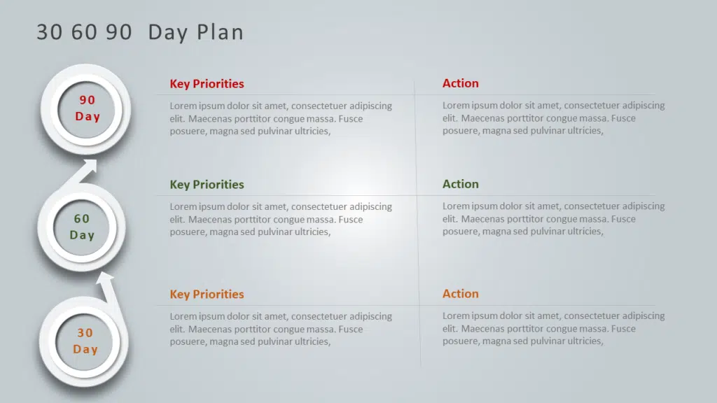
In the below PowerPoint Template Example, the presenter wants to convey multiple points. But the neat spacing, and grid, make the slide clutter-free and organized. The content is now easy to follow, and the text makes logical and visual sense.
Source: 30 60 90 Day Plan Example by SlideUpLift
PROXIMITY AND ALIGNMENT
When two objects are placed closer relative to the distance between other elements, the human brain assumes them to be related. And then it cognitively works to find and make sense of that relation. Hence you can use the concept of proximity, to subconsciously alert the viewer about relations between two objects on your PowerPoint slide. It serves as a guide to your viewers to the different parts of your message.
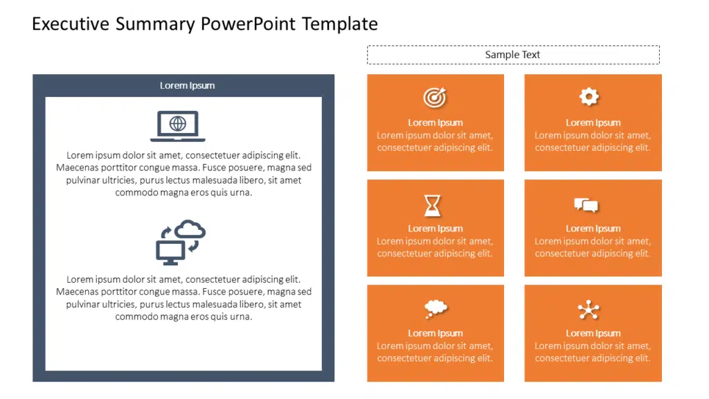
Source: Executive Summary Template by SlideUpLift
In the above PowerPoint template, the orange grid separates similar content in different sections of the grid. Through alignment, spacing, and color, the design tells a story. The story is that while the individually related content is grouped in different sections (hence spaced and aligned such), they are still overall related to the main message of the slide. Further, the left portion can be used as a summary, listing the most important point of the slide. The way this section is outlined visually gives the cue to the audience that it contains highlights of the grouped content on the right side of the template.
TYPOGRAPHY
While text-heavy PowerPoint slides are better avoided for business presentations, sometimes they are necessary (like presenting your research papers to the company management.). Learn about the hacks of transforming dull text-heavy PowerPoint slides into awesome business presentations here.
Typography refers to the font, font size, font weight, font color, and spacing. Visual contrast through typography is very effective for text-heavy slides. It allows you to divide the content into different sections, to impart a logical flow for the reader to follow.
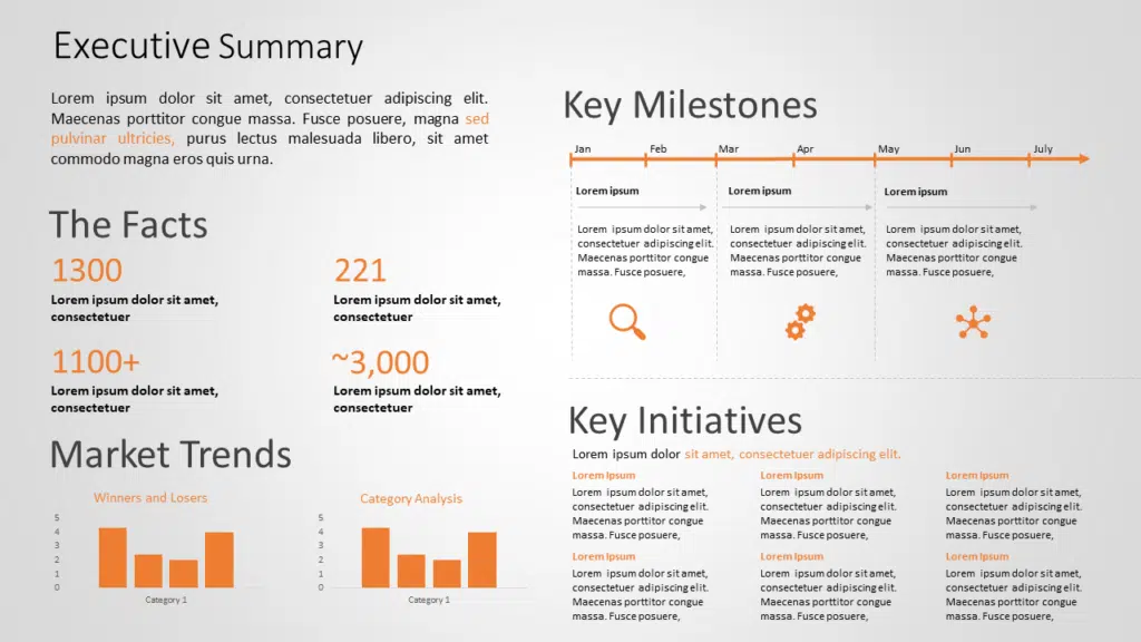
Look at the example below. There are three different fonts, with different font weights.
The titles of different sections (The facts, Executive Summary, Key Milestones ) divides the content on the slide into different sections. This visual separation divides the large content into bite-sized chunks. The dull orange color accents the important part of the text and highlights visual priority. Lastly, the font size of numbers is larger in size than the content. For business presentations, data is important for the audience. And increasing its size attracts the audience to the most important part of the PowerPoint slide. This is a classic example of how typography helps in creating a visual hierarchy.
Source: Executive Summary Template by SlideUpLift
A few tips related to using Typography on the slides are:
- Divide the text into Title, Subtitle, content, etc.
- Use different fonts, sizes, and spacing, etc., to make the content look clean and visually appealing.
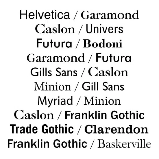
- Avoid fancy fonts. They tend to distract more and depart from professionalism. A few Business PowerPoint Presentation-friendly fonts are Helvetica, Garamond, Futura, Gill Sans, and Rockwell, all of which are present in Microsoft PowerPoint by default.
- For text-heavy slides, make the title attractive and indicative of the content. Also, try to keep a section that acts as a summary for the entire content and conveys your main message.
- Font choices should not clash. Rather they should complement each other. See below some classic font pairings for Professional PowerPoint presentations.
In summary, Text-heavy PowerPoint slides are straining to the readers. So, make sure that your choices for powerpoint fonts, font sizes, and powerpoint colors are easy on the eyes and perfectly legible.
Testing your design
Once you finish designing your PowerPoint slide, you need to be sure that it works exactly as you intended. To test whether your design is effective, just sit back from your computer screen a bit. Now squint at your design so all the details blur and you just see general shapes. What still stands out? Is it what you would want viewers to look at first? If so, then you’re in good shape — if not, then it may be time to go back and try something else.
Conclusion
A great presentation is not just about conveying information. It is about leaving an impact on the audience, that convinces them for your Call to Action. Visual hierarchy and principles of vision science in powerpoint allow you to strategically enter your audience’s mind, and guide their perception, to cognitively convey that impact. So use the concept wisely, and make your presentations unforgettable.
You can check out more examples of best practices in using visual hierarchy in Professional PowerPoint templates at SlideUpLift.
Now you don’t have to scour the web to find out the right templates. Download our PowerPoint Templates from within PowerPoint. See how?

