

How To Create Neumorphic PowerPoint Presentation To Dazzle Your Audience?
Neumorphic designs are a relatively recent design style that was first used in the User Interface design of gadgets in the previous decade. The perfect and straightforward design is unexpectedly popular, despite the fact that it does not employ any main color combinations in its initial design.
The design’s simplicity, often known as ‘soft design’ and neumorphism, is its selling feature. But it doesn’t mean it has to be ugly or unattractive. Instead, this gem is today regarded as one of the most widely recognized designs on the globe.
How should it be done? In this article, we will walk you through the process of creating business presentations using neumorphic design.
What is a Neumorphic Design?
The Neumorphic design style is a user interface design style that replicates real-life things while being as clean and simple as possible. It merges flat design with skeuomorphism into a single paradigm, using just the best aspects of each.
The design mixes background colors, shadows, shapes, and gradients to make the user interface’s buttons and switches seem as realistic as possible. With the mix of various elements, the design makes the buttons and switches look virtually 3D.
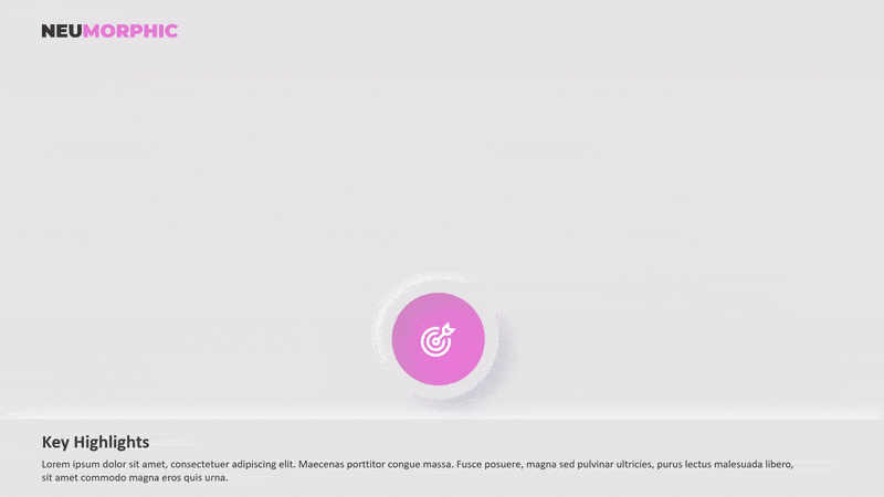
The most noticeable features of neumorphic-styled buttons are a deeper shade of shadow below and a lighter shade of shadow above. Its visually deceptive nature, including apparent movement when touched, gives users the impression that they are pressing or switching on physical buttons underneath the screen.

Benefits of Using Neumorphic Designs in your business presentations
Here are some benefits you can grab by using Neumorphic designs in your business presentations.
Gives a Fresh Look and Feel To Your Presentation
Neumorphic design in PowerPoint presentations exposes its components, such as cards and buttons, in a whole new manner, making it easier to distinguish itself from the competition. That’s why, since its introduction, it’s gained a lot of attention and sparked a design trend on Dribbble, Behance, and Instagram. This is a popular design that will set your presentation out from the crowd.
Balances realism and minimalism perfectly
Neumorphic icons extensively combine shadows, colors, and lights, introducing a new basic design style and aiding in the natural display of design hierarchy.
The ideal blend of realism and simplicity makes it an excellent option for designers creating diverse corporate presentations for crucial meetings.
Looks consistent and coherent
To provide a consistent user experience, designers must consistently employ the same shadow, color, and light contrast to ‘neumorph‘ their interface.
This helps designers maintain consistency and speed up their design process, regardless of how many design screens they need to develop or how many times they need to test and revise their presentations.
How to create a business presentation using the Neumorphic design?
So, how can you change the tone and create a unique business presentation using neumorphic design? The steps are simple, but accuracy is required to make it seem nearly like a 3D design.
Let’s get started.
Create an object
The first thing you should do is create an object. It makes no difference if the item is a rectangle, circular, or even a star. After you’ve decided on the item, you’ll need to replicate it into two.
Control the shadow
The next thing you need to do is control the object’s shadow. You can achieve this by clicking the ‘Format Shape’ button, then expanding the ‘Change Style’ box and selecting ‘Shadow.’ There, you can adjust the transparency and size of your object’s shadow, as well as its angle and distance.
In this part, you can experiment, but to make it appear more like the most popular neumorphic shape, set the angle to 45 degrees and blur the shadow by roughly 13 points. Also, make the shadow somewhat smaller in size than your item.
Control the shadow of another object
Your second item should have the same formatting as the first. However, be sure to adjust the shadow angle to 225 degrees after that. If you make the shadow of your first item emerge at 4 o’clock, the shadow of your second object must appear at 10 o’clock.
After that, alter the color of this shadow to white to make it more visible. As a hint, before applying this ‘bright shadow,’ alter the backdrop of the slide to dark.
Pile up the object
The next step is to stack the objects such that they perfectly match one another. Then, select both items and align them with ‘center’ and ‘middle.’ The goal is to completely cover one item with another. Then we make it seem to be getting light from one side and casting a shadow on one of its opposite sides.
Blend them and match them with the background’s color
Before you do anything with your objects, be sure to modify their color to match the background color of your slide. To view the brighter shadow, we recommend using a minor shade of grey as the backdrop color rather than pure white.
Spice them up
Remember to ‘Group’ your items into one object to avoid unexpected changes in the future. After you’ve completed all of that, strive to spice up your presentation. For example, you can adjust the gradation of its color to give the appearance of a pressed button.
Okay, after going through all six stages, you should now understand how to make a neumorphic-styled button. You may need ten or more of them to produce a distinctive corporate presentation with a neumorphic design. It seemed exhausting. Don’t worry; we have an answer.
But, once again, do you see a single issue that makes individuals reluctant to create business presentations using neumorphic design? Yes, the amount of work required to produce a single button makes this design popular only among those who see it.
However, you don’t have to be concerned since the design specialists at SlideUpLift have produced attractive Neumorphic design templates to save you time and work.
Wrapping It Up
Neumorphism is a design that sits between flat and skeuomorphism, giving a highly unique visual impression to help you draw customers into your goods. However, the monochromatic color palette and soft aesthetic can have an adverse effect on user experiences, resulting in certain accessibility concerns.
As a result, before deciding to adopt neumorphic design in PowerPoint presentations, you should carefully evaluate all variables. Even after making a choice, plan strategies to mitigate the probable negative impacts of neumorphism. Make care to visualize your neumorphic interfaces first and thoroughly test them all ahead of time.
PowerPoint Templates
Table Of Content


Related posts from the same category

11 Sep, 2024 | SlideUpLift
How To Create Puzzle Pieces In PowerPoint [+Templates]
The jigsaw puzzle is the perfect design element that you can use for your strategy presentations; it helps with the storytelling aspect of your presentation by showing how the pieces

2 Nov, 2022 | SlideUpLift
How To Highlight Certain Parts Of Your PowerPoint Presentation
PowerPoint includes several wonderful features that will make your presentation stand out and leave an impression on your audience. One such function is PowerPoint's Zoom Effect. You can use the

27 Feb, 2026 | SlideUpLift
How To Broadcast a PowerPoint Presentation Online [6 Working Methods]
If you have been looking for a way to broadcast a PowerPoint presentation online to a remote audience, you have probably run into tutorials that tell you to click Slide

19 Apr, 2023 | SlideUpLift
How To Add PowerPoint Borders To Your Presentation
Adding borders in PowerPoint is an essential aspect of presentation design as it helps to enhance the visual appeal of your slides. Customizing your presentation with borders can be a

25 Jan, 2018 | SlideUpLift
PowerPoint Hack: How To Create Sections In PowerPoint And How To Zoom In PowerPoint
This PowerPoint tutorial is about How To Create Sections In PowerPoint. Imagine that you are about to begin your business presentation to a room full of clients, and you remember

15 May, 2024 | SlideUpLift
How To Create A Captivating Title Slide For A Presentation
Are you looking for a way to ditch the boring title slide and hook your audience from the start? This blog will teach you all you need to know to

5 May, 2025 | SlideUpLift
Step-by-Step Guide: How to Create a PowerPoint Template
If you use PowerPoint often to make professional presentations, you probably have realized that the built-in PowerPoint Library doesn't have sufficient PowerPoint templates available for all types of presentation needs.

13 Jun, 2025 | SlideUpLift
How to Make an Org Chart in PowerPoint: Step-by-Step Guide [+ Templates]
Without a clear org chart, even small teams feel messy. People start asking: “Who’s responsible for what?” Whether you are a manager, HR professional, or team lead, explaining the team

28 Dec, 2020 | SlideUpLift
How To Screen Record Using PowerPoint Screen Recording | How To Record Your Screen | PowerPoint Tutorial
A lot of us use different desktop screen recorder tools and Softwares to record screens. But did you know there is a better and easy way to capture the screen?

3 Feb, 2023 | SlideUpLift
How To Make A Graph In PowerPoint?
Do you need help communicating data effectively in your presentations? Data visualization is an essential tool in today's world as it helps represent complex data sets in a simple and