
×
Sign up
Login

This Bell Curve PowerPoint Template is an incredible, eye-catching template that helps you categorize your customers among Innovators, Early Adop....

The Business Review Dashboard PowerPoint Template is a thorough and aesthetically pleasing tool created for professionals to effectively and quic....

The Business Review Dashboard PowerPoint Template is an effective tool to assist professionals in efficiently presenting and analyzing business d....

One page fact sheet helps you indicate the analysis of your sales team, it uses visually engaging graphs and tables to present key insights effec....
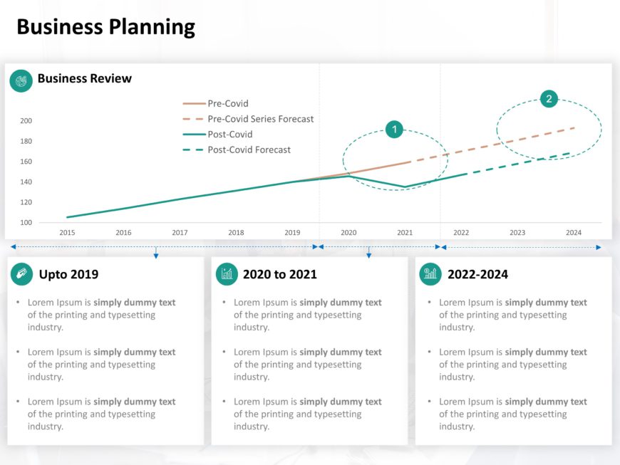
Business Timeline Template PowerPoint For Business Review This Business Timeline template is Designed to showcase your business evaluation proces....

Data Visualization 03 Presentation Template Use this Data Visualization 03 PowerPoint template to create visually appealing presentations in any ....

Sales Business Review Dashboard Presentation Template Use this Sales Business Review Dashboard PowerPoint template to create visually appealing p....

Charts Infographics Presentation Template Use this Charts Infographics PowerPoint template to create visually appealing presentations in any prof....

Chart Timeline Presentation Template Use this Chart Timeline PowerPoint template to create visually appealing presentations in any professional s....

IT Maturity Model Presentation Template Use this IT Maturity Model PowerPoint template to create visually appealing presentations in any professi....

Competitor Analysis 13 Presentation Template Use this Competitor Analysis 13 PowerPoint template to create visually appealing presentations in an....

Product Performance Presentation Template Use this Product Performance PowerPoint template to create visually appealing presentations in any prof....
56 templates>
44 templates>
3 templates>
8 templates>
30 templates>
There are several uses of a chart PPT:
Yes, you can import data from Excel to PowerPoint chart templates:
PowerPoint graph templates help your audience understand the relation between distinct data sets. You can make a graph in PowerPoint to tell a compelling story and effectively communicate complex financial data and trends. Here is some mainly used presentation chart that may be used for efficient data presentations so that you can grasp how data can be usefully illustrated.
Creating a PowerPoint chart template from scratch entails various stages to guarantee a visually appealing consistent design. Here’s a step-by-step tutorial for creating a PowerPoint chart template.
Yes, you can add multiple data series to a chart PowerPoint template
