 Fall Sale
  Flat 40% off on our Unlimited Access Yearly Membership plan!

Data Visualization PowerPoint Templates
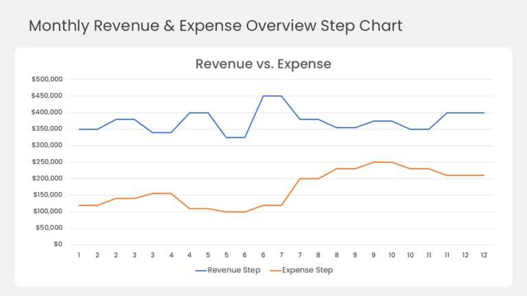
This step line chart compares monthly revenue and expenses across a full 12-month year. A blue revenue line and an orange expense line run across....


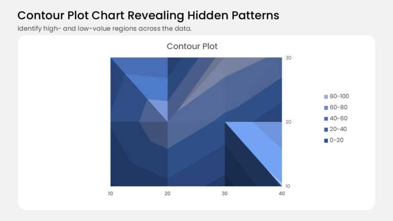
This contour plot turns a grid of values into shaded bands, like a topographic map for your data. It plots 12 data points on a 4 × 3 grid, with 1....
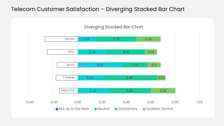
This diverging stacked bar chart compares customer ratings for five sample telecom carriers in one view. Each horizontal bar splits at a zero lin....
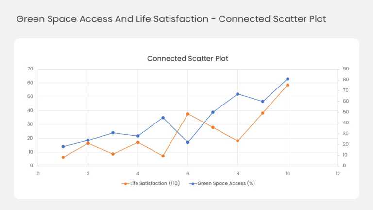
This two-series line chart tracks how two related measures move together across ten data points. Orange markers plot life satisfaction against th....
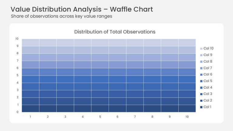
This waffle chart shows how a total splits across ten value ranges on a 10 × 10 grid. Each of the 100 cells stands for one percent of all observa....
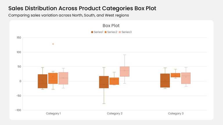
Three category groups anchor this box plot, and each group holds three color-coded boxes. A burnt orange, mid orange, and pale peach series run l....
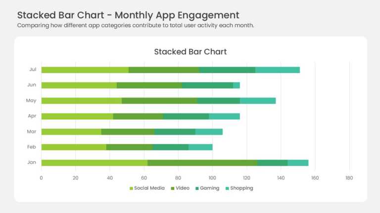
Seven horizontal bars stack four data series across the months January through July. Yellow-green, medium green, teal, and mint segments mark Soc....
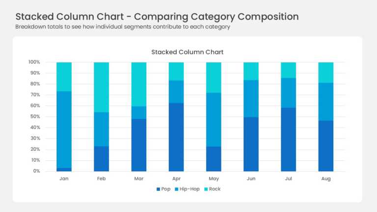
Eight full-height columns run from January to August, each one normalized to 100 percent. Three blue series divide every column: deep navy Pop, b....
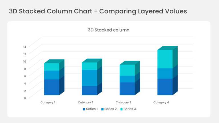
Four three-dimensional columns sit on a perspective floor with gridlines running back into the wall. Each column stacks three series in deep blue....
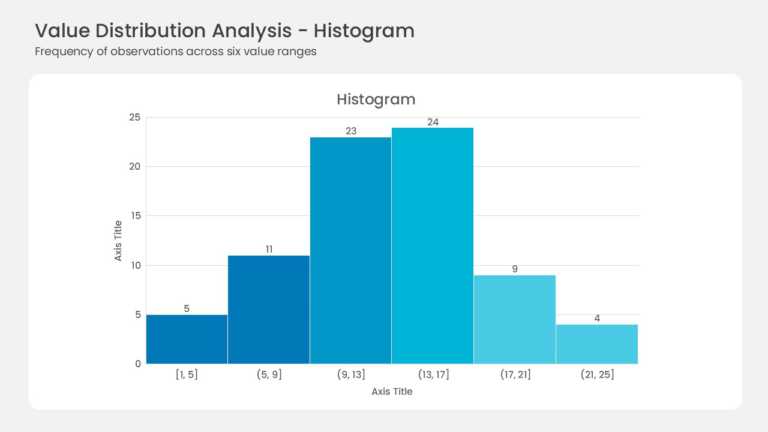
Six adjacent bars form the histogram with no gaps between them. Bin ranges run from [1, 5] up to (21, 25] along the horizontal axis. Frequencies ....
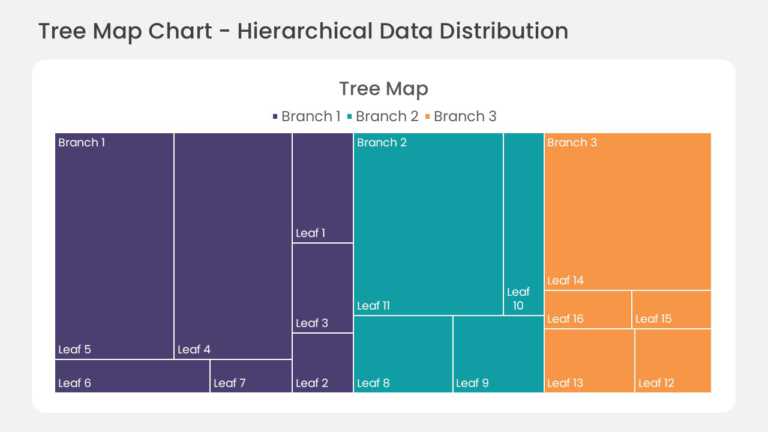
This hierarchical treemap chart divides the slide area into nested rectangles, with each rectangle sized by its share of the total value. Child s....
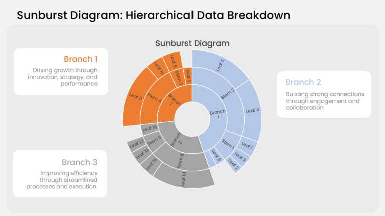
This sunburst chart arranges hierarchical data in three concentric rings. The inner ring holds the top-level categories, the middle ring breaks e....
Related Presentations
-

Gauge Chart
30 templates>
-
Line Chart
14 templates>
-
Pert Chart
5 templates>
-
Charts Diagrams
332 templates>
-
Bar Chart
75 templates>


Data Visualization PowerPoint Templates for Presentations:
The Data Visualization PowerPoint templates go beyond traditional static slides to make your professional presentations stand out. Given the sleek design and customized features, they can be used as PowerPoint as well as Google Slides templates. Inculcated with visually appealing unique and creative designs, the templates will double your presentation value in front of your audience. You can browse through a vast library of Data Visualization Google Slides templates, PowerPoint themes and backgrounds to stand out in your next presentation.
What Is A Data Visualization PowerPoint Template?
A Data Visualization PowerPoint template is a ready-made presentation template that provides a structured framework for creating professional Data Visualization presentations. The Data Visualization PPT presentation template includes design elements, layouts, and fonts that you can customize to fit your content and brand.
How To Choose The Best Data Visualization Presentation Templates?
Keep the following points in mind while choosing a Data Visualization Presentation template for PowerPoint (PPT) or Google Slides:
- Understand your presentation goals and objectives.
- Make sure the Data Visualization template aligns with your visual needs and appeal.
- Ensure the template is versatile enough to adapt to various types of content.
- Ensure the template is easily customizable.
Are Data Visualization PowerPoint Templates Compatible with Google Slides?
Yes, all our Data Visualization presentation templates are compatible and can be used as Data Visualization Google Slides templates.
What Are the Advantages of Data Visualization Presentation Templates?
Data Visualization PPT presentation templates can be beneficial because they:
- Add multiple visual and aesthetic layers to your slides.
- Ensure that complex information, insights and data is presented in a simplistic way.
- Enhance the overall visual appeal of the content.
- Save you a lot of time as you don’t have to start editing from scratch.
- Improve the professional outlook of your presentation.
Can I Edit The Elements In Data Visualization PowerPoint Templates?
Yes, our Data Visualization PowerPoint and Google Slides templates are fully editable. You can easily modify the individual elements including icons, fonts, colors, etc. while making your presentations using professional PowerPoint templates.
How to Download Data Visualization PowerPoint Templates for presentations?
To download Data Visualization presentation templates, you can follow these steps:
- Select the resolution (16*9 or 4*3).
- Select the format you want to download the Data Visualization template in (Google Slides or PowerPoint).
- Make the payment (SlideUpLift has a collection of paid as well as free Data Visualization PowerPoint templates).
- You can download the file or open it in Google Slides.