Presentation Tips for Structuring Messages and Effective Storytelling
This blog breaks down practical presentation tips to help you plan, design, and deliver slides that truly stand out. It covers how to simplify text, use visuals effectively, and maintain smooth flow throughout. Together, these techniques help you create presentations that are engaging, professional, and easy to follow.
Introduction
Most presentations fail for one simple reason: they try to say too much, too fast, on too many slides. We’ve all sat through decks packed with text, random visuals, and no clear flow—where the message gets lost before it ever lands. The problem usually isn’t the topic or the speaker; it’s how the presentation is structured and designed.
In this guide, you’ll learn practical presentation tips to help your slides stand out for the right reasons. We’ll walk through how to structure your presentation like a story, design slides that actually support your message, and use simple checklists to refine your deck before presenting. Whether you’re preparing a business pitch, a classroom presentation, or a high-stakes meeting, these tips will help you create presentations that are clear, engaging, and easy to remember.
How To Structure Your Presentation Like a Story (Not Just Slides)?
Every standout presentation follows the same rule as a great story: It knows who it’s talking to, what it wants to say, and where it’s being told.
Before you open PowerPoint or Google Slides, step back and answer these three storytelling questions:
1. Who Is Your Audience? (The Characters of Your Story)
In storytelling, every story begins with its characters. In presentations, your audience is the main character. Ask yourself:
- Who will be watching this presentation?
- What do they already know about the topic?
- What do they care about most?
- What problem are they trying to solve?
A presentation for clients should feel very different from one for internal teams, investors, or students. When you understand your audience and purpose—whether it’s a sales pitch, investor deck, training session, or academic talk—the structure naturally adapts to different types of presentation, making your story feel focused rather than generic.
Storytelling tip: If your audience can see themselves in your slides, they’ll stay engaged.
2. What Is Your Core Message? (The Plot of Your Story)
Every good story has one clear plot, not ten side stories. Before adding slides, define:
- What is the one key message you want people to remember?
- What action should they take after the presentation?
- What problem are you solving for them?
Your slides should support the story, not compete with it. If a slide doesn’t move the story forward, remove it.
Storytelling tip: If someone remembers only one sentence from your presentation, make sure it’s the right one.
3. Where Will This Presentation Be Shown? (The Stage & Setting)
A story changes depending on where it’s told—and so does a presentation. Consider:
- Is it presented in a large room or on a laptop screen?
- Is it live, virtual, or sent as a PDF?
- Will people watch it on mobile devices?
The environment affects:
- Font sizes
- Amount of text
- Color contrast
- Use of animations and visuals
Storytelling tip: Design for the setting, not just the content—because even a great story can fail on the wrong stage.
Why This Storytelling Structure Works?
By defining the Who, What, and Where, you:
- Create a clear narrative flow
- Avoid cluttered slides
- Make your presentation feel intentional
- Keep your audience engaged from start to finish
Think of your presentation as a story with a beginning, middle, and end—not a stack of slides. These presentation techniques help improve clarity, flow, and audience engagement.
How to Design a Presentation That Supports Your Story?
Design isn’t about making slides look good. It’s about making your story easier to follow, easier to remember, and easier to act on. Along with structure and design, strong presentation skills help bring your story to life and keep your audience engaged from start to finish. Think of these as design principles for visual storytelling.
1. Text First: Strip Your Slides to the Essentials
Text should act like dialogue in a story—short, clear, and purposeful. Design rules to follow:
- One key idea per slide
- Short phrases instead of sentences
- No paragraphs or walls of text
- Slides should hint, not explain
If your audience is reading heavily, the story has already paused.

2. Visual Design: Create the Look & Feel of Your Story
Every story has a mood—and design creates it instantly. Focus on:
- Limited color palette (2–3 main colors)
- Maximum two fonts
- Clean layouts with breathing space
- Visuals that explain faster than text
Strong design quietly tells your audience: “This presentation is worth paying attention to.”
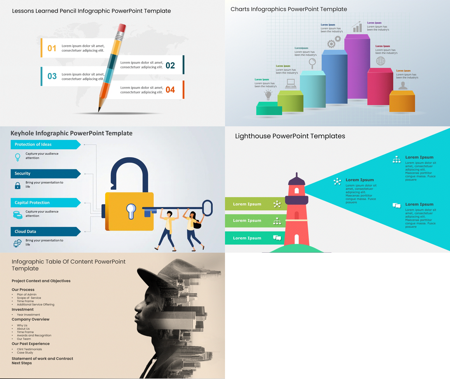
3. Navigability: Help the Audience Move Through the Story
Your audience should never feel lost. Improve slide flow by:
- Keeping layouts consistent
- Using section divider slides
- Maintaining alignment and spacing
- Creating predictable visual patterns
A smooth flow keeps attention locked in. Interactive presentation techniques work especially well in workshops, training sessions, and live meetings.

4. Visual Hierarchy: Control What Gets Noticed First
Every slide should answer one question: “Where should the eye go first?” Use hierarchy to:
- Emphasize key messages
- Reduce visual noise
- Guide reading order
- Improve comprehension
Size, contrast, and spacing do most of the storytelling work here.

5. Consistency: Keep the Story World Intact
Inconsistent design breaks immersion. Stay consistent with:
- Fonts and font sizes
- Color usage
- Icon and image styles
- Grid and spacing rules
Consistency makes your presentation feel designed, not assembled.

6. White Space: Let the Story Breathe
White space isn’t empty—it’s intentional. It helps:
- Separate ideas
- Improve readability
- Reduce cognitive overload
- Make slides feel premium and focused
Crowded slides overwhelm. Spacious slides communicate confidence.

7. Visuals Over Words: Show the Story Whenever Possible
The brain processes visuals faster than text. Replace text with:
- Icons
- Diagrams
- Timelines
- Simple charts
- Before/after visuals
If something can be shown instead of explained, always show it.

8. Accessibility: Design So Everyone Can Follow the Story
A great story is one that everyone can understand. Design for accessibility by:
- Using high contrast colors
- Avoiding tiny text
- Keeping animations subtle
- Not relying on color alone to convey meaning
Accessible design improves clarity for all audiences.
Why This Design Approach Works?
When design supports storytelling:
- Slides become easier to scan
- Messages become clearer
- Attention lasts longer
- Your presentation feels intentional and professional
Great presentations don’t impress with complexity—they win with clarity.
Conclusion
At the end of the day, great presentations aren’t about fancy slides or overused effects—they’re about clarity. When you take the time to structure your presentation like a story, design your slides with intention, and make sure everything flows smoothly, your audience feels it. They don’t have to work to understand your message—and that’s what makes a presentation truly stand out.Before you hit Present, pause and look at your slides from your audience’s point of view. Is the message clear? Is anything distracting? Does the story flow naturally? Use the checklist as a quick final filter, simplify wherever you can, and trust your voice to do the rest. When your slides support you instead of competing with you, your presentation becomes far more memorable.
FAQs
-
What are the most important tips for making an effective PowerPoint presentation?
- Know your audience and your core message
- Keep slides simple and focused on one idea
- Use minimal text and readable fonts
- Design with consistency and strong contrast
- Use visuals to support your message, not distract from it
- Ensure smooth flow and clear navigation between slides
-
How can I design PowerPoint slides that keep my audience engaged?
- Keep your slides simple so your audience listens to you, not the text
- Use visuals, icons, and diagrams to explain ideas faster than words
- Maintain consistent colors, fonts, and layouts for a smooth flow
- Create a visual hierarchy so the most important message stands out
- Use white space to avoid clutter and keep slides easy on the eyes
These small design choices make your slides easier to follow—and much more engaging. These storytelling techniques for presentations help keep your audience focused and engaged.
-
What are some common mistakes to avoid in PowerPoint presentations?
- Overloading slides with too much text or data
- Reading directly from the slides instead of engaging the audience
- Using too many fonts, colors, or design styles
- Adding distracting animations and transitions
- Using low-quality or irrelevant visuals
- Ignoring slide flow and overall structure
Avoiding these mistakes instantly makes your presentation clearer, more professional, and easier to follow.
-
Which PowerPoint features help make slides more visually appealing?
Utilizing features such as SmartArt for infographics, high-quality images, and consistent templates can enhance the visual appeal of your slides. Additionally, using animations and transitions judiciously can add interest without overwhelming your audience, allowing you to create effective presentations without taking much time.
-
How should I organize content on a PowerPoint slide for clarity?
- Focus on one main idea per slide
- Use short headings and supporting keywords
- Create a clear visual hierarchy with size, contrast, and spacing
- Align elements consistently to guide the eye
- Use white space to separate ideas and reduce clutter
A well-organized slide helps your audience understand the message in seconds. Presentation storytelling techniques make complex ideas easier to follow and remember.
-
What are some quick design tips to enhance PowerPoint slides?
- Reduce text and replace it with visuals wherever possible
- Use high-contrast colors for better readability
- Stick to one or two fonts across all slides
- Keep layouts consistent for a clean, professional look
- Use white space to make slides feel less crowded
These quick tweaks can instantly make your PowerPoint slides look clearer and more polished.
-
How can I use images effectively in my PowerPoint presentation?
Select high-quality, relevant images that support your message. Avoid low-quality clip art and ensure that visuals are not only engaging but also enhance the audience’s understanding of your key points. Use images strategically to break up text and maintain interest.
-
Are there any simple tricks for improving PowerPoint presentations for beginners?
- Use simple, clean slide layouts instead of complex designs
- Limit each slide to one clear idea
- Choose readable fonts and large text sizes
- Use built-in alignment and spacing tools
- Remove anything that doesn’t support your message
These easy habits help beginners create clearer, more confident presentations quickly.


