

How to Make a PowerPoint Presentation Attractive: 11 Design Techniques (2026)
Quick Answer: Making a PowerPoint attractive comes down to a set of repeatable layout techniques — visual bullets, split layouts, chunking, full-bleed images with overlays, icon systems, focal points, and journey layouts. Below, each one is broken down into the exact PowerPoint steps to build it, plus the pro move most people miss.
Most “attractive PowerPoint” advice stops at “use fewer words and nicer colors.” That’s not wrong, but it’s not buildable. The techniques below are the ones professional deck designers actually use — and each comes with the menu paths, the specific values, and the one detail that separates a slide that looks designed from one that looks decorated.
1. Turn Bullet Lists Into Visual Bullets
A plain bulleted list is the single most common reason a slide looks dull. “Visual bullets” replace the dot with a shape, number chip, or icon and add breathing room between items.
Build it:
- Select the list, then Home → Convert to SmartArt → Vertical Box List for an instant upgrade; or build it manually for full control.
- Manual version: Insert → Shapes → Rounded Rectangle for a number “chip,” set its height and width to 0.5″ in the Size pane so every chip is identical, and type the number inside.
- Add a 1–1.5pt divider line between items (Insert → Shapes → Line, hold Shift for perfectly straight), and set paragraph line spacing to 1.5 so the list isn’t cramped.
Pro move: Select all your chips and use Shape Format → Align → Distribute Vertically — it spaces them to the pixel, which is the difference between “neat” and “almost neat.”
2. Split the Slide With a Double-Sided Layout
Alternating points on the left and right of a centre line separates dense content and gives the eye a clear path — perfect for comparisons, pros/cons, and before/after.
- Set the centre: View → Guides, then drag a vertical guide until it snaps to 0.00 (the exact middle of a 13.33″ widescreen slide).
- Hug the divider: Right-align the left column and left-align the right column so both lean toward the centre line — this reads as one intentional unit, not two random boxes.
- Add a 2pt vertical divider on the guide, and keep each side to one short idea.
Pro move: Pair it with a timeline treatment — alternate milestones above and below a centre line and let the white space do the work; it’s the same split principle applied horizontally.
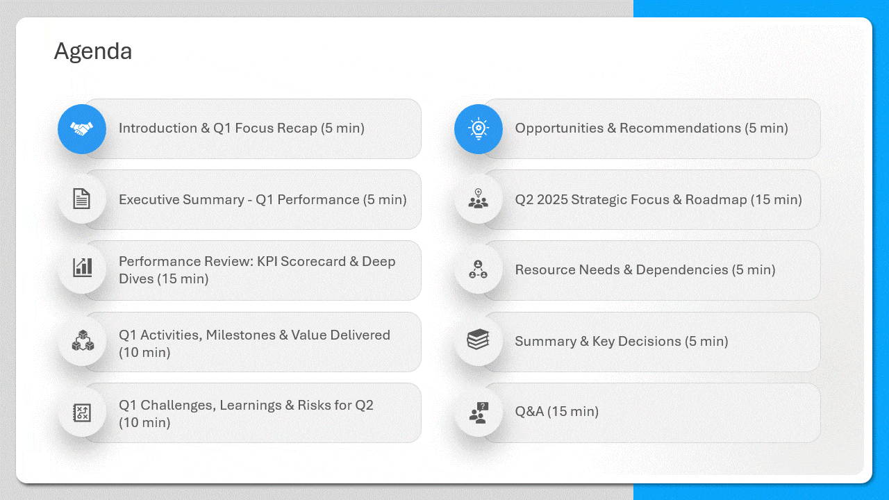
3. Use the Chunking Method (Group of 3–5, Never 9)
Our brains hold ~3–5 items at once, not nine. Chunking breaks a crowded slide into a few labelled groups so it’s instantly scannable.
- Group related items: select them and press Ctrl + G so each chunk moves and aligns as one unit.
- Show the grouping visually: drop a rectangle behind each chunk (Insert → Shapes → Rectangle → Send to Back) filled with a 10–15% tint of one accent color, so related items share a “zone.”
- Create separation: push unrelated chunks physically apart — proximity is what the eye reads as “these belong together.”
Pro move: If a slide has nine items, make it three chunks of three with a one-word label on each. Same information, a third of the perceived effort to read.
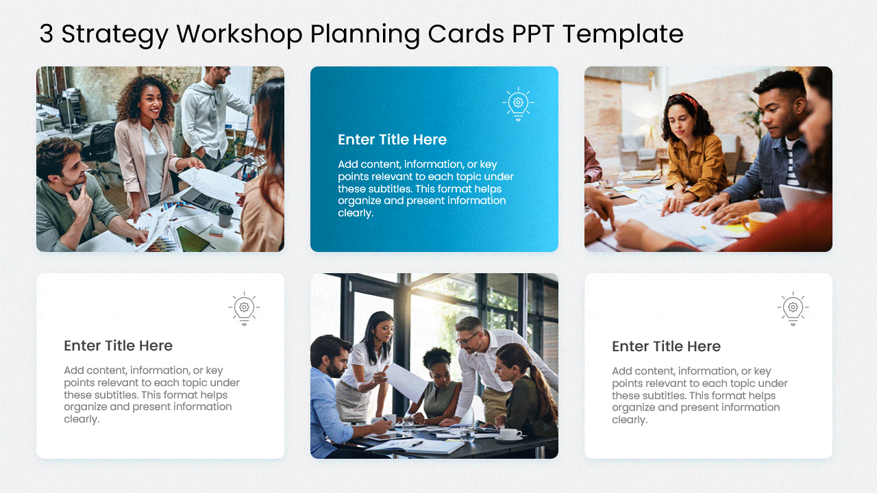
4. Picturize With Cohesive Images and Isometrics
Mismatched stock photos make a deck look stitched together. The fix is making every image feel like it came from the same set.
- Standardize shape: select all images and use Picture Format → Crop → Aspect Ratio → 16:9 (or 1:1) so they’re uniform, then Crop to Fill so nothing distorts.
- Unify the color: Picture Format → Color → Recolor and apply the same wash (a brand-tinted duotone) to every photo — instantly cohesive even from random sources.
- Reach for isometrics for process, tech, and finance content; they convey complexity cleanly. Recolor SVG isometrics to your palette via Graphics Format → Graphics Fill.
Pro move: Set a full-bleed photo, then add a brand-colour duotone overlay (a rectangle with a two-stop gradient fill at ~70% transparency). It ties a generic stock image to your brand in five seconds.
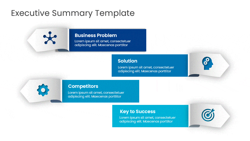
5. Build an Icon System (Not Just “Add Icons”)
Icons cut text and add polish — but only if they look like a set. The mistake is mixing styles and sizes.
- Insert from inside PowerPoint: Insert → Icons (Microsoft 365) for thousands of scalable vectors that never blur.
- Lock the size: set every icon to the same exact height (e.g., 0.6″) in the Size pane so the row looks engineered, not pasted.
- Keep one style: all outline or all filled — never both — and recolor each to a single accent via Graphics Format → Graphics Fill. Pair each with a 3–5 word label.
Pro move: Right-click an icon → Convert to Shape, then use Shape Format → Merge Shapes to drop it onto a colored circle — a tiny “badge” that looks custom-designed but takes ten seconds.

6. Use Full-Bleed Backgrounds With a Readable Overlay
An edge-to-edge image sets the tone before you say a word — the trick is keeping text legible on top of it.
- Bleed the image: Insert the photo, Send to Back, and drag its corners slightly past all four slide edges so there’s no border.
- Add the overlay: draw a rectangle over the whole slide, fill it black (or your brand color), then Format Shape → Fill → Transparency 40–60%. Put text above the overlay.
- Check contrast: aim for a text-to-background contrast ratio of at least 4.5:1 so it’s readable on a projector and accessible.
Pro move: Soften a busy photo with Picture Format → Artistic Effects → Blur before adding text — a defocused background keeps the mood without fighting your words.

7. Add Depth Without Cheesy 3D
“3D” done with PowerPoint’s preset rotation looks dated. Modern depth comes from soft shadows and subtle layering.
- Float your cards: select a shape, Shape Effects → Shadow → Offset, then customize to Blur ~20pt, Transparency ~70%, Distance ~4pt. That soft shadow makes content feel like it’s lifting off the slide.
- Fake a stack: duplicate a card, nudge the copy 4px down/right, give it a slightly darker fill, and Send to Back — an instant paper-stack effect.
- Skip Shape Effects → 3-D Rotation presets; they’re the fastest way to make a 2026 deck look like 2010.
Pro move: Keep shadows consistent — same blur, same direction — across the whole deck. Inconsistent shadows are what make “depth” look amateur.
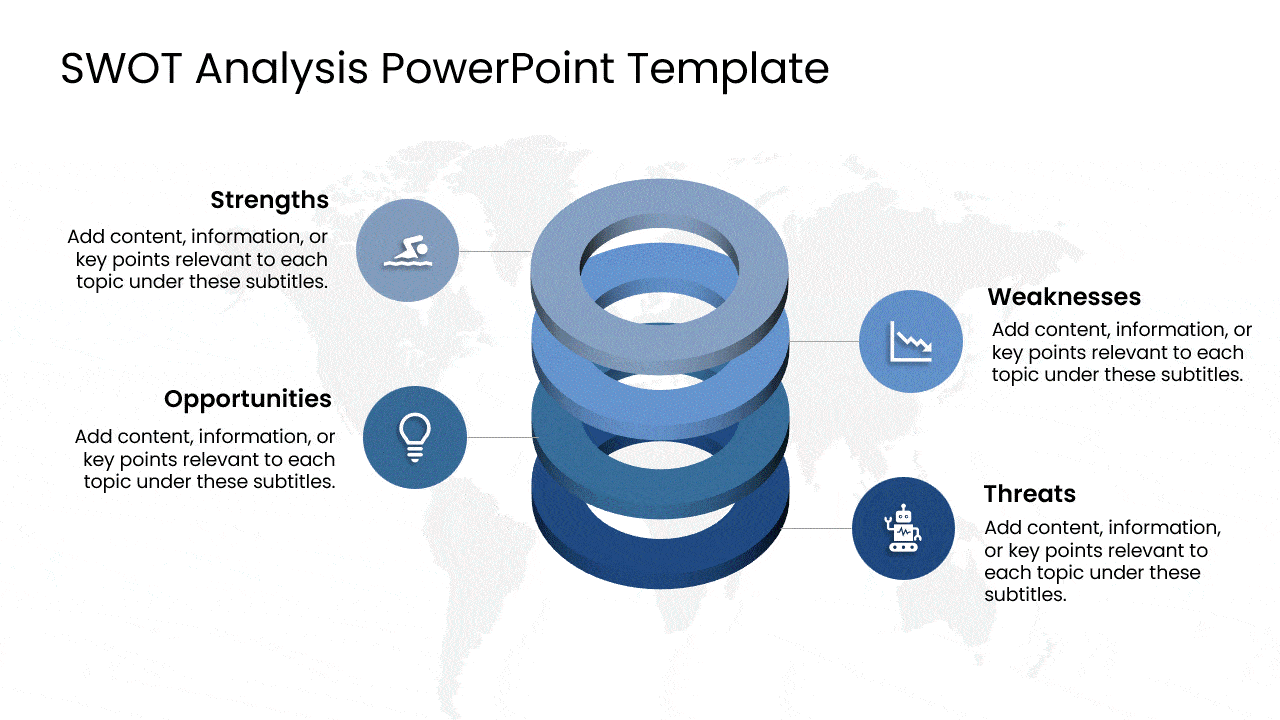
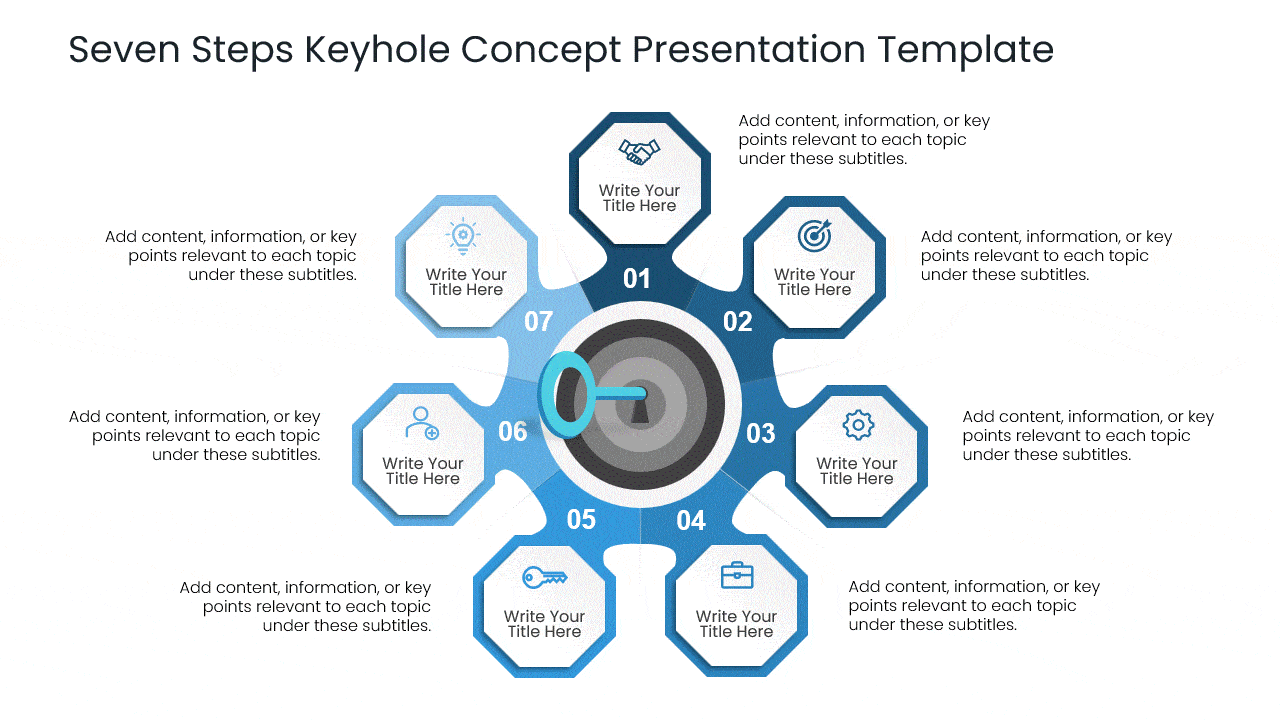
8. Anchor Each Slide With a Central Figure
Give the eye one place to land first. A single dominant element — a big number, a circular diagram, a hero visual — organizes everything around it.
- Center it precisely: select the element and use Align → Align Centre and Align Middle so it sits dead-centre, then radiate supporting points outward.
- Build the hub-and-spoke: SmartArt → Cycle, or manually with an Oval in the middle and connector lines to satellite items.
- Make it dominate: size the focal element 2–3× larger than everything else — hierarchy is what makes it feel designed.
Pro move: Turn one statistic into the whole slide: a single 80pt number with a six-word caption beats a paragraph every time — and it’s the most shareable slide in any deck.
9. Reveal Parts of a Whole One Step at a Time.
When a concept has several parts, showing them all at once overwhelms. Revealing them in sequence keeps the audience exactly where you are.
- Animate each part: Animations → add Appear or Fade to every element, set to Start On Click, and order them in the Animation Pane.
- Dim the past: in Effect Options → After Animation, set each step to dim to grey once you advance — the current step stays bold and obvious.
- Keep it to one effect: a single Fade reads as professional; Fly In, Bounce, and Spin read as a school project.
Pro move: For a “whole → parts” reveal, use the Morph transition between a slide showing the full diagram and a slide showing it exploded into pieces — cinematic, with zero animation timeline to manage.

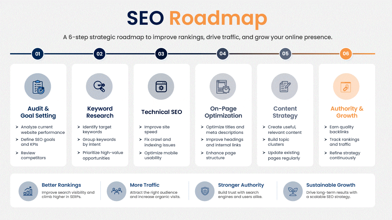
10. Show Direction With a Roadmap or Journey Layout
Sequential content — milestones, phases, a process — lands better as a visual path than a bullet list. The journey metaphor makes progress feel tangible.
- Draw the path: Insert → Shapes → Curve or Freeform to sketch a winding road, then right-click → Edit Points to smooth the bends.
- Place milestones: drop numbered circles along the path and add a “you are here” marker so the audience always knows the stage.
- Order matters: left-to-right or bottom-to-top only — a path that doubles back confuses more than it clarifies.
Pro move: Animate a dot travelling the road with Animations → Add Animation → Custom Path, drawn along your road. As you present each phase, the marker advances — the single most “wow” roadmap move in PowerPoint.
11. Commit to One Aesthetic (With a Real Recipe)
“Attractive” is really “consistent.” Pick one look and define it concretely, then apply it through the Slide Master so it sticks.
- Minimalist: one accent color, a single sans-serif (e.g., a humanist sans), 40%+ white space, thin 1pt lines. Best for corporate and data.
- Bold/modern: oversized headlines (40pt+), saturated color blocks, high contrast. Best for marketing and pitches.
- Editorial/academia: a serif for headings, muted earth tones, generous margins. Elegant for reports and education.
- Lock it in: set the palette in Design → Variants → Colors → Customize Colors and the fonts in the Slide Master, so every new slide inherits the look automatically.
Pro move: Use the Eyedropper (in any color dropdown) to pull your accent straight from a hero image or logo — your palette then matches your visuals exactly, no hex codes needed. Browse aesthetic templates if you want a ready-made starting point.
Bonus: Let AI Do the First Pass — With a Good Prompt
AI gets you from blank slide to draft layout fast, but only a specific prompt gives a usable result.
- Designer: Design → Designer suggests polished layouts from your raw content; apply one, then recolor to your palette.
- Copilot: instead of “make a slide about sales,” prompt “Create a 3-column comparison slide of our Basic, Pro, and Enterprise plans with one icon and three benefits each.” Specific structure in, usable slide out.
Pro move: Always treat AI output as a first draft — swap its generic stock images and default colors for yours, or it’ll look like everyone else’s AI deck.
Conclusion
Attractive slides aren’t about decoration — they’re about a handful of repeatable techniques applied consistently: visual bullets instead of plain lists, chunking instead of crowding, one focal point per slide, cohesive images, and a single committed aesthetic. Build two or three of these into your next deck, and the difference is immediate.
Want a head start? Explore the SlideUpLift template library — every template already applies these techniques. And for the feature-level shortcuts behind them, see our guide to PowerPoint hacks.
FAQs
-
How do I make my PowerPoint look aesthetic?
Commit to one aesthetic (minimalist, bold, editorial, or retro), limit yourself to two or three colors and two fonts, use full-bleed images with a readable overlay, and keep generous white space. Starting from an aesthetic template and refining it is the fastest route to beautiful powerpoint slides with a cohesive look.
-
How do I make a PowerPoint look good without design experience?
Use a professional template, turn on Designer (Design → Designer) for AI layout suggestions, replace bullet lists with icons, and stick to one idea per slide. Those four moves are the answer to how to make PPT look good with no design background.
-
What colors make a presentation attractive?
A light background, a dark primary text color, and one or two accent colors used sparingly. Set them under Design → Variants → Colors → Customize Colors so the palette stays consistent, and lean on your brand colors if you have them.
-
How can students make a PowerPoint presentation attractive?
Pick a clean template, use a single aesthetic, replace dense text with icons and images, and keep one idea per slide. A retro or editorial aesthetic works well for projects, and the interesting powerpoint presentation ideas in tips 5, 7, and 12 above — icons, chunking, and Morph — add polish with almost no effort.
-
What is the best way to make slides less text-heavy?
Use the chunking method to group related points visually, convert lists into icons or SmartArt, and follow one-idea-per-slide. Every beautiful slide moves detail into the spoken delivery or notes rather than cramming it onto the slide.
Table Of Content


Related posts from the same category

10 Nov, 2021 | SlideUpLift
PowerPoint Presentation Tips: How to Make a Good PowerPoint Presentation
A well-crafted PowerPoint presentation can have a lasting impact on your audience. However, creating an effective presentation can be daunting, especially if you are unsure how to make it engaging

6 Feb, 2026 | SlideUpLift
How To Make A Professional PowerPoint Presentation With Practical Tips
This blog shows how to make professional presentations with clear structure, engaging visuals, and effective delivery. It highlights using AI tools like ChatGPT and Copilot with ready-made templates to quickly

10 Nov, 2022 | SlideUpLift
Top 8 PowerPoint Hacks for Consultants
Consulting is the business of selling ideas and concepts, and there's no question that presentations are the primary medium to demonstrate these ideas. Therefore, having a good understanding of dominant
4 Jul, 2025 | SlideUpLift
Why Your Conclusion Slide Matters—And How To Get It Right
Picture this: You've delivered an amazing presentation. Great start solid middle... but then... the ending just... flops. The energy drains. People shuffle out, already thinking about lunch. Sad, isn't it?

4 Oct, 2023 | SlideUpLift
The Best And Worst PowerPoint Presentation Examples
Engaging presentations are the lifeblood of effective communication in today's information-driven world. Whether you're in a boardroom pitching a new idea, standing in front of a classroom of curious learners,

14 Feb, 2023 | SlideUpLift
How To Make A Presentation: A Comprehensive Guide
Are you tired of mediocre presentations that leave your audience bored and uninterested? Presentations are a crucial aspect of communication in the modern world, whether in the workplace, school, or

6 Jan, 2021 | SlideUpLift
How To Start a Presentation : Make A Strong First Impression
Presenting well requires preparation, and the first step is mastering the art of the opening statement. You may pique your audience's curiosity by crafting a captivating introduction to your presentation.

14 Sep, 2023 | SlideUpLift
How to Make A Branded PowerPoint Template?
Delivering an interesting presentation is a skill that can set you apart and take your message to new levels. Engaging presentations are the engines that propel efficient communication and are

23 Aug, 2024 | SlideUpLift
The Best PowerPoint Presentation Examples To Get Inspired By!
Engaging presentations are the secret sauce of effective communication. They bring life to your ideas and transform information into inspiration. They are the heartbeat of any memorable message, connecting with

6 Jan, 2026 | SlideUpLift
Presentation Tips for Structuring Messages and Effective Storytelling
This blog breaks down practical presentation tips to help you plan, design, and deliver slides that truly stand out. It covers how to simplify text, use visuals effectively, and maintain