

11 Best Visual Roadmap Ideas & Design Trends for 2026
This blog shares the best roadmap examples and PowerPoint roadmap templates for presenting plans, timelines, and goals clearly. It explains different roadmap styles and when to use them. The guide also helps you create simple, visual roadmaps that stakeholders easily understand.
Introduction
Having a plan is one thing; communicating it clearly to stakeholders is another. A “wall of text” roadmap often gets ignored, but the right visual layout can secure buy-in instantly.
Below, we have curated the most effective visual roadmap styles used by business professionals, categorized by the intent of the design.
11 Types of Visual Roadmap Layouts (And When to Use Each)
Not every roadmap should look the same. The right layout depends on three things: your audience, the complexity of what you are communicating, and whether your plan has fixed dates or evolving priorities.
The 11 visual roadmap layouts below cover the full range of use cases — from board-level strategy presentations to engineering sprint planning, from portfolio management to customer journey communication. For each layout, we explain what it looks like, when it works best, and a real-world example of who uses it.
If you are unsure which format to use, start with now-next-later for most stakeholder audiences, swimlane for multi-team work, and timeline for anything with committed delivery dates.
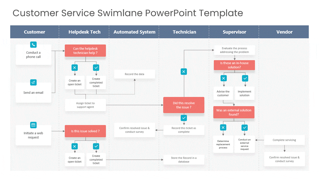
1. The Swimlane Layout (Best for Parallel Workstreams)
When you need to show how different teams (e.g., Marketing, Development, Sales) are working simultaneously, a standard timeline can look messy.
- Why this Visual Works: The “Swimlane” design creates horizontal bands that physically separate different departments while keeping them on the same timeline. It allows executives to scan vertically to see who is doing what at any given moment.
- Best For: Cross-functional teams and Agile sprints.
- Design Tip: Use contrasting colors for each swimlane to make the separation distinct.
- Real-world example: A SaaS company with three product lines (Mobile, Web, API) uses a swimlane roadmap to show investors how each line progresses independently through Q1–Q4 without overlapping priorities.
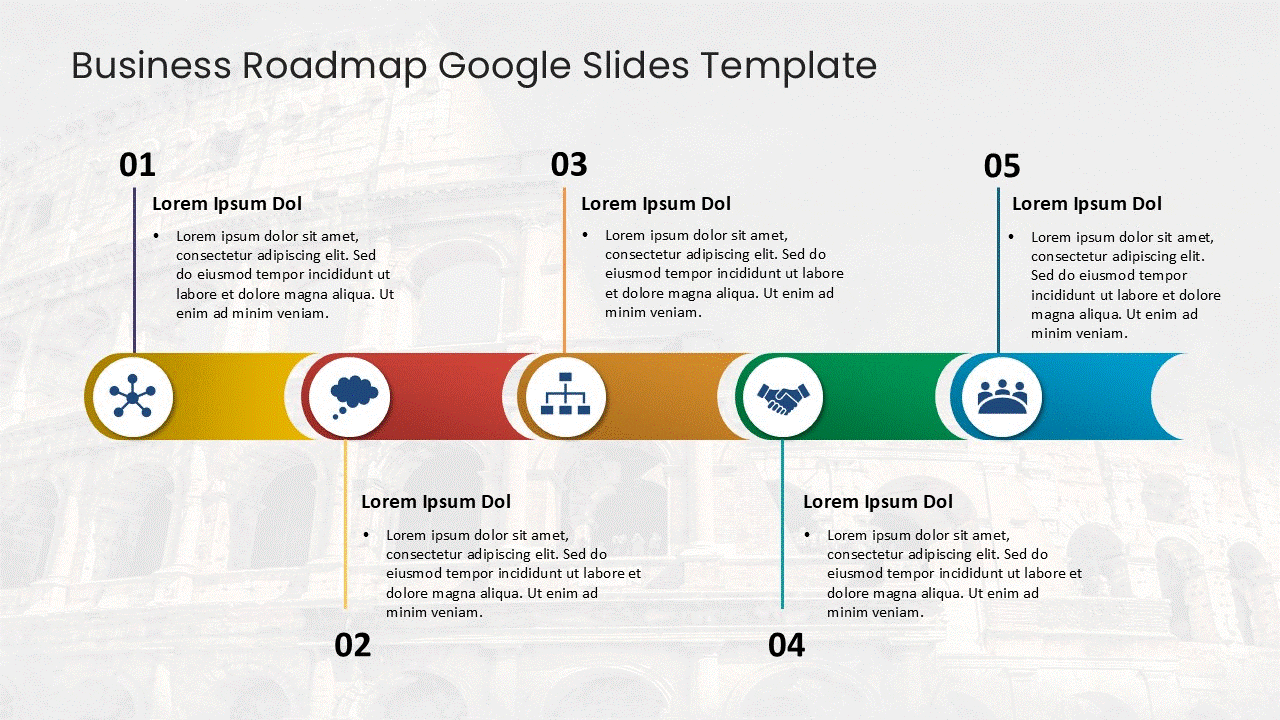
2. The Chevron Process Layout (Best for High-Level Strategy)
Sometimes, showing dates and deadlines is a distraction. If you are presenting to a Board of Directors, they often care more about the “Phase” than the specific “Date.”
- Why this Visual Works: The chevron (arrow-shaped) layout implies forward momentum. It simplifies complex projects into 3-5 distinct phases (e.g., “Planning > Execution > Launch”). It is clean, uncluttered, and focuses on the sequence of value delivery.
- Best For: Quarterly business reviews (QBRs) and 5-year strategic plans.
- Design Tip: Use a gradient color scheme (light to dark) to visually represent progress toward the goal.
- Real-world example: A consultancy presenting a digital transformation strategy to a client’s leadership team uses a chevron roadmap to show the five-phase journey from ‘Assess’ to ‘Scale’ without getting into project-level detail.
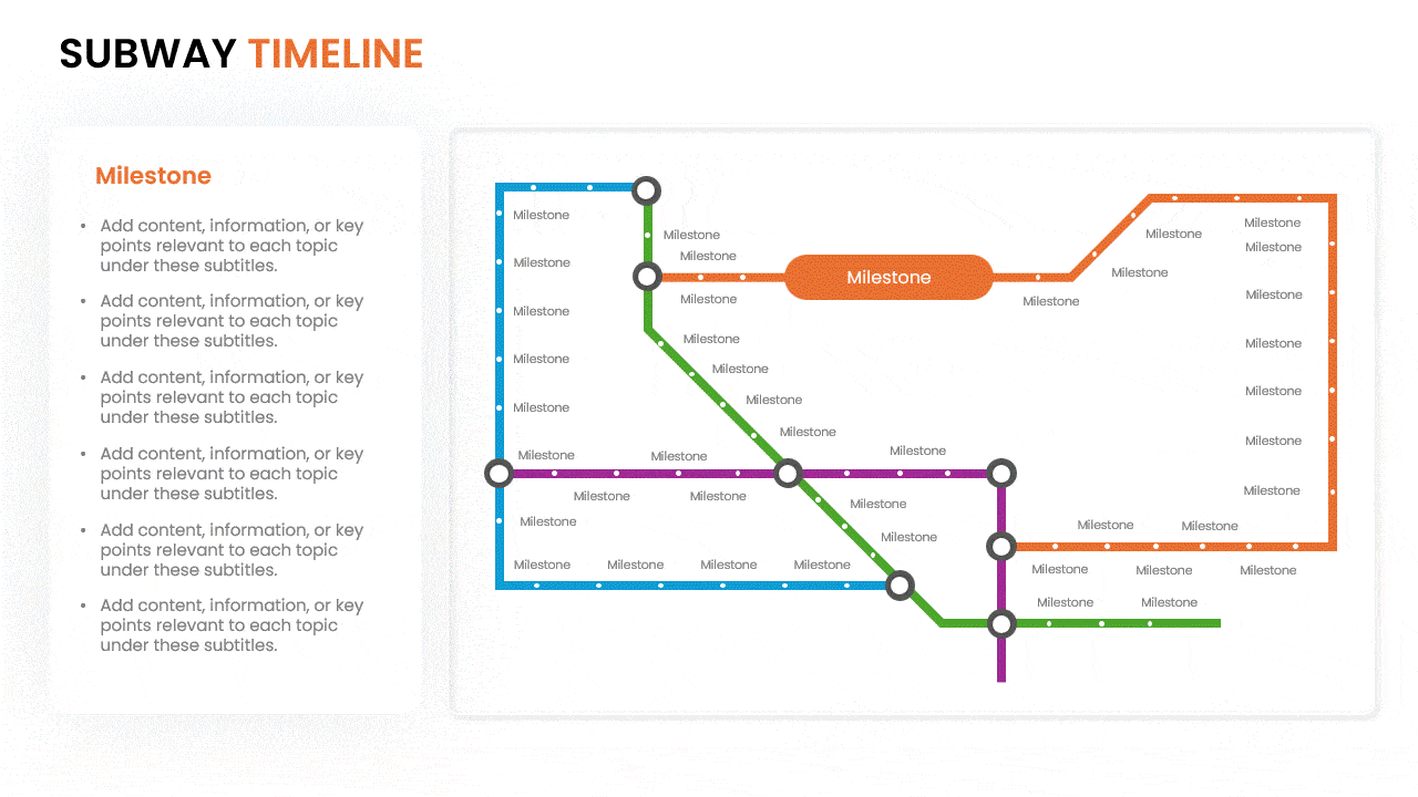
3. The “Subway Map” Visual (Best for Milestones)
This is a creative, non-linear layout that treats your project like a transit system. Stops represent major milestones, and the connecting lines represent the journey.
- Why this Visual Works: It turns a boring schedule into a narrative journey. It is particularly effective for “Transformation” projects where you want to highlight the stops (achievements) rather than the duration (time).
- Best For: Change management, employee onboarding journeys, or product evolutions.
- Design Tip: Use bold, rounded icons at every “stop” to symbolize the achievement (e.g., a flag for launch, a gear for build).
- Real-world example: A marketing team mapping an annual campaign calendar uses a subway map visual to show five campaign tracks (Brand, Demand Gen, Product Launch, Partner, Events) with shared milestone ‘stations’ — like a major trade show — where all tracks intersect.
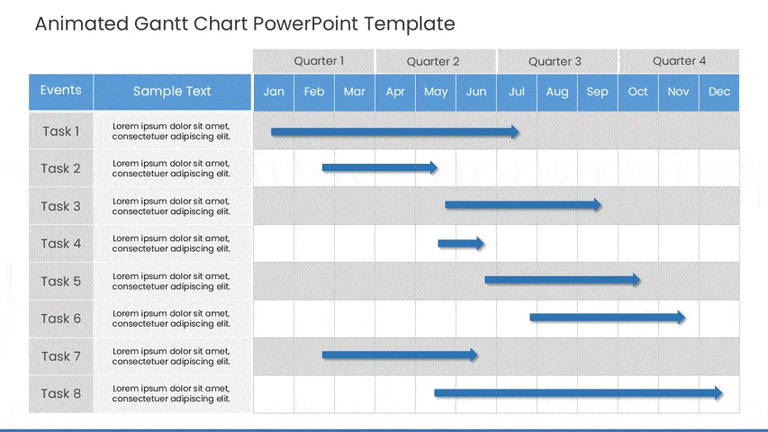
4. The Gantt-Hybrid Visual (Best for Dependency Management)
The classic Gantt chart is powerful but often ugly. Modern visual hybrids keep the “waterfall” structure but use cleaner bars and softer connectors to make it presentation-ready.
- Why this Visual Works: It visually proves to stakeholders why a delay in Task A will cause a delay in Task B. It uses “connectors” (lines between bars) to visualize risk and dependencies.
- Best For: Construction, Manufacturing, or fixed-date software launches. It also works well as a project roadmap for teams managing hard deadlines and cross-task dependencies.
- Design Tip: Use “Harvey Balls” (quarter-filled circles) next to each bar to indicate % completion status at a glance.
- Real-world example: A construction company presenting a phased build schedule to a client uses a Gantt-hybrid to show three workstreams (Foundation, Structure, Fit-Out) with clear dependency arrows — designed to be legible in a boardroom without needing a specialist to read it.
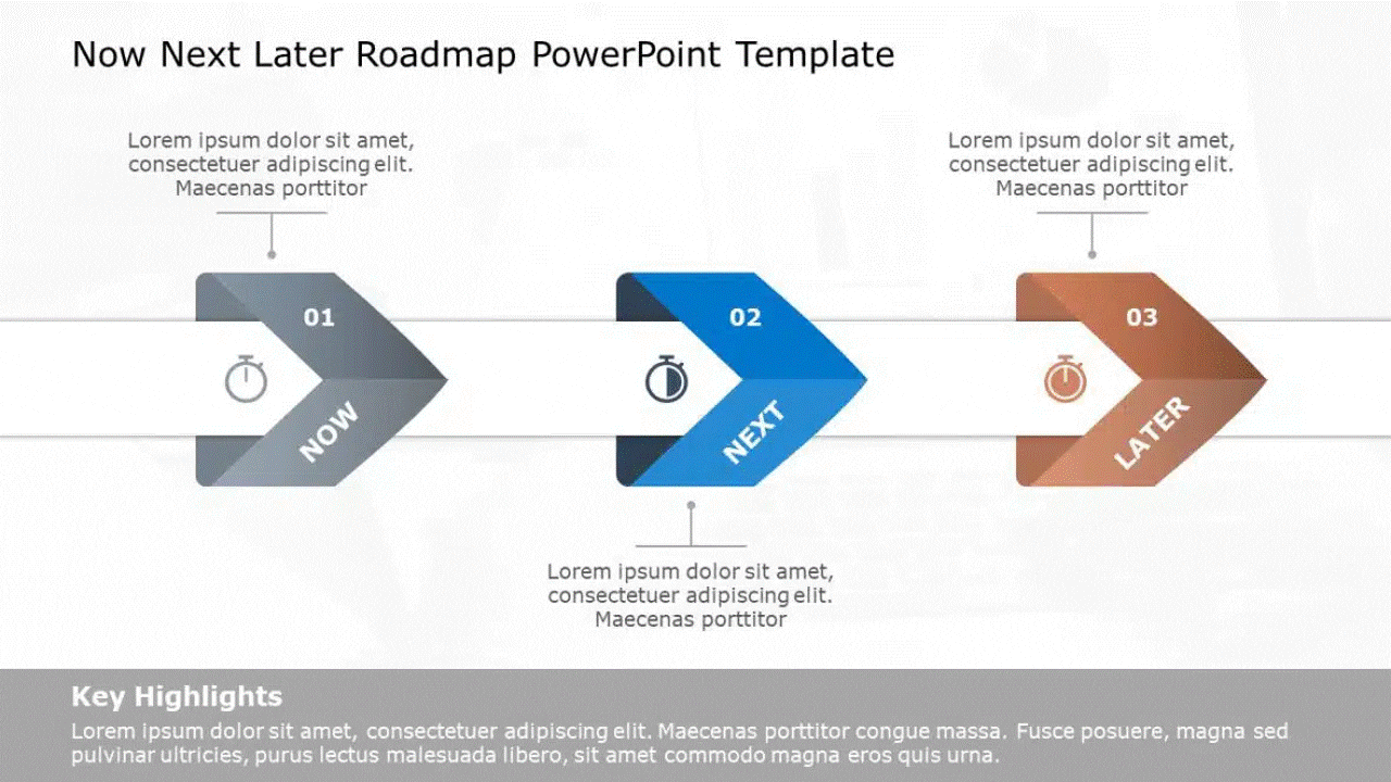
5. The “Now-Next-Later” Layout (Best for Lean Prioritization)
In modern product management, strict dates can be a trap. The “Now-Next-Later” visual removes the pressure of specific deadlines and focuses on priority buckets.
- Why this Visual Works: It uses three distinct columns or buckets to simplify the roadmap into:
- Now: Committed work (Detailed).
- Next: Upcoming work (Broad scope).
- Later: Future aspirations (Vague scope). It prevents stakeholders from fixating on “Which day in November?” and focuses them on “What is the next most important value?”
- Best For: Early-stage startups and Agile product teams who need flexibility. This layout works best when your product roadmap is still evolving, and priorities shift frequently.
- Design Tip: Use decreasing visual density. The “Now” column should have detailed cards, while the “Later” column should just have big, simple headers.
- Real-world example: A product manager presenting to a Series B investor uses a now-next-later roadmap to avoid committing to specific dates while still demonstrating a clear prioritisation logic for the next 12 months.
6. The Layered Architecture Roadmap (Best for IT & Tech Stacks)
IT roadmaps often need to show how hardware, software, and applications interact over time. A simple line isn’t enough; you need depth.
- Why this Visual Works: This layout stacks horizontal bars on top of each other (e.g., Infrastructure at the bottom, Middleware in the middle, User App on top). It visually demonstrates that the App release (Top Layer) cannot happen until the Server upgrade (Bottom Layer) is complete.
- Best For: CTOs, System Architects, and Digital Transformation projects.
- Design Tip: Use connecting vertical arrows to show how a change in the bottom layer “unlocks” a feature in the top layer.
- Real-world example: A CTO presenting a two-year technology stack modernisation to the board uses a layered architecture roadmap to show how the infrastructure, application, and data layers evolve together without getting into engineering specifics.
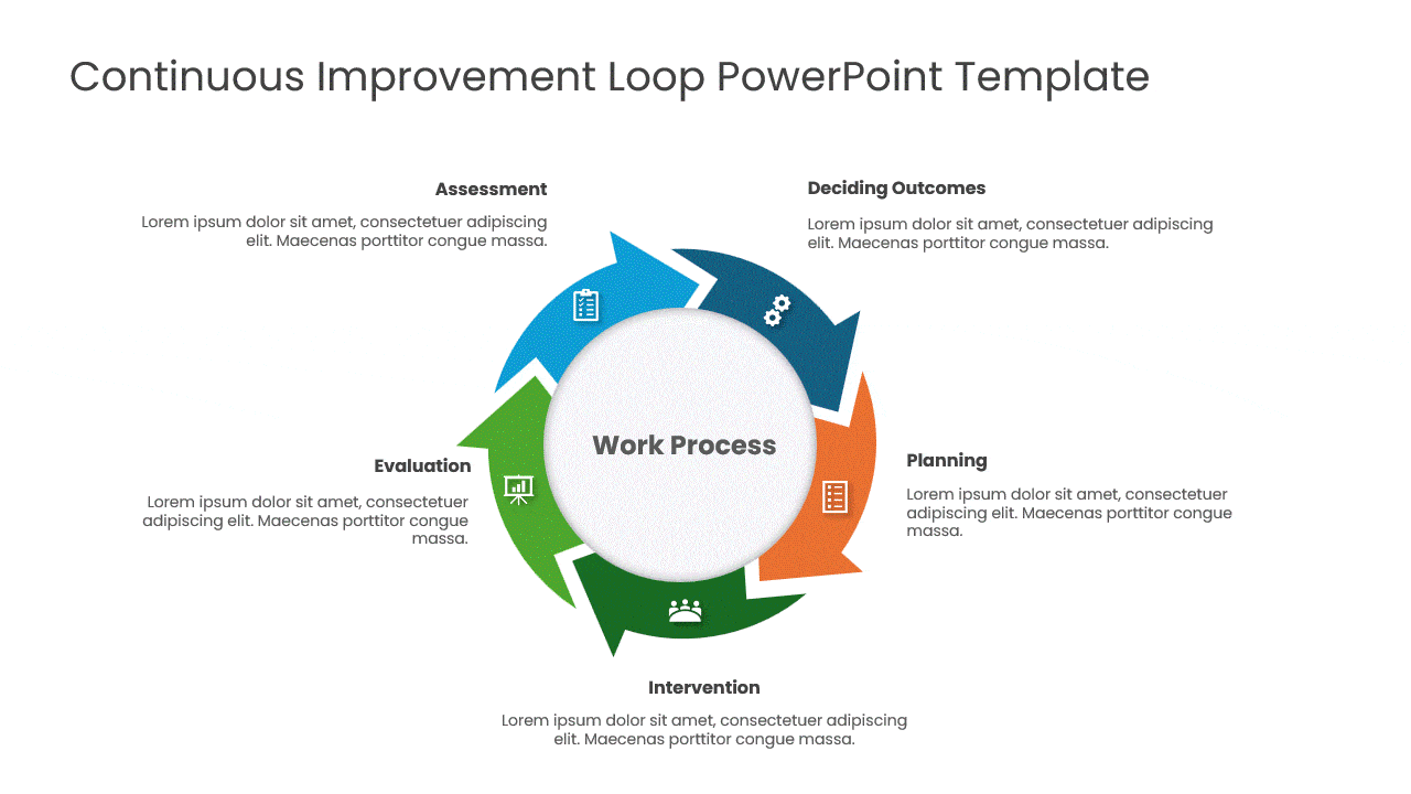
7. The Circular Loop Roadmap (Best for Continuous Cycles)
Not all roadmaps have a “Start” and “Finish.” Some processes, like annual budgeting or marketing audits, repeat every year. A line implies an end, but a circle implies continuity.
- Why this Visual Works: It breaks the mental model of a “race to the finish line.” It reinforces the idea of continuous improvement (Kaizen) or recurring operational cycles.
- Best For: Product Lifecycle Management (PLM), Marketing Content Calendars, and HR Review cycles.
- Design Tip: Use an “Infinity” loop or a segmented donut chart style to represent the phases (Plan > Do > Check > Act).
- Real-world example: A CFO presenting the annual budgeting and forecasting cycle uses a circular roadmap to show that the process has no ‘end’ — each year’s close feeds directly into next year’s planning.
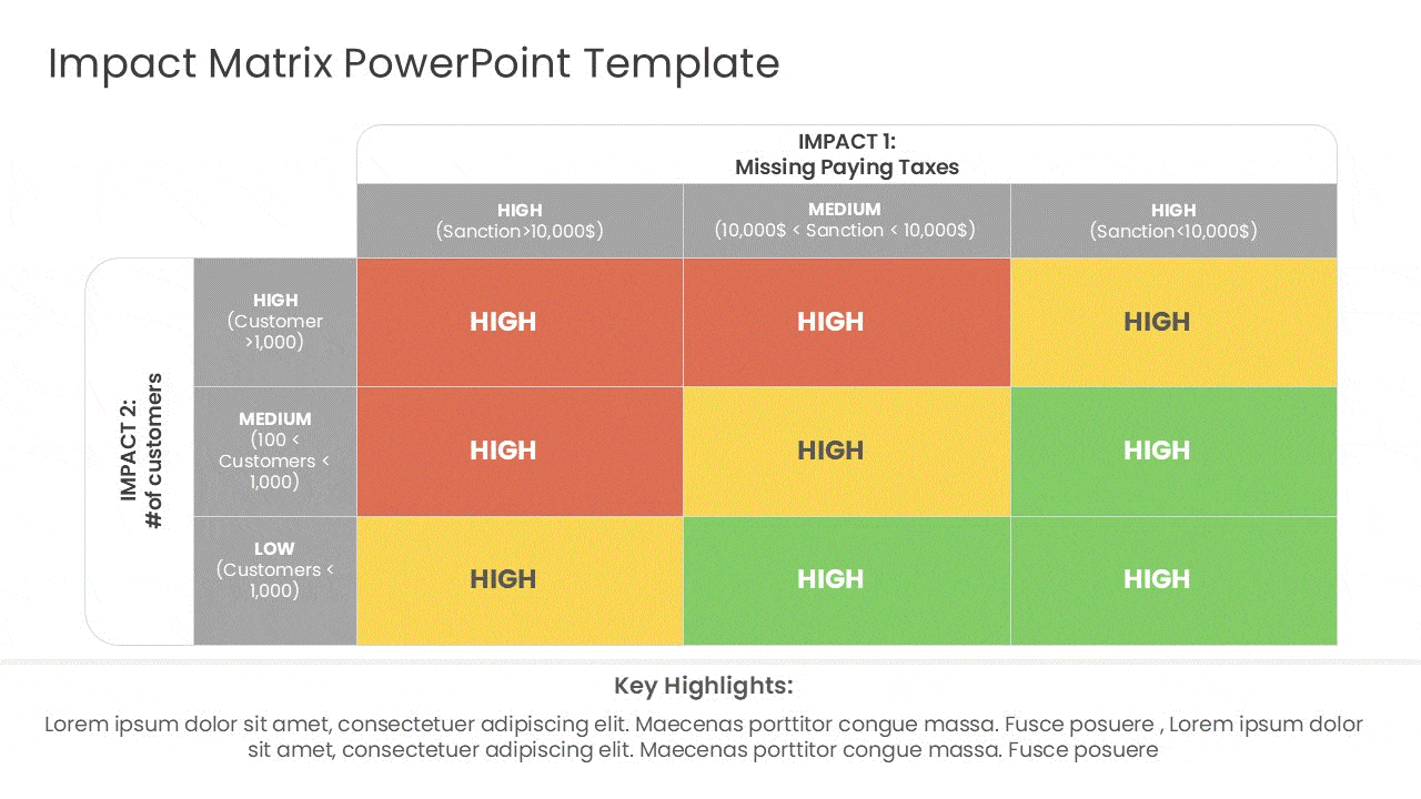
8. The Portfolio “Heatmap” View (Best for PMOs)
When you are managing 10+ projects at once, a timeline becomes unreadable. A “Heatmap” style roadmap abandons the timeline axis in favor of a status grid.
- Why this Visual Works: It uses color-coding (Red/Yellow/Green) to show the health of multiple initiatives on a single slide. Executives can look at the “grid” and instantly spot which project needs attention without reading the details.
- Best For: Program Management Offices (PMO) and Quarterly Business Reviews with the CEO.
- Design Tip: Keep text minimal. The value here is the color. Ensure your Red/Green status colors are distinct and accessible.
- Real-world example: A PMO director presenting 14 active projects to the CEO uses a heatmap roadmap to show status (green/amber/red) across all projects in a single view — without scheduling 14 individual status reviews.
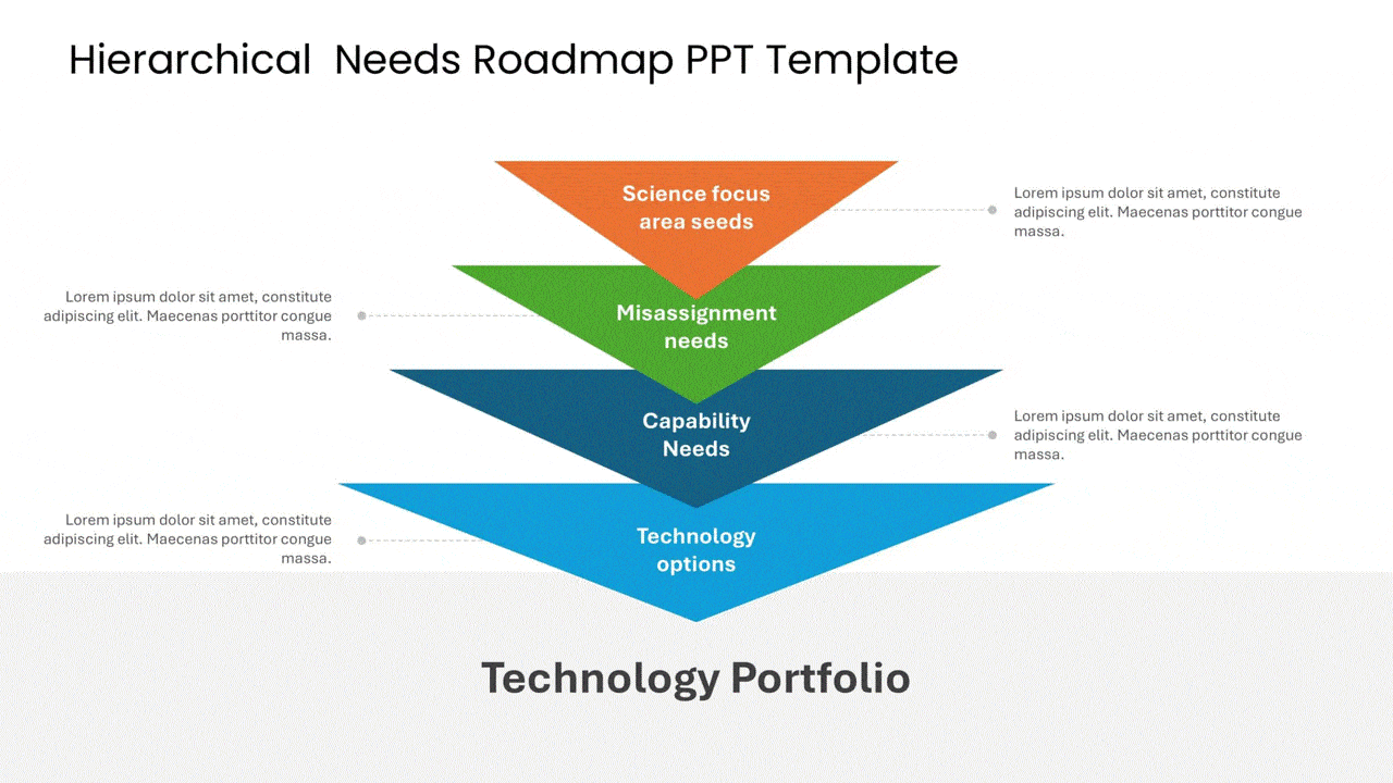
9. The Goal-Oriented (Theme-Based) Roadmap (Best for Outcome Alignment)
Instead of listing features (e.g., “Add Search Button”), this roadmap groups work into high-level strategic “Themes” or “Goals” (e.g., “Improve User Retention”).
- Why this Visual Works: It shifts the conversation from output (“When will the button be done?”) to outcome (“How are we solving the retention problem?”). It prevents stakeholders from micromanaging specific features and keeps them focused on the business value.
- Best For: Product Leaders negotiating with stakeholders and teams fighting “feature creep.”
- Design Tip: Use large “Container” boxes for each theme, and list the supporting features as bullet points inside the box. This visually reinforces that the features are just a means to an end.
- Real-world example: A VP of Product presenting the annual roadmap to the board uses a theme-based roadmap to show three strategic priorities (Expand Market, Reduce Churn, Platform Stability) with 2–3 initiatives under each — framing work in terms of business outcomes, not feature lists.
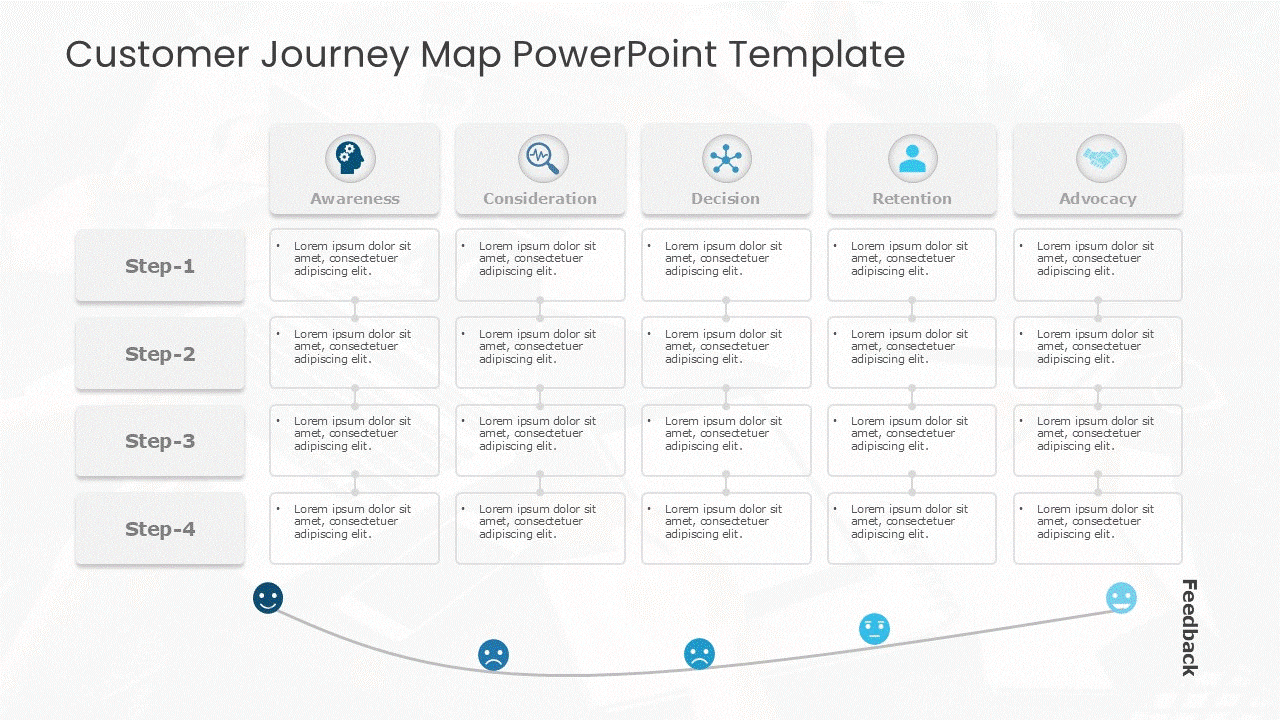
10. The Customer Journey Roadmap (Best for Marketing & UX)
Most roadmaps look internally at what the team is building. This roadmap looks externally at what the customer is experiencing over time.
- Why this Visual Works: It maps the project timeline against the stages of the customer lifecycle (Awareness > Consideration > Purchase > Retention). It ensures that you aren’t just launching features, but actually supporting the user at every touchpoint.
- Best For: Marketing campaigns, UX design overhauls, and Customer Success planning.
- Design Tip: Use a curved line or a “step” layout to represent the user’s progression. Place icons at key “Touchpoints” (e.g., Email, App, Store) to show where the interaction happens.
- Real-world example: A UX team presenting a 6-month research and redesign plan to marketing leadership uses a customer journey roadmap to show how each workstream (Research, Design, Testing, Launch) maps to a specific stage of the customer experience.
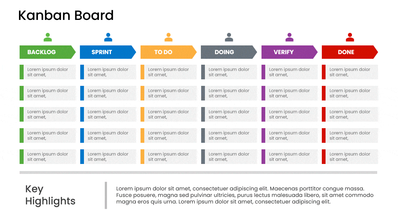
11. The Kanban Roadmap (Best for Continuous Delivery & Operational Teams)
Unlike time-boxed roadmaps that focus on dates or phases, a Kanban Roadmap visualizes work as a continuous flow. It shows how tasks move from idea to completion, making bottlenecks and priorities instantly visible.
- Why this Visual Works: It emphasizes flow over deadlines. By mapping work across columns like Backlog → In Progress → Review → Done, teams can easily spot overload, balance capacity, and keep work moving without constant re-planning.
- Best For: DevOps teams, support teams, content production, operations, and any project with ongoing or repeatable work.
- Design Tip: Use vertical columns with clear status labels and limit the number of cards in each column (WIP limits). Color-code cards by priority or work type to improve scannability at a glance.
- Real-world example: A DevOps team presenting its continuous delivery pipeline to operations leadership uses a Kanban roadmap to show work items flowing through Backlog → In Progress → Review → Done — making WIP limits visible without requiring stakeholders to log into the team’s project tool.
Ready to Build Your Roadmap?
Don’t start from a blank slide. We have categorized hundreds of professionally designed layouts to match your specific reporting needs. Once you’ve chosen a layout, see how to present a roadmap to stakeholders.
FAQs
-
What makes a visual roadmap effective for project planning?
A visual roadmap is effective for project planning because it translates complex goals into a clear, easy-to-understand format. It helps product managers align teams, communicate priorities, and track progress against key milestones. This visual clarity ensures everyone in project management is working toward the same strategic objectives.
-
Where can I find free templates for visual roadmaps?
You can find many free roadmap templates online. Platforms like Slideuplift offer downloadable templates for project management, while tools like PowerPoint and Google Slides have built-in options. These free resources provide a great starting point for product managers looking to create their own product roadmap template without starting from scratch.
-
How do I customize a visual roadmap for my team's needs?
To customize a roadmap, start with a template and adapt it to your planning process. Define your key objectives, then adjust the timeline, milestones, and level of detail to fit your project. Involve your team members in the process to ensure their own roadmap reflects their workflow and responsibilities accurately.
-
What are the key elements of a project roadmap?
The key elements of a project roadmap include objectives, milestones, timelines, dependencies, and ownership. These components provide clarity and help teams manage projects effectively.
-
Who should use visual roadmaps?
- Product managers
- Project managers
- Executives & leadership teams
- Stakeholders and cross-functional teams
-
How often should a visual roadmap be updated?
A visual roadmap should be updated regularly—monthly or quarterly—to reflect changes in priorities, progress, and business goals.
-
What is the difference between a product roadmap and a project roadmap?
A product roadmap focuses on long-term product strategy and features, while a project roadmap outlines timelines, tasks, and milestones needed to deliver a specific project.
-
Can visual roadmaps improve stakeholder communication?
Yes, visual roadmaps improve stakeholder communication by simplifying complex plans into easy-to-understand visuals that clearly show progress and priorities.
-
What are the different types of roadmaps?
The main types of roadmaps are: product roadmap (strategic product direction), project roadmap (single initiative milestones), technology roadmap (IT or infrastructure evolution), marketing roadmap (campaign and channel planning), and strategic roadmap (company-level priorities). Within each type, you can use different visual layouts — swimlane, now-next-later, timeline, Gantt-hybrid, heatmap, or goal-based — depending on your audience and the level of detail required.
-
What is the most effective visual format for a roadmap?
It depends on your audience. For executives: now-next-later or theme-based (no dates, outcomes-focused). For delivery teams: Gantt-hybrid or swimlane (dependencies visible, timeline clear). For investors: milestone-only or goal-based (business outcomes front and centre). For portfolio views: heatmap (status across multiple projects at a glance). All 11 formats are covered with examples in this guide.
Table Of Content


Related posts from the same category

24 Jan, 2024 | SlideUpLift
What Is a Project Roadmap? A Complete Guide With Examples and Free Templates
A project roadmap is a high-level visual plan that shows a project’s goals, major milestones, key deliverables, and timeline at a glance. Unlike a detailed project plan that tracks tasks
12 Sep, 2025 | SlideUpLift
What is KPI? Step-by-Step Guide with KPIs Examples That Work
Is it hard for you to know if your business is getting to the level it should be? That's where key performance indicators (KPIs) come into play. KPIs indicate how

18 May, 2021 | SlideUpLift
The 5 Essential PowerPoint Themes For Project Managers
As a project manager, making presentations is an integral part of your job. Making a good presentation requires many elements to be successful, with good presentation design being one of

16 Dec, 2021 | SlideUpLift
Breaking Down Work Breakdown Structure in Easy Steps : Must Have Resource For Project Managers
Project management is complex. It necessitates keeping track of multiple – sometimes geographically dispersed – teams, coordinating tasks, and holding everyone accountable to a common goal. Fortunately, there are a

15 Apr, 2021 | SlideUpLift
5 Most Popular Agile Project Management Frameworks
Agile frameworks strongly emphasize collaboration and open communication within project teams. Regular events such as daily meetings, sprint planning, and retrospective sessions facilitate ongoing discussions and ensure everyone is on

8 Jul, 2021 | SlideUpLift
Avoid Making These 7 Project Management Mistakes
Making mistakes is not a bad thing; tons of lessons can be learned from them. And in the field of Project Management, lessons abound. Projects, unfortunately, seldom go smoothly. There

13 Oct, 2022 | SlideUpLift
Agile vs Traditional Project Management: Key Differences and Which Is Better
Agile project management is an iterative, flexible approach that delivers work in short cycles and adapts to change as it goes. Traditional (Waterfall) project management is a linear, plan-driven approach

27 Sep, 2021 | SlideUpLift
Kanban Board – An Underused Visual Tool to Take control of your projects
Productivity is one of the essential ideas in today's corporate environment. It is what business experts strive towards while carrying out operations. In many companies, however, lack of productivity is

6 Jun, 2024 | SlideUpLift
Project Kickoff Meeting: Agenda, Checklist & Best Practices
A project kickoff meeting is the first formal meeting held after a project is approved. Its purpose is to align stakeholders, clarify objectives, confirm roles, and set expectations before execution

6 Mar, 2024 | SlideUpLift
Best Work Plan Templates For Easy Task Organization [With Examples]
A project's success depends on having a detailed task plan. How can you perform tasks without having a plan for them? You and your team can produce the ideal work