

 Flat 4


 Edit with AI
 Ask Us To Edit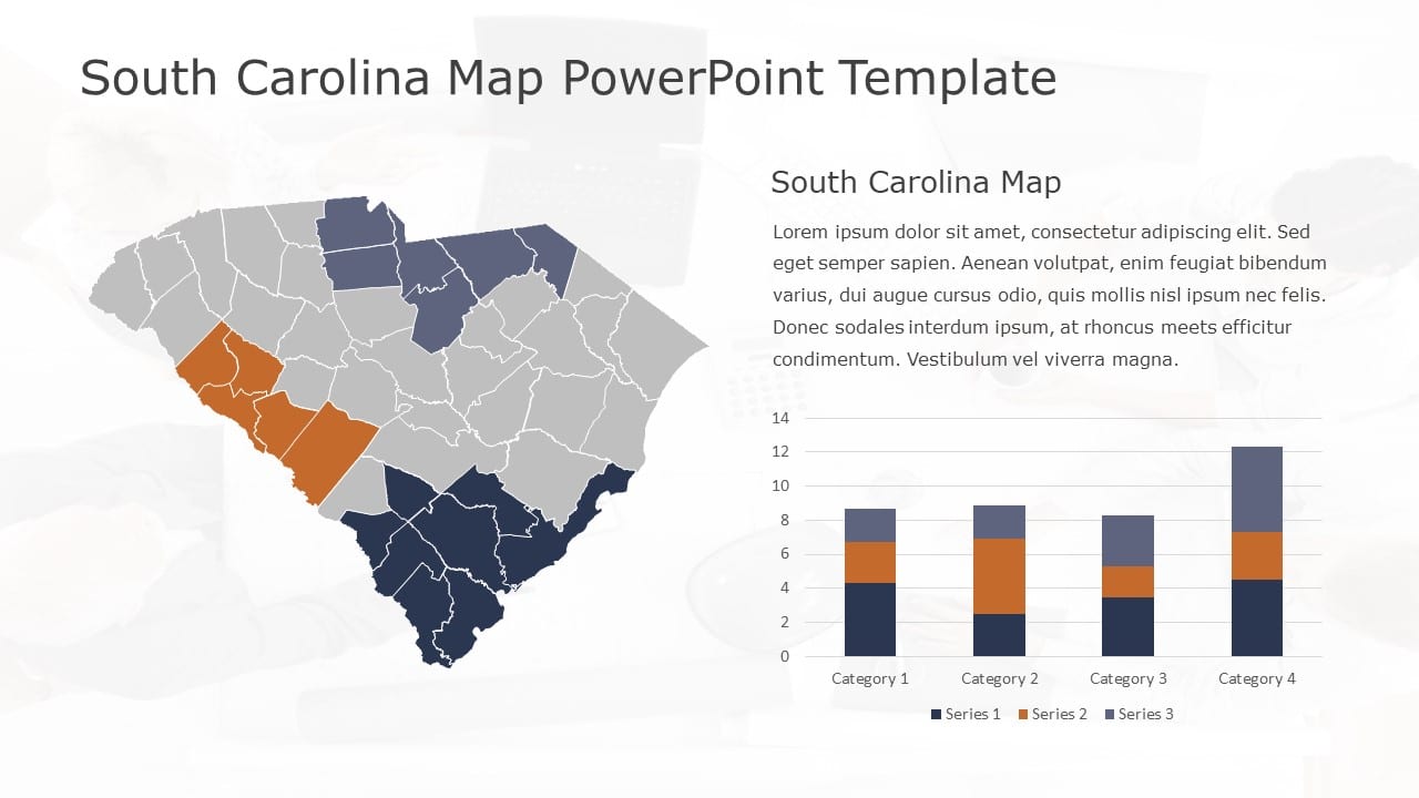

Product Description:
The South Carolina Map Analysis with Orange and Blue Highlights Presentation Template helps users present regional data, geographic comparisons, and category-based performance across different areas of South Carolina. It is suitable for business analysts, sales teams, consultants, market researchers, government professionals, and planners who need to combine location-based insights with supporting quantitative data.
The slide features a detailed South Carolina map with county boundaries and selected regions highlighted in orange, blue, and gray tones. The right side includes a supporting text section and a stacked column chart comparing four categories across three data series. The contrasting map highlights make key regions easy to distinguish, while the chart helps users compare values and performance across multiple categories. Explore more US Maps PowerPoint Templates for presenting state-level analysis, regional performance, market coverage, geographic comparisons, and location-based business insights.
Compatible with: PowerPoint | Google Slides | Widescreen (16:9)


