 Fall Sale
  Flat 40% off on our Unlimited Access Yearly Membership plan!

Cool PowerPoint Templates
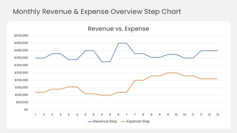
This step line chart compares monthly revenue and expenses across a full 12-month year. A blue revenue line and an orange expense line run across....


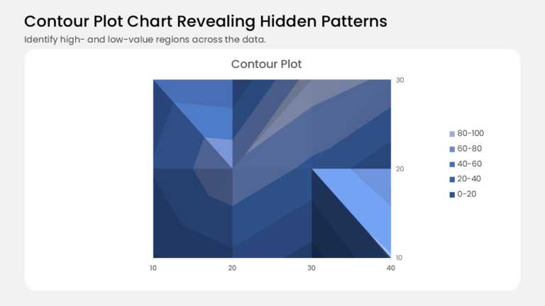
This contour plot turns a grid of values into shaded bands, like a topographic map for your data. It plots 12 data points on a 4 × 3 grid, with 1....
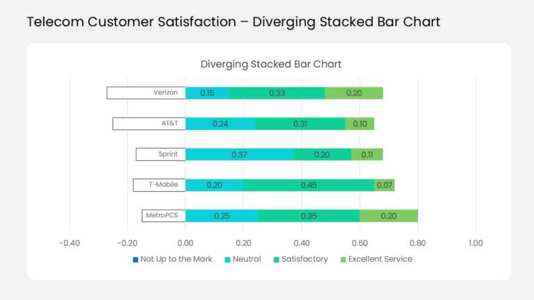
This diverging stacked bar chart compares customer ratings for five sample telecom carriers in one view. Each horizontal bar splits at a zero lin....

This two-series line chart tracks how two related measures move together across ten data points. Orange markers plot life satisfaction against th....
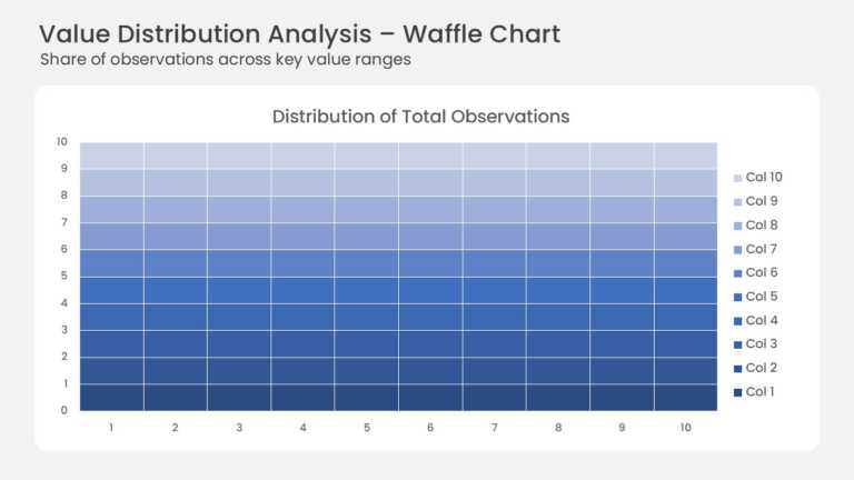
This waffle chart shows how a total splits across ten value ranges on a 10 × 10 grid. Each of the 100 cells stands for one percent of all observa....
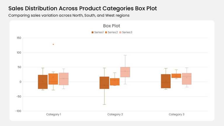
Three category groups anchor this box plot, and each group holds three color-coded boxes. A burnt orange, mid orange, and pale peach series run l....

Seven horizontal bars stack four data series across the months January through July. Yellow-green, medium green, teal, and mint segments mark Soc....
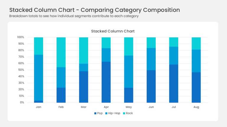
Eight full-height columns run from January to August, each one normalized to 100 percent. Three blue series divide every column: deep navy Pop, b....
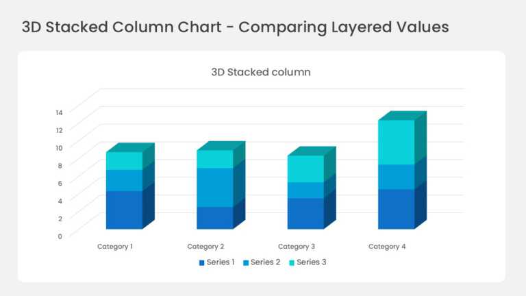
Four three-dimensional columns sit on a perspective floor with gridlines running back into the wall. Each column stacks three series in deep blue....
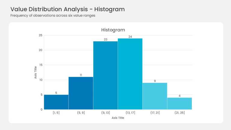
Six adjacent bars form the histogram with no gaps between them. Bin ranges run from [1, 5] up to (21, 25] along the horizontal axis. Frequencies ....

This slide combines a revenue chart broken down by business segment with a dedicated key takeaways panel. The chart area shows the revenue contri....
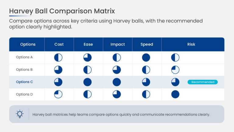
This decision scorecard arranges options in columns and evaluation criteria in rows, with a Harvey Ball in each cell. Circles filled in quarter i....
How To Make Cool PowerPoint Slides?
Infographics are probably the best way to make your business presentations more attractive and attention-grabbing. It results in increased engagement as compared to other visual media. And also make sure to choose the font size appropriately, use strong contrast with the text, and try not to use too much text and too many colors on your PowerPoint slides.
How to make Cool PowerPoint presentation?
To make your presentations more appealing and memorable you need cool backgrounds, simple transitions, clean fonts, & attractive graphics to make the presentation more engaging.
Here are a few ways to make a cool presentation,
- Use a consistent theme
- Use more images & less text
- Use animations to highlight each bullet point
- Convey one message in each slide
- Use 2/4/8 rule - The 2/4/8 rule is-don't spend more than 2 minutes on a one slide, don't use more than 4 bullets per slide, and no more than 8 words per bullet.