PowerPoint Graphics: Elevate Every Slide from Blah to Brilliant
Free PowerPoint Graphics
The Marketing Budget Pie Chart PowerPoint Template is a resource for visually organizing and presenting the marketing budget, aiding in analysis, decision-making, and effective communication. The template has a title bar at the top that can be edited as per the topic. It has a pie chart in the center. This chart is divided into five sections. Each section is...
read more
This colourful spin-wheel presentation template visually represents the concept of luck and destiny in life. It can be used by varied professionals like marketers and HR professionals to convey the idea of rewards and risks to the audience. The subtle background and bold graphics create a stunning visual interface for the content in this modern presentation slide. The colourful icons...
read more
The Pyramid Shape PowerPoint Template is a trial PPT template designed to visually represent various steps. It is perfect for business, education, and project management presentations. This pyramid PowerPoint template has a header that can be edited as per the title. There is a pyramid on the left side of the template. The layout of the pyramid template is well...
read more
Presentation Graphics
Impress stakeholders with this collection of sleek and modern Azure icons designed specifically for PowerPoint and Google Slides presentations. T....
Transform your data into insights with this eye‑catching comparison template. Set against a backdrop, the design throws the contrast between a ta....
Use this Business Risk Factors template to create visually appealing presentations in any professional setting. Its minimalistic design and ready....
Simplify information sharing with this engaging whiteboard template designed for presenting key growth drivers. This versatile layout allows you ....
This Roadmap Infographic Template is ideal for visualizing a process, project timeline, or strategic planning. The roadmap effectively conveys a ....
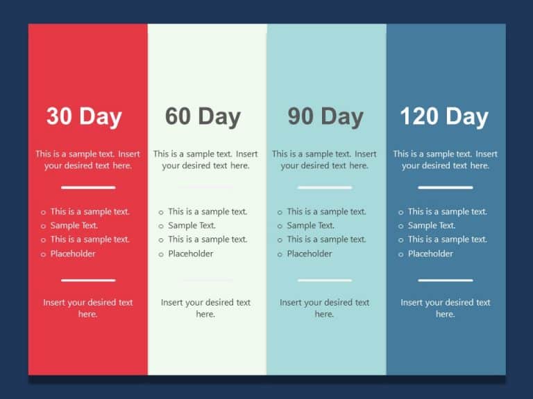
This 30 60 90 day plan template is an important guide for professionals embarking on their first three months in a new position. This template he....
The Professional Background PowerPoint Template has predefined topics that are versatile and can be used by a wide range of professionals. Busine....
Share your vision using this set of male silhouettes that can add vitality and excitement to your presentations effortlessly! This design include....
This PowerPoint template is a vibrant and well-organized tool created for professionals. This slide offers a format to outline an executive’s goa....
Maximize your impact with this visually engaging timeline template designed for PowerPoint and Google Slides! Perfect for showcasing your project....
Org Chart is an effective tool that professionals and businesses can use to showcase their team members or the structure of an organization’....
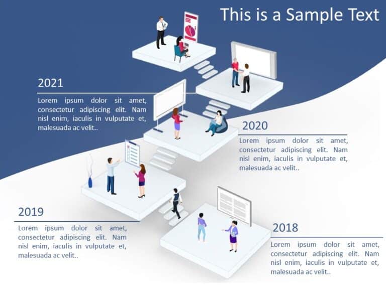
The Timeline Chart PowerPoint Template has a clear layout design to present a series of events or activities over time. The layout includes diffe....
Related Presentations
What Are PowerPoint Graphics in a Presentation?
Graphics for presentation are pictures, charts, icons, shapes, infographics, or any visuals you add to slides to help explain the data easily and make it more engaging. Instead of showing only words, graphics make your slides more visual and interesting. They break up long content, highlight key points to make it easy to read and grasp the information.
How Do Colors and Graphics Help Keep People Interested in a Presentation?
The impact of the color schemes in PowerPoint graphics refers to how the colors make people feel and react when they see your slides. Colors have the ability to create emotions, set the mood, and influence how your message is understood. At the same time, using good graphics as PowerPoint backgrounds can enhance the overall look of your presentation.
-
- Colors in PowerPoint graphics can affect how people feel and respond, and set the right mood.
- Different colors create different emotions and meanings. (blue: calm, professional, trustworthy; red: urgent, bold, energetic).
- Good ones can make your presentation more appealing and memorable.
- It keeps the audience from losing interest in the presentation.
- Simple, well-chosen color graphics help your audience focus and understand better.
What are the types of Presentation Graphics?
PowerPoint Graphics for presentations come in many forms, each contributing to explaining the ideas more clearly and keeping things interesting. From charts to icons, these visuals make your slides catchy.
|
Type of Graphic |
What It Is |
Why Use It |
|
Charts & Graphs |
Visuals like bar charts, pie charts, and line graphs. |
To show numbers and data clearly. |
|
Diagrams |
Drawings that explain steps or how things are connected. |
Great for showing processes or systems. |
|
Infographics |
A mix of pictures, icons, and short text. |
To explain things quickly and visually. |
|
Icons & Symbols |
Small pictures that stand for ideas or actions. |
To make slides simpler and cleaner. |
|
Images & Photos |
Real-life pictures. |
To create impact or show real examples. |
|
Tables |
Information is shown in rows and columns. |
Good for comparing data or listing things. |
|
Timelines |
A line that shows events in order over time. |
Perfect for showing project plans or history. |
|
Maps |
Graphics that show places or locations. |
Useful for showing geographic data or global info. |
|
Animated Graphics |
Moving visuals, like animated charts or GIFs. |
To grab attention and show changes over time. |
|
Mind Maps |
A visual map with one main idea in the center and related ideas around it. |
Great for brainstorming or organizing ideas. |
|
Illustrations & Doodles |
Hand-drawn or cartoon-style images. |
To add a creative or friendly touch. |
|
Data Visualizations |
Fancy visuals like heat maps or bubble charts. |
For showing complex data in a smart way. |
|
Callout Boxes & Highlights |
Boxes or shapes that point out something important. |
To make key info stand out. |
|
Comparison Graphics |
Visuals like Venn diagrams or side-by-side layouts. |
To show differences or similarities. |
|
Flow Animations |
Moving arrows or paths that show direction or change. |
Good for showing steps or progress. |
|
Visual Metaphors |
Images that represent ideas (like a lightbulb for an idea). |
Makes ideas easier to understand and remember. |
Looking for easy-to-use templates? Many free PowerPoint templates and Google Slides themes for graphics are available online to help build impactful slides effortlessly.
What does Integrating Interactive Graphics in PowerPoint do?
Interactive presentation graphics are design elements that let your audience take control of navigating through the presentation. Elements like clicking, hovering, or choosing options. Instead of just watching the slide, people can interact with the content. Here are some:
-
- Clickable Buttons: Let the viewer jump to specific slides or sections.
- Live Polls or Quizzes: Slides where people can choose answers.
- Animated Charts: Charts that show data step-by-step when clicked upon.
- Clickable Menus: Turn the slide into a mini website where users choose what to explore next.
- Image Hotspots: Clickable parts of an image that show more information.
- Drag-and-Drop Graphics: Interactive exercises for training or workshops.
Keep it simple, don’t overload the slide with too many clickables. Make sure to test the links and animation to make sure that everything is working smoothly. These interactive elements turn PPT graphics from simple visuals into engaging, story-driven tools.
How Can You Build Accessible Graphics for Diverse Audiences?
Accessible PowerPoint graphics are made for people with disabilities like color-blindness, poor eyesight, or who use screen readers to read the text aloud. Using clear fonts, strong color contrast, and adding shapes or labels aids them in understanding what is being presented to them. Adding descriptions to images helps screen readers explain them. Keeping slides simple and tidy makes it easier for all viewers to follow. This way, your presentation reaches more people and includes everyone.
How to create good graphics for PowerPoint?
To create good graphics, keep them simple, clear, and easy to understand. Use high-quality images. Choose colors that go well together and make sure that the text is easy to read. Use charts, icons, and shapes to support your message, not distract from it. Keep everything neat and not too crowded.
What are the common mistakes to avoid when using graphics in PowerPoint?
Some of the common mistakes include using too many PPT graphics. This can easily cluster your slides. Using low-quality or blurry images can tamper with the standard of the content you are presenting. Avoid using colors with poor contrast that are hard to see. Do not rely on colors alone; use labels or shapes too. Make sure that they are not too small and that they properly support your message.
How can you use interactive graphics in PowerPoint?
You can use interactive graphics like clickable buttons, live polls, or animated charts that change when clicked. These let your audience do more than just watch. They can explore, respond, and stay engaged. It makes your presentation more fun and interesting.
How do I edit the Slide Master graphics in PowerPoint?
To edit Slide Master graphics:
- Go to the ‘View’ tab.
- Click on ‘Slide Master’.
- Edit or add the preferred graphics.
- Click ‘Close Master View’ when you are done. Your changes will apply to all the slides.
What are the advanced data visualization techniques in PowerPoint?
Advanced data visualization techniques are smart ways to show data so it’s easier to understand. Instead of using basic charts and diagrams, you can try using heat maps, interactive dashboards, or custom visuals. These will help you to show trends, patterns, and comparisons more clearly. And they make the data more interesting and meaningful.
Where can I get free PowerPoint graphics templates to download?
You can find and download free PPT graphics from SlideUpLift. Here you will get a wide range of professionally designed graphics like charts, diagrams, icons, and presentation templates that you can use to enhance your presentations. Use them to create engaging and visually appealing slides with ease.


