The Best And Worst PowerPoint Presentation Examples
Engaging presentations are the lifeblood of effective communication in today’s information-driven world. Whether you’re in a boardroom pitching a new idea, standing in front of a classroom of curious learners, or delivering a keyote speech to an interested investor, the ability to create and deliver engaging presentations is a skill that can truly make or break your message.
Various elements contribute to making a presentation good or bad, from compelling visuals to persuasive delivery; these factors collectively influence how your ideas are received and remembered. So, in this article, we will look at some of the good and bad presentation examples to help you transform your presentations and make them more engaging.
Main Differences Between Good V/S Bad PowerPoint Slides
Knowing the difference between the best and worst PowerPoint presentations is vital for creating engaging presentations.
| Good Presentations | Bad Presentations |
| Relevant, organized, and focused on the key points. | Disorganized, lacks structure, and includes irrelevant information. |
| Clear and concise with a logical flow of ideas. | Confusing, rambling, and challenging to follow. |
| Effective visuals that enhance understanding. | Overloaded with text, cluttered and poorly designed slides. |
| Addresses the needs and interests of the audience. | Fails to connect with the audience or even address their needs. |
| Encourages questions, discussions, and audience participation with demonstrated expertise. | No opportunity for questions or discussions. Shows no expertise as such. |
What Makes A Good PowerPoint Presentation?
Have you ever wondered how you differentiate between a good design v/s bad design PPT? In this section, we’ll look at some examples of making PowerPoint presentations that inspire and engage the audience. Look at what’s behind the slides that stick in mind long after the projector is turned off:
- Less text, more impact
- Choose a color scheme that works
- Proper balance of animation and texts
- Logical flow of information
- Context-relevant graphics or illustrations
READ MORE: The Golden Rules for Impactful Presentations
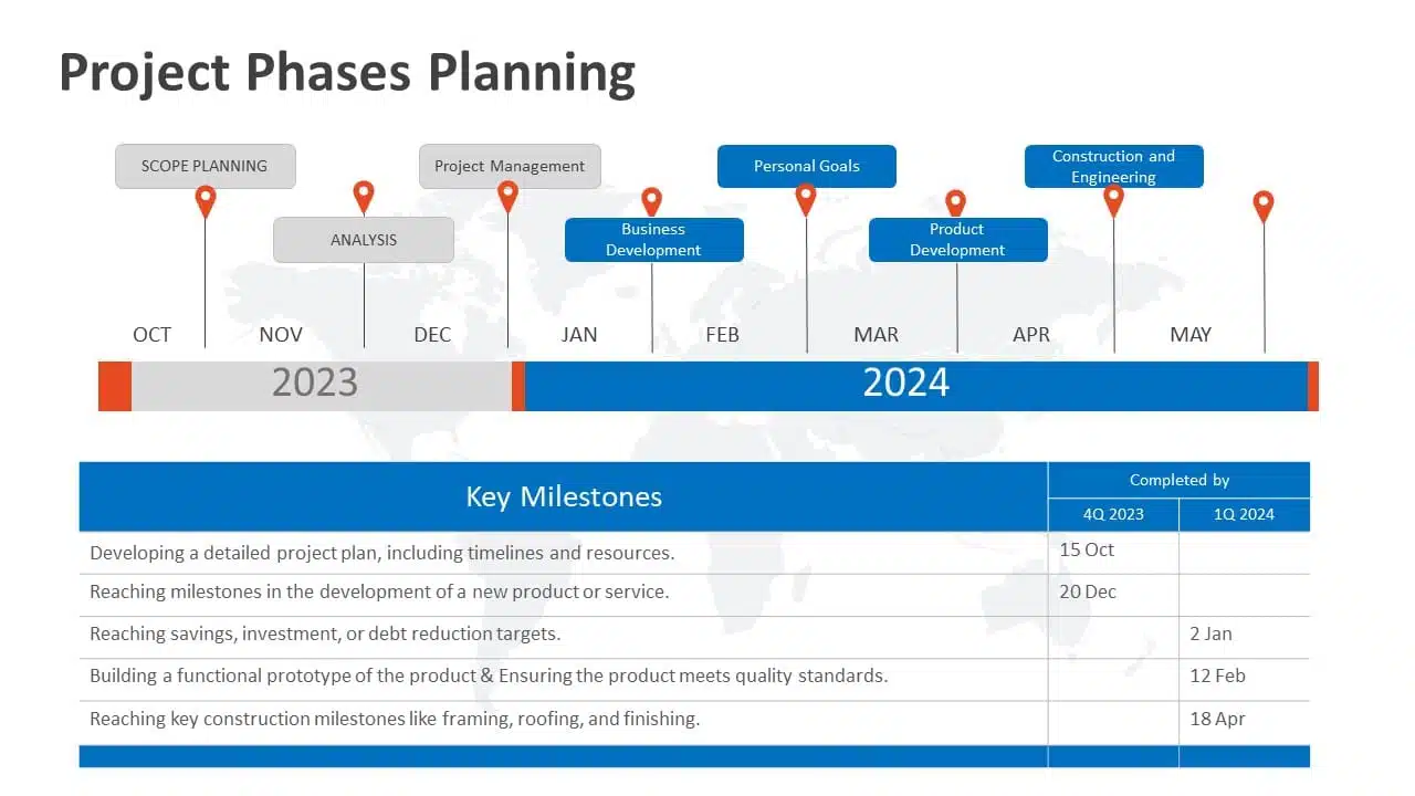
1. Less Text, More Impact
Imagine your presentation as a visual storybook. Less text on each slide means your audience can focus on your story, not squint at paragraphs. Use striking images or a single powerful phrase to grab attention. It makes your presentation look impressive and helps people remember the article’s key points. Keeping about 30 words per slide or 6-8 lines in your presentation will help maintain a proper flow of words and pictures, resulting in a fluid presentation.
Example
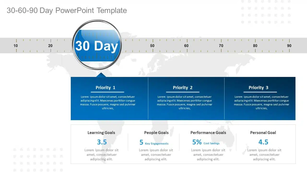
2. Choose A Color Scheme That Works
You don’t need to be an artist to pick the right colors. A good presentation uses colors that work together nicely. Choosing harmonizing colors can guide the audience to focus on important information. Choose colors that look good together and don’t hurt the eyes. Microsoft Office’s color schemes can save the day if you’re short on ideas. Avoid using light colors on a dark background and vice versa.
Example
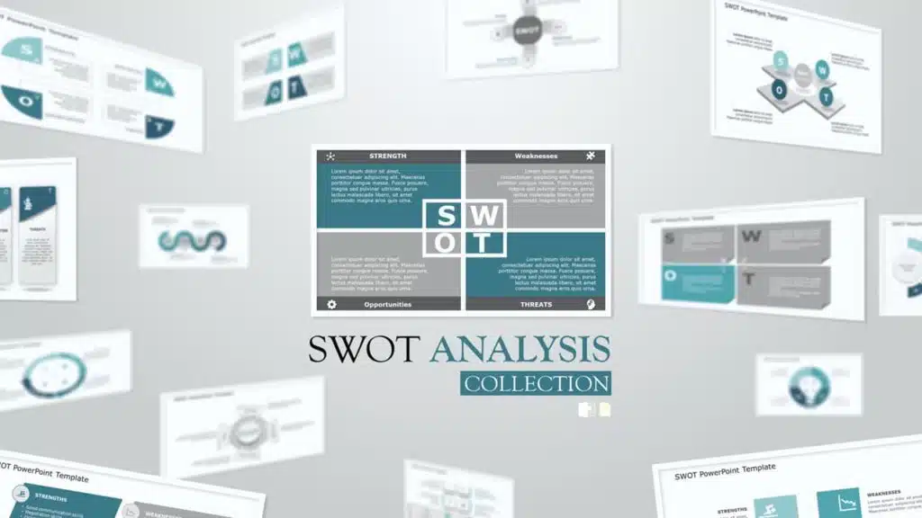
3. Proper Balance Of Animation And Texts
Animations and transitions can be like party crashers in your presentation if not used wisely. They might steal the show from your message. A top-notch presentation keeps both animations and texts in check, ensuring they don’t overpower each other. However, don’t ditch them altogether! Use transitions and animations only to highlight key points. For example, make bullet points appear individually instead of all at once. It keeps your audience focused.
READ MORE: How to add animation in PowerPoint?
Example

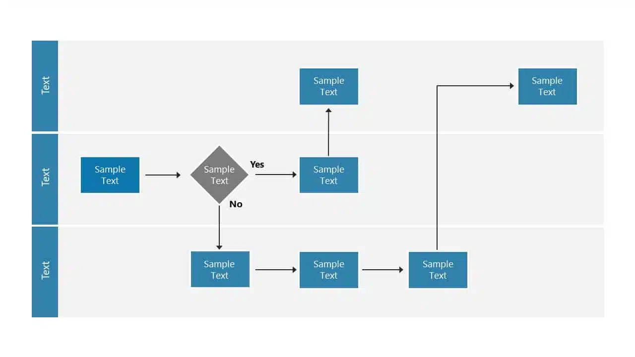
4. Logical Flow Of Information
Think of your presentation as a road trip. Imagine if your GPS gave you all mixed up directions. Chaos, right? Similarly, your slides need a logical order and a roadmap. Maintaining the logical flow of your slides helps the audience follow the information easily. A logical flow makes your message clear and easy to remember. It’s like telling a great story with a beginning, middle, and end.
EXPLORE: Flowchart PowerPoint Templates
Example
5. Context-Relevant Graphics Or Illustrations
A picture speaks volumes. Our brains love visuals. Using context-related graphs, photos, and illustrations that complement your slides can amp up important pointers and keep your audience engaged during the presentation. However, while presenting, make sure to explain why a graphic or a picture is there. Explaining the graphics verbally makes your message crystal clear and memorable.
Example
EXPLORE: Want to create stunning presentations? Check out our presentation services!
A PowerPoint presentation shall excel in these aspects of making it engaging, informative, and memorable. These good PowerPoint presentation examples could help you make a better PPT in one or more areas, not leaving the audience disengaged or confused.
While it’s important to look at good presentation examples, it’s equally important to avoid mistakes that can turn your presentation dull.
What Makes A Bad PowerPoint Presentation?
Ever been in a room with a presentation that made you want to escape through the nearest exit? We’ve all been there! In this section, we’ll highlight some common mistakes that turn a good presentation into a dull one. With many examples of good and bad PowerPoint slides on the internet, we have listed some bad examples that show the ‘DON’Ts’ and ‘AVOID AT ALL COSTS’ of PowerPoint mistakes:
- Image behind the text
- Using only bullet points and no paragraphs
- Having no symmetry in texts and pointers
- Being too minimal
- Keeping text too small
1. Image Behind The Text
Anyone who considered utilizing an image as a background most likely missed the memo. Text and images simply do not work together. One of the worst PowerPoint presentation examples is text overlaid on an image. Keeping the image in the background complicates understanding the text, and the main image should be clarified. Finding a text color that shines out in the background is nearly tough because all of those colors merely draw your attention away from the words. To avoid this calamity, avoid utilizing photos as slide backgrounds when you have text to highlight.
EXPLORE: Best PowerPoint Backgrounds Collection
Example

2. Using Only Bullet Points And No Paragraphs
To make a presentation audience-friendly, reducing paragraphs to bullet points is a wise choice. However, it is critical to emphasize that this is more than simply putting only bullet points and leaving out all paragraphs. Using 5-8 bullet points is ideal for a slide. If the text size shrinks to 12 or 10 points, you’ve written a lot. Lengthy bullet points tend to bore the audience; some might even think of them as paragraphs.
Example
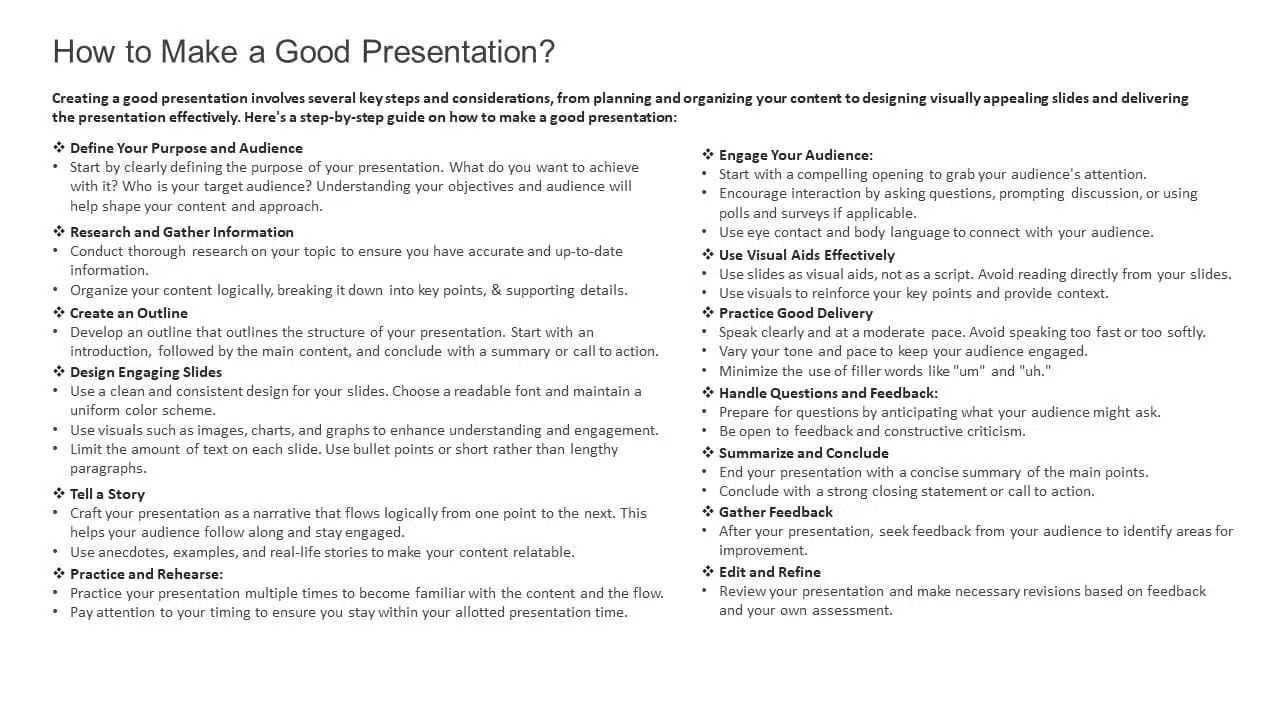
3. Having No Symmetry In Texts And Pointers
A lack of balance or alignment between textual material and supporting visual elements, such as arrows, bullets, etc., can make your presentations appear unpleasant. When text and pointers are strewn about, it’s difficult for the audience to follow a logical flow of information; a common bad PowerPoint slide example to avoid at any cost. Your audience will be obsessed with deciphering the relationship between the text and graphics if your presentation needs more harmony.
Example
4. Being Too Minimal
Being too minimalistic is as bad as overdoing it. Not having the required text on slides or keeping them blank makes them dull and non-engaging. You don’t need a color explosion or too many texts, but bringing some life to your slides is always a good idea. Using pre-made PowerPoint templates is a good idea to keep your content balanced; however, it is best not to leave blank spaces. A blank slide with no colors or text might give the impression of minimal effort. Strive for a balanced approach to keep your audience engaged and awake.
EXPLORE: 40,000+ PowerPoint Templates and Google Slides Themes
Example

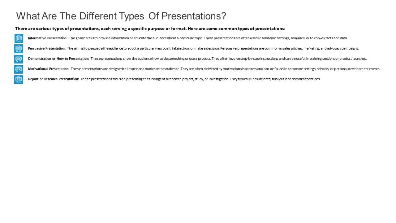
5. Keeping Text Too Small
Another thing to avoid is making your font size too tiny, almost like the size of a peanut. The size of the font is extremely important in any presentation. Think of it like trying to enjoy a beautiful scenic view through a tiny keyhole – not very enjoyable, is it? It’s the same with your PowerPoint. Your slides can be perfect with great colors, and graphics, but it’s a bummer if your audience can’t read them. A simple trick is to stand at the back of the room where you’ll present. If you can read the font comfortably, then you should be fine!
READ MORE: Best Presentation Fonts
Example
A bad PowerPoint presentation will dismiss all your efforts and disengage your audience. To look more, avoid these bad PowerPoint presentation examples at any cost while making your next presentation.
We have carefully curated a visual appearance of how your PowerPoint presentations change by following the aforementioned points.
Conclusion
A good PowerPoint presentation is a balance – not too much, not too little. It’s about enhancing your message, not taking the spotlight away from you. However, striking that balance requires a lot of practice and trial and error.
You can always opt for presentation design services, like SlideUpLift. It gives you the advantage and access to presentation specialists. We design visually appealing presentations, with modern design elements, graphics, and illustrations; maintaining a perfect balance of every element.
Whether you want to customize your slides completely or just tailor the color or font, we ensure that your brand or personal style always reflects in your presentation.
Explore from our collection of 40,000+ PowerPoint templates and Google Slides themes. Utilize our presentation design services to create stunning PPTs. Give us a try with our custom-slides service, or schedule a call with us to know more!
FAQs
-
What is the biggest difference between the best and worst PowerPoint presentations?
A good PowerPoint presentation effectively communicates its message, engages the audience, and uses visuals, layout, and content in a clear and compelling manner. In contrast, a bad PPT has cluttered slides, too much text, poor design choices, or distracting elements that hinder understanding.
-
How can I avoid making a bad PowerPoint presentation?
To avoid creating a bad PowerPoint presentation, focus on simplicity, use visuals wisely, keep text concise, maintain a logical flow, use appropriate fonts and colors, and avoid excessive animations or irrelevant content. Seek feedback from peers or experts to improve your overall presentation.
-
What role do visuals play in differentiating a good design v/s bad design PPT?
In a good presentation, visuals support and clarify key points. While in a bad one, they may be excessive, distracting, or irrelevant, overshadowing the main message.
-
How important is the audience's experience in determining the quality of a PowerPoint presentation?
The audience’s experience is essential in evaluating a presentation. A good PPT keeps the audience engaged and attentive compared to a bad PPT, which leads to disengagement and confusion.
-
How can I fix my bad PowerPoint presentation?
You can fix your PowerPoint presentation by opting SlideUpLift as your presentation buddy. With over 40,000+ PowerPoint Templates and Google Slides Themes to explore, you can choose what’s best for you. In case you have very specific presentation needs, you can opt for their presentation design services or custom slide service to create stunning PPTs. Schedule a call to know more.


