 Fall Sale
  Flat 40% off on our Unlimited Access Yearly Membership plan!

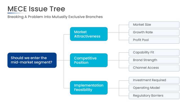
This MECE issue tree starts with a root problem statement on the left and splits it into 3 primary branches. Each branch extends into sub-issues,....


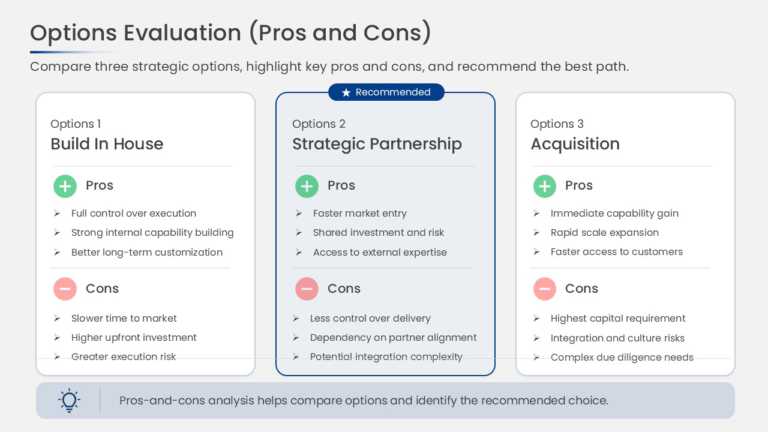
This comparison slide presents strategic options side by side, with separate pros and cons sections for each option. The parallel column structur....
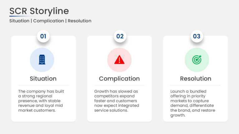
This SCR framework slide presents Situation, Complication, and Resolution as 3 cards arranged in sequence. Each card holds a heading and a short ....
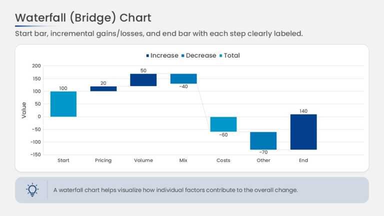
This waterfall chart bridges a starting value to an ending value through a series of floating bars. Increases and decreases are shown as separate....
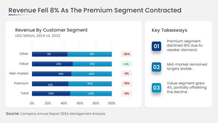
This slide combines a revenue chart broken down by business segment with a dedicated key takeaways panel. The chart area shows the revenue contri....
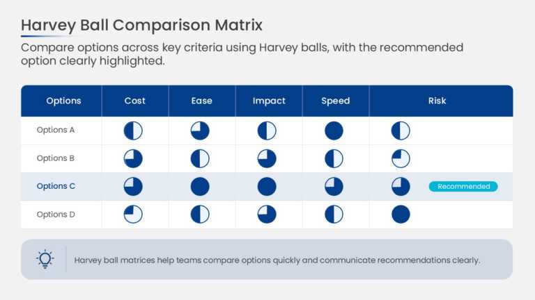
This decision scorecard arranges options in columns and evaluation criteria in rows, with a Harvey Ball in each cell. Circles filled in quarter i....
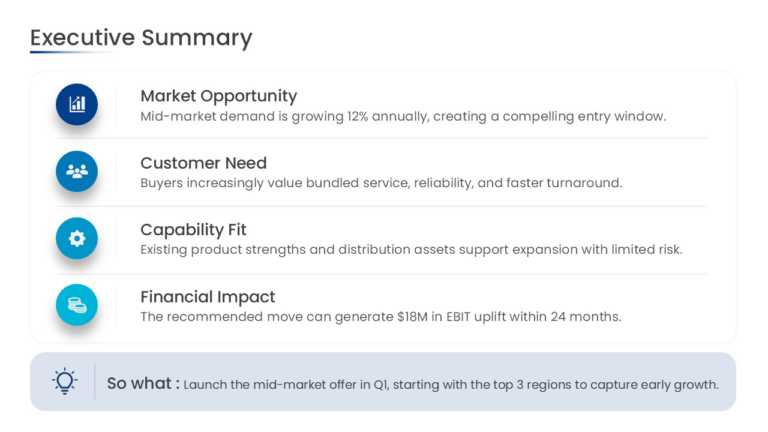
This consulting-style executive summary slide organizes findings into structured key takeaway blocks. Each block pairs a bold headline statement ....

This customer onboarding action plan organizes the onboarding journey into sequential stages. Each stage has space for key tasks, responsible own....
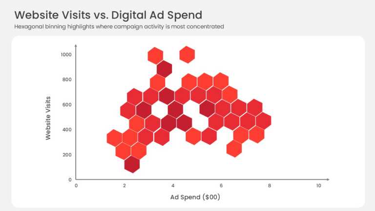
This hexbin scatter plot replaces individual data points with a grid of hexagonal bins plotted against X and Y axes. Color intensity indicates ho....
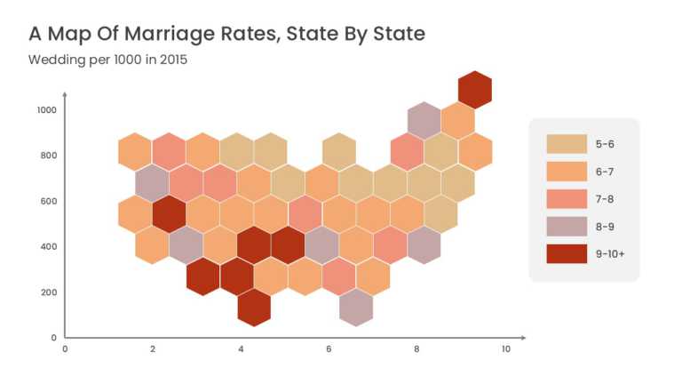
This US data map represents each state as a uniform hexagonal tile arranged in the approximate geographic layout of the country. Equal tile sizes....
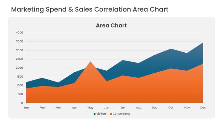
Overlapping area series compare marketing spend with sales revenue over consecutive periods. Translucent fills keep both series visible where the....
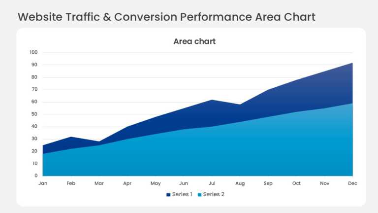
Layered bands in a monthly stacked area chart show website traffic by acquisition channel. The top edge tracks total visitors, and each colored b....
Related Presentations
-

PowerPoint Themes
246 templates>
-

Backgrounds
347 templates>
-

Executive Summary
256 templates>
-

Latest
4,906 templates>
-

Simple
120 templates>