Fall Sale
  Flat 40% off on our Unlimited Access Yearly Membership plan!

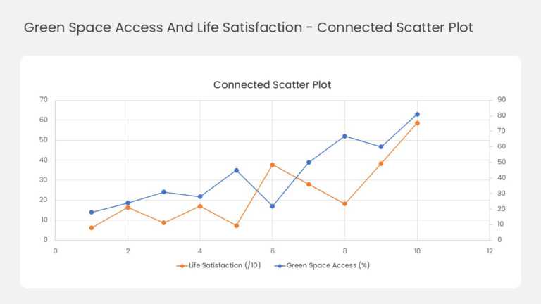
This two-series line chart tracks how two related measures move together across ten data points. Orange markers plot life satisfaction against th....


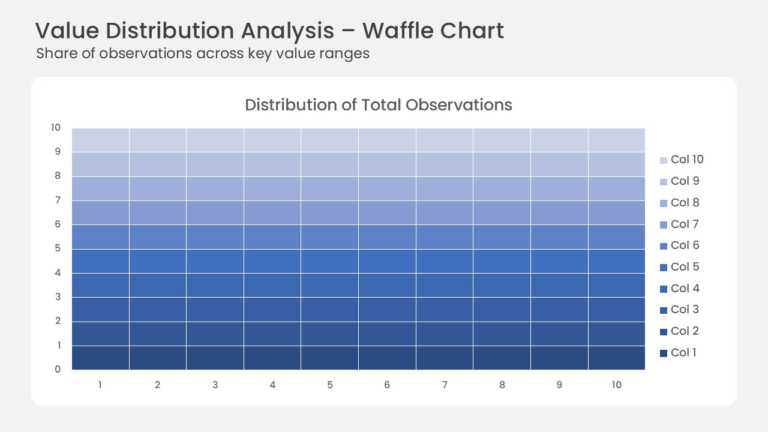
This waffle chart shows how a total splits across ten value ranges on a 10 × 10 grid. Each of the 100 cells stands for one percent of all observa....
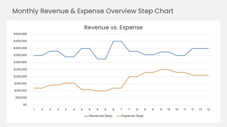
This step line chart compares monthly revenue and expenses across a full 12-month year. A blue revenue line and an orange expense line run across....
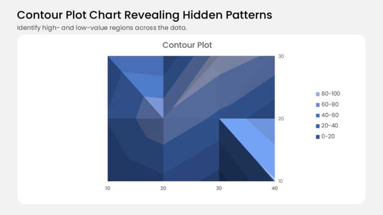
This contour plot turns a grid of values into shaded bands, like a topographic map for your data. It plots 12 data points on a 4 × 3 grid, with 1....
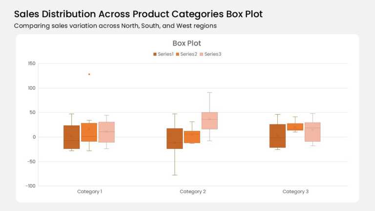
Three category groups anchor this box plot, and each group holds three color-coded boxes. A burnt orange, mid orange, and pale peach series run l....
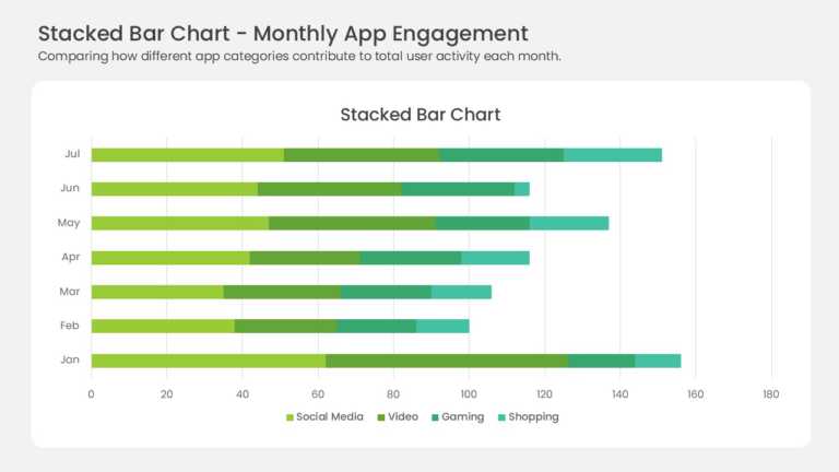
Seven horizontal bars stack four data series across the months January through July. Yellow-green, medium green, teal, and mint segments mark Soc....
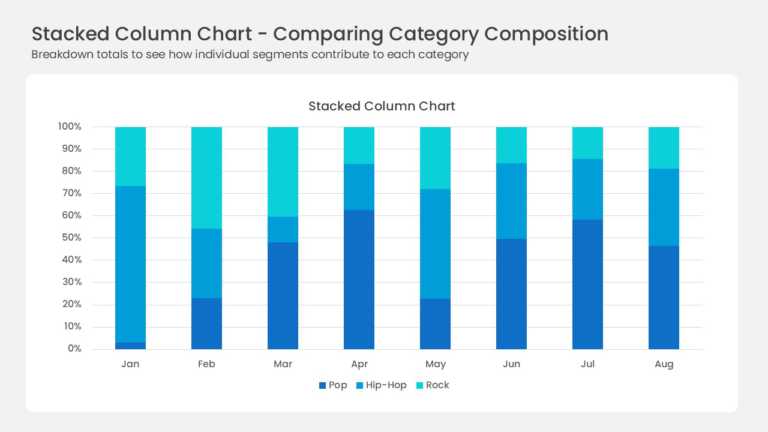
Eight full-height columns run from January to August, each one normalized to 100 percent. Three blue series divide every column: deep navy Pop, b....
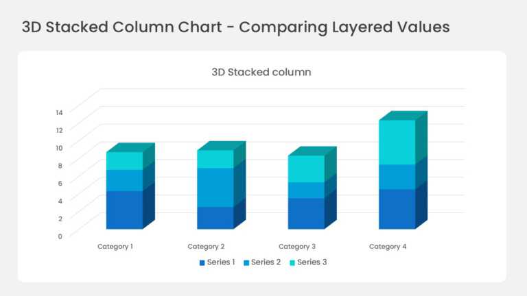
Four three-dimensional columns sit on a perspective floor with gridlines running back into the wall. Each column stacks three series in deep blue....
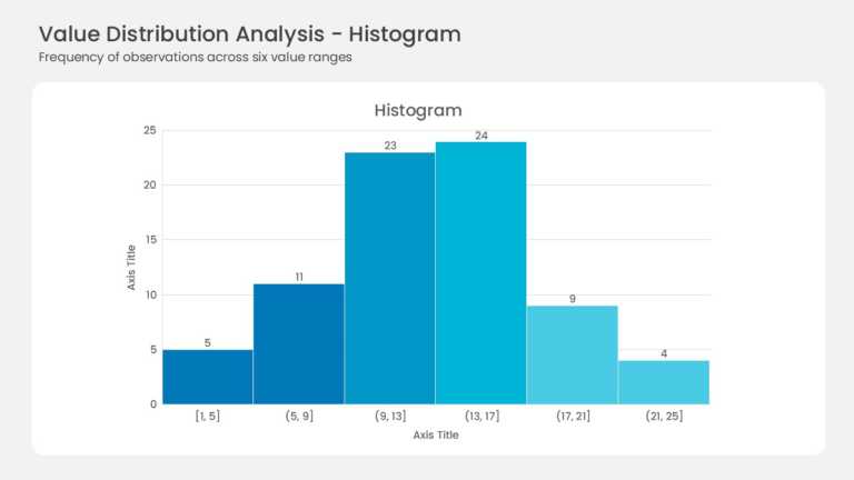
Six adjacent bars form the histogram with no gaps between them. Bin ranges run from [1, 5] up to (21, 25] along the horizontal axis. Frequencies ....
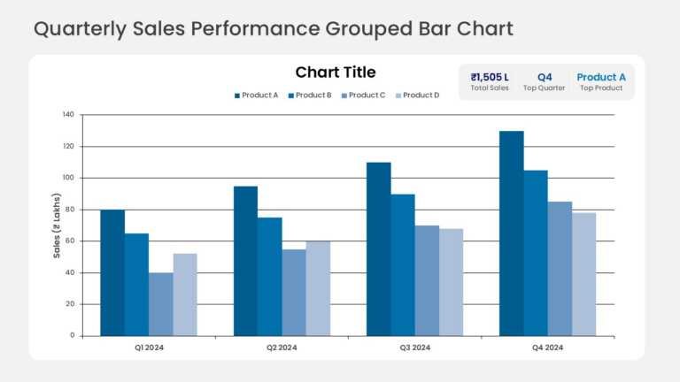
Grouped columns compare quarterly sales across several product lines, with one column per product in each quarter. KPI callout cards above the ch....
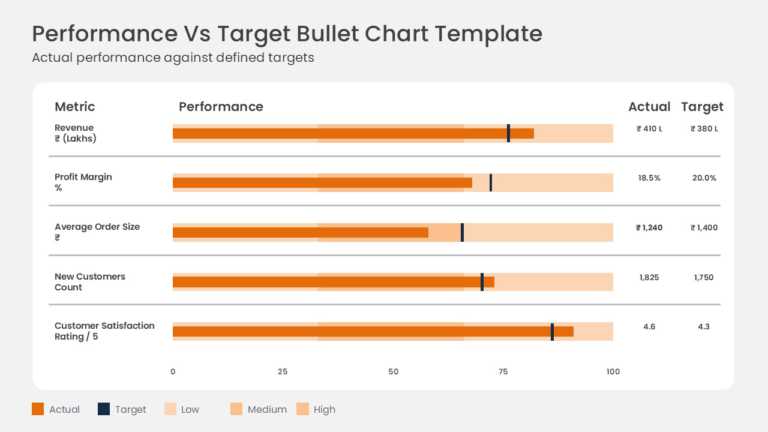
Actual results are measured against targets on horizontal bullet charts for metrics such as gross sales and operating margin. Each row combines a....
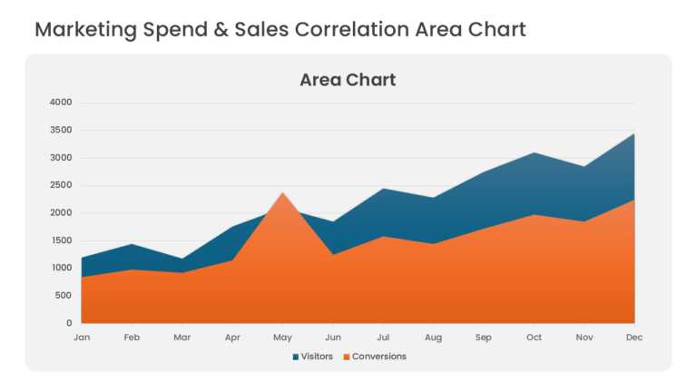
Overlapping area series compare marketing spend with sales revenue over consecutive periods. Translucent fills keep both series visible where the....
Related Presentations
-

Morphing
7 templates>
-
Silhouette
78 templates>
-
Images
163 templates>
-
Poster
53 templates>