The Chevron PowerPoint Template for a 30 60 90 Day Plan is crafted to help professionals. It helps to organize their goals and targets across a s....
Presenting a method to outline the first three months for new members of your sales team using the Sales Onboarding 30 60 90 Day Plan PowerPoint ....
In business, understanding your position and planning for the future are keys to your success. A time-tested tool that can help the business do t....
This template is a tool for outlining your strategic plan for new ventures, orientation, or projects. This template elegantly divides the plannin....
The 30 60 90 day plan for New Manager 3 PowerPoint Template is created to assist managers in organizing and presenting their objectives and activ....
For new managers transitioning into a role, the 30 60 90 Day Plan for New Manager 4 PowerPoint Template provides a structured method to organize ....
The Comprehensive 30 60 90 Day Plan PowerPoint Template is a structured and easy-to-follow PowerPoint layout. It is created to assist professiona....
Boost your event planning to new heights with our Event Agenda Template PowerPoint Presentation. A well-organized template structured to help you....
The 30 60 90 day plan for New Manager PowerPoint Template is crafted to assist managers in establishing clear objectives and mapping out their in....
The Timeline Monthly Milestone Template showcases monthly milestones in a timeline format. It helps you keep track of important dates and events ....
This Project Planning PowerPoint Template is a comprehensive slide that can help you plan your project’s quality plan. The template include....
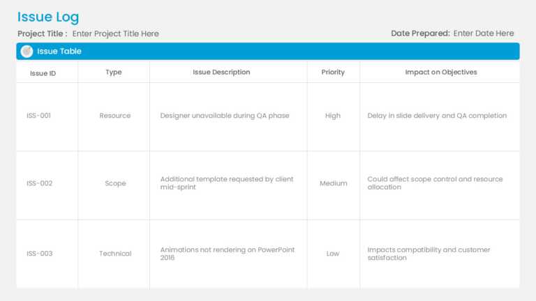
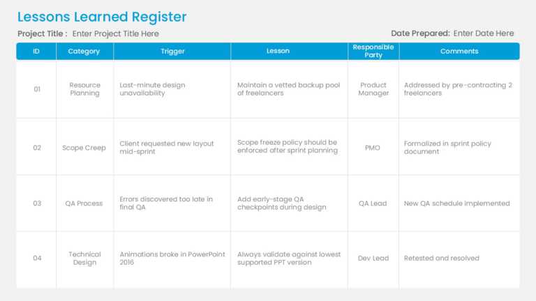
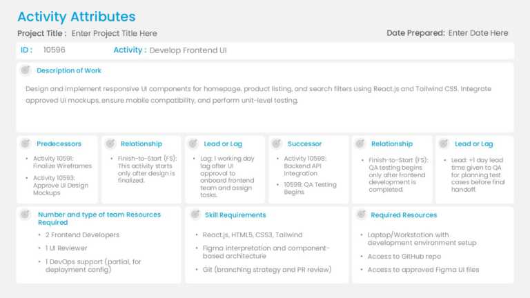
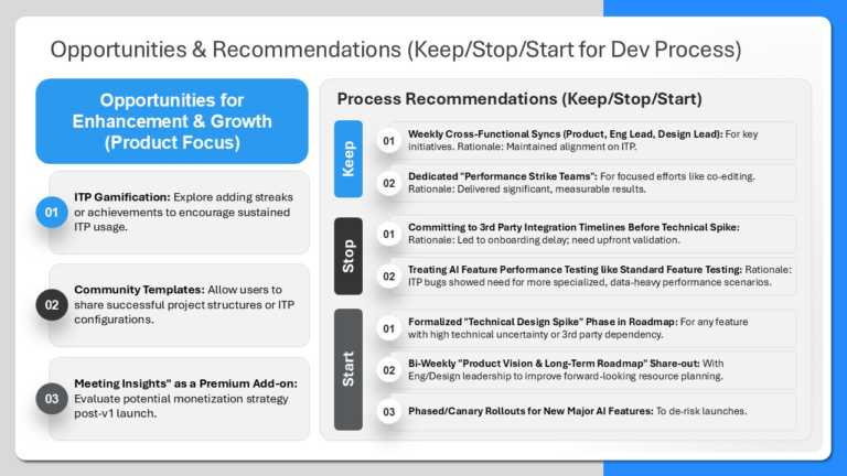
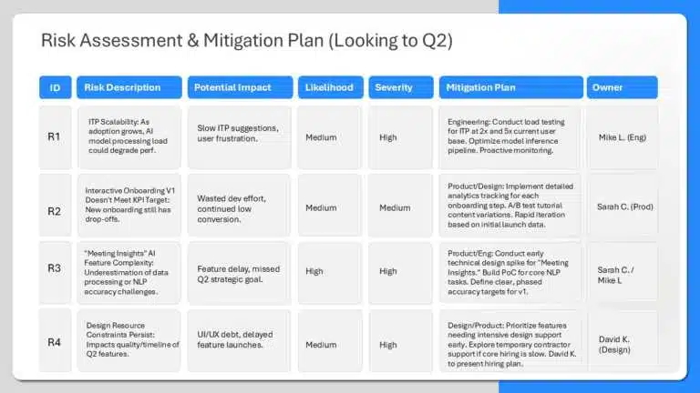
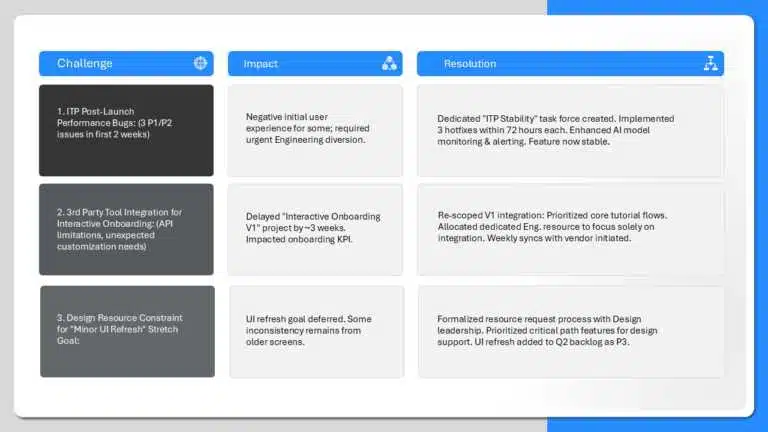
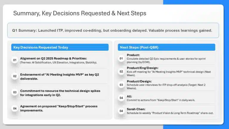
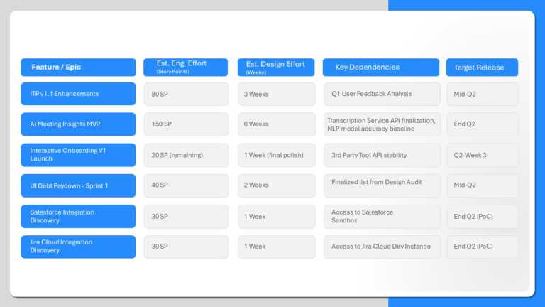
A PowerPoint table design template in a presentation is a table format to organize and display data in rows and columns. It helps to show complex data in a structured and easy-to-understand format. This systematic presentation of information makes it easier for the audience to compare data, list items, show relationships between different sets, and grasp key points.
Table presentation helps to break up the key messages into different parts and provide enough details, making it organized and easier for the audience to understand the key takeaways. Tables are useful when displaying different data types in the same space, especially when you want the audience to read the actual numbers. They help you save time, maintain consistency, improve readability, and provide flexibility in design for your various presentation needs. Using PowerPoint table templates lets you focus on the content and key points rather than the formatting and design, making your presentations more impactful.
Table PowerPoint designs are important in simplifying complex data and communicating information effectively.
1. Clarity and Organization: Table presentation is useful for organizing large amounts of data into a systematic format, which makes it professional and easier to understand.
2. Quick Comparison: They help in side-by-side comparison of different data sets, highlighting the differences, similarities, and trends, and eases data analysis.  Â
3. Simplicity: The presentation table summarizes the information, which reduces clutter and helps the audience easily understand large amounts of data.
4. Visual Impact: Well-designed, attractive table PPTs have creative and interactive elements that make presentations visually appealing and increase audience engagement.
5. Data Accuracy: Tables provide raw data as it is with accuracy without generalizing or oversimplifying it.
6. Professionalism: Table PPT reflects attention to detail and professionalism while dealing with numbers or comparisons in business, finance, marketing, and other data-driven presentations.
There are several types of creative tables in PowerPoint for specific purposes, depending on the information you want to present. Selecting the right type helps to convey clear data and engage the audience. Here are some common types:
1. Simple Table Design: This table PPT design shows basic information in grids of rows and columns for listing or categorizing data like contact details, product names, or other simple data.
2. Comparison Table Design: The comparison table PowerPoint helps to compare two or more units on specific attributes in side-by-side columns such as products, services, features, or prices.
3. Matrix Table Design: This design is useful for presenting multiple variables in a grid format to show relationships between different factors and analyzing cross-functional data like risk matrices, performance evaluation, etc.
4. Hierarchical Table Design: This PPT table design organizes data in a hierarchical form that shows levels of importance or relationships. They are great for showing organizational structures, project plans, etc.
5. Financial Table Design: This table design PowerPoint summarizes the financial data like revenues, expenses, profits, and losses. These are useful in quarterly reviews, budget reports, or financial forecast presentations.
6. Color-Coded Table Design: This design highlights key data points with different colors to emphasize or categorize data. These are best for KPIs, sales data, etc, where highlighting or differentiating is essential.
7. Interactive Table Design: These presentation tables are used in digital or interactive presentations to filter, sort, or link data to other slides.
8. Trend Analysis Table Design: These PPT table designs display data over time to showcase trends and changes. It is useful for showing progress, growth, or decline over months, quarters, or years.
9. Checklist Table Design: These PowerPoint table designs offer a list for items with checkboxes to mark when completed. They are best for project management presentations or tasks with multiple deliverables.
1. Professional Designs: Choose PowerPoint table design templates from a wide range of collections designed by professionals to give your presentation a polished look and make it stand out. We offer different styles like animated, interactive, 3D, color-coded, matrix, hierarchical, and other modern table PowerPoint templates.
2. Fully Adaptable Templates: Explore our 100% customizable presentation table templates that let you adjust colors, fonts, layouts, borders, and other elements to fit your presentation needs and brand guidelines.  Â
3. Seek Our Expertise for a Customized Table Presentation: Rely on our design experts to make a customized presentation table and you relax. Just drop your file on our page and add your requirements in the comment section, and we will give you a custom-made PowerPoint table design according to your needs in just 24 hours.
Creating a presentation table in Google Slides is an easy and simple process. Follow these steps to make an attractive table PPT:
1. Go to Google Slides and create a new or open a presentation.
2. Go to Insert. From the dropdown, select Table and then choose the number of rows and columns you need.
3. Click on the table and drag its corners to adjust size according to your content and design preferences.
4. Add content to the cells, then format and resize it per your needs.
5. Format the table, insert or delete rows, merge cells, and change alignments, borders, and background color according to your needs.
6. Add the finishing touch, and you are good to go.
There is no specific rule for this, but you can limit the number of rows and columns to avoid cluttering. It is best to keep a maximum of 5-7 rows and 3-5 columns for clarity. If there is more data, then use multiple table PPT slides.
1. Open your PowerPoint presentation.
2. Select the table. Table tools will appear with two new tabs, Table Design and Layout.
3. Go to the Table Design tab, then select Borders.
4. Click on the Pen Color dropdown menu and choose the new color for your border.
5. Click on the Borders button (next to Pen Color) and choose which borders you want to apply the color to all borders, outside borders, inside borders, or on individual sides.
6. After applying the border color, preview your slide so the table looks how you want it to.
The font size should be between 18 to 24 points for good readability from a distance. However, the font size can also depend on the amount of data and the design of your presentation.