Product Description:
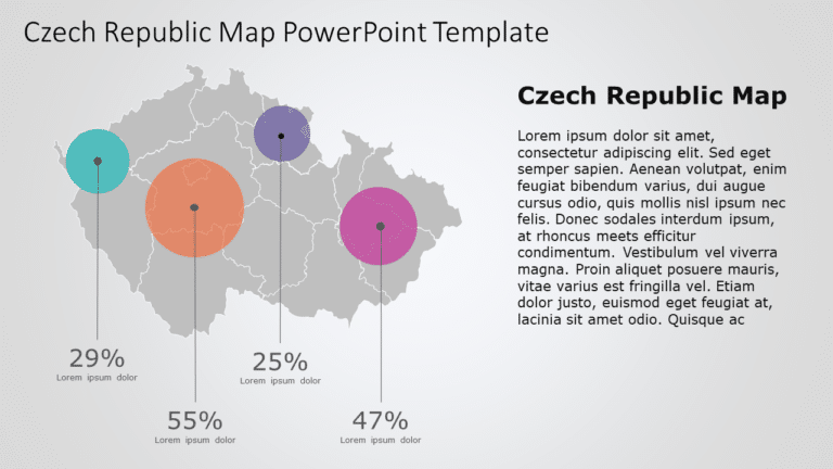
Check out this infographic of Hong Kong that makes your data come alive and captivates your audience with stats, about the citys various regions in a visually engaging way using color coded data circles to emphasize important information, for a more engaging and informative presentation.
The design of the layout is sleek and contemporary while emphasizing clarity and aesthetic appeal.The strategic placement of each data circle, on the map enables a dissemination of information.This template is well suited for individuals in the business sector or education field who wish to showcase data.It serves as a tool, for market research analysis,strategic development planning and educational presentations.
Enhance your presentations with an easy, to use design that lets you tailor the content to suit your preferences effortlessly Ð download to turn your ideas into compelling visual narratives! Find more such Map PowerPoint templates for engaging presentations. These templates are compatible with both PowerPoint and Google Slides.


