Product Description:
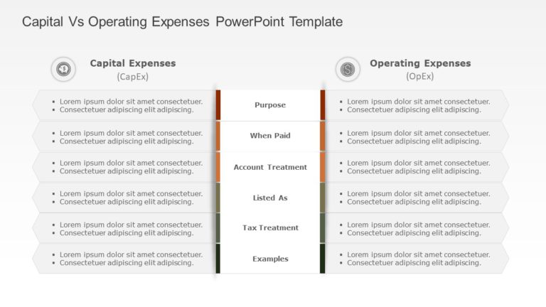
Enhance your storytelling, with this informative chart template that effectively shows the difference between projected and real costs. Tailored for finance experts and project leaders this template simplifies data, into engaging charts facilitating the communication of financial progress over time.
With a design that blends colors, like blue and orange to emphasize cost differences between different periods effectively and with clear labeling and a structured layout that allows viewers to easily understand important details at a glance; this presentation template is perfect, for evaluating budgets or giving financial reports during strategic planning meetings.
When you’re sharing information, with parties or reviewing project costs this tool is perfect for providing insights easily accessible, to you anytime you need them.Download it now. Start improving your presentations today! Find more such Finance PowerPoint templates for engaging presentations. These templates are compatible with both PowerPoint and Google Slides.


