 Fall Sale
  Flat 40% off on our Unlimited Access Yearly Membership plan!

Comparison Chart & Slide Templates for PowerPoint and Google Slides
Free Comparison PowerPoint Templates


Here is a user friendly visual aid that simplifies concepts, by showcasing trends using dynamic up and down arrows for illustrating growth and de....


The Comparison Pyramid Diagram is used to create professionally visually appealing presentations. It consists of minimalistic designs and ready-t....

The Free Marketing Analysis PowerPoint Template is a template created to study the process of market research and data analysis. This template pr....
Editable Comparison PPT Templates

Lift your storytelling by swapping in a graphic that juxtaposes client expectations with the reality on the ground. This plug‑and‑play template e....
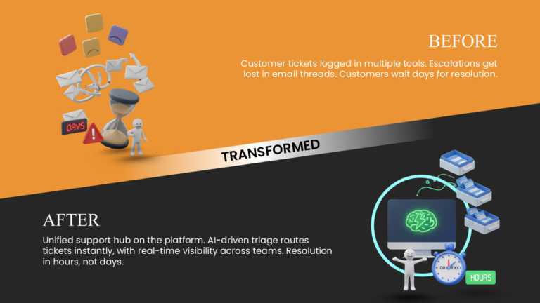
Complex ideas get a lease on life thanks to this spirited before‑and‑after comparison template. When it comes to showcasing how customer‑service ....

Transform your data into insights with this eye‑catching comparison template. Set against a backdrop, the design throws the contrast between a ta....

Tailored for team briefings, this template delivers a clear, engaging snapshot of how yesterday’s workflow measures up against today’s. Its bold ....
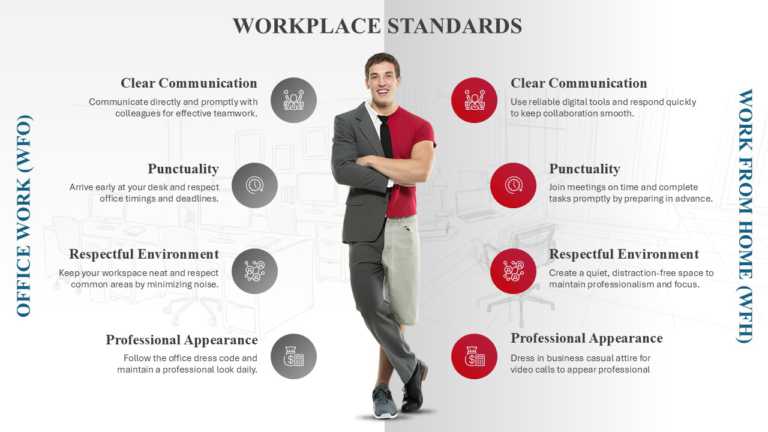
Crafted to be clear and striking, this comparison template boosts your presentations by separating office‑based and remote‑work standards. Its cl....

This template is useful for professionals, project managers, team leaders, educators, consultants, and business analysts. It is ideal for perform....

The “From To” presentation template is designed to effectively present progress, transitions, comparisons, or future objectives in a ....
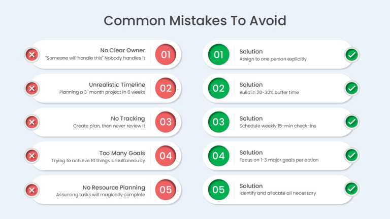
The Mistakes And Solutions 5 Row Comparison PowerPoint And Google Slides Template helps users identify common planning mistakes and present pract....
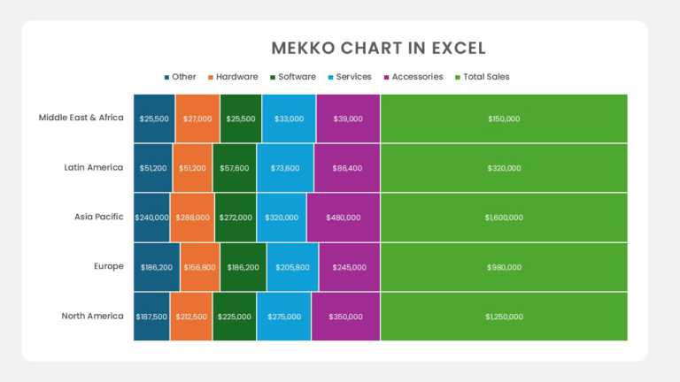
The Regional Product Sales Mekko Chart PowerPoint And Google Slides Template helps users compare product sales across multiple regions and unders....
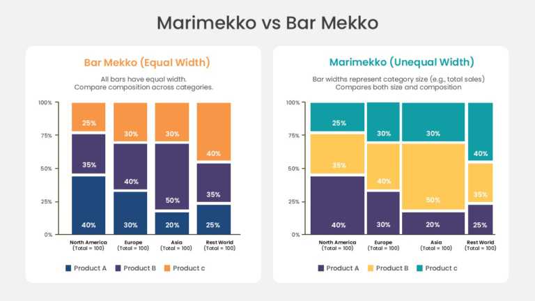
The Marimekko and Bar Mekko Chart PowerPoint And Google Slides Template helps users compare two stacked chart formats side by side across four ca....
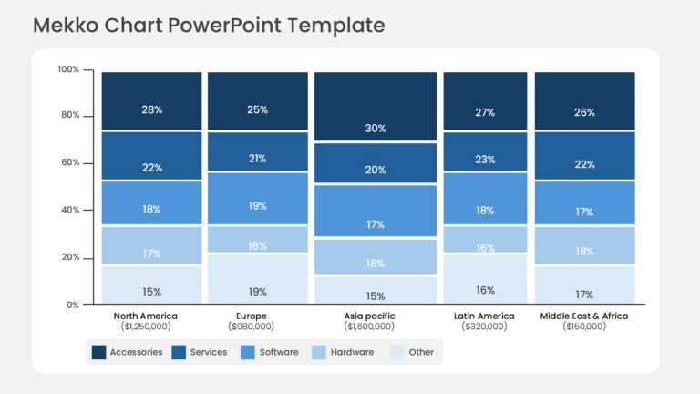
The Mekko Chart PowerPoint Template helps users present sales or revenue breakdowns across five regions and multiple product categories in a sing....
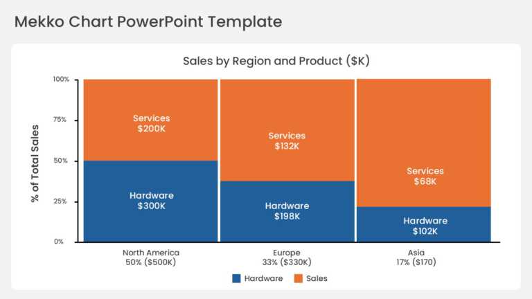
The Mekko Chart PowerPoint Template helps users present sales or revenue breakdowns across multiple regions and product categories in a single pr....
Related Presentations
-

Pros And Cons
65 templates>
-
Challenges & Solution
161 templates>
-
Before After
32 templates>
-
Advantages-Disadvantages
42 templates>
-
From To
37 templates>





Browse comparison templates by type
Side-by-side comparison slides
The classic two-column layout — Option A against Option B with matched rows. The fastest format when you’re comparing exactly two things.


Comparison tables
Structured rows and columns for feature-by-feature detail — pricing plans, product specs, vendor evaluations. The right choice when completeness matters more than speed.


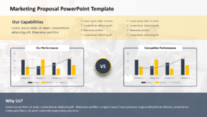
Comparison charts
Bar, column, and matrix charts that compare performance visually — before/after numbers, competitor benchmarks, actual vs forecast.


Comparison infographics
Icon-driven layouts for three or more options — visual enough for audience-facing decks where a data table would lose the room.



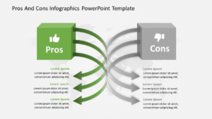
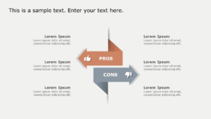
Pros & cons and versus slides
Two-sided layouts built for a verdict: pros against cons, this versus that, do’s against don’ts. See also our full guide to pros and cons slides.

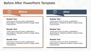
Before & after slides
Current state against future state — transformations, process improvements, and roadmap comparisons. For timeline-based versions, browse our roadmap comparison slide templates.


How to make a comparison slide in PowerPoint
- Pick the format for your data: side-by-side for two options, a table for detailed features, a chart for numbers, an infographic for three or more options in an audience-facing deck.
- Label each side with a clear heading (for example, “Plan A vs Plan B”) so the comparison is legible before anyone reads a detail.
- Keep rows parallel — every criterion appears for both options, in the same order, at the same level of detail.
- Highlight the verdict, not everything: bold or color only the cells where the difference matters.
- Balance the design — equal column widths, consistent icons, and matching fonts so neither side looks pre-favored.
Or skip the build entirely: every template above has these principles designed in — download, replace the placeholder text, and present.
Which comparison format should you use?
- Two options, quick decision → side-by-side slide.
- Many features or specs → comparison table.
- Numeric performance → comparison chart.
- Three or more options for a non-technical audience → comparison infographic.
- Arguing for or against one choice → pros & cons slide.
- Showing change over time → before & after or roadmap comparison.
What are comparison PowerPoint templates?
Ready-made slide layouts that present two or more items side by side — products, strategies, plans, or results — using columns, tables, charts, or infographics. Everything is editable: text, colors, icons, and the number of items compared.
Can I compare more than two items?
Yes. The infographic and table layouts in this collection scale to three, four, or more options — add columns or duplicate elements, and the design stays balanced.
Are These Templates Suitable For Pitch Decks And Executive Summaries?
Absolutely! These comparison slides are perfect for pitch decks and executive summaries. They help highlight key differences, showcase value propositions, and support decision-making, making your message clear, concise, and visually compelling for stakeholders and executives.
Are these templates customizable for different industries?
Yes — the layouts are industry-neutral. Marketing teams use them for competitor analysis, finance for actual-vs-forecast, product for feature matrices, and educators for concept comparisons; swap colors and icons to match your brand.
What's the difference between a comparison chart and a comparison table?
A table organizes details in labeled rows and columns — best for feature-by-feature completeness. A chart turns numbers into visuals like bars or matrices — best when the size of a difference matters more than the detail behind it.
Do you offer free and premium comparison templates?
Both. The free section above lists no-cost, fully editable comparison slides. Premium designs — animated comparisons, positioning tables, multi-criteria matrices — are included with a paid plan.
What makes a good comparison slide?
Parallel structure (every criterion shown for every option), short text, one highlighted verdict, and visual balance so neither side looks pre-favored. The five-step guide above covers each.