Flat 4


 Edit with AI
 Ask Us To Edit

Product Description:
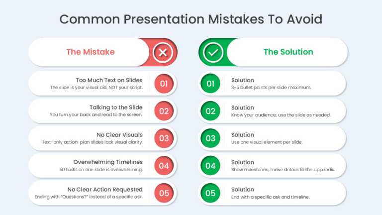
Three cards set common presentation design mistakes against their fixes. The cards address text-heavy slides, reading directly from the screen, and weak visual hierarchy, pairing each problem with a practical design rule.
Corporate trainers can run the slide in a presentation skills workshop to agree on shared design standards before a team builds its next client or leadership deck.
Browse our comparison PowerPoint templates for other side-by-side layouts, or review 15 bad PowerPoint slide examples to avoid for more before-and-after lessons. Card text and colors can be changed in PowerPoint or Google Slides.