Create a story using this user template tailored for the Start Stop Continue approach! Ideal, for team talks and project assessments this captiva....
Enhance your narrative with this structure crafted for conversations and planning sessions, among teams who want to evaluate their operations acr....
Enhance your narrative skills using this captivating diagram featuring a traffic light motif that streamlines the decision making process for you....
This template is crafted to improve the clarity and effectiveness of your project management presentations by offering a method, for defining acc....
Create a story using this time management planning template! Tailored to assist you in organizing your tasks and boosting efficiency This pleasin....
Stand out with this eye catching dashboard created for analyzing test cases. It’s a game changer, for project managers and QA teams alike, ....
This template is great, for breaking down concepts in a to understand way with its visually appealing design that helps track progress and perfor....
Creating a Harvey balls product comparison in a PowerPoint presentation may sound complicated and time-consuming, but you don’t have to start fro....
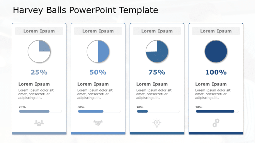
Harvey ball is a circular shape diagram mostly used for comparison in PowerPoint presentations. Harvey Balls provides richer information to the a....
This template is great, for team meetings as it simplifies information into to understand visual representations using a stylish blue circular la....
Turn your information into to understand insights using this captivating percentage analysis format template! It comes with an contemporary desig....
Enhance your project management with this template, for assigning tasks to your team members and effortlessly The intuitive layout lets you clear....


