

Org Chart in PowerPoint: Simplify Complex Team Structures with Smart Visuals
Without a clear org chart, even small teams feel messy. People start asking: “Who’s responsible for what?”
Whether you are a manager, HR professional, or team lead, explaining the team structure over and over again can be frustrating. When teams grow or change even in the slightest, things can quickly get confusing without a clear structure in place. This is where an organizational or an org chart in powerpoint comes in. They give a simple, clear view of ‘who’s who in your team or company. They are super helpful for:
- New joiner onboarding
- Team alignment
- Planning resources
- Pitching to clients and investors
In this blog, you will learn about how to create an org chart in PowerOint, step-by-step.
Let’s get started!
What is an Organizational Chart in PowerPoint?
Let’s first consider creating an organizational chart from scratch in PowerPoint.You can do this by using SmartArt diagrams or Shapes in PowerPoint.
An organizational chart (or org chart) in PowerPoint is a visual way of illustrating the chain of command and how people are connected in a team or company. It is like a family tree for your workplace. It shows:
- Who reports to whom?
- Team roles and responsibilities.
- The structure of departments or projects.
This way, you are using slides to map out your team in a way that is clean, clear, and easy to understand. These charts usually have boxes or new shape styles for each team member, with lines connecting them to show reporting relationships. For example, the CEO sits at the top of the chart; underarm them might be the department heads, and below that, you have team leads and individual team members.
Why Use Org Charts in Microsoft PowerPoint?
Adding org charts in PowerPoint can instantly boost how your audience understands your team or project. Here’s what makes them so effective in a presentation:
- Quickly Show Team Structure: They give a clear picture of who is on the team and how everyone is connected, without requiring any long explanations.
- Make Roles and Reporting Lines Clear: They help your audience to see who reports to whom, who handles what, and understand the hierarchy better.
- Looks Professional and Organized: A well-designed org chart adds structure to your presentation and shows that your team is well-organized.
- Help New People Understand the Team: Whether it’s new hires, clients, or leadership, org charts help everyone understand the setup faster.
- Support Better Planning and Decisions: When people can see the team layout, it becomes easier to plan, spot gaps, or improve how things are managed.
- Simplify Complex Team Setups: If your team is big or spread across locations, an org chart breaks it down into something simple and easy to follow.
Now that we have learned how the org charts contribute to making your presentation more impactful and give it a professional look, let’s learn how to build an org chart in PowerPoint with multiple useful ways.
How to Create Org Chart in PowerPoint?
An organogram is a visual diagram that shows the structure of an organization, which displays the hierarchy in a systematic way. In simple terms, this family tree for a company shows different roles connected and shows an individual’s responsibilities.
Before creating an org chart in PowerPoint, you need to decide what type of flow you want for your organizational chart. First, define your structure clearly. This ensures that your chart displays the correct reporting relationships from the outset.
- Decide what type of org chart will best represent the hierarchy of your project or business. (flat team or divisional structures, multi-level hierarchy).
- Do you want to include departments, roles, or both?
- And how many levels of leadership do you want to show in your chart? (CEO- Department heads- Team Leads and Executives)
Not all structures are the same. Learn about the different types of organizational charts to choose the right one for your team.
Once you have selected that, creating an org chart in PowerPoint is easier than you might think, and there is more than one definite way to do it. PowerPoint has options to help you build a clear, professional-looking team structure. An org chart can be created in PowerPoint through:
- Using Shapes
- Using SmartArt Diagrams
- Using ready-made templates like SlideUpLift’s.
These methods are easy to follow and can help you create polished org charts, which will give your presentation that edge.
1. Using Shapes:
This is a manual method that gives you full control if you want to design an org chart in PowerPoint from scratch.

Step 1: Add Shapes to the Slide.
Go to the Insert tab → click on Shapes → choose a shape like a rectangle, circle, or oval. Click on the slide to add it.
Step 2: Arrange Shapes into a Hierarchy.
Drag the shapes into position to show reporting lines.
You can copy and paste or right-click → Duplicate to quickly add more.
Align them horizontally or vertically using the Home tab → Arrange tools.
Step 3: Connect the Shapes.
Go back to the Insert tab → click on Shapes → choose a Line or Arrow to draw connections between team members and show reporting relationships.
Step 4: Add Colors or Images.
Select a shape → go to the Shape Format tab → use Shape Fill to add color (helpful for showing different levels or departments).
To insert an image, go to the Insert tab → Pictures and place it inside or near the shape.
Step 5: Format for a Polished Look.
Use the Shape Format tab to customize fonts, borders, shadows, alignment, and layout. This helps keep your org chart clean and professional.
2. Using SmartArt Diagrams:
SmartArt is a fast and easy way to build an org chart in PowerPoint with built-in tools.

Step 1: Insert a SmartArt Org Chart.
Go to the Insert tab → click on SmartArt → select Hierarchy.
You’ll see different chart styles like standard org charts, ones with pictures, horizontal layouts, half-circle styles, and more. Choose the one that best fits your presentation.
Step 2: Add Text to the Chart.
Click on each box to enter names, job titles, or departments. You can also add or remove boxes to match your team structure. You can also use the Text Pane to type names and titles for better alignment and easier editing.
Step 3: Adjust the Hierarchy.
Use the SmartArt Design tab to promote or demote roles, move boxes up or down, or reorder them to reflect the correct reporting lines. Use Connector lines instead of plain arrows, so they adjust automatically if you move shapes. To fine-tune positions, hold down Ctrl while pressing the arrow keys on your keyboard for precise adjustments.
Step 4: Use Colors and Images.
Highlight roles by using color codes or adding photos to make your chart easier to understand and more visually appealing.
Step 5: Format the Org Chart.
Use the SmartArt Design and Format tabs to customize the look, change colors, styles, fonts, and layout to match your branding.
Note: If your org chart gets too large, consider splitting it across multiple slides or grouping it by department to keep things clear
Later, save your org chart as a template. Go to File> Save As, and choose PowerPoint Template (.potx). This way, you can reuse it in the future and help your team to stay consistent and save time.
3. Using SlideUpLift’s templates:
For those who want to skip manual effort and quickly create an org chart in PowerPoint, these pre-designed org chart templates are ideal for you.
Step 1: Visit SlideUpLift and search for “org chart” or “organizational chart” to find the perfect template.
Step 2: Choose a template, download it, and open it in PowerPoint. You can also open it in Google Slides if you wish to create an org chart in Google Slides.
Step 3: Replace the placeholder text with your team information.
Step 4: Customize colors, images, and logos for a branded look.
Step 5: Save your presentation.
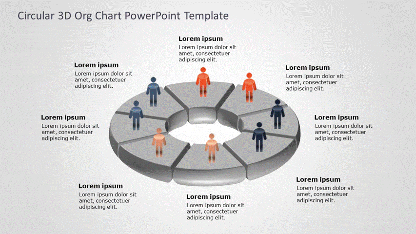
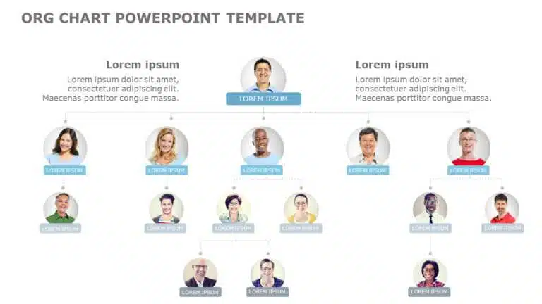
Looking for ready-to-use visuals? Explore our complete collection of org chart templates to find professionally designed layouts for every business need.
Trendy Org Chart Design Tips for 2025
| Trend | What It Means (Simple Explanation) | Why It’s Trendy in 2025 |
| Minimalist Look | Clean design with fewer lines and boxes | Keeps charts clutter-free and easier to understand |
| Color-Coded Roles | Use different colors for teams or departments | Makes it easy to scan and spot team structures fast |
| Photo Avatars | Add employee photos next to names | Personalizes the chart and builds a connection |
| Interactive Charts | Clickable org charts in digital formats (PDF/Slide/Website) | Helpful for virtual teams and remote onboarding |
| Hierarchy + Function Labels | Show both job titles and what the person does | Gives more clarity about who does what |
| Vertical Scrolling Layout | Tall, scrollable org chart instead of a wide horizontal design | Better for mobile and web use |
| Diversity Highlights | Mark diversity-related roles or stats (e.g., DEI leads) | Reflects modern values and inclusion goals |
| Animated Charts | Subtle animations like fade-in, slide-out when presenting | Makes live presentations more engaging |
| Integrated Contact Info | Add quick links like email, LinkedIn, or Slack icons | Boosts accessibility and connection in hybrid teams |
What are the Common Mistakes when Building an Org Chart in PowerPoint? (With Fixes)
Here is how to avoid errors when creating an org chart in PowerPoint:
1. Using Default SmartArt Without Personalizing: Relying on built-in templates without editing makes your chart look generic.
Fix: Customize the design to match your brand colors, fonts, and slide layout.
2. Poor Alignment of Boxes: When boxes are not properly lined up, the chart looks messy and hard to follow.
Fix: Use PowerPoint’s Align and Distribute tools for a clean, balanced layout.
3. Inconsistent Fonts and Text Sizes: Mixing fonts or using different sizes across the chart creates a cluttered look.
Fix: Stick to one font style and size throughout to maintain a professional appearance.
4. Cramming Everything Into One Slide: Trying to show the entire org structure on a single slide makes it too small to read.
Fix: Split the chart by departments or levels across multiple slides for better clarity.
5. Drawing Lines Manually: Using basic lines instead of connectors causes issues when moving shapes; they don’t stay linked.
Fix: Use Connector lines from the Shapes menu so they adjust automatically with your layout.
6. Overusing or Randomizing Colors: Too many colors, or colors used without meaning, can confuse your audience.
Fix: Use a simple, purposeful color scheme (e.g., by team or function) and keep it consistent.
7. Ignoring Spacing and Slide Margins: Placing elements too close to the slide edge makes the chart feel cramped.
Fix: Leave enough white space around the edges for a neat and readable design.
8. Not Grouping Related Elements: If text and shapes aren’t grouped, they shift out of place when moved.
Fix: Select and group related elements (Ctrl + G) to keep everything aligned when editing.
9. Showing Outdated Information: Displaying an old team structure reduces trust and causes confusion.
Fix: Double-check that all names, roles, and reporting lines are current before sharing.
10. Using Icons or Colors Without Explanation: If you use visual cues without labeling them, viewers may not understand what they mean.
Fix: Add a small legend or key to explain icons, color codes, or any special symbols used.
If you’re more comfortable with Google Slides, no worries, learning how to create an org chart in Google Slides is easy, and you still get great sharing and editing features.
Conclusion:
An effective organogram in PowerPoint is more than just showing names and titles; it helps your audience to understand how your organization functions. From using SmartArt tools or shapes, customizing the design, to structuring your hierarchy clearly, you can create a chart that is both informative and visually polished. Do not forget to tailor it according to your branding. Now that you know how do you create an org chart in PowerPoint, save it as a template for future use. With the correct approach, your org chart can become a valuable communication tool in every presentation.
FAQs
-
What is an org chart in PowerPoint?
An org chart in PowerPoint is a visual diagram that outlines the hierarchy within an organization. It presents the reporting relationships, team structure, and how different roles are connected to each other. It is often used in presentations to give a clear picture on who does what and who reports to whom.
-
Who typically uses the organizational chart layout in presentations?
HR professionals, team leaders, department heads, and executives commonly use organization chart layouts in PowerPoint to explain team setups, introduce new hires, or communicate internal changes. They are especially useful in onboarding, restructuring, and strategy meetings.
-
How do I add or remove positions in an org chart?
To add or remove roles while building an org chart in PowerPoint through SmartArt, you can easily add roles using the “Add Shape” option. Choose to add a subordinate, assistant, or peer role. To remove a position, simply click the shape and press “Delete”. Microsoft PowerPoint will automatically adjust the layout to maintain the structure.
-
Can I add profile photos to my org chart?
Absolutely! It is a great way to humanize your org chart in PowerPoint. Some SmartArt layouts support images directly. Otherwise, you can insert pictures manually by using “Insert” > “Pictures”, and place them inside or next to the relevant boxes. This will make the chart more engaging and memorable.
-
What should I do if my org chart is too large?
Large org charts can get stuffy quickly. For this problem, the easy solution is to break them into smaller sections, by department, team, or hierarchy level, and place them on separate slides. This will improve the readability and will keep your presentation clean and focused.
-
Can I save my org chart as a reusable template?
Certainly, once you have finished designing an org chart in PowerPoint, go to “File” > “Save As”, then select the PowerPoint template (.potx). This allows you to reuse the layout with updated names or roles. It also saves time and ensures consistent formatting across decks.
-
Can I Import Data From Excel Into My Org Chart In PowerPoint?
Yes, you can import data from Excel to build an org chart in PowerPoint. It allows you to import data from Excel into your org chart layout, making it easy to create and update it with large amounts of data.
-
How can I export my org chart to other formats?
You can export your chart as a PDF, PNG, or JPEG using “File” > “Export” or “Save As”. You can also copy and paste it into Word or Excel for reports, handouts, or documentation purposes. Whether you’re making an org chart in PowerPoint for a report or presentation, these export options make it easy to repurpose your work.
Table Of Content


Related posts from the same category

11 Sep, 2024 | SlideUpLift
How To Create Puzzle Pieces In PowerPoint [+Templates]
The jigsaw puzzle is the perfect design element that you can use for your strategy presentations; it helps with the storytelling aspect of your presentation by showing how the pieces

12 Jun, 2025 | SlideUpLift
Create An Org Chart in Google Slides: A Step-by-Step Guide
Want to map out any type of organizational structure—whether it's a company, project team, or even a hierarchy? An org chart helps visualize relationships between roles, departments, or functions in

14 Aug, 2025 | SlideUpLift
How to Make a Curved Arrow in PowerPoint? A Detailed Guide
Think of your presentation as a journey. On a slide, you have the ideas stacked up, but there is no way you are understanding what is connected to the next.
17 Feb, 2020 | SlideUpLift
How to make 3D Arrow Diagram in PowerPoint | PowerPoint Tutorial
This PowerPoint article contains a stepwise tutorial to create 3D Arrows in PowerPoint. Also learn- What do Arrow PPT's represent? How to create an Arrow template in PowerPoint Examples of

27 Feb, 2026 | SlideUpLift
How To Broadcast a PowerPoint Presentation Online [6 Working Methods]
If you have been looking for a way to broadcast a PowerPoint presentation online to a remote audience, you have probably run into tutorials that tell you to click Slide

3 Feb, 2023 | SlideUpLift
How To Make A Graph In PowerPoint?
Do you need help communicating data effectively in your presentations? Data visualization is an essential tool in today's world as it helps represent complex data sets in a simple and

30 Dec, 2020 | SlideUpLift
How to Make a Quiz in PowerPoint | PowerPoint Tutorial
Did you know you could make a Quiz in PowerPoint? To make your presentations all the more intriguing and intuitive, you can add an interactive PowerPoint quiz to your presentation

25 Jan, 2018 | SlideUpLift
PowerPoint Hack: How To Create Sections In PowerPoint And How To Zoom In PowerPoint
This PowerPoint tutorial is about How To Create Sections In PowerPoint. Imagine that you are about to begin your business presentation to a room full of clients, and you remember

25 Jan, 2018 | SlideUpLift
How To Add Annotations In PowerPoint | How To Add Comments In PowerPoint
This PowerPoint tutorial explains how to add annotations in PowerPoint in simple steps. Often presentations are used in business discussions and interactive sessions. During the discussion, you might need to

2 Mar, 2021 | SlideUpLift
Learn How To Use PowerPoint Slide Master | PowerPoint Tutorial
When creating your own PowerPoint presentation, it can be a tedious process to make individual changes on your slides if there are elements that need to be modified throughout