
Create An Org Chart in Google Slides: A Step-by-Step Guide
Want to map out any type of organizational structure—whether it’s a company, project team, or even a hierarchy? An org chart helps visualize relationships between roles, departments, or functions in a clear, professional way.
Google Slides makes it easy to create one, with options to use templates or design your own. Perfect for presentations, onboarding, or planning, a well-built org chart keeps complex structures simple. Let’s break down how to make one quickly.
What Is An Org Chart?
An org chart is a graphical representation of an organization’s hierarchical structure, showcasing simple shapes such as rectangles. It clearly showcases the hierarchy or chain of command in an organization, along with each member’s roles and responsibilities. Organizations of all types, such as commercial, government, or educational, can use this chart to outline their structure.
Org charts in Google Slides can be structured in various ways and have multiple applications. They could be employed, for instance, as a personnel directory, planning tool, or management tool. Suppose you have hired new employees for your business. Then, you need to explain to them the hierarchy, including all the stakeholders. In that case, an org chart is helpful as it explains the structure to your new employees.
Creating an org chart in Google Slides will help you take your team and company to the next level, whether you’re a business owner, manager, or team leader.
Where To Use Org Charts?
Here are different instances where you can use org charts:
- Company Onboarding: Assist new hires in understanding team structures and reporting lines.
- Business Presentations: Clearly and visually explain your organization’s hierarchy to stakeholders or clients.
- Project Planning: Clarify roles and responsibilities for team collaborations.
- Departmental Reviews: Analyze team sizes, workflows, or gaps in leadership.
- Mergers & Restructuring: Show changes in teams, roles, or reporting structures.
- Educational Institutions: Map faculty, staff, or student organization structures.
Which Org Chart Template In Google Slides Fits Your Needs?
| Type | Best For | Key Characteristics | Example |
| Hierarchical | Large companies, clear chain of command | Top-down structure- Defined roles & levels- Formal communication | Corporate firms (Walmart, IBM) |
| Flat | Startups, collaborative cultures | Few/no management layers- Open communication- Shared decision-making | Small creative teams (early-stage startups) |
| Matrix | Cross-functional projects | Autonomous divisions- Product/region-focused- Dedicated resources | Consulting agencies (Deloitte) |
| Divisional | Companies with multiple product lines | Autonomous divisions- Product/region-focused- Dedicated resources | Global brands (Unilever, GM) |
| Network | Remote teams, freelancers | Core team + external partners-Flexible staffing-Digital collaboration | Agile organizations (GitHub, Upwork) |
| Holacracy | Role-based flexibility | Core team + external partners- Flexible staffing- Digital collaboration | Tech innovators (Zappos) |
How To Create Org Chart In Google Slides?
Before jumping into the tools, first decide what kind of organizational hierarchy you need to present. This will help you structure the chart properly and save editing time later.
Ask yourself:
- Are you showing a flat team structure or a multi-level hierarchy?
- Will your chart include departments, roles, or both?
- How many levels of leadership need to be shown?
Example:
Suppose you’re creating an org chart for a mid-sized company. You might start with:
- CEO at the top
- Department Heads (e.g., Sales Manager, Marketing Manager, HR Manager) below
- Team Leads and Executives under each manager.
Once you’ve planned your org structure—like CEO, managers, and team leads—you’re ready to build it in Google Slides. You can create it from scratch using Shapes, or use the built-in Diagram tool for a quicker layout. Let’s explore both options.
How To Make Org Chart In Google Slides Using Shapes?
Here’s a step-by-step guide on how to create an org chart template in Google Slides using shapes:
- Step 1: Open Google Slides
- Go to Google Slides and open a new blank presentation.
- Delete any default text boxes to start with a clean slide.
- Step 2: Set the Slide Layout
- Click on “Slide” > “Apply layout” > “Blank” to clear distractions and create more space.
- Step 3: Insert Shapes for Team Members
- Go to the “Insert” menu > “Shape” > “Shapes” > choose “Rectangle” (or a shape of your choice).
- Click and drag on the slide to draw the shape. This will represent one person or role.
- Add a name or title inside the shape by double-clicking and typing.
- Step 4: Copy and Arrange Shapes
- Use Ctrl + C and Ctrl + V (or Cmd + C / Cmd + V on Mac) to copy the shape.
- Arrange the shapes to represent the organization’s hierarchy (e.g., CEO on top, managers below, team members under them).
- Step 5: Align and Distribute
- Select multiple shapes (hold Shift while clicking each).
- Click “Arrange” > “Align” to center-align them.
- Use “Distribute horizontally/vertically” to evenly space them.
- Step 6: Add Connecting Lines
- Go to “Insert” > “Line” > “Elbow Connector” or “Line”.
- Draw lines from one shape to another to indicate reporting relationships.
- Connect the lines to the blue dots that appear at the edges of the shapes for cleaner connections.
- Step 7: Customize Colors and Fonts
- Select a shape and use the toolbar to:
- Change the fill color, border, and text color.
- Use consistent fonts and sizes for a professional look.
- Step 8: Group the Org Chart (Optional)
- Select all shapes and lines.
- Right-click and choose “Group” to keep everything together when moving or resizing.
Bonus Tips:
- Use circles or rounded rectangles for a softer design.
- Add pictures by inserting images inside or beside the shapes.
- Use slide transitions or animations to make your org chart more engaging.
If you need more advanced customization and layout control, you can also create an organizational chart in PowerPoint using SmartArt and design tools.
How To Make An Org Chart In Google Slides Using Diagrams?
Google Slides has built-in diagram templates, including hierarchy diagrams, that are perfect for org charts.
- Step 1: Open Google Slides
- Visit Google Slides and start a Blank Presentation.
- Delete the default text boxes to create a clean slide.
- Step 2: Insert a Diagram
- From the top menu, click on:
Insert > Diagram
- From the top menu, click on:
- Step 3: Choose the Hierarchy Option
- A sidebar will appear on the right with different diagram types.
- Click on Hierarchy – this is Google’s built-in format for org charts.
- Step 4: Customize the Hierarchy Diagram
- Choose the number of levels (e.g., 3) from the dropdown.
- Choose a color theme to match your presentation.
- Google will insert a basic hierarchy chart on your slide.
- Step 5: Edit the Text
- Click on each box to replace the placeholder text with your actual team members and titles.
- Step 6: Resize and Reposition
- Click and drag to move the entire diagram or resize it from the corners.
- You can also ungroup elements (Right-click > Ungroup) to move individual boxes around if needed.
- Step 7: Add Finishing Touches
- Change fonts, sizes, and colors from the top toolbar.
- Add profile pictures or icons using Insert > Image to personalize the chart.
- If needed, you can add extra lines or shapes manually using Insert > Line or Insert > Shape.
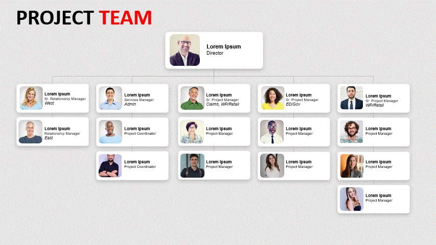
How To Insert Org Chart In Google Slides With Slideuplift’s Templates?
If you are looking for another option for creating an org chart in Google Slides with ease and pleasing visual appeal, then you can opt for Slidesgo’s Slideuplift’s org chart presentation templates. We provide multiple templates with various themes and backgrounds suitable for individuals from various industries. Follow the steps below to learn how to create an org chart with Slideuplift’s presentation templates :
- Go to SlideUpLift.com: Search for “org chart” or “organizational chart” in the homepage search bar.
- Choose a Template: Browse the collection and pick a template that suits your needs.
- Download the Template: All templates are in 16:9 format and compatible with PowerPoint or Google Slides.
- Open in Google Slides: Upload the file to Google Drive and open it with Google Slides.
- Customize the Content: Edit names, roles, and layout to match your org structure.
- Add Branding: Insert your logo, adjust colors, and tweak fonts for consistency.
- Save and Present: Review your chart and save or present directly from Google Slides.
- Looking to build or create org chart in PowerPoint? Check out this blog to get started!
Looking to build a professional org chart in PowerPoint? Check out this blog to get started!
The following sections will discuss some of our best org chart in Google Slides for you to try. You can also check out our org chart examples to get a better idea of which type best fits your purpose.
Best Google Slides Org Chart Templates
We understand that creating presentations from scratch can be time-consuming. Don’t worry; we have got you covered. We have created various org chart in Google Slides for you. All of our templates are fully editable and customizable according to your preferences. They come with placeholders where you can directly input your information. Simply download our templates and start using them to create outstanding presentations.
Here are the top templates from SlideUpLift that you can use while preparing your org chart template in Google Slides:
What Are Some Tips For Presenting An Org Chart Effectively Using Google Slides?
- Keep It Clear and Simple: Use a clean, hierarchical layout that’s easy to follow. Avoid overcrowding the slide.
- Use Consistent Design: Apply uniform fonts, colors, and shapes to maintain a professional look.
- Break Down Large Charts: Divide complex structures into smaller sections across multiple slides.
- Highlight Key Roles: Emphasize leadership or important roles using color, bold text, or icons.
- Add Visuals for Engagement: Include profile photos or team icons to make the chart more relatable and memorable.
What Are The Limitations Of Creating Org Charts In Google Slides Compared To Other Software?
- Lack of Advanced Features: Google Slides doesn’t offer built-in tools for dynamic org chart creation like drag-and-drop or auto-align features found in tools like Lucidchart, Microsoft Visio, or PowerPoint’s SmartArt.
- Limited Customization Options: Customizing connections, levels, and box layouts manually can be time-consuming and imprecise, especially for large or complex hierarchies.
- No Real-Time Data Integration: You can’t link data from spreadsheets or HR tools to automatically update the table, which is possible in apps like Excel or Power BI.
- Basic Diagram Styles Only: The built-in hierarchy diagrams are visually basic with minimal styling options compared to the design variety offered by SlideUpLift templates or tools like Canva and Creately.
- Manual Updates Required: Any changes to the organizational structure must be manually edited—there is no automation or syncing with external databases.
Conclusion
In today’s fast-paced, information-driven world, org charts are crucial for clearly communicating organizational structures and roles. Simplify complex information and expedite decision-making and communication with SlideUpLift’s templates. All the templates of the org chart in Google Slides are customizable. They empower your team, clients, and stakeholders to grasp your organization’s structure effortlessly, saving valuable time and resources.
FAQs
-
Where Can I Get Free Org Chart Google Slides Templates For Organizational Presentations?
You can explore a wide range of free PowerPoint and Google Slides templates at SlideUpLift — all in one place, your one-stop destination for all business presentation needs..
From sleek organizational charts to full-scale business decks, SlideUpLift offers a massive library of free and premium Google Slides templates built specifically for professionals. Whether you’re in HR, marketing, operations, or leadership, you’ll find free PowerPoint templates designed to suit every industry, every use case.
Why SlideUpLift?
- Fully customizable – Easily tailor each slide to your team, structure, and branding.
- Cross-platform compatibility – Seamlessly switch between Google Slides and PowerPoint.
- Mobile optimized – Create, edit, and present on the go, anytime, anywhere.
Whether you’re working from your laptop or your phone, SlideUpLift ensures your presentation game stays strong. Explore the power of smart design and effortless storytelling — all without spending a dime.
Start with our free org chart templates or level up with free and premium designs — everything you need is right here.
-
How Can I Build An Org Chart Manually Using Shapes And Connector Lines In Google Slides?
You can easily build a custom org chart using shapes and connectors. Here’s how:
- Open Google Slides and start with a blank slide.
- Insert shapes via Insert > Shape to represent team roles.
- Add text inside each shape (e.g., name, title).
- Duplicate and arrange shapes to show the reporting structure.
- Connect shapes using Insert > Line > Elbow Connector.
- Align and space neatly using the Arrange menu.
- Customize with colors, fonts, or logos as needed.
This method gives full control over layout and design.
-
Can I Add Or Remove Hierarchy Levels After Inserting A Diagram In Google Slides?
No, Google Slides does not allow direct editing of the hierarchy levels in pre-built diagram structures once inserted.
However, here’s what you can do:
- To add levels: Manually copy and paste existing shapes and reposition them to expand the hierarchy.
- There’s no auto-expand feature for diagrams like in tools such as Lucidchart or PowerPoint’s SmartArt.
- Alternative: Use shapes and elbow connectors to fully customize and add/remove levels as needed.
-
Are There Ready-Made Org Chart Templates I Can Use With Google Slides?
Yes! SlideUpLift offers professionally designed, fully editable org chart templates compatible with Google Slides. You can choose from a variety of styles—hierarchical, flat, matrix, and more. Just download, customize with your team data, and present with ease. These templates save time and ensure your org charts look clean, modern, and on-brand.
-
How Do I Import Or Convert An Org Chart Created In Powerpoint To Google Slides?
Quick Steps:
- Open Google Drive.
- Click New > File upload and upload your PowerPoint file.
- Right-click the file > Open with > Google Slides.
- Edit the org chart as needed in Google Slides.
- Your changes auto-save—ready to present or share!
Note: Some formatting may need slight adjustment after import.
-
How Do I Structure A Large Team In An Org Chart In Google Slides?
Tips to effectively structure a large team in Google Slides:
- Break into sections – Divide teams by departments or functions across multiple slides to avoid clutter.
- Use consistent shapes and connectors – Keep it organized and easy to follow.
- Apply color-coding – Different colors for each department or level improve clarity.
- Use grouping – Group related roles visually with boxes or background shapes.
- Add labels and legends – Helps viewers understand the structure quickly.
For a complex hierarchy, consider using editable templates from SlideUpLift for a clean, professional look.
-
What Are The Limitations Of Using Google Slides For Org Charts?
While Google Slides is useful for simple org charts, here are some key limitations:
- No dynamic hierarchy editing – You can’t easily add/remove levels like in SmartArt (PowerPoint) or Lucidchart.
- Limited diagram styles – Only basic org chart diagrams are available under the built-in diagram options.
- Manual formatting – Requires more effort to align shapes, connectors, and spacing.
- No data integration – You can’t link your org chart to data sources like Google Sheets for auto-updates.
- Less automation – Lacks advanced formatting and auto-layout tools found in specialized org chart software.
-
How Do I Handle Large Or Complex Org Charts (E.G., Many Nodes)?
Here are some practical ways to manage large or complex org charts:
- Split across multiple slides: Break down the chart by departments, teams, or hierarchy levels for clarity.
- Use Zoom or linking: Create summary-level slides and link them to detailed sub-charts using internal slide links.
- Minimize text: Stick to names and titles to keep it clean and readable.
- Apply color-coding: Use consistent colors to visually group roles or departments.
- Use pre-built templates – Save time and ensure visual consistency by using ready-made org chart templates from platforms like SlideUpLift.
Table Of Content


Related posts from the same category

13 Jun, 2025 | SlideUpLift
Org Chart in PowerPoint: Simplify Complex Team Structures with Smart Visuals
Without a clear org chart, even small teams feel messy. People start asking: “Who’s responsible for what?” Whether you are a manager, HR professional, or team lead, explaining the team

19 Mar, 2024 | SlideUpLift
How To Insert An Equation In Google Slides?
Google Slides is a fantastic online professional software for professionals across industries. If you are new to it, you must be wondering how to insert an equation in Google Slides.

29 Dec, 2023 | SlideUpLift
How to Make Checkboxes in Google Slides?
Google Slides is one of the most widely used presentation tools today. It is used for creating simple text and picture presentations and complex presentations. You can create surveys and

30 Apr, 2026 | SlideUpLift
How to Add a Border in Google Slides (7 Easy Methods)
To add a border in Google Slides, insert a rectangle shape, set its fill to transparent, and customize the border color and weight from the toolbar. You can apply borders

22 Apr, 2026 | SlideUpLift
How to make a Venn Diagram on Google Slides (3 Easy Methods)
Need to compare two products, contrast competing ideas, or map shared traits for a classroom exercise? The most common question designers and educators ask is how to make a Venn

1 Apr, 2026 | SlideUpLift
How to Print Google Slides with Notes: Step-by-Step Guide
Knowing how to print Google Slides with notes gives presenters and audiences a richer, more complete version of any presentation — each printed page shows the slide in the upper

1 Oct, 2025 | SlideUpLift
Insert Calendar In PowerPoint And Google Slides: Quick Guide For Smarter Planning.
Do you want your presentations to be more organized, attractive, and professional? Learning how to add a calendar in PowerPoint or Google Slides will take boring schedules and deadlines and

8 Dec, 2023 | SlideUpLift
How to Make a Chart in Google Slides Presentations?
Charts and graphs are essential components of statistics. They are the most effective means of visually representing the slow deterioration of a state or its progressive advancement. For instance, Google

6 Jan, 2023 | SlideUpLift
How to Add Header and Footer in Google Slides?
Google Slides is a powerful presentation tool allowing users to create professional-looking presentations easily. One important aspect of any presentation is the header and footer, which can provide context and

23 Sep, 2022 | SlideUpLift
How To Add Drop Shadows In Google Slides
Google Slides provide effects like drop shadows, which is an effective feature for presentation design. They can assist in making a flat image, text, or object more interesting by making