 Fall Sale
  Flat 40% off on our Unlimited Access Yearly Membership plan!


Enhance your storytelling by using this appealing infographic that showcases the timeline of Brazil on a map, in a captivating way! This template....


Enhance your presentation setup using this captivating map design tailored for displaying data, from parts of China. This attractive slide offers....

Streamline concepts using this captivating map design crafted for highlighting data points throughout Spains regions and cities.This striking sli....

This template is great, for team meetings as it turns your data into a presentation that captivates the audience visually! With a map of the Czec....
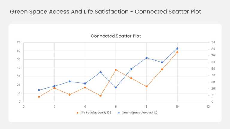
This two-series line chart tracks how two related measures move together across ten data points. Orange markers plot life satisfaction against th....
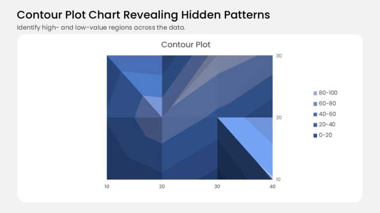
This contour plot turns a grid of values into shaded bands, like a topographic map for your data. It plots 12 data points on a 4 × 3 grid, with 1....