Flat 4

 Edit with AI
 Ask Us To Edit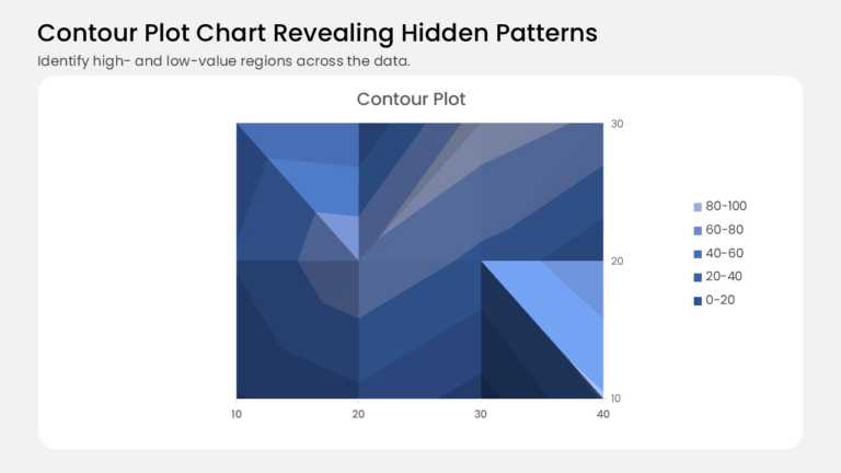

Product Description:
This contour plot turns a grid of values into shaded bands, like a topographic map for your data. It plots 12 data points on a 4 × 3 grid, with 10 to 40 along the base and 10 to 30 in depth. Blue shades run from deep navy for the lowest values to pale sky blue for the highest. A legend on the right keys each band to its value range. The chart sits on a white rounded card beneath a headline and a one-line subtitle.
Analysts can use it to spot hot and cold zones in pricing, demand, or performance data. Product, operations, and research teams can show where results peak without a crowded table. Swap in your own values and PowerPoint redraws the bands for you.
Browse our data visualization chart templates for more layouts, or read our guide to building a heat map in PowerPoint for a related approach. Available in 4:3 and 16:9, the slide works in both PowerPoint and Google Slides.