Flat 4

 Edit with AI
 Ask Us To Edit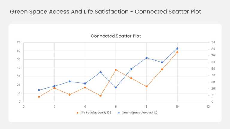

Product Description:
This two-series line chart tracks how two related measures move together across ten data points. Orange markers plot life satisfaction against the left axis, which runs from 0 to 70. Blue markers plot green space access against a secondary right axis from 0 to 90. Both lines trend upward from left to right and rise sharply together at the final point. A legend under the chart names each series, and light gridlines frame both axes.
Analysts can use it to show the link between two metrics that use different scales. Try it for marketing spend versus leads, price versus demand, or headcount versus output. Researchers and policy teams can also compare survey scores with environmental or social indicators.
Explore more PowerPoint chart templates for your data stories, or follow our step-by-step guide to making a graph in PowerPoint. The slide comes in 4:3 and 16:9 and works in PowerPoint and Google Slides.