![]() Mid-Year Steal
Mid-Year Steal ![]() Flat 10% off on our Unlimited Access Yearly & Team plans!
Flat 10% off on our Unlimited Access Yearly & Team plans!


Venn Diagram Templates for PowerPoint

Enhance your narrative skills using this captivating Venn diagram layout tailored for analyzing target audiences ! The striking slide showcases a....

Venn Diagram Template Collection for PowerPoint & Google Slides Venn Diagrams are effective tools that can be used to showcase similarities o....

The Marketing Strategy Venn Diagram PowerPoint Template can be used to present business marketing strategies effectively. This template can help ....

Enhance the quality of your presentations with a color circular process diagram that adds a professional flair, to your content delivery needs! T....

Make sharing information with this captivating Venn diagram template crafted for business strategy presentations! The layout is visually appealin....

Capture your audience’s attention right from the start with this engaging Venn diagram template! Perfect for illustrating relationships and....

Share your vision using this captivating Venn diagram layout that simplifies market analysis tasks! This pleasing design comprises five layers to....

Enhance your storytelling using this Venn diagram created for performance evaluation purposes specifically It’s a tool, for professionals a....

Boost the effectiveness of your presentations by using this Venn diagram template comprising five sections to showcase connections and key insigh....

Wow stakeholders, with this infographic created specifically for market analysis presentations! This design template showcases a blue gradient st....

Enhance your information by using a captivating Venn diagram template that brings clarity to connections, among job functions, within a company s....
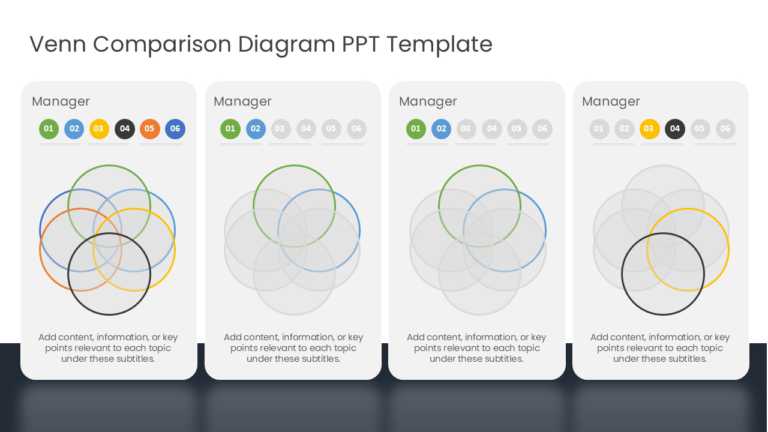
Enhance your presentation by using this Venn diagram template for comparisons and analyses tailored for managers and team leaders alike. The temp....
Related Presentations
-

Golden Ratio
7 templates>
-

Linear
40 templates>
-

Motion Diagrams
32 templates>
-

Animation
669 templates>
-

Diagrams
227 templates>
What Is A Venn Diagram?
A Venn diagram is a simple graphical illustration that uses overlapping circles to show how different groups relate to each other. Each circle represents a category (like “Apples” or “Oranges”), and the space where they overlap reveals what those categories share. Think of it as a map for comparing ideas—instantly showing what’s unique and what’s common.
Because it turns messy comparisons into something clean and easy to understand, whether you’re explaining business strategies, classroom concepts, or research data, a Venn diagram helps your audience see connections and differences at a glance. No design skills needed—just drag, drop, and let the circles do the talking.
What are the key components of an effective Venn diagram PowerPoint template?
An effective Venn diagram PowerPoint template is essential for making impactful business presentations. Key components include clarity in design, appropriate use of colors, and the ability to convey information succinctly.
- Well-Defined Circles or Shapes
-
- Each circle or shape should clearly represent a distinct group or category.
- Overlapping areas should be visually distinct (via color, transparency, or borders) to highlight shared attributes.
- Consistent and Meaningful Color Coding
- Use contrasting but harmonious colors to differentiate each set.
- Ensure overlapping areas blend the original colors to imply shared traits or intersections.
- Editable Text Areas
- Space for labels inside and outside each circle for category names and details.
- Optional callouts or bullet points to explain each section.
- Logical Layout Options
- Templates with different numbers of sets: 2-set, 3-set, 4-set, or more, depending on complexity.
- Variations like concentric circles, stacked diagrams, or segmented ovals are used for unique data visualization needs.
- Clarity and Readability
- Minimalist design with ample spacing between elements.
- Legible font choices with adjustable sizing for both headings and body text.
- Icons or Visual Cues (Optional)
- Use of icons or illustrations to visually reinforce the concept behind each category or intersection.
- Animation and Transitions (for Dynamic Presentations)
- Subtle animations to introduce one section at a time.
- Morph or fade effects to guide the viewer’s focus through each relationship.
What Are The Different Types Of Venn Diagram Templates For PowerPoint?
When selecting a Venn diagram that accurately represents your data, consider the quantity and positioning of shapes, as these factors influence the hierarchy and overlap. You can enhance your presentations by making Venn diagrams in PowerPoint. Here are the different types of Venn diagrams you can pick from:
- Two-Circle Venn Diagram
- Ideal for comparing two ideas, concepts, or data sets.
- Shows individual characteristics and their intersection (shared traits).
- Best for simple comparisons like pros vs. cons or product A vs. product B.
- Three-Circle Venn Diagram
- Used to explore interrelationships among three sets.
- Clearly visualizes all possible overlaps, including the central intersection where all three categories share common traits.
- Great for analyzing strategy, marketing, or decision-making models.
- Overlapping Venn Diagrams
- These diagrams emphasize the intersections and relationships between categories.
- Useful for showcasing shared functions, collaborative roles, or integration points.
- Can be used with two or more sets, depending on the level of complexity required.
- Non-Overlapping Venn Diagrams
- Circles or shapes are placed near each other but do not intersect.
- Used to contrast completely distinct categories or when there is no commonality.
- Visually clean and effective when you need to show mutual exclusivity.
- Nested Venn Diagrams
- Circles are placed inside each other, like a set of concentric circles.
- Shows hierarchical relationships, such as subsets or categories within a broader set.
- Ideal for explaining levels of inclusion or scope in a system.
- Euler Diagrams
- A variation of Venn diagrams, but only shows actual relationships that exist (no need to represent all possible overlaps).
- More accurate and less cluttered when some intersections don’t apply.
- Great for logical or conceptual maps where precision is more important than completeness.
How can a Venn diagram enhance presentations in PowerPoint?
A Venn diagram can significantly enhance PowerPoint presentations by turning complex relationships into key points and visual comparisons. Here’s how it adds value:
- Simplifies Complex Information
- Helps audiences grasp relationships, overlaps, and distinctions between ideas at a glance.
- Converts data-heavy explanations into a visual format that’s easy to follow.
- Clarifies Comparisons and Contrasts
- Perfect for comparing products, processes, departments, strategies, or audience segments.
- Highlights commonalities and differences in a way that’s more engaging than text or tables.
- Increases Visual Engagement
- Well-designed Venn diagrams break the monotony of bullet points and keep your audience visually interested.
- Color-coded sections and overlapping visuals draw attention and aid information retention.
- Boosts Conceptual Understanding
- Great for explaining abstract concepts like:
- Strategic alignment
- Target market overlap
- Role distribution in teams
- Makes relationships and intersections easier to comprehend.
- Great for explaining abstract concepts like:
- Professional and Polished Look
-
-
- Adds a structured, data-driven visual that enhances credibility.
- Demonstrates thoughtful preparation and strategic thinking.
-
How Do I Identify The Overlapping Content?
To identify overlapping content in a Venn diagram template PowerPoint, you must first understand the relationships between the items being compared. Then, look for any common elements or attributes present. These will be placed into the overlapping segments of the shapes. Place any differing characteristics into the non-overlapping bits.
How Do I Arrange The Circles In A Venn Diagram?
To efficiently arrange your Venn diagram’s shapes, be it circles or triangles, first assign each shape a particular element. Then, identify which elements have similarities and place them to overlap accordingly. Try to maintain a symmetrical layout for an easy-to-understand design that’s also informative.
What are common mistakes to avoid when using a Venn diagram in PowerPoint?
Utilizing SmartArt diagrams can streamline the creation of your visuals. This feature within Microsoft PowerPoint allows for quick adjustments to the Venn diagram layout while offering various formatting options on the Insert tab. Transparency settings can enhance the overlapping area, making data sets easily distinguishable. Additionally, incorporating text boxes for clarifying labels further enhances comprehension. Transition effects, such as animations, can effectively draw attention to connections within the diagram, elevating the overall impact of your presentation.
Which Different Shapes Are Used In Venn Diagrams?
Venn diagrams use shapes to represent different items. The types of shapes typically used are:
- Circles: The most common choice in Venn diagrams, circular diagrams make overlaps easy to understand.
- Triangles: These are used to represent sets when dealing with relationships of higher complexity.
- Rectangles: A rectangle around the circles can help denote the universal set.
- Ovals: You can use these in cases where perfect circles aren’t moldable enough to show overlaps accurately within limited space.
You can easily show connections and differences by creating Venn diagrams in Google Slides.
How do you effectively pair colors and shapes in a Venn diagram for clarity?
Utilizing PowerPoint shapes offers a flexible method for crafting a Venn diagram tailored to specific needs. By applying various formatting options, such as transparency for overlapping areas, users can emphasize key relationships within data sets. Additionally, combining shapes with text boxes enables clear communication of concepts using a text box. This approach allows for customization of graphics and layouts, enhancing the overall aesthetic of the presentation. A well-designed PowerPoint Venn diagram template not only supports comprehension but also captivates the audience’s attention during an online presentation.