Best Fonts For PowerPoint Presentation: The Runway Of Letters
Imagine this: your presentation is a red-carpet event. Your slides are the guests, the content is the message, and the font? That is the outfit; the one builds up the whole personality of each and every slide before you even speak. A sleek, sharp font commands respect, whereas a casual or messy one might get laughs.
Fonts silently set the stage for how your audience will perceive your ideas. It can be polished, modern, creative, or even unprofessional. That is why picking the best font for PowerPoint is like choosing the perfect outfit. One that can either inspire confidence or cause distraction.
And if your fonts are outfits, then PowerPoint is your wardrobe. When you open it, you will find a wide range of styles lined up. From classic business looks to everyday comfort styles, you can choose whichever you like. And when you make that effort of dressing up your presentation with the perfect font outfit, your message will definitely become the showstopper. But with so many choices at hand, it gets confusing to select the best one for your presentation. And getting it right will determine how your audience connects with the message you want to convey. Feels challenging, right? Don’t worry at all! We have got you covered.
In this blog, we will open up PowerPoint’s wardrobe and walk you through the best PowerPoint fonts for every occasion,….
Understanding How Fonts Shape Visual Flow
In a presentation, whenever anyone first takes a glance at the slides, their brain starts arranging the content into an order. First comes the title, then the key points, and finally the supporting details like text, visuals, and other design elements. The order that they follow decides how well the message sits with the audience. And what decides that order? Very often, it is the fonts.
The size, weight, and style of the fonts signal what should stand out first, and then the secondary points that follow. This is what we call a ‘Visual Hierarchy’. It is a design principle that organizes text, fonts, and visuals in a way that the audience’s eyes naturally move through the presentation in the right order.
But, how exactly do fonts play into this? They help your brain to make sense of the information that is shown on the screen. Fonts group related points, separate ideas, and create a flow that makes the content easy to follow without any conscious effort. Want to know exactly how? Let’s explore what benefits the best PowerPoint font adds to the presentation.
Why Font Choice Can Make or Break Your Presentation?
Picking out the best font for PPT is more than just about the style. It affects how the audience perceives and remembers the presentation. Here is why your choice of font matters:
- Clarity and Readability: It makes the slides easy to read at first glance.
- Hierarchy: It helps to distinguish between titles, headings, and body text through their sizes.
- Tone and Personality: The fonts convey professionalism, creativity, or approachability, whichever one is aiming to showcase.
- Audience Engagement: The best fonts for presentations are the ones that keep the viewers interested and focused on the message.
- Consistency Across Slides: It definitely keeps the slides looking uniform and polished.
Font selection is a small detail, but it makes a big difference in how the audience will read, understand, and remember your presentation. They are powerful, but they are a part of the larger picture called ‘Typography’. And within typography, fonts belong to bigger families called ‘Typefaces’. Before we explore specific fonts, it will be helpful to know what these terms contribute to shaping the slides of a presentation.
Fonts and Typefaces: The Family Connection
As the fonts are the outfits, ‘Typography’ is the stylist behind the scenes. It is the art and technique of arranging text. It decides the font sizes, spacing, alignment, and placement. Just like a stylist, it ensures every outfit looks perfect. Good typography makes sure that every word on the slides stands out. So it can grab the audience’s attention naturally.
We talked about PowerPoint being a wardrobe for your slides’ outfit; that wardrobe is called a ‘Typeface’, and the ‘Fonts’ are the individual outfits you choose from it.
- Typeface: It is the overall design or style of letters that belongs to a family. For example: Arial, Times New Roman, Calibri.
- Font: It is a specific version of a typeface, such as Arial Bold, Arial Italic, or Times New Roman Regular. Fonts define the weight, style, and size you can actually apply to your text.
Now that we know what each of the terms means, the real question is: why does it matter for your PowerPoint slides? The simple answer is: the typeface you choose sets the overall mood of the presentation. Be it formal, casual, or creative. And the fonts that you pick within that typeface decide what stands out and what blends in.
Just as the best font for PowerPoint presentation determines what stands out, the color, being a decorative element, brings the slides to life. If fonts are the outfits for your slides, then color is the accessory that adds personality and flair to the overall look.
The Power of Font Color as a Decorative Element
Colors are a powerful decorative element in presentations. When used correctly, they make your slides clear, appealing, and easy to follow. Different colors also affect how the human mind perceives the information presentation. They also evoke mixed feelings; for example, warm colors can grab attention and energize, while the cool ones give off a calm and professional feel. Using a colorful set can overwhelm the viewers and dilute the key points mentioned. At such times, a simple, harmonious palette can help you keep the slides professional and clean.
Sometimes, the safest and most professional choice is to go with a grayscale approach. The shades of black, white, and gray can keep your slides clear and readable. This way, the viewers will not get distracted by bright or clashing colors. It always gives a professional appearance that lets the content shine. You can check out our blog on the 10 best color palettes you can use for presentations to pick the right shades that can create a subtle impact without overpowering the message.
We have seen how the right fonts can transform the mood and readability of a slide. This brings us to the three main decorative font families that you will be working with in PowerPoint.
The 3 Main Types of Fonts You Need to Know for PowerPoint
When it comes to choosing the best font for presentation, it really depends on the impression you want to create. Different font styles set different tones, and picking the right one can make your slides more effective. To be able to pick the right one, you first need to understand the three main font families:
- Serif
- Sans Serif
- Decorative
Each of the following has its own personality and purpose. Knowing the difference between them will help you to set the right mood for your presentation.
Serif PowerPoint fonts have small ‘tails’ or lines at the ends of the letters, kind of a geometric style. They give a classic and formal look to your presentation.
Sans Serif fonts are modern fonts with extra strokes, which makes them easy to read. They work best for digital slides and casual or modern topics.
Decorative fonts are the ones with small lines or embellishments at the ends of letters. They are often used for creative or eye-catching texts or paragraphs. They should be used sparingly, mainly for titles or headers.
So you see, each font carries its own personality. And knowing when to use which best presentation fonts will also appeal to the viewers’ eyes and match the message you want to convey. The key balance is to choose the best fonts for PowerPoint presentations that will make it easy to read and also reflect the desired tone.
This brings us to the most fun and awaited part of the blog, which is finally knowing the top 10 best fonts for presentations. These fonts will instantly elevate the look and feel of your slides.
The Top 10 Best Fonts for Powerpoint Presentations 2025
Here is the list of the 10 most trending fonts for presentations, with the reasons supporting why they are great to use in the slides:
| Rank | Font | Why It’s Great for Presentations |
| 1 | Verdana | Specifically designed for screens, its wide spacing and clear shapes make text easy to read even in small sizes. |
| 2 | Roboto | A modern, balanced font that works equally well for headings and body text, giving slides a clean and professional look. |
| 3 | Open Sans | Neutral and versatile, it blends into any presentation style while keeping text simple and legible. |
| 4 | Lato | Friendly and approachable in tone, with multiple weights that give flexibility for emphasis and hierarchy. |
| 5 | Montserrat | Stylish and bold, it makes headings stand out and instantly gives your slides a modern feel. |
| 6 | Georgia | A serif font made for digital screens. It adds a touch of elegance while remaining easy to read. |
| 7 | Tahoma | Compact and straightforward, perfect for slides with more text or limited space. |
| 8 | Rockwell | Strong slab-serif font that grabs attention; ideal for titles or key points that need impact. |
| 9 | Futura | Clean and geometric, it works well for design-heavy presentations or modern corporate themes. |
| 10 | Bebas Neue | All-caps font that’s bold and commanding, perfect for striking headlines (but not for body text). |
You can also style them by mixing and matching the fonts to give an effective presentation. When the pairing is done correctly, they add the perfect contrast and hierarchy to the presentation. For example, one font can highlight the titles and the other focuses on the body text. The perfect balance gives off the impression of a synchronously professional deck. Here are some popular and effective combinations of the best fonts for PowerPoint presentations:
Popular and Effective Font Pairing Combinations
Mixing up the appropriate heading and body fonts adds style and clarity to the slides. Here are some tested combinations:
| Heading Font | Body Font | The effect it has |
| Montserrat | Lato | Clean and modern, great for professional slides. |
| Oswald | Roboto | Script font for bold headings with readable body text. |
| Playfair Display | Open Sans | Elegant headings paired with simple, legible text. |
| Poppins | Roboto Slab | Contemporary look with a subtle serif contrast. |
| Bebas Neue | Raleway | Eye-catching headings with smooth, modern body font. |
| Lora | Nunito | Serif body text balanced with soft, rounded headings. |
| Raleway | Open Sans | Light, airy headings with clear, readable body text. |
| Merriweather | Lato | Classic serif headings with neutral, modern body text. |

Try out these combinations and make your presentations unbelievably attractive. You can also pair it up with aesthetic backgrounds and really make the message shine.
How to Embed Fonts in PowerPoint?
At the same time, remember to pick those fonts that are functional and support all the characters you need. This means that the text should remain clear at any size and should work across different devices.
Sometimes, the fonts may not appear the same as you want them to on other devices. This also implies that you should check their licensing as well. So, you can share the presentation without the fear of PowerPoint swapping the fonts you initially chose. Therefore, we suggest that you embed them into your powerPoint presentation. Let’s see how you can embed the fonts in PowerPoint:
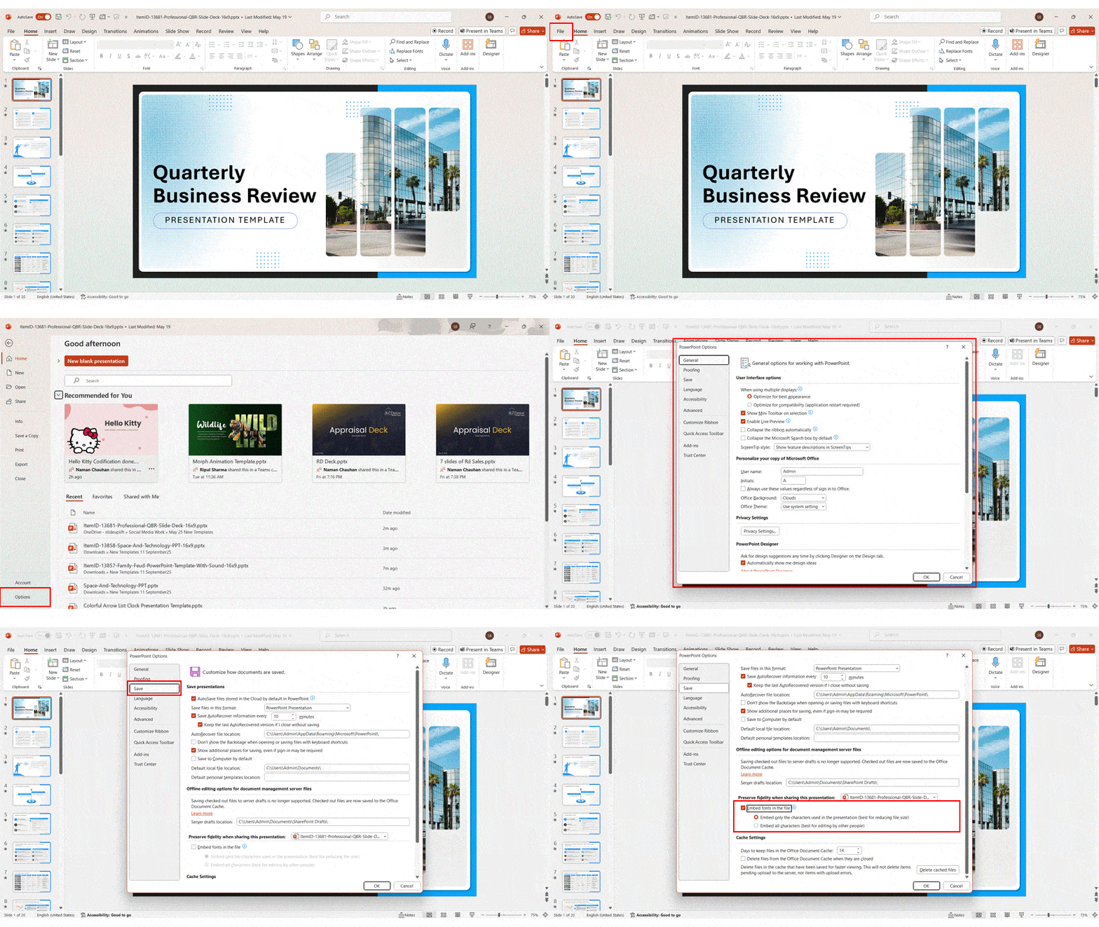
Step 1: Open the presentation.
Step 2: Here, click on Files > Options > Save.
Step 3: Then, check the box ‘Embed fonts in the file’.
Step 4: You can either choose ‘Embed only the characters used’ (smaller file) or ‘Embed all characters’ (allows editing).
Step 5: Now, click ‘OK’ and save the presentation.
This way, your fonts will not change even if the presentation is accessed with a different device.
How to Install Fonts in Microsoft PowerPoint on Windows and Mac?
You may also like a font you saw somewhere online and desire to use it in your presentation. The good news is, you can install a new font in PowerPoint as well. For both platforms, follow the following steps:
- On Windows
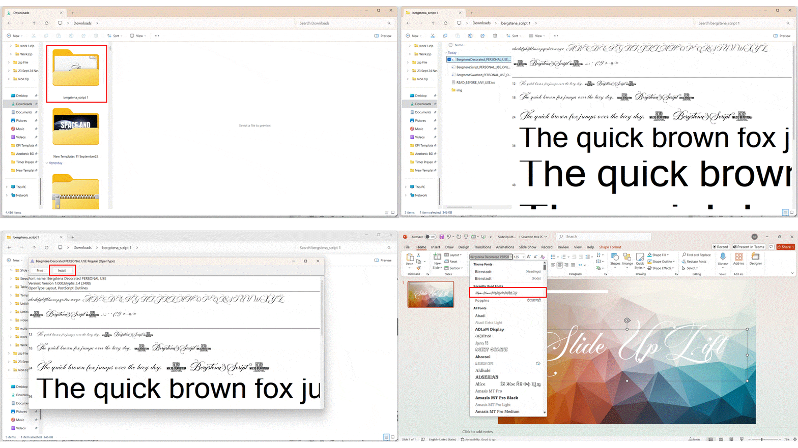
Step 1: First, download the font file. It is usually in [.ttf] or [.otf] format from a trustworthy source.
Step 2: Go to your downloads folder or anywhere you want.
Step 3: Right-click the font file and select ‘Install’.
Step 4: The font will now appear in the font dropdown menu. If it does not appear, restart PowerPoint to refresh the list.
- On Mac
Step 1: First, download the font file. (.ttf) True Type Font or (.otf) Open Type Font.
Step 2: Go to the ‘Applications’ folder on Mac computers and open the ‘Font Book’.
Step 3: Now, right-click on the font and add it to the ‘Font Collection’ you prefer. (fun, modern, traditional web, PDF)
Step 4: Click on the font to install it on the computer.
Step 5: The font will appear in the dropdown menu in PowerPoint. Restart PowerPoint if otherwise.
Now, you can have full control over how your deck looks, whenever it is opened.
Avoid These Common Font Blunders in PowerPoint
To pick the best font for a presentation may sound simple for many, but people still make these small mistakes that ruin the overall look of their slides. Here are some common blunders with their quick fixes to help you keep your presentations clean and easy to read:
- Using Too Many Fonts.
Fix: It is better to stick to just two fonts (one for headings, one for body text) to keep the slides consistent. - Choosing Fancy or Decorative Fonts.
Fix: You can use those for posters or invites. For professional presentations, pick clear and simple fonts. - Ignoring Readability.
Fix: Make sure that the text is large enough and stays clear from the back of the room. - Not Checking Contrast.
Fix: Always use light fonts on dark backgrounds and vice versa. This makes a strong contrast and keeps everything visible. - Skipping Font Hierarchy.
Fix: Use bold and bigger sizes for titles and lighter weight for the body copy. It will be easier to read. - Using Uncommon Fonts without Embedding.
Fix: If the font is not embedded, the font might swap when opened on other devices. You can embed it or choose system fonts. - Not Testing on Different Devices.
Fix: Test with multiple fonts to check which will look good on other devices like laptops, projectors, etc.

Conclusion
Good presentations are not only about the content, they are also about how that content looks. Choosing the best font for PowerPoint can make your message and ideas reach the audience effortlessly. Having in-depth knowledge of how fonts act as one of the highest hierarchical elements will definitely help you enhance the appearance of your presentations. And most importantly, it will help you to connect with your audience more closely. Because when your fonts are dressed to impress, your message walks the stage with confidence.
FAQs
-
What are the best fonts for PPT to use for making a clear and professional presentation?
The best fonts for PowerPoint for professional presentation designs are Verdana, Arial, Helvetica, and Georgia. These are clean and easy to read in a work setting. And works well on screens of all sizes. Using them consistently with the wide spaces on the slides. It will definitely give a polished look to your decks.
-
Which fonts work well for scientific PowerPoint presentations to ensure readability?
For scientific decks, being able to read clearly is an important criterion. Using fonts like Arial, Verdana, and Tahoma is an excellent choice. They are simple, clear, and the best when you have dense text or graphs to read.
-
Can you recommend some of the best fonts for PowerPoint that help presentations stand out visually?
To make your slides more attractive, you can use these best fonts for a PowerPoint presentation from different families:
- Montserrat (heading) + Lato (body)
- Raleway (heading) + Open Sans (body)
- Oswald (heading) + Roboto (body)
Using such a contrasting font combination can make your slides eye-catching.
-
What are the tips for choosing the best PowerPoint presentation fonts?
Here are some tips that can help you to choose the best font for a PPT presentation:
- Do not use more than 2-3 fonts per presentation.
- Choose a font that is easy to read on all kinds of screens.
- Also, consider the audience. See whether the topics are formal and need serif or clean sans-serif. The creative ones can use the decorative fonts.
- Make sure that the font supports all the characters (accents, symbols, etc.)
- And do avoid using overly decorative fonts for body text. Use them to only highlight titles.
-
Which fonts are considered most prestigious for use in presentations for business settings?
Fonts like Times New Roman, Georgia, Helvetica, and the oldest font, Garamond, are viewed as most prestigious for business presentations and other best practices. They give the deck a professional and formal look.
-
Are there specific fonts that are recommended for PowerPoint presentations used in high school classrooms?
For the students, they can use the standard fonts. Like Arial, Calibri, Verdana, and Tahoma are some of the safest options. You should avoid using decorative fonts as they can distract the viewers from the content.
-
How many different fonts should I use in one PowerPoint presentation to keep the design clean?
The rule of thumb is to use 2-3 fonts per presentation. One for the headings, one for the body text, and one accent font (optional). Too many of these can make the slide look messy and difficult to read.
-
What font and background color combination is most effective for readability in PowerPoint?
For this, you can use dark text on a light background, like black text on white or light gray; or vice versa, white text on navy or black. This will create a good contrast between the font and background. But do not use too many bright or clashing colors. Make sure they balance out the contrast well. You can pair these with stunning PowerPoint backgrounds to make your whole deck impossible to ignore.
-
Which font file types should I choose to ensure compatibility on both Mac and PC when making Google Slides?
In Google Slides, you do not have to worry about font files like (.ttf) or (.otf) because it uses web-based fonts (Google Fonts). They work across all devices. But, if you use custom fonts in your PowerPoint templates, then make sure they are in (.ttf) or (.otf) formats before you upload them.
-
Could you share a list of the top 10 best PowerPoint fonts commonly used for making presentations?
Here is the list of the top 10 best and classic presentation fonts for 2025:
- Verdana
- Arial
- Helvetica
- Calibri
- Georgia
- Tahoma
- Montserrat
- Raleway
- Open Sans
- Lato


