

 Flat 4


PowerPoint Design Ideas: Layouts, Colors, Charts & the Design Ideas Feature (2026)
A great message can still fail on a bad slide. Design is what carries your idea from your head into your audience’s — the color choices, the layout, the way a chart is built, whether the type is legible from the back row. This guide covers PowerPoint design ideas across the areas that matter most: the fundamentals (color, typography, hierarchy), layout patterns you can copy directly, chart and data design, how to use PowerPoint’s built-in Design Ideas feature, and content-type-specific suggestions for the slides you build most often.
Looking for how to hold your audience’s attention, not how the slide looks? See our guide to presentation ideas to engage any audience.
Quick Answer
The best PowerPoint design ideas are: one point per slide, high-contrast large type, a 2-3 color palette used consistently, the right chart type for your data, full-bleed images with text overlays, and PowerPoint’s built-in Design Ideas (Designer) feature for instant layout suggestions on Office 365. Good design isn’t decoration — it’s the fastest way to make your point land.
Why Presentation Design Matters
Presentation design is what turns information into something an audience actually retains. A well-designed presentation grabs attention, conveys the message clearly, and leaves a lasting impression — while a poorly designed one buries a good idea under clutter, regardless of how strong the content is. Design isn’t about making slides pretty; it’s about using color, layout, and visual elements to make the message land faster and stick longer.
For a ready-made design foundation, explore our PowerPoint background templates to give your slides a consistent and professional look.
The Fundamentals of PowerPoint Design
Four principles do most of the work in any slide:
Color Theory
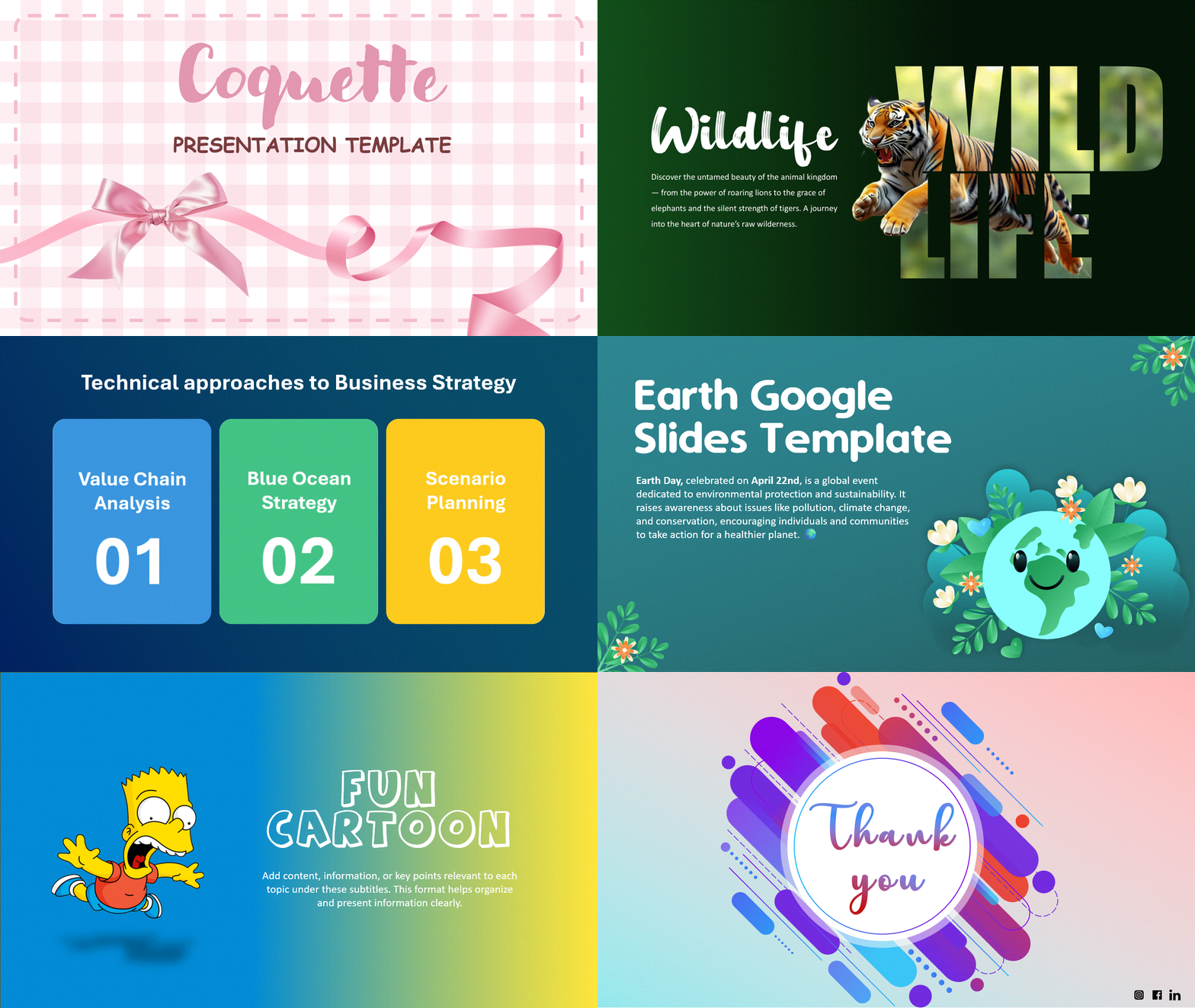
Color sets the emotional tone before anyone reads a word — blue reads calm and trustworthy, red reads urgent or bold. Pick a palette that matches your message and brand, and stay consistent across every slide. See our full breakdown of effective color palette combinations.
Typography
Legible type is non-negotiable: large sizes, high contrast, and a clean typeface your audience can read from the back row or on a phone screen. Skip italics unless the content genuinely calls for it. Our guide to the best fonts for presentations breaks down exactly which typefaces work and why.

Visual Hierarchy
Hierarchy tells the eye where to go first: larger text for headings, smaller for supporting detail, size and placement doing the guiding so the audience never has to hunt for the point of the slide.
Images & Graphics
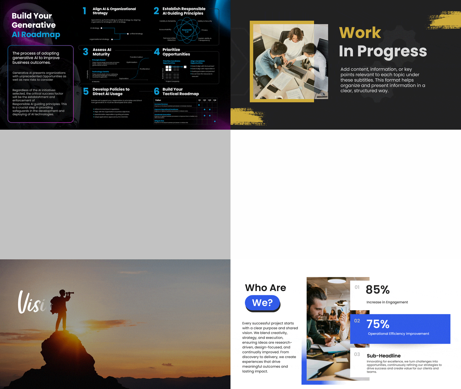
Images break up text-heavy slides and carry meaning words can’t — but only when they’re high-quality, relevant, and on-brand. For slide-by-slide guidance on which visual format fits which message, see our guide to the types of slides that make presentations easier to follow.

How to Use PowerPoint’s Built-In Design Ideas Feature
PowerPoint’s Design Ideas feature (also called Designer) generates instant layout suggestions from whatever text and images you’ve already added to a slide — it’s the fastest way to go from a blank layout to something polished.
How to turn it on
- Add your text and/or images to a slide first — Designer needs content to work with.
- Go to the Design tab in the ribbon and click Design Ideas (in some versions, it opens automatically as a side panel).
- Click any suggested layout to apply it instantly — each one is unique, so you rarely see the same suggestion twice.
If Design Ideas isn’t showing up
- It requires a Microsoft 365 subscription — it isn’t available in one-time-purchase PowerPoint or older versions.
- It needs an internet connection, since suggestions are generated in the cloud.
- Check Options → General → “Automatically show me design ideas” is enabled if it isn’t appearing by default.
Design Ideas is a fast starting point, but it works best paired with a real template underneath — explore PowerPoint themes for a foundation Designer can build on.
PowerPoint Layout Ideas
- Full-bleed image with text overlay: one strong photo fills the slide, text sits in a high-contrast band — works for section breaks and quotes.
- Split-screen layout: image on one half, key point on the other — clean way to pair visual and message without crowding either.
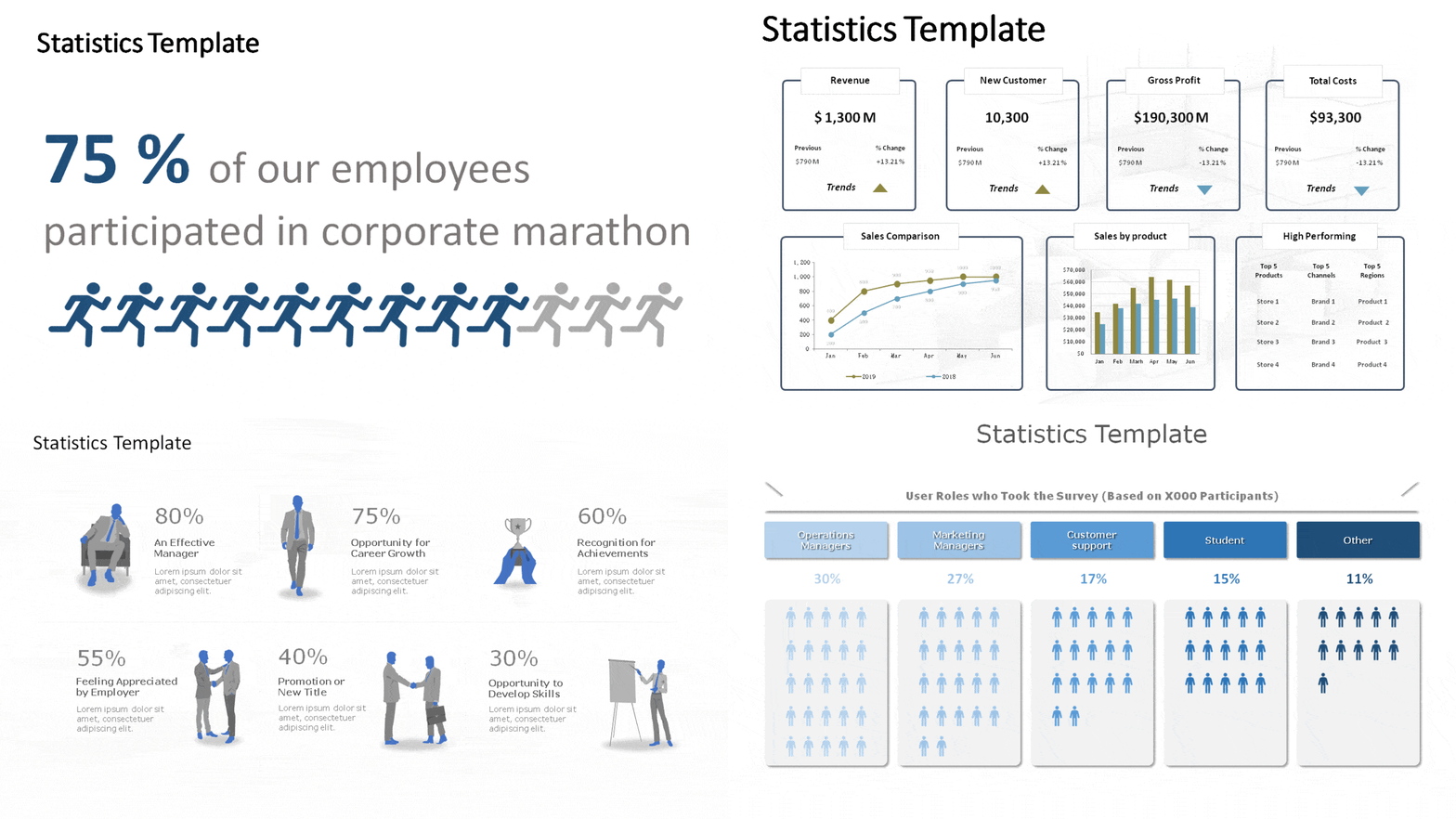
- Big-number layout: one statistic, huge type, minimal supporting text — for the single fact you want remembered.
- Grid/masonry layout: multiple images or icons in a structured grid — good for team slides, portfolios, or feature comparisons.
- Left-rail navigation layout: a persistent sidebar showing where you are in a longer deck — helps orient audiences in 20+ slide presentations.
- Quote layout: large italicized text, attribution below, generous white space — built for testimonials or a single powerful line.

Chart & Data Design Ideas
The right chart type makes data instantly readable; the wrong one makes your audience work to understand it:
- Tables: best for comparing a small number of precise values side by side.
- Bar or combo charts: best for complex or multi-category data where a table would overwhelm.
- Big-number call-outs: best for one standout statistic you want remembered above the rest.
- Icons instead of bullet lists: replace text-heavy lists with icon sets where the items are concrete and countable.
PowerPoint Design Suggestions by Slide Type
- Title slide: one strong visual, minimal text — sets tone before you say a word.
- Agenda slide: numbered or iconized list so the audience can track progress through the deck.
- Comparison slide: side-by-side columns or a simple table — avoid cramming more than 3-4 comparison points onto one slide.
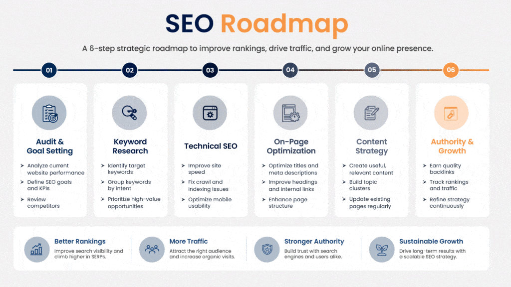
- Timeline slide: horizontal or vertical progression for milestones, history, or roadmaps.
- Thank-you/closing slide: simple, on-brand, with contact info — the last thing your audience sees.

Best PowerPoint Presentation Design Examples
Reading about good design only goes so far — seeing it applied is faster. Our roundup of the best PowerPoint presentation examples breaks down real decks people have actually used, section by section.
Conclusion
No design idea works in isolation — the fundamentals (color, type, hierarchy), a layout suited to your content, correctly chosen charts, and PowerPoint’s own Design Ideas feature all compound together. Start with the layout patterns and chart guidance above, run your draft through Design Ideas for a fast first pass, then refine by hand. SlideUpLift’s free templates give every one of these ideas a professionally designed starting point.
FAQs
-
What is the Design Ideas feature in PowerPoint?
Design Ideas (Designer) is a built-in PowerPoint tool that generates instant layout suggestions based on the text and images already on your slide. It requires a Microsoft 365 subscription and an internet connection.
-
How do I get Design Ideas to show up in PowerPoint?
Add content to your slide first, then open the Design tab and select Design Ideas. If it doesn’t appear, confirm you have a Microsoft 365 subscription (not a one-time-purchase version), check your internet connection, and verify the auto-suggest option is enabled under Options → General.
-
What does a PowerPoint presentation designer do?
A presentation designer builds the visual system for a deck — color palette, typography, layout, and chart design — so the content communicates clearly and consistently. SlideUpLift’s templates give you that system pre-built.
-
What are the best sources for professional slide design inspiration?
Curated template libraries (like SlideUpLift), PowerPoint’s own Design Ideas feature, and studying real presentation examples are the three fastest sources — far faster than starting from a blank slide.
-
What's the difference between PowerPoint design ideas and presentation ideas?
Design ideas are about how a slide looks — color, layout, typography. Presentation ideas are about how you engage an audience — story, pacing, interaction. This guide covers the former; see our presentation ideas guide for the latter.
Table Of Content



Related posts from the same category
16 Nov, 2022 | SlideUpLift
15 Presentation Ideas to Engage Any Audience in 2026
Your audience is one notification away from leaving you. That's the reality every presenter works against in 2026: attention is scarce, patience for slow, data-heavy slide decks is gone, and

10 Sep, 2025 | SlideUpLift
Best Fonts For PowerPoint Presentation: The Runway Of Letters
Imagine this: your presentation is a red-carpet event. Your slides are the guests, the content is the message, and the font? That is the outfit; the one builds up the

25 Apr, 2025 | SlideUpLift
Bored with Hangouts? These PowerPoint Night Ideas Will Change Everything!
Having trouble spicing up your get-togethers? Are your usual hangouts feeling a little… predictable? You're not alone! Many find it challenging to discover fresh and engaging ways to connect and

6 Jan, 2026 | SlideUpLift
Presentation Tips for Structuring Messages and Effective Storytelling
This blog breaks down practical presentation tips to help you plan, design, and deliver slides that truly stand out. It covers how to simplify text, use visuals effectively, and maintain
27 Feb, 2026 | SlideUpLift
How to Change Transparency in PowerPoint (Step-by-Step Guide)
Learn how to use transparency in Microsoft PowerPoint to adjust the opacity of images, shapes, and text for cleaner, more professional slide designs. This step-by-step guide explains how to change

2 Jul, 2021 | SlideUpLift
4 Decision Frameworks That Will Change The Way You Make Decisions
Decision-making is the process of gathering information, evaluating alternatives and resolutions. According to the Oxford Advanced Learners Dictionary, the word "decision making" means "the process of deciding what is important

18 Aug, 2023 | SlideUpLift
10 Best PowerPoint Templates for Presentations
In today's landscape of the corporate industry, an effective PowerPoint presentation speaks volumes and is paramount. Presentations have evolved into more than just slides and bullet points—they've become powerful tools

6 Sep, 2023 | SlideUpLift
10 Best Presentation Companies And Design Agencies
According to the Hinge Research Institute, an effective presentation can lead to 20.1% accelerated growth and 24.8% higher profits for a company. Well, it is more valid than ever in

25 Nov, 2024 | SlideUpLift
Make Your Slides Talk With PowerPoint Text To Speech!
Can PowerPoint read to you? Absolutely! PowerPoint Text to Speech is the tool that makes slides speak the content on your presentations! Being a professional, you know presentations are not

23 Aug, 2024 | SlideUpLift
The Best PowerPoint Presentation Examples To Get Inspired By!
Engaging presentations are the secret sauce of effective communication. They bring life to your ideas and transform information into inspiration. They are the heartbeat of any memorable message, connecting with