9 Best Presentation Ideas That Your Viewers Will Adore
There used to be a time of simplicity – an era of no notifications, vibrating phones, or social media pings- when things were done one at a time.
Today is the age of hyper tasking. There is something trying to take our attention every step of the way- during waking, sleeping, driving, playing, and working hours. The implication- take it as a given that people will frequently lose focus. Translating this into what it means for presenters- People will have no patience for presentations that don’t hit the sweet spot right away. Boring, long, roundabout, data-heavy, overbearing presentations will turn off your audience to the presentation and to you as a presenter.
On the other hand, people can be persuaded to pay attention and buy your ideas via effective, visual presentations. While there are no set rules for giving PowerPoint presentations that will win the day in every situation, there are guiding principles that seem to apply universally.
Nine failsafe presentation ideas that will engage your audience till the end.
Consider Using A Minimalistic Presentation Theme
A presentation strategy that effectively conveys your point to your audience is being minimalist. Using a simple presentation theme, you draw the audience’s attention to the bare minimum they need to focus on. There won’t be any obtrusive photos, designs, or graphics because you’re keeping things barebones.
Your readers won’t have to browse through a lot of “unnecessary” information to find what they are looking for. Forget the 3-point rule (which says that each slide should make no more than 3 points), the guiding rule here is ONE point per slide and no more. At SlideUpLift you can find a vast library of professionally designed PowerPoint themes.
Make Your Presentation Simple To View
There are many places within a presentation where you can exercise your creative muscle. Typography is one of them. However the moment your text becomes hard to read either because of its size, background contrast, font family, or for any other reason, you have started to lose your way. Know that there can be a variety of demographics in your audience – folks with color blindness, folks who have reading difficulties, people who will see your presentation on a small screen- the list goes on. People will lose interest in your presentation if they cannot read what is written on the slide.
Large fonts, with clear contrast, smart use of bolding (lose the italics unless you are writing Latin in your presentation- there is almost never a good reason to italicize your fonts). Always pick the right font family such as Arial and Helvetica that have legible typefaces to help your audience can read from a distance on any screen size. Learn more which are the best fonts for presentations.
Statistics Support It More
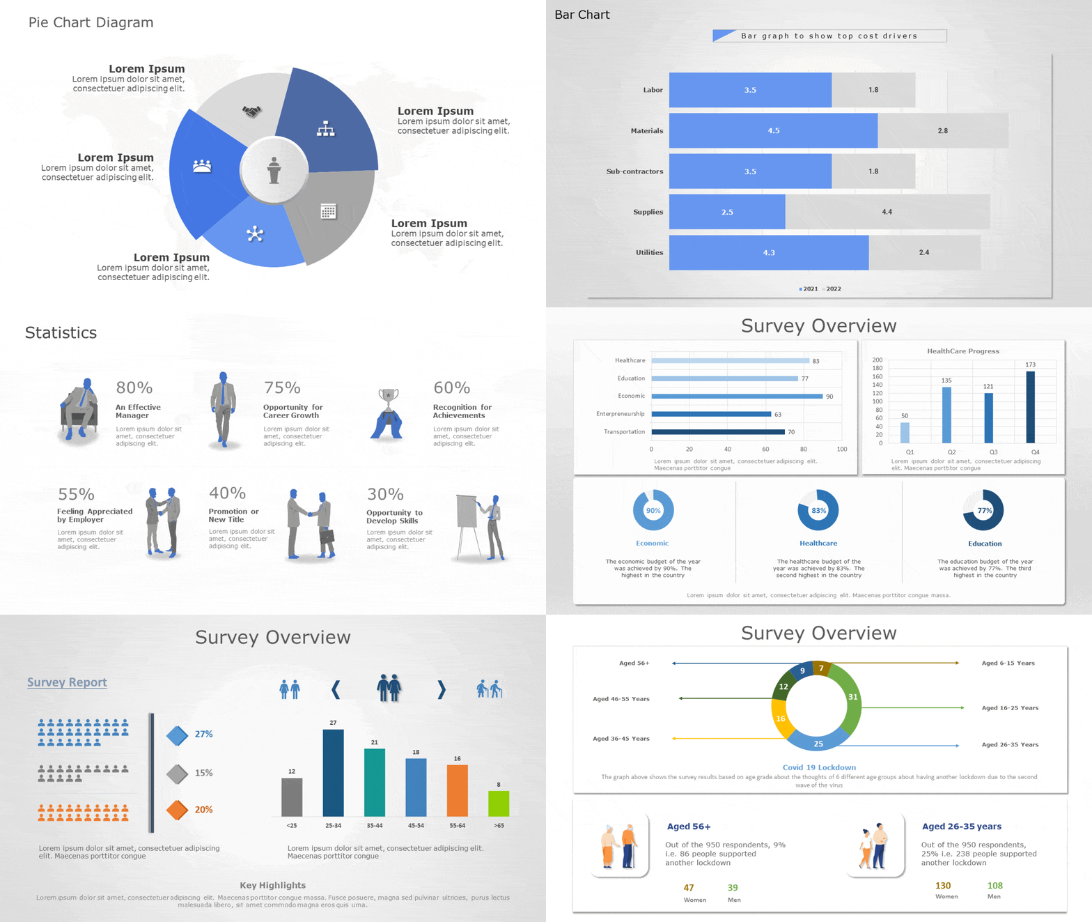
Using data is a powerful way to strengthen your argument while outlining an issue or explaining an ongoing scenario. Many presentations include statistics and data yet forget to ask the so what question or worse do not focus on the numbers that really matter.
Make statistics simple to understand when distributing them. Use the right table, number, infographic, or chart for the right purpose. For example, Tables are ideal for comparing a small number of statistics, but a bar chart or combo chart can make it easy to work with complex information.
SlideUpLift.com has several examples and templates of the right formats and tools to use when presenting data.
Pose Inquiries
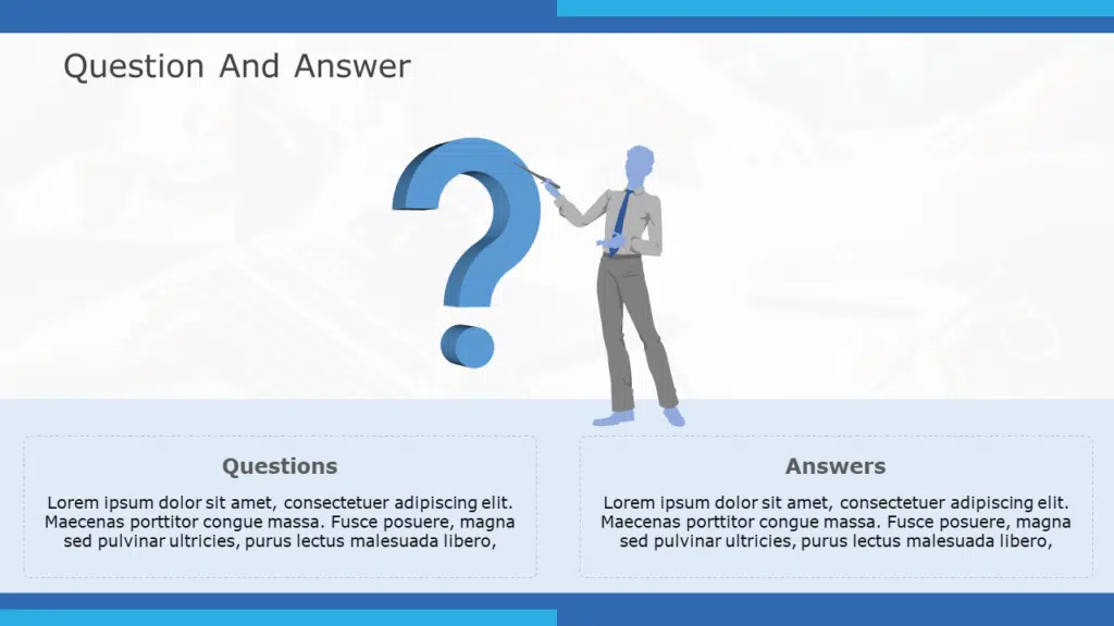
Questions and a highly interactive dialog is the hallmark of a great presentation. Smart presenters prompt their audience with questions and encourage a two-way discussion without losing focus on their core presentation content.
There are of course many ways to do this: formal, informal, batched to the end versus sprinkled throughout. The method you pick may be dependent our the context and your personal style. The important part is to ensure that the audience actively engages and participates in your session and you not only demonstrate receptivity to it but also encourage them to do so.
Use Color Without Fear
If you want your presentation to stand out, do not be afraid to use color. You should consider employing colors if you’re wondering how to make your PowerPoint presentation appealing. It would not be an overstatement to say that colors can change the way you and your presentation are perceived.
Although colors can make your slides more visually appealing, they can also turn viewers away if they are not properly blended or are too vivid. Please ensure the colors are pleasing to the eye; neither should they be very bright nor overly muted. Know more about the best colors for presentations.
Include Videos That Are Relevant to the Speech
Even if not everyone in your audience prefers videos to still images, some of them will. Videos give your debate life and can become incredibly interesting if they are completely relevant to the subject. Animations occasionally function perfectly. If you’re unsure, look at some animated PowerPoint templates examples.
You Should Send Printed Materials
When you send pre-reads, you are communicating your respect to your audience. People value pre-reads for a variety of reasons- some adore having the ability to be in the know and avoid surprises, some like taking printouts and having their questions ready while you present your slides, and some just like the respect endowed to them to send the material in advance and appreciate your readiness and punctuality.
So send the pre-reads. If you want certain parts to remain in suspense until the time of the presentation, send background material- anything that helps your audience prepare well for your presentation. You can read the blog to know how to convert google slides into pdf.
Keep Your Speech to No More Than 20 Minutes
People have a lot to do- we already talked about that. They may not be willing to give you a big slice as much as you might want to indulge. Ensure that you only talk about the pertinent issues and omit everything that does not support your position.
Even if your presentation is mighty entertaining, after 25 minutes, your audience will begin to lose interest. Give a brief, enthralling, focused presentation in under 20 minutes. If your audience wants more after your presentation, you will know you were successful. Know about storytelling in presentations by reading our blog.
Finalize Your Points With a Summary
Use the chance to reiterate the key topics you covered in your presentation toward the conclusion. Reminding your audience of what you have been talking about throughout should be the goal of your summary. Focus on the residual messages – what they must retain after forgetting everything else. Learn how to end a presentation to make a lasting impression.
Conclusion
No presenting concepts are known to work miracles. A presentation that engages the audience successfully, conveys the essential points and accomplishes the overall goal is the finest presentation.
Yet, designing professional presentations is a cumbersome job. At SlideUpLift, we work hard to help you make it easier to incorporate these concepts and make them work for you. SlideUpLift provides an extensive array of free presentation templates that can make your work easy. Select one according to your required designs and create engaging PowerPoint presentations.


