Product Description:
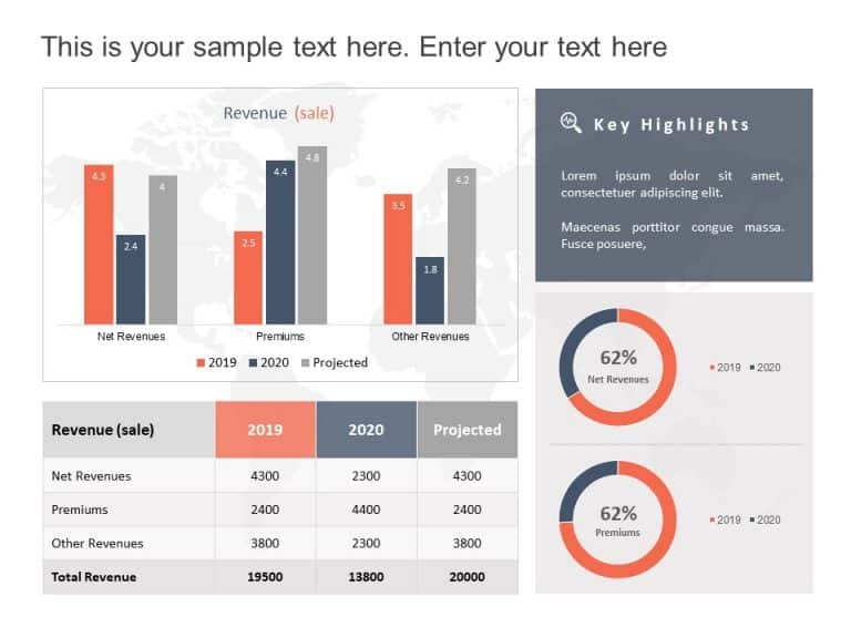
Enhance your presentations with this dynamic bar graph template that effectively showcases break analysis in an engaging manner! The sleek design and dark background highlight your data beautifully—ideal, for presentations and investment talks alike! With colors representing trends—blue for growths and orange, for declines—the audience can easily understand the financial patterns month by month.
This template is great, for professionals in the business field as it allows you to display performance figures and investment returns or assess project outcomes easily with each bar indicating changes, in your status in a simple and clear way.
Whether you’re sharing information, with stakeholders or presenting to your team or clients this tool is designed to assist you in delivering your message powerfully. Get it now. Enhance the effectiveness of your presentations effortlessly! Find more such Graphs & Charts PowerPoint templates for engaging presentations. These templates are compatible with both PowerPoint and Google Slides.


