Flat 4

 Edit with AI
 Ask Us To Edit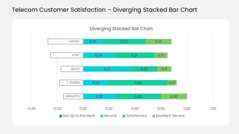

Product Description:
This diverging stacked bar chart compares customer ratings for five sample telecom carriers in one view. Each horizontal bar splits at a zero line, with negative feedback extending left and positive feedback extending right. Four color-coded levels run from dark blue for “Not Up to the Mark” through cyan and teal to light green. Data labels show each share, and the axis spans −0.40 to 1.00. A legend under the chart names all four response levels.
CX leads can use it to benchmark satisfaction against competitors or across regions. Market researchers can present Likert-scale survey results without five separate pie charts. Rename the carriers and update the shares to fit your own brands, products, or teams.
Find more chart templates for clear data visualization, or read how to present data in the best way before your next review. The template comes in 4:3 and 16:9 formats for PowerPoint and Google Slides.