Product Description:
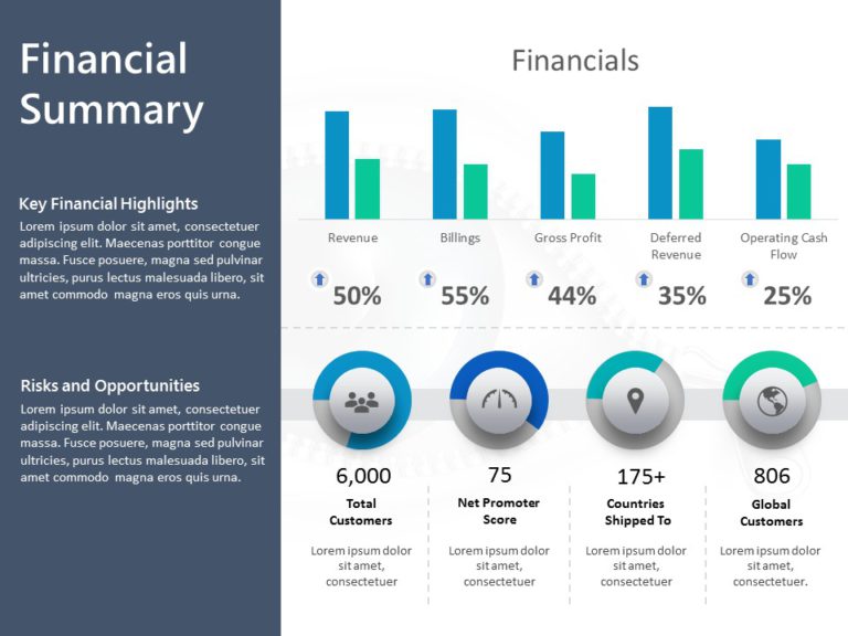
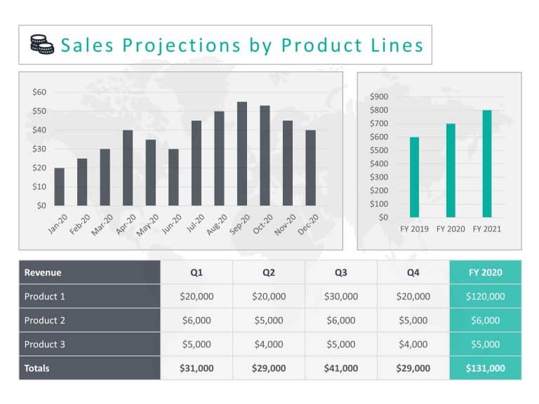
Make complicated concepts easier to understand using this 3D bar graph created for comparing financial products efficiently and effectively, in presentations or meetings related to finances and business operations the blue and gray color palette adds a touch of sophistication while aiding viewers in distinguishing between various products and years effortlessly.
With its user design, in mind. This presentation highlights the performance of the product across a span of three years to facilitate comparisons and engaging discussions for professionals in finance and marketing as well as product managers alike; serving as a valuable tool, for effectively communicating crucial information when delving into sales patterns or assessing the triumph of products.
Turn your information into captivating graphics that grab attention and guide choices effortlessly. Get it now to enhance your presentations with ease! Find more such Finance PowerPoint templates for engaging presentations. These templates are compatible with both PowerPoint and Google Slides.


