
 Fall Sale
  Flat 40% off on our Unlimited Access Yearly Membership plan!


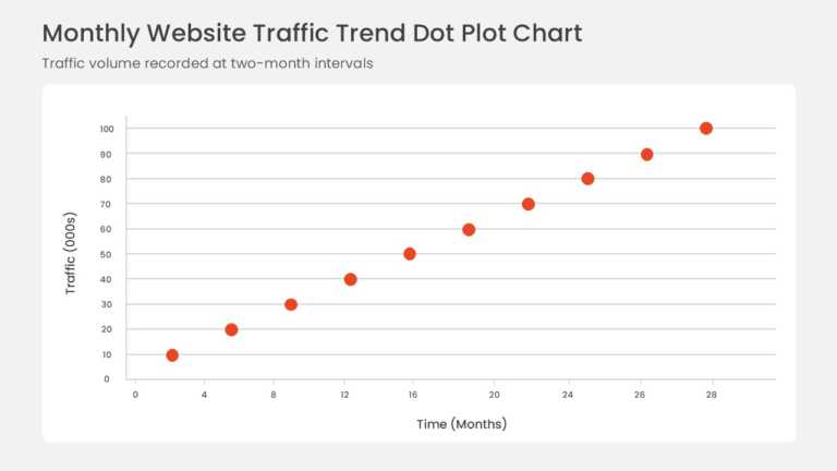
Data points plotted on horizontal and vertical axes form a scatter plot with a fitted linear trendline. The rising pattern shows a positive corre....


Opportunities are positioned on a bubble chart by market attractiveness and competitive position, and bubble size adds a third measure for revenu....
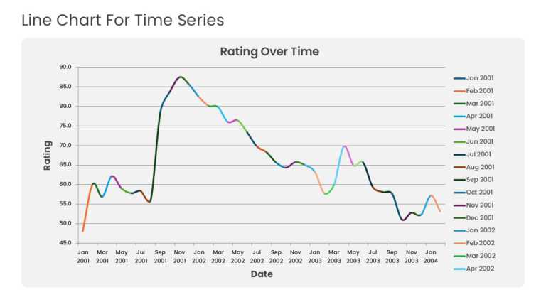
Multiple years of historical data run across a time-series line graph with point markers and gridlines. The layout highlights baseline momentum, ....
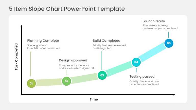
Five circular nodes climb an upward slope, tracking milestone completion across sequential delivery phases. The stages run from scope confirmatio....
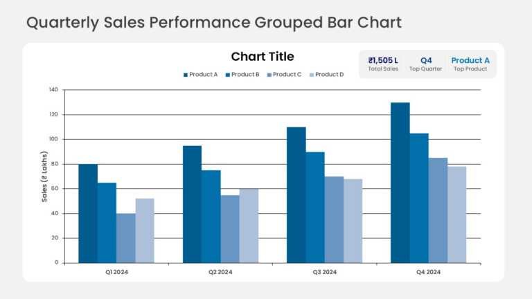
Grouped columns compare quarterly sales across several product lines, with one column per product in each quarter. KPI callout cards above the ch....
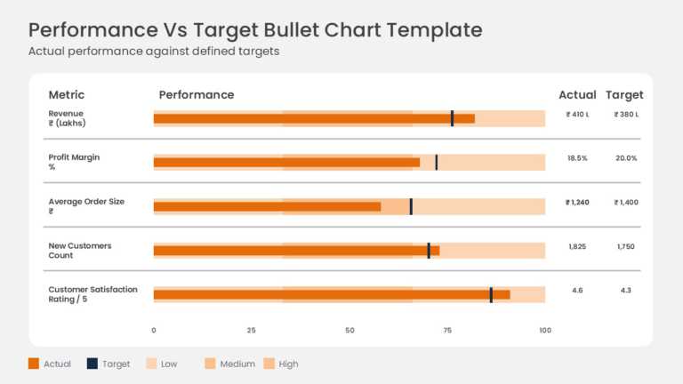
Actual results are measured against targets on horizontal bullet charts for metrics such as gross sales and operating margin. Each row combines a....
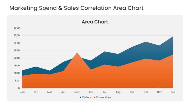
Overlapping area series compare marketing spend with sales revenue over consecutive periods. Translucent fills keep both series visible where the....
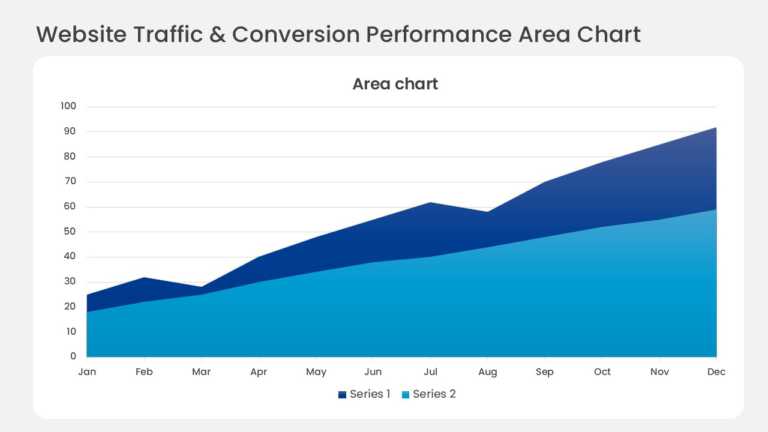
Layered bands in a monthly stacked area chart show website traffic by acquisition channel. The top edge tracks total visitors, and each colored b....
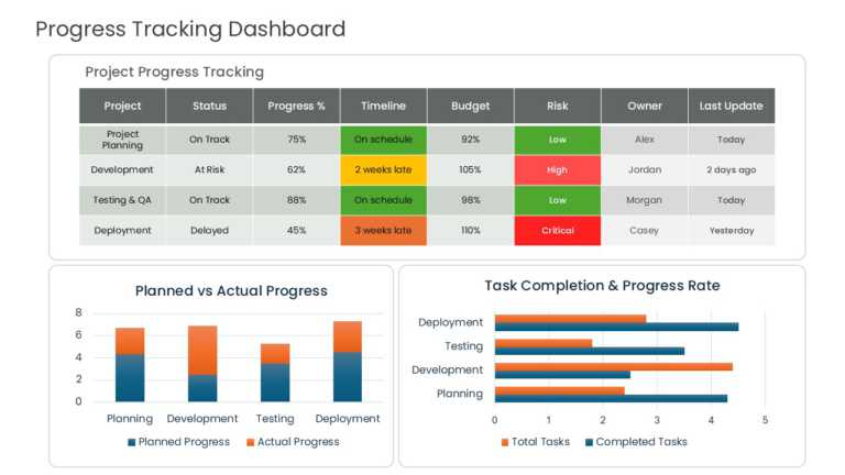
Planned and actual progress sit side by side in a multi-column dashboard table. Columns track task status, percent complete, schedule adherence, ....
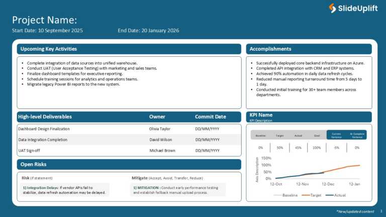
Maximize your impact with this comprehensive project overview template designed to keep your team aligned and informed. This visually appealing l....
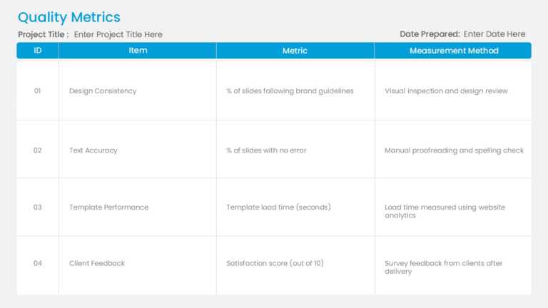
Enhance sharing information effortlessly with this all tool created for monitoring quality measurements ! This model offers an easy-to-follow for....

Enhance your narrative with this presentation template crafted for business reviews, purposefully tailored with a contemporary and polished aesth....
Related Presentations
-

KQI
9 templates>
-
1 Page Business Plan
34 templates>
-
Dashboard
157 templates>
-
Business
6,523 templates>
-
SWOT Analysis
131 templates>