Flat 4

 Edit with AI
 Ask Us To Edit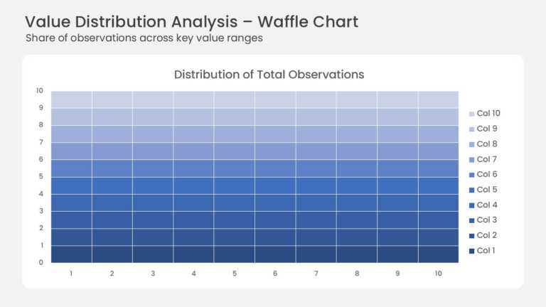

Product Description:
This waffle chart shows how a total splits across ten value ranges on a 10 × 10 grid. Each of the 100 cells stands for one percent of all observations. Ten horizontal bands shift from deep navy at the bottom to pale lavender at the top. A legend on the right lists each band, and thin white gaps separate every cell. The grid sits on a white rounded card under a headline and a short subtitle.
Waffle charts make percentages easier to read than pie slices, especially for non-technical audiences. Analysts can show survey response shares, market share, or budget allocation at a glance. Recolor one band to highlight a segment, and the grid tells the story on its own.
See more chart templates for data visualization, or read our guide to chart types and their uses to pick the right format. The template comes in 4:3 and 16:9 and works in PowerPoint and Google Slides.