 Fall Sale
  Flat 40% off on our Unlimited Access Yearly Membership plan!

World Map Templates for PowerPoint
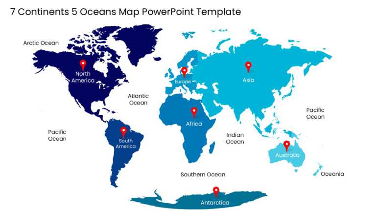
Designed for clarity and impact, enhance your presentations with this comprehensive world map template that showcases 7 continents and 5 oceans. ....


Use this animated world map template to visualize and communicate country-wise global data and insights with the help of cool morph animation. Th....

Enhance your presentation, with a timeline slide that highlights your global journey beautifully. This design includes an elegant horizontal map....

Company Reach Presentation Template Use this Company Reach PowerPoint template to create visually appealing presentations in any professional set....

Enhance your influence with this design that blends practicality and elegance seamlessly! This layout showcases a ruler form that is ideal, for p....

Create a story using this demographic distribution map design template tailored for professionals aiming to communicate customer information effi....

Enhance your presentations with a world map infographic tailored for displaying business locations effectively. This design incorporates a blend ....

Easily break down concepts using this versatile company profile template crafted for presentations! Ideal, for firms aiming to display their acti....

Start off by grabbing the interest of your audience, with this world globe template! Ideal for presentations related to business endeavors; this ....


Make complex concepts simple using this free map template‚ which is great for presenting geographic information‚ in a visually attractive way. Th....

Create a story using this captivating template made for presenting worldwide perspectives effectively and attractively displayed data insights.Th....

This eye catching data visualization template is perfect, for making a statement about insights. With its blue and green colors and detailed worl....
Related Presentations
-

Maps
506 templates>
-
India Map
9 templates>
-
Country Flags
23 templates>
-
US Maps
391 templates>
-
Demographics
101 templates>



Free world map templates
This collection includes free world map templates, full versions with all 195 countries editable, no watermark, working in PowerPoint, Google Slides, and SlideUpLift AI. Use the Free filter above the grid to see them.
What is a world map template for PowerPoint?
A world map template for PowerPoint is a slide in which all 195 countries are drawn as separate vector shapes rather than one flat image. You can recolor any country, add or remove country names, group countries into continents or custom regions, and resize the whole map without losing sharpness.
Which world map style do you need?
| Style | Use it for | Watch out for |
| World map with country names | Audiences unfamiliar with geography; education; market overviews | Labels become unreadable below ~24pt map height; hide names on small maps |
| Blank / outline world map | Quizzes, worksheets, “fill it in live” workshops, minimalist decks | Add a legend if you color regions; blank maps carry no context |
| Global map with location pins | Office locations, international footprint, expansion story | More than ~25 pins collide at world scale; switch to coloring countries |
| Continents-colored world map | Regional revenue splits, EMEA/APAC/Americas structures | Define your region boundaries; “EMEA” isn’t a continent |
| Dotted / pixel world map | Modern title slides, tech and startup decks | Individual small countries may not be selectable as dots |
| World map background | Section dividers, title slides, agenda pages | Wash it out (60-80% transparency or a light overlay) so text stays readable |
| Animated world map | Revealing markets one by one as you speak | One appear-animation per region; anything fancier distracts |
How do you highlight countries or continents on a world map slide?
- Click any country on the map. It selects as its own shape.
- Hold Shift and click to add more countries to the selection.
- Open Shape Format > Shape Fill and apply one color to the whole selection.
- To reuse a region, group it: select the countries, right-click > Group. One click selects the whole region from then on.
- To label a region, insert a text box and, if the region is small, a leader line from Insert > Shapes.
For continent-level coloring, most templates in this collection ship with continents pre-grouped. Click once for the continent, twice for a single country inside it.
Which world map projection works best on slides?
| Projection | Looks like | Choose it when | Trade-off |
| Mercator | The familiar web-map look | Audience recognition matters most | Severely inflates Greenland, Canada, Russia; Africa looks far too small |
| Robinson | Gently curved, balanced | General business presentations: the safe default | Everything is slightly distorted, nothing badly |
| Equal Earth / Gall-Peters | True relative country sizes | Data maps where area implies magnitude | Shapes look stretched and unfamiliar to most audiences |
If you’re coloring countries by a data value, avoid Mercator. It visually exaggerates high-latitude countries and your audience will read Russia’s area, not Russia’s number.
Can you use a world map as a slide background?
Yes. Place the world map on the slide, then reduce its transparency to 60-80% or add a semi-transparent white or dark rectangle over it so title text stays readable. Keep the map behind all content: right-click > Send to Back. For recurring use, add it to the Slide Master so every new slide inherits it.
Presenting to an international audience? Check the borders
World maps encode political positions. Before presenting across regions, check how your map draws Kashmir, Taiwan, Western Sahara, Crimea, and the South China Sea. Different audiences expect different borders, and several countries legally mandate specific depictions.
Because every border on these templates is an editable shape, you can adjust a depiction for a specific audience. When in doubt, color by region rather than tracing precise boundaries, and avoid using disputed borders as decoration.
Do these world maps work in Google Slides?
Yes. Upload the .pptx to Google Drive and open it with Google Slides. Countries stay individually selectable and recolor through Fill color.
Is there a blank world map without labels?
Yes. The collection includes blank and outline world maps, and any labeled map becomes one by deleting its text layer.
Can I animate the map to reveal regions one at a time?
Yes. Because each country is a shape, apply an Appear or Fade entrance animation per country or per grouped region, ordered in the Animation Pane.
Can I remove or edit the country names?
Yes. Country names are text boxes, separate from the country shapes. Delete them all, edit individual names, or restyle them without touching the map.
Can I edit a world map without PowerPoint?
Yes. Open any of these maps in SlideUpLift AI and countries remain selectable in the browser; export to .pptx when done.
How many countries do these world maps include?
All 195, the 193 UN member states plus two observer states. Small island nations are included but may need zooming to select.