
 Flat 4


 Edit with AI
 Ask Us To Edit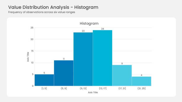

Product Description:
Six adjacent bars form the histogram with no gaps between them. Bin ranges run from [1, 5] up to (21, 25] along the horizontal axis. Frequencies read 5, 11, 23, 24, 9, and 4 above each bar. A blue gradient lightens from left to right, and the peak sits in the (13, 17] bin at 24 observations.
A histogram shows shape, not just totals, so skew and spread become obvious. Quality teams, researchers, and analysts use it for cycle times, test scores, and response distributions. The labeled bars let an audience read exact counts without squinting at the axis.
Find more chart templates built for data visualization when another view fits your dataset. Our walkthrough on making a chart in Google Slides covers the setup steps. The download includes 4:3 and 16:9 versions, and every bin stays editable in PowerPoint & Google Slides.