
 Flat 4


 Edit with AI
 Ask Us To Edit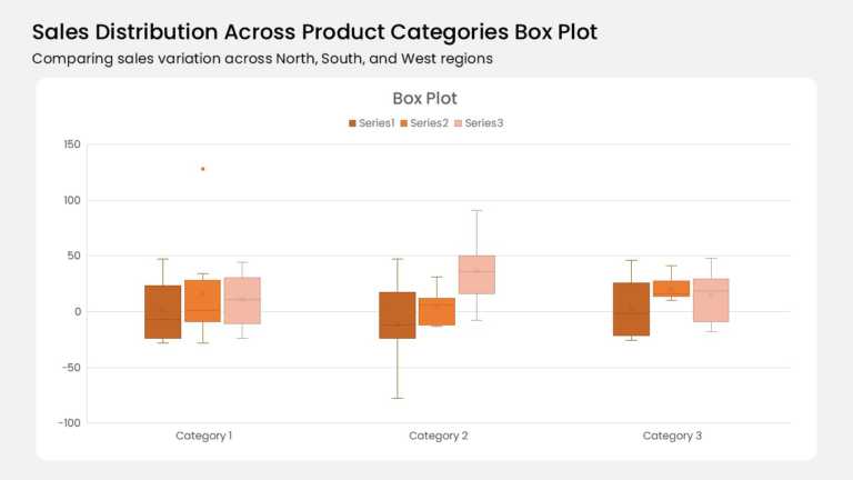

Product Description:
Three category groups anchor this box plot, and each group holds three color-coded boxes. A burnt orange, mid orange, and pale peach series run left to right. Whiskers extend from every box, and an X marks each mean. One outlier dot floats above Category 1, and the y-axis spans -100 to 150.
Analysts reach for box plots when averages hide the real story. This layout suits sales variance reviews, regional performance readouts, and quality control updates. Operations leads and data teams can show median, spread, and outliers in one glance.
Browse our chart templates built for data visualization for more ways to plot your numbers. Our guide to chart types and their uses explains when a box plot beats a bar. The download includes 4:3 and 16:9 versions, and every box, whisker, and label stays editable in PowerPoint & Google Slides.