
 Flat 4


 Edit with AI
 Ask Us To Edit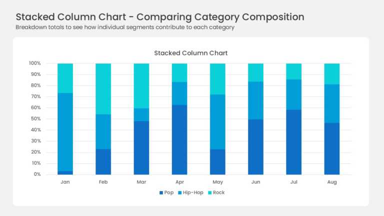

Product Description:
Eight full-height columns run from January to August, each one normalized to 100 percent. Three blue series divide every column: deep navy Pop, bright azure Hip-Hop, and cyan Rock. The percentage axis steps in tens from 0 to 100 percent. A legend labels all three series below the plot area.
Percentage stacking answers a share question that raw totals cannot. Analysts use it for market share shifts, revenue mix, and channel contribution over time. Strategy and finance leads can read composition change month by month at a glance.
See the wider collection of chart templates when a different cut fits better. Our post on telling a story with data offers six practical angles. Both 4:3 and 16:9 ship with the file, and every segment stays editable in PowerPoint & Google Slides.