Flat 4

 Edit with AI
 Ask Us To Edit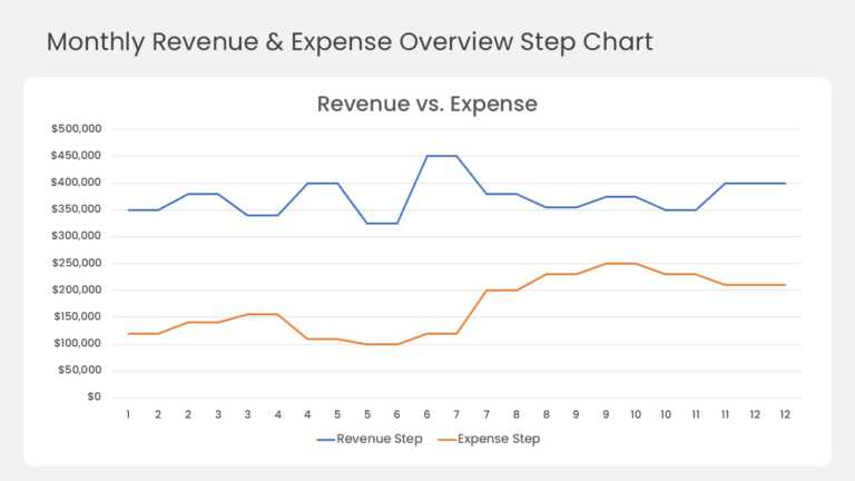

Product Description:
This step line chart compares monthly revenue and expenses across a full 12-month year. A blue revenue line and an orange expense line run across a white card on a light grey slide. Each series holds a flat plateau for the month, then shifts to its next level. The dollar axis runs from $0 to $500,000 in $50,000 steps. A legend under the chart labels both series.
Revenue peaks at $450,000 in month six, while expenses climb from month seven onward. Finance leads can use it to show how rising costs squeeze the margin over the year. CFOs, FP&A analysts, and founders can drop it into monthly reviews, budget meetings, or board updates.
Explore more PowerPoint chart templates for data visualization, or browse our financial presentation examples for ideas. The template comes in 4:3 and 16:9 and works in PowerPoint and Google Slides.