
 Fall Sale
  Flat 10% off on our Unlimited Access Yearly Membership plan!


PowerPoint Map Templates

Easily turn your data into insights using this set of editable US maps that cater to professionals, across different industries. These templates ....


Explore a range of Europe map templates that can enhance your presentations and convey your ideas effectively! This diverse collection includes m....

Start engaging your audience by showcasing this array of customizable maps of Asia! Ideal, for teachers in the classroom or boardroom professiona....

This appealing map template is perfect, for impressing stakeholders with data presentation strategies! The map showcases England in a teal color.....

Create a story using this captivating insights map tailored for presenting customer information throughout Russia effectively. This attractive de....

The Product Launch Timeline Map Template is designed to illustrate the timeline of a product launch, showing the different stages of the process ....

Use South Carolina Map 1 PowerPoint Template to make impactful presentation.

Elevate your presentations with this cutting edge template, for analyzing UAE maps at a glance!. Ideal for professionals aiming to deliver inform....

Enhance your presentations with this captivating map template tailored for displaying locations effectively and engagingly! With its contemporary....

Share your vision using this interactive map locations template tailored for highlighting areas, in Germany! Great for professionals in the busin....

Easily break down concepts using this versatile company profile template crafted for presentations! Ideal, for firms aiming to display their acti....
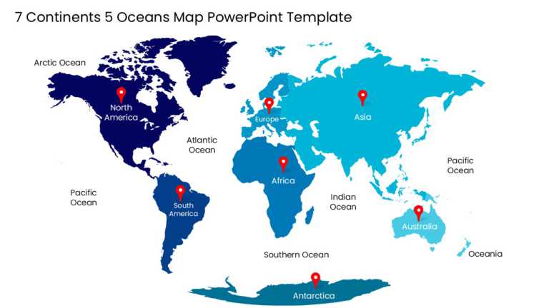
Designed for clarity and impact, enhance your presentations with this comprehensive world map template that showcases 7 continents and 5 oceans. ....
Related Presentations
-

World Maps
29 templates>
-

India Map
9 templates>
-
Country Flags
23 templates>
-

US Maps
390 templates>
-

Demographics
101 templates>
What is a PowerPoint map template?
A PowerPoint map template is a slide file in which each country, state, or region is a separate vector shape rather than a flat image. Because the regions are individual objects, you can select one, change its fill color, add a label, or move it — without rebuilding the map or editing the file in external software.
Map template vs. PowerPoint’s built-in Map chart
| Built-in Map chart | Map template in PowerPoint | Map template in SlideUpLift AI | |
| Where to find it | Insert → Chart → Map | Downloaded .pptx file | Browser — no download |
| Software requirement | Microsoft 365 or PowerPoint 2019+ | Any PowerPoint version | None; runs in browser |
| Internet required | Yes — creating or updating connects to Bing | No | Yes |
| Region selection | Not possible — chart is one locked object | Every region is a separate shape | Every region is a separate shape |
| Can you ungroup it | No | Yes | Yes |
| Recolor one region | Only via data value | Directly, via Shape Format | Directly, or by AI instruction |
| Move or resize a region | No | Yes | Yes |
| Apply brand colors | Manually | Manually | Automatically, via saved Theme |
| Street addresses / lat-long | Not supported — regions only | N/A | N/A |
| Attribution watermark | Bing and Microsoft credits render in corner | None | None |
| Export to .pptx | Native | Native | Yes |
When the built-in chart is the better choice: you have a clean table of region names and numeric values, you want a straight choropleth, and you’re on Microsoft 365 with a connection. It’s faster than downloading anything.
When you need a template: you’re highlighting specific markets rather than shading by value, you’re building a sales territory map, you need it to work offline or in an older PowerPoint build, or you need to place the map inside a designed layout rather than a chart frame.
Can you edit a map template without opening PowerPoint?
Yes. Every map in this collection opens in Creatos AI, SlideUpLift’s browser-based slide editor. Regions stay individually selectable, so you can click a country and recolor it inline without downloading the file. You can also describe the change in plain language — recolor a region, relabel it, or apply your brand palette — and export the finished slide to PowerPoint.
What you can do in the editor:
- Edit regions inline. Click any country, state, or region and change its fill, label, or position in the browser.
- Instruct the AI in plain language. Describe the change you want rather than clicking through format panels.
- Apply a saved brand Theme. Set your colors, fonts, and logo once in Theme Designer, then apply them to any map slide so it matches the rest of your deck.
- Export to .pptx. The map arrives in PowerPoint with regions still editable as shapes.
Slide editing in Creatos is included with selected membership plans.
Which type of map slide do you need?
| Map type | Use it for | Avoid it when |
| Choropleth (filled) | Shading regions by a single numeric value — revenue, population, adoption rate | Comparing more than one metric at once |
| Pin / marker map | Office locations, store footprint, distribution hubs, event venues | You have more than ~25 points; markers collide |
| Territory map | Sales coverage, rep assignment, service regions | Boundaries don’t follow official region lines |
| Flow / route map | Supply chains, logistics routes, migration, expansion sequence | Routes cross heavily and the slide becomes unreadable |
| Hex / tile grid map | Comparing regions fairly, where small regions get visually lost | The audience needs to recognize real geography |
| Data-overlay infographic | Combining a map with KPIs, callouts, and text | The geography itself is the point |
How do you insert a map in PowerPoint?
Using a template:
- Download the .pptx file and open it in PowerPoint, Google Slides, or Canva.
- Click the region you want to change. It selects as an individual shape.
- Open Shape Format → Shape Fill and choose your color.
- Hold Shift and click to select and recolor several regions at once.
- Click any text box to replace the label.
- Copy the finished map onto your own slide, or replace the template’s placeholder text.
Using the built-in Map chart:
- Go to Insert → Chart, select Map from the left-hand list, click OK. On Windows you can press Alt, N, C, 1.
- A small Excel grid opens. Enter region names in column one and numeric values in column two.
- Close the grid. PowerPoint shades the regions by value.
- Use Chart Design → Change Colors to adjust the palette, and Add Chart Element for legends and data labels.
- To show only regions you supplied data for: Format Data Series → Map area → Only regions with data.
Requires Microsoft 365 or PowerPoint 2019 or newer, plus an internet connection. Some perpetual-license builds don’t include the Map chart at all.
How do you color-code a map by data value?
Select the region shape, open Shape Format → Shape Fill, and apply a color from a graduated scale — for example, four shades of one hue from lightest to darkest. Add a legend on the slide mapping each shade to its value range so the audience can read it without narration.
Use a single-hue sequential scale for one metric that runs low to high. Use a two-color diverging scale only when there’s a meaningful midpoint, such as growth versus decline against a zero baseline.
What map colors should you avoid?
Avoid red-green scales. Roughly 1 in 12 men and 1 in 200 women have red-green color vision deficiency, which makes those two shades hard to distinguish. Blue-orange and purple-green scales carry the same contrast without the problem.
Three more rules that hold up in a boardroom:
- Don’t use more than five shades in one scale. Beyond five, viewers can’t reliably map shade back to legend value.
- Never encode a value by hue alone. Add a label, a number, or a pattern so the map survives greyscale printing and projector color shift.
- Keep non-data regions neutral. Light grey for regions outside your dataset — colored regions should mean something.
When do you not need a map template?
Skip the template and use something else if:
- You’re plotting street addresses or coordinates. Neither PowerPoint map templates nor the Map chart handle lat-long or street-level data. Use Excel’s 3D Maps or Power BI, then screenshot the result.
- Your map needs to update when the data changes. Templates are static. Link a Power BI visual instead.
- You need genuine interactivity — clickable regions that navigate. PowerPoint hyperlinks on shapes will do simple navigation, but anything more needs dedicated software.
- You only need one region highlighted on a world map. That’s a two-minute job with a shape and the Merge Shapes tool. A template is overkill.
- Your audience doesn’t need geography at all. If the point is “these five markets grew,” a bar chart communicates it faster than a map. Maps are for showing spatial relationships — adjacency, distance, coverage, spread. If none of those matter to your argument, don’t use a map.
How many regions do common map templates include?
| Map | Editable regions |
| World map (countries) | 195 |
| United States | 50 states + DC |
| Europe | 44 countries |
| Africa | 54 countries |
| Asia | 48 countries |
| South America | 12 countries |
| United Kingdom | 4 nations |
| India | 28 states + 8 union territories |
| Canada | 10 provinces + 3 territories |
| Australia | 6 states + 2 territories |
Are these map templates editable in Google Slides?
Yes. Upload the .pptx to Google Drive and open it with Google Slides. Region shapes stay individually selectable, and you recolor them through Fill color in the toolbar.
Can I highlight multiple regions at once?
Yes. Hold Shift, click each region, then apply a fill color to the whole selection.
Can I add my own data labels?
Yes. Every template includes editable text placeholders, and you can insert additional text boxes anywhere on the map.
Will the map keep my brand colors?
Yes. Save your colors, fonts, and logo as a Theme in Creatos, then apply it to any map slide so it matches the rest of your deck.
Do I need PowerPoint 2019 or Microsoft 365?
No. Map templates are ordinary vector shapes and work in any PowerPoint version. The version requirement applies only to PowerPoint’s built-in Map chart.
Do these work offline?
Yes. The templates contain no external data connections. The built-in Map chart is the one that needs an internet connection, because it queries Bing.
Do I need to download the file to edit a map?
No. Open it in Creatos AI and edit regions directly in your browser, then export to .pptx when you’re finished. Downloading and editing in PowerPoint remains an option.