 Fall Sale
  Flat 40% off on our Unlimited Access Yearly Membership plan!

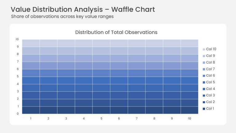
This waffle chart shows how a total splits across ten value ranges on a 10 × 10 grid. Each of the 100 cells stands for one percent of all observa....


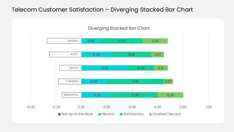
This diverging stacked bar chart compares customer ratings for five sample telecom carriers in one view. Each horizontal bar splits at a zero lin....
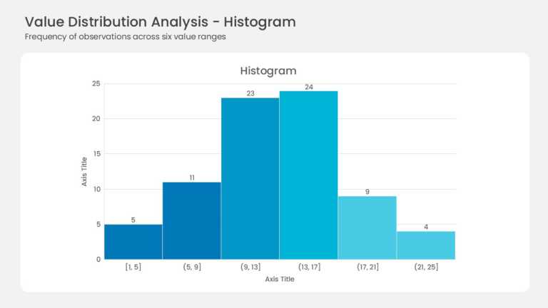
Six adjacent bars form the histogram with no gaps between them. Bin ranges run from [1, 5] up to (21, 25] along the horizontal axis. Frequencies ....
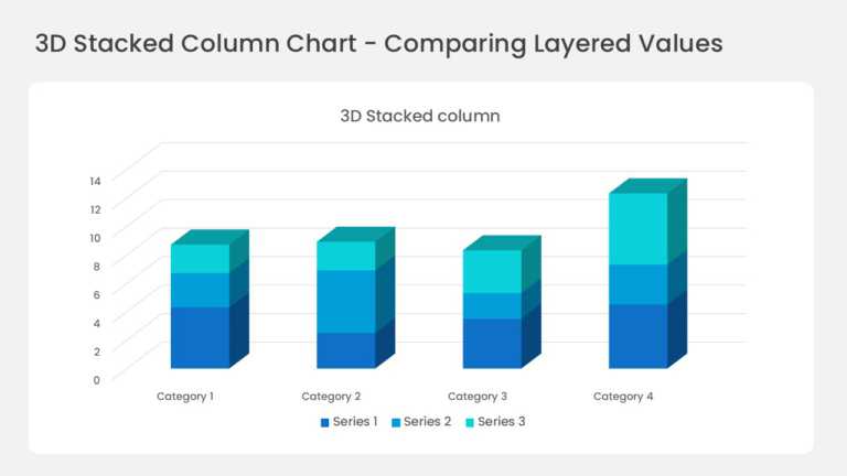
Four three-dimensional columns sit on a perspective floor with gridlines running back into the wall. Each column stacks three series in deep blue....
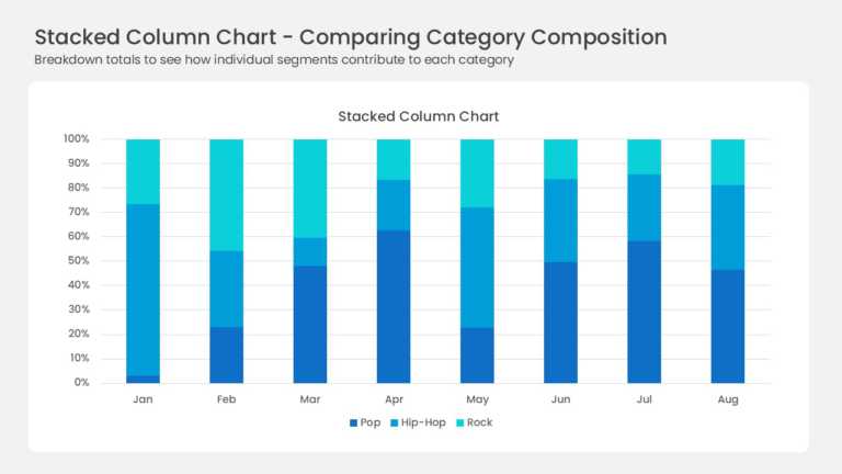
Eight full-height columns run from January to August, each one normalized to 100 percent. Three blue series divide every column: deep navy Pop, b....
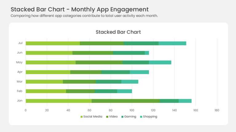
Seven horizontal bars stack four data series across the months January through July. Yellow-green, medium green, teal, and mint segments mark Soc....