
How To Create Infographics In PowerPoint For Smarter Visual Storytelling?
As a professional, you might have to host meetings and deliver presentations to your stakeholders and team members. As a host, it’s crucial to deliver presentations in a way that engages your audience and helps them understand the fundamental concepts of the meeting. You surely want to avoid a meeting where half of the team members are clueless and sleepy, right? This is exactly why you must learn how to create infographics in PowerPoint.
We will teach you everything about infographics- from their importance to creation. After reading this blog, you can deliver engaging presentations at your work.
What Is An Infographic?
An infographic is a collection of images, charts, and minimal text that provides an easy-to-understand overview of a topic. Infographics use striking, engaging visuals to communicate information quickly and clearly. Regular texts become dull to the audience. People tend to skim your content rather than actually read it. And infographics help in doing this.
Infographics are the way forward now for all heavy-duty business presentations, as they use appealing, winning visuals to convey complicated information quickly and clearly.
Humans, by nature, tend to be drawn towards visuals more than huge blocks of data; hence, Infographics are an effective storytelling medium. Infographic design templates in business can be used for any presentation, from preparing annual reports and creating pitch decks to showing basic business processes and flow with graphics, diagrams, and icons.
Check out the following sections to learn how to make an infographic in PowerPoint.
What Is The Importance Of Infographics In Business Presentations?
Here’s why infographics are a game-changer for business presentations:
- Simplifies complex information: Nobody wants to decode your spreadsheet. A well-designed infographic makes your data instantly understandable, like showing a map instead of giving directions.
- Boosts audience engagement: We’ve all suffered through “death by PowerPoint.” Infographics are your escape plan – they give tired eyes something refreshing to look at while making your points stick.
- Improves information retention: Most of your presentation will be forgotten by tomorrow. But that clever visual metaphor you used? That’s what people will remember next week.
- Saves presentation time: Why waste precious minutes explaining what a simple chart could show in seconds? Your audience gets it faster, and you get to finish on time for once.
- Strengthens brand image: Those polished visuals do more than look pretty – they silently scream “we know what we’re doing” before you’ve said a word.
- Highlights key points: Your audience shouldn’t have to play detective to find the important stuff. A good infographic puts the spotlight right where it belongs.
Think of infographics as your presentation’s highlight reel – they take the messy reality of your data and turn it into something people actually want to see.
How To Create Infographics In Powerpoint?
Step-By-Step Guide: How To Create A Infographic In PowerPoint With SmartArt:
Creating infographics in PowerPoint doesn’t have to be complicated—seriously, your secret weapon is already hiding in plain sight. SmartArt turns “design panic” into “I’ve got this” in minutes. Here’s how to make it work for you:
- Step 1: Open a New Slide: Kick things off with a blank presentation—no templates, no clutter. Think of it as your creative playground.
- Step 2: Insert SmartArt: Click Insert → SmartArt. Feeling stuck? Hover over layouts to preview them live. Pro tip: “Cycle” works for workflows, “Hierarchy” for org charts—pick what fits, not what’s pretty.
- Step 3: Enter Your Content: Ditch full sentences. Feed it punchy fragments:
- Don’t: Customer satisfaction increased by 40%
- Do: 40% happier customers
- Step 4: Customize Colors and Styles: Under SmartArt Design, tweak colors like you’re dressing for the occasion:
- Colorful: energetic startup vibe
- Monochromatic: sleek corporate mood
- Step 5: Add Icons or Images: Hit Insert → Icons for visual shortcuts. A tiny bulb icon screams “idea!” faster than text ever could.
- Step 6: Adjust Layout and Spacing: Hold ALT while dragging to fine-tune spacing. Crowded? Kill filler—white space is oxygen for your infographic.
- Step 7: Final Touches: Do the squint test: Blur your eyes. What pops? That’s your hero element. Align text (Format → Align), check fonts, and breathe—you just made something awesome.
Remember: Your first draft is supposed to look rough. Tweak, walk away, tweak again—it’ll click.
The best infographics aren’t designed – they’re refined. Your first version is just the starting point. Keep tweaking until it feels right.

Step-By-Step Guide: How To Create An Infographic In PowerPoint Without SmartArt:
You don’t need SmartArt to create infographics in PowerPoint—just grab basic shapes, icons, and text boxes. Think of it like building with LEGO: total freedom, zero limits. Here’s how:
- Step 1: Open a Blank Slide: Start fresh. A blank slide is your playground—no templates, no rules.
- Step 2: Plan Your Layout: Sketch a quick doodle: Should info flow top-to-bottom? Left-to-right? Sections? Pro tip: Scribble it on sticky notes first.
- Step 3: Insert Shapes: Insert → Shapes → grab circles, arrows, rectangles. Use them as:
- Containers for stats (circle + number)
- Connectors for flow (arrows between boxes)
- Visual metaphors (a pie shape = market share)
- Step 4: Add Text Boxes: Insert → Text Box → type punchy phrases. Crucial: 7 words max per box.
- Don’t: Our Q3 growth increased by 22%”
- Do: Q3: 22% growth”
- Step 5: Use Icons and Images: Insert → Icons → search for visual shortcuts. Example:
- Lightbulb = idea
- Rocket = growth
- Puzzle = solution
- Step 6: Apply Colors and Styling: Right-click shapes → Format Shape:
- Colors: Pick 2–3 max (use your brand palette!).
- Transparency: 10–20% on large shapes for depth.
- Effects: Tiny shadows = instant polish.
- Step 7: Align and Organize: Select elements → Format → Align:
- Align Left/Right: No crooked text boxes.
- Distribute Vertically/Horizontally: Even spacing using grids = pro look.
- Hold ALT while dragging to nudge things pixel-perfect.
- Step 8: Review and Finalize: Zoom out to 50% view:
- Does your eye flow naturally?
- Any clutter? Delete it.
- Colors clash? Mute one.
- Grumpy colleague test: Show it quickly—if they “get it” in 3 secs, you nailed it.
Your first draft will look rough—that’s normal! Tweak, take coffee breaks, and polish ’til it feels right. You’ve got this.
What Are The Different Types Of PowerPoint Infographics?
Infographics come in many styles, each designed to present information in a visually engaging way. From timelines to statistical charts, infographic elements serve a unique purpose in presenting data points and making your PowerPoint presentations more impactful and easier to understand.
- Informational Infographic:
- Your go-to for turning dry facts into “wow!” moments.
- Perfect when you need to simplify reports, case studies, or complex ideas.
- Runs on icons, bold headlines, and bite-sized text—no fluff allowed.
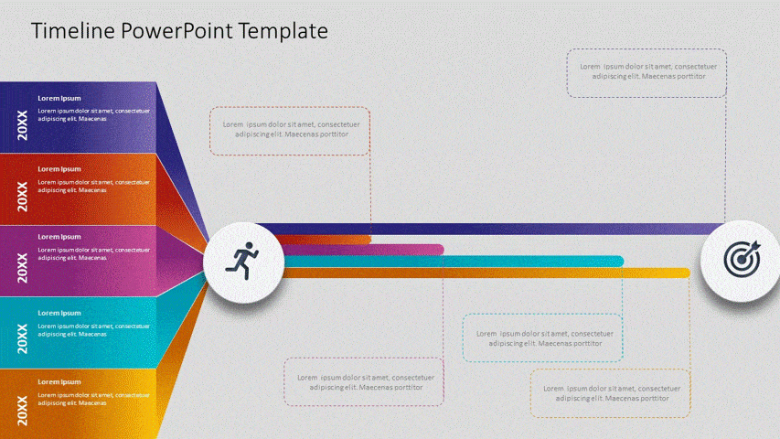
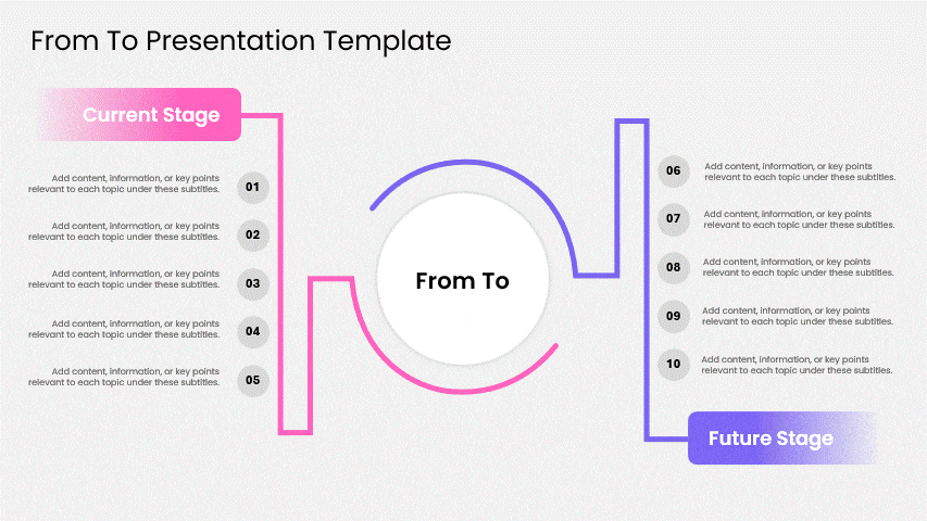
- Timeline Infographic:
- Storytelling with deadlines.
- Chronology made visual: project milestones, company history, or growth journeys. Think arrows, dates, and clean lines that guide eyes like a roadmap.
- Animated Infographic:
- Where PowerPoint magic happens.
- Morph, fade, or zoom key stats into focus—ideal for keeping distracted audiences hooked. (Pro tip: Subtle moves > seizure-inducing strobes.)

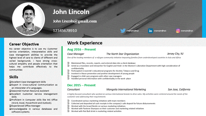
- Resume Infographic:
- When your LinkedIn needs a glow-up.
- Ditch the Word doc. Showcase skills, wins, and career paths visually with flowcharts.
- Bonus: Recruiters spot your superpowers faster.
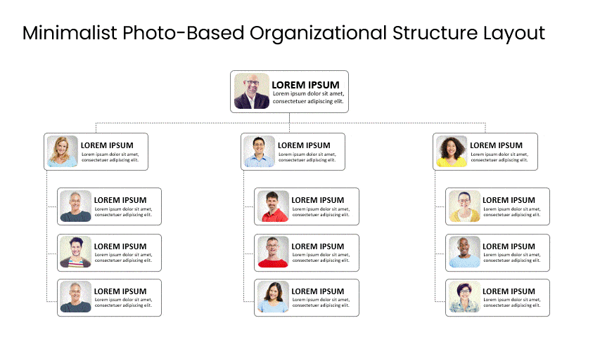
- Hierarchical Infographic:
- Org charts that don’t suck.
- Clarifies “who reports to whom” or decision layers. Top-down flow = less “Wait, whose boss is this again?”
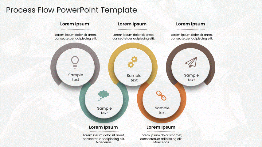
- Process Infographic:
- Your how-to guide, minus the confusion.
- Breaks workflows into numbered, arrow-connected steps. Use it for training, onboarding, or IKEA-style assembly instructions.
- Geographic Infographic:
- Maps that tell data stories.
- Heatmaps, regional stats, or global trends—make location-based insights instantly obvious. (No geography degree required.)

- Comparison Infographic:
- The “versus” showdown.
- Pit options side-by-side (products, plans, features). Helps teams decide fast with icons, percentages, and cheeky pros/cons.
- List Infographic:
- Bullet points’ cooler cousin.
- Action items, tips, or takeaways—organized with numbers/icons so they actually get used.

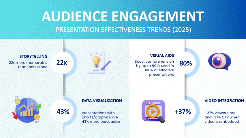
- Statistical Infographic:
- A data geek’s dream.
- Turns spreadsheets into visual stories: bars, pies, and big bold numbers that make trends pop.
What Are The Best Tips For Creating Effective Infographics In PowerPoint?
- Keep It Simple: Cut the noise. If it doesn’t directly support your core message, ditch it. Think “billboard,” not novel—your audience should get it in 3 seconds flat.
- Use Consistent Branding: Your colors/fonts are your signature. Stray, and you look amateur; stick to them, and you build instant credibility (while making your marketing team proud).
- Highlight Key Points: Make critical data unmissable. Try:
- Bold color pops on key stats
- Arrows pointing to “the big number”
- Icons that scream “look here!” (Your eyes naturally follow these cues.)
- Choose the Right Visuals: Match the visual to the story and have a little fun with your design choices.
- Trends over time? → Line chart
- Part of a whole? → Pie chart
- Compare options? → Bar graph
- Maintain Readability: If they’re squinting, you’ve lost. Test drive your design:
- Font size: 18pt+ for body, 30pt+ for headlines
- Color contrast: Dark text on light background (or vice versa)
- Icons: Should read clearly at thumbnail size
Pro tip: Throw your infographic on a projector before presenting. If the back row can’t see it, neither can your audience’s patience.
How Can You Use Infographics In PowerPoint For Real-World Business Needs?
Stop drowning people in data. Turn your 20-page report into a snackable visual—highlight wins with bold stats, trace progress on a timeline, and use icons to spotlight winning moments. Your audience will actually remember the punchline.
- Pitching Ideas and Announcements: Got a new product or big initiative? Skip the rambling intro. An infographic shows:
- Why it matters (market gaps, pain points)
- How it works (clean process flow)
- Why now (launch timeline + upside)
- Pro tip: Make your competitor comparison brutally visual.
- Internal Training and Onboarding: New hires glazing over? Swap policy PDFs for:
- Process cheat sheets (with icons + arrows)
- Culture visuals (values = emoji + short quotes)
- Org maps (who does what, minus the confusion). Cuts “where do I?” questions by half.
- Aligning Teams on Strategy: If your strategy deck feels like herding cats, try:
- Goal pyramids (big vision → quarterly targets)
- KPI scorecards (traffic-light status updates)
- Action roadmaps (who owns what by when). No more “wait, what’s priority?” meetings.
Infographics work because they meet people where they are—overwhelmed, distracted, and craving clarity. Show, don’t tell.
Conclusion
Infographics make your new presentation effective and audience-engaging; therefore, the next time there is a soul-crushing business presentation, make sure you use Infographic Templates to leave an impression on your audience. This blog taught you how to create infographics in PowerPoint.
Try out SlideUpLift’s presentation templates, specifically designed to meet all the needs of business professionals for building business presentations.
FAQs
-
What Are The Key Elements Of A Good Infographic?
A good infographic should have a clear and concise message, a visually appealing design, relevant data visualizations, and a logical flow of pertinent information. Key Elements of a Good Infographic:
- Clear Objective – Defines the main message or takeaway.
- Engaging Headline – Captures attention instantly.
- Concise Content – Keeps text short and impactful.
- Relevant Visuals – Uses icons, images, or charts to support the message.
- Logical Layout – Organizes information in an easy-to-follow flow.
- Consistent Style – Maintains uniform fonts, colors, and design elements.
- Accurate Data – Ensures facts and figures are correct and credible.
- Balanced White Space – Avoids overcrowding for better readability.
-
What Common Mistakes Should I Avoid When Making Infographics In PowerPoint?
Common Mistakes to Avoid When Making Infographics in PowerPoint:
- Overloading with Text – Too much text makes the infographic hard to scan.
- Using Too Many Colors – Excessive colors can look messy and distract from the message.
- Inconsistent Fonts – Mixing too many font styles reduces professionalism.
- Cluttered Layout – Overcrowding elements makes it harder for viewers to focus.
- Poor Data Visualization – Using the wrong chart type or unclear visuals can confuse the audience.
- Ignoring Alignment – Misaligned shapes and text look unpolished.
- Low-Quality Images or Icons – Blurry visuals can make your infographic look unprofessional.
- No Clear Hierarchy – Without visual order, viewers won’t know where to start reading.
- Skipping Brand Consistency – Ignoring your brand’s colors and style reduces impact.
- Lack of White Space – Not leaving enough breathing room makes the design overwhelming.
-
How To Make An Infographic In Google Slides?
- Insert Shapes and Text Boxes – Build your structure with simple design elements, keeping standard page sizes in mind.
- Plan Your Layout – Decide the flow (vertical, horizontal, or sectioned).
- Insert Shapes and Text Boxes – Build your structure with simple design elements.
- Add Icons and Images – Use Insert → Image or add icons from free sources.
- Customize Colors and Fonts – Apply a consistent color scheme and readable fonts.
- Organize and Align – Use alignment tools to keep everything neat.
- Review and Finalize – Check readability, flow, and overall balance.
- Download as Image or PDF – Go to File → Download to export your infographic.
-
Can I Use Custom Fonts And Colors In My PowerPoint Infographic?
Yes, absolutely! Using custom fonts and colors in your PowerPoint infographic can make it more unique and aligned with your brand. Just ensure your font is easy to read and that choosing a color palette is a good idea to maintain consistency, so the design stays professional and visually appealing.
-
How Can I Add Data To My Infographic In PowerPoint?
- Use SmartArt or Charts – Insert visual layouts or built-in charts for structured data.
- Insert Shapes and Text Boxes – Manually create sections for stats or key points.
- Add Tables – Organize numerical data neatly for quick understanding.
- Use Excel Integration – Link a chart to Excel for easy updates.
- Insert Icons or Images – Represent data visually with symbols or relevant graphics.
- Apply Data Labels – Make figures clear and easy to read without extra explanation.
-
Can I Animate Elements In My Infographic In PowerPoint?
Yes, you can animate elements in PowerPoint to add visual interest and emphasize key points. Use animations sparingly and purposefully to enhance the infographic without overwhelming the viewer.
-
How Can I Use PowerPoint Templates To Make Infographics Quickly And Easily?
- Choose a Relevant Template – Select one of our free templates that matches your topic and infographic style.
- Replace Placeholder Text – Swap in your own content while keeping the layout intact.
- Customize Colors and Fonts – Adjust to match your brand or presentation theme.
- Add or Remove Elements – Modify shapes, icons, or sections to fit your information.
- Insert Your Data – Use charts, icons, or images already built into the template.
- Leverage Built-in Animations – Enhance engagement without designing from scratch.
- Save as a Reusable Slide – Keep your customized design for future projects.
-
What PowerPoint Tools And Features Should I Use To Add Icons, Charts, And Graphics To My Infographic?
- Insert → Icons – Access a built-in library of professional, scalable icons.
- Insert → Pictures – Add photos from your device, stock images, or online sources.
- Insert → Shapes – Create custom visuals using basic and advanced shape options.
- Insert → Charts – Add bar, pie, line, or other charts to visualize data.
- SmartArt – Quickly create structured diagrams like processes, cycles, or hierarchies.
- Design Ideas – Get AI-powered suggestions for arranging your graphics attractively.
- Format Pane – Fine-tune colors, effects, and transparency for icons or shapes.
- Merge Shapes Tool – Combine shapes for custom icons or unique designs.
- Animations & Transitions – Make icons and charts appear dynamically to grab attention.
-
Are There Any Recommended Websites Or Resources To Download Free Infographic Templates For PowerPoint?
Yes! One of the best places to find high-quality infographic PowerPoint templates and infographics examples for PowerPoint is SlideUpLift. They offer a wide range of professionally designed templates—covering timelines, processes, data visualizations, and more—that you can easily customize to fit your presentation. Many of their infographic PowerPoint slides are free to download, while premium options give you even more variety and advanced designs.
The best part? SlideUpLift’s templates are built with business professionals in mind, so they’re clean, modern, and presentation-ready. You can simply choose a template, replace the placeholder content with your own, and have a polished infographic ready in minutes—no design experience needed.
-
How Do I Export Or Save My Infographic From PowerPoint As A Standalone Image Or PDF?
- To Save as an Image:
-
- Go to File → Save As (or Export in some versions).
- Choose a location, select JPEG or PNG as the file type, and click Save.
- Select Just This Slide to save only your infographic slide.
- To Save as a PDF:
- Go to File → Save As (or Export).
- Choose PDF as the file type and click Save.
- Adjust the export settings if you want to save only the infographic slide instead of the whole presentation.
Table Of Content


Related posts from the same category

18 Feb, 2025 | SlideUpLift
Poster Presentations – Meaning, How to Create, and Tips for Effective Presentations
We live in an era where the attention span of people is shrinking day by day; this makes presenting information in a concise and engaging manner very crucial. Poster presentations

11 Sep, 2024 | SlideUpLift
How To Create Puzzle Pieces In PowerPoint [+Templates]
The jigsaw puzzle is the perfect design element that you can use for your strategy presentations; it helps with the storytelling aspect of your presentation by showing how the pieces

25 Jan, 2018 | SlideUpLift
PowerPoint Hack: How To Create Sections In PowerPoint And How To Zoom In PowerPoint
This PowerPoint tutorial is about How To Create Sections In PowerPoint. Imagine that you are about to begin your business presentation to a room full of clients, and you remember

3 Feb, 2023 | SlideUpLift
How To Make A Graph In PowerPoint?
Do you need help communicating data effectively in your presentations? Data visualization is an essential tool in today's world as it helps represent complex data sets in a simple and

14 Oct, 2022 | SlideUpLift
How To Create Your Perfect Webinar Presentation
Webinars are becoming an increasingly important tool for businesses to connect directly with their customers — to educate and inform, maintain relationships and even build a brand. They're also excellent

15 May, 2024 | SlideUpLift
How To Create A Captivating Title Slide For A Presentation
Are you looking for a way to ditch the boring title slide and hook your audience from the start? This blog will teach you all you need to know to

29 Feb, 2024 | SlideUpLift
How To Create A Harvey Balls PowerPoint Presentation?
Adding quantitative data to your presentations, such as numbers, metrics, and stats, is easy. But How do you represent data focused on understanding the underlying reasons, motivations, and nuances behind

20 Mar, 2026 | SlideUpLift
How to Add Annotations in PowerPoint: The Complete Step-by-Step Guide
This blog explains how to add real-time annotations in PowerPoint presentations using tools like the pen, highlighter, and laser pointer to make slides more interactive and engaging. It provides step-by-step

24 Jan, 2024 | SlideUpLift
What Is A Roadmap? How To Create A Roadmap Presentation?
Have to present a roadmap in an upcoming meeting but don’t know what is a roadmap? Wondering how to conduct more effective roadmap presentations in your meetings? Well, we have

25 Jul, 2023 | SlideUpLift
How to Create a SWOT Analysis Presentation in PowerPoint and Google Slides?
Creating SWOT in PowerPoint and Google Slides is much easier than it looks. SWOT analysis is an effective tool that can be applied across various domains and is necessary for