
 Flat 4


 Edit with AI
 Ask Us To Edit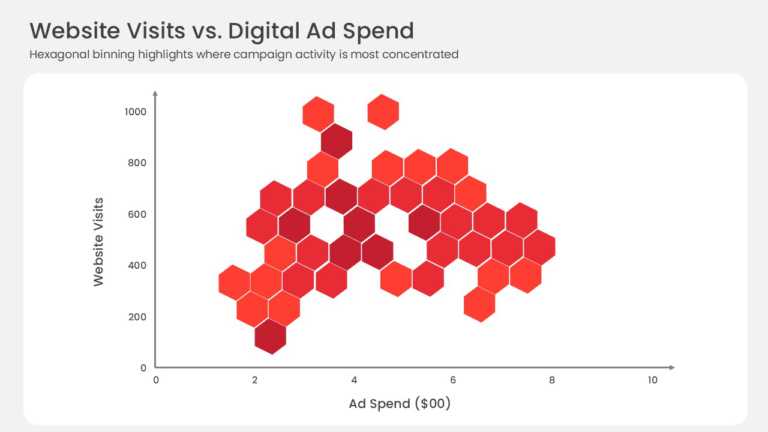

Product Description:
This hexbin scatter plot replaces individual data points with a grid of hexagonal bins plotted against X and Y axes. Color intensity indicates how many observations fall within each bin, which makes clusters and sparse regions visible in datasets too dense for a standard scatter plot.
A Data Analyst or Research Lead can use this chart in an analytics readout to show where customer transactions or performance scores concentrate across two variables. The density view highlights patterns that overlapping points would hide.
Browse more PowerPoint chart templates, or read our guide on creating heat maps in PowerPoint. This template is fully editable and compatible with PowerPoint and Google Slides.