

 Flat 1


 Edit with AI
 Ask Us To Edit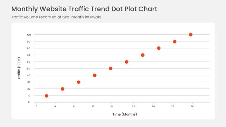

Product Description:
Data points plotted on horizontal and vertical axes form a scatter plot with a fitted linear trendline. The rising pattern shows a positive correlation between time elapsed and website traffic.
Business intelligence analysts presenting a growth forecast to leadership can use the plot to show both the overall trend and how closely individual observations follow it.
Browse our PowerPoint chart templates for other analytical layouts, and learn how to build a narrative around your figures with six ways to tell a story with data. Axis labels and data points can be customized in PowerPoint or Google Slides.