


How to Create a McKinsey-Style Presentation: The Complete Guide (2026)
Creating presentations that rival McKinsey’s legendary clarity and impact isn’t about copying slides—it’s about mastering a communication philosophy that transforms complex ideas into actionable insights. Whether you’re pitching to executives, presenting strategy recommendations, or leading corporate presentations, this comprehensive guide will teach you the exact frameworks, design principles, and storytelling techniques that make McKinsey presentations so effective.
What Makes McKinsey Presentations Different?
McKinsey presentations aren’t just visually clean—they represent a fundamental shift in how consultants communicate. Since its founding in 1926, McKinsey & Company has refined a presentation methodology that prioritizes structured thinking, logical flow, and executive-level communication over decorative design. Whether you’re examining McKinsey slide decks, McKinsey PowerPoint templates, or McKinsey presentation slides from actual consulting engagements, you’ll notice consistent patterns that make these materials instantly recognizable.
The McKinsey approach answers three critical questions every executive asks: What’s the recommendation? Why should I believe you? What should I do next? This focus on decision-making rather than information-sharing is what separates McKinsey decks from typical corporate presentations and standard consulting presentation formats.
The Three Pillars of McKinsey Communication
McKinsey presentations rest on three foundational pillars that work together to create persuasive, action-oriented communication:
1. Structured Thinking (The Architecture) Every McKinsey presentation follows a rigorous logical structure that guides the audience from problem to solution. This isn’t arbitrary—it mirrors how executives think and make decisions.
2. Evidence-Based Reasoning (The Foundation) Every claim in a McKinsey deck is supported by data, analysis, or documented precedent. Opinions are clearly labeled as such, and recommendations are built on quantifiable evidence.
3. Audience-Centric Design (The Interface) McKinsey consultants design presentations for time-starved executives who need to make decisions, not consume information. Every slide is optimized for scannability, comprehension, and retention.
Core Frameworks That Structure McKinsey Presentations
Understanding McKinsey’s fundamental frameworks is essential before you design a single McKinsey slide. These aren’t just theoretical models—they’re practical tools that shape how consultants organize information in every McKinsey presentation PPT, and consulting deck. The McKinsey presentation framework has been refined over decades and forms the foundation of the firm’s consulting presentation approach.
The Pyramid Principle: Top-Down Communication
Developed by Barbara Minto, a former McKinsey consultant, the Pyramid Principle revolutionized business communication by inverting traditional presentation structure. Instead of building suspense by revealing the conclusion at the end, McKinsey presentations lead with the answer.
How the Pyramid Principle Works:
The pyramid has three levels that mirror how executives process information:
- Top Level (The Answer): Start with your main conclusion or recommendation. This is what you want the audience to remember and act on.
- Middle Level (Supporting Arguments): Present 3-5 key arguments that support your conclusion. Each argument should be independently valid and collectively comprehensive.
- Base Level (Evidence): Provide data, analysis, case studies, and examples that validate each supporting argument.
Practical Example:
Instead of saying: “Sales in Region A declined 15%. Region B grew 8%. Region C remained flat. Customer satisfaction dropped in Region A. We need to restructure our regional strategy.”
Say: “We should consolidate operations in Regions A and C and expand in Region B. This recommendation is based on three factors: Region B shows strong growth momentum (8% YoY), Region A faces declining sales and satisfaction (-15% sales, -12 NPS), and consolidation could save $2.3M annually in overhead costs.”
The second version immediately tells executives what to do, then provides the reasoning. This matches how busy leaders prefer to receive information.
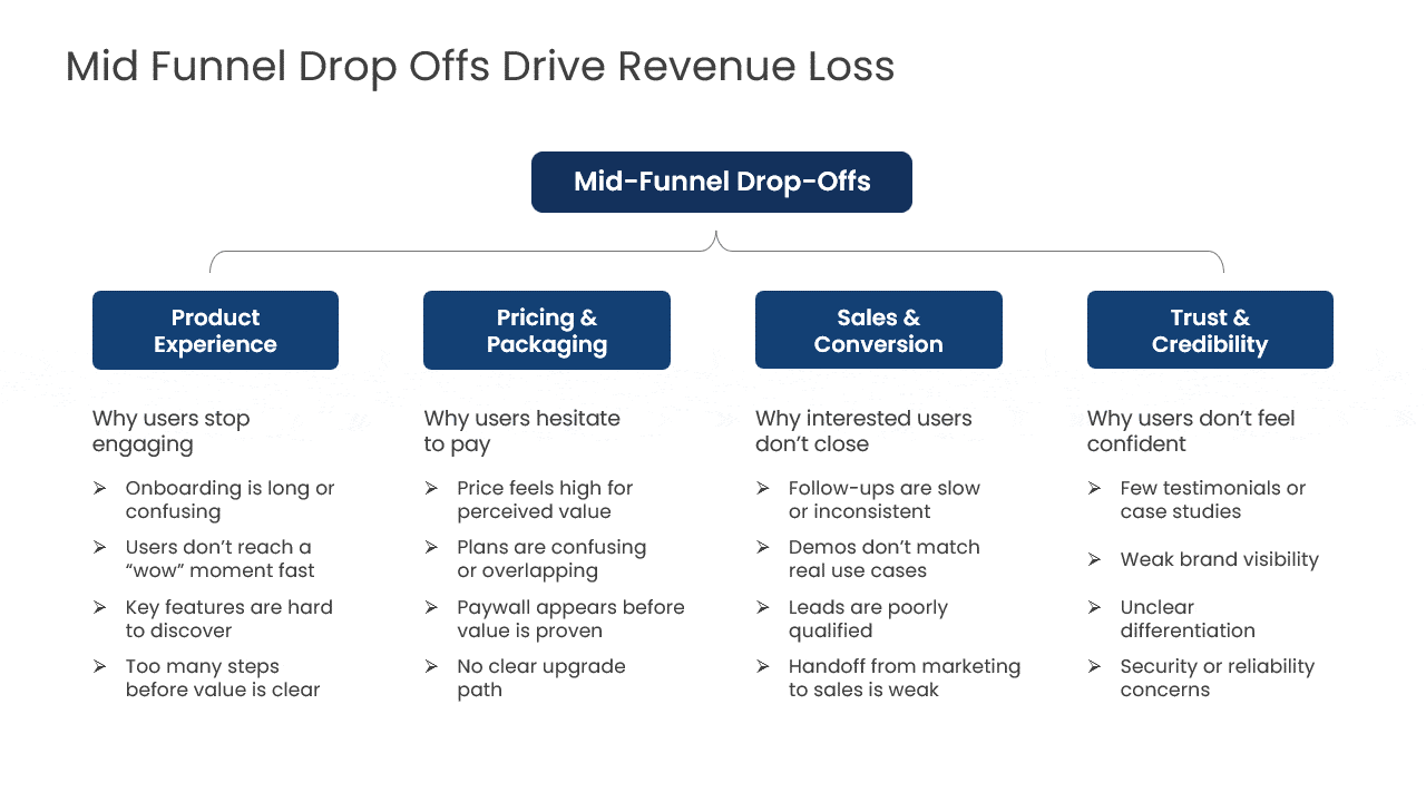
The MECE Framework: Organizing Your Arguments
MECE (Mutually Exclusive, Collectively Exhaustive) is McKinsey’s organizing principle for breaking down complex problems. It ensures your analysis covers everything relevant while avoiding redundancy.
Mutually Exclusive means: No overlap between categories. Each data point, argument, or insight belongs to only one bucket.
Collectively Exhaustive means: You’ve covered the entire scope. Nothing important is missing from your analysis.
The example below shows a MECE breakdown commonly used in McKinsey-style decks.
How to Apply MECE in Your Presentations:
When structuring your supporting arguments, ask yourself:
- Can any of these points be merged? If two arguments are making essentially the same point, they’re not mutually exclusive.
- Have I covered all the major dimensions of this problem? If a critical stakeholder could say “but what about X?” you’re not collectively exhaustive.
- Could I reorganize these categories differently? There are often multiple valid MECE structures. Choose the one that best supports your conclusion.
MECE Example for Market Entry Decision:
Non-MECE structure:
- Market size is attractive
- Competitors are weak
- Our brand is strong
- Distribution channels are accessible
- Regulatory environment is favorable
- Local partnerships are available
MECE structure (organized by feasibility dimensions):
- Market Attractiveness: Size, growth, and profitability analysis
- Competitive Position: Our capabilities vs. incumbent strengths
- Implementation Feasibility: Regulatory, distribution, and partnership requirements
The MECE version groups related factors and ensures nothing falls through the cracks. It also matches how executives think about strategic decisions: Is it attractive? Can we win? Can we execute?
The SCR (Situation-Complication-Resolution) Storyline
SCR is McKinsey’s narrative framework for building compelling storylines. Unlike the Pyramid Principle (which structures arguments), SCR structures your overall presentation narrative to create engagement and urgency.
The Three Components:
- Situation: Establish the current state and why it matters. This creates context and gets everyone aligned on the starting point.
- Complication: Introduce the problem, challenge, or opportunity that disrupts the situation. This creates tension and urgency.
- Resolution: Present your recommended solution and how it addresses the complication. This provides relief and a path forward.
The following example illustrates how consultants use the SCR structure to build a clear storyline.
SCR in Action:
A typical McKinsey presentation might flow like this:
Situation: “Your retail division has maintained 23% market share for three years, generating $450M in annual revenue across 200 locations.”
Complication: “However, three new digital-first competitors have entered the market in the past 18 months, capturing 12% market share primarily from your 25-40 demographic—your highest-margin customer segment. If this trend continues, you could lose $85M in revenue by 2027.”
Resolution: “We recommend a three-part digital transformation strategy that protects your core while capturing growth in digital channels. This approach could recover 7% market share within 18 months and position you for long-term competitive advantage.”
This structure creates a narrative arc that keeps executives engaged while building toward your recommendations.
Designing McKinsey-Style Slides: The Visual Principles
McKinsey’s visual design philosophy can be summarized in one phrase: ruthless clarity. Every visual element serves the message; anything that doesn’t actively help the audience understand or remember is removed.
The Action Title Principle
McKinsey slides never use generic titles like “Market Analysis” or “Financial Performance.” Instead, every McKinsey slide format follows the action title principle—a complete sentence that communicates the key takeaway. This approach is evident in every McKinsey slide template and McKinsey PowerPoint presentation you’ll encounter from the firm.
Weak Titles:
- “Revenue Trends”
- “Customer Segmentation”
- “Competitive Landscape”
Action Titles (McKinsey Title Slide Style):
- “Revenue declined 8% due to premium segment contraction.”
- “Three customer segments account for 67% of lifetime value.”
- “Two competitors are rapidly gaining share in our core markets.”
Action titles serve three purposes in McKinsey PowerPoint slides:
- First, executives can understand your main points by reading just the titles—critical for people who skim McKinsey slide deck examples before meetings.
- Second, action titles keep you honest about what each slide actually proves or demonstrates.
- Third, during presentations, the audience knows immediately what the data on the slide is telling them.
The difference between weak and strong slide titles is best illustrated visually.

How to Write Effective Action Titles:
- Transform observations into insights. Don’t just describe what the data shows; explain what it means. For example, instead of “Market share by quarter,” write “We’ve lost 3pts of market share despite increased marketing spend.”
- Be specific with numbers and timeframes. “Revenue is declining” is vague. “Revenue declined 12% in Q4, the steepest drop in five years” is actionable.
- Make the title self-contained so someone could understand the key message without reading the slide content.
- And limit titles to one line when possible—two lines maximum. If you need more than two lines, your message isn’t focused enough.
The One Slide, One Message Rule
Each McKinsey slide communicates exactly one insight, recommendation, or piece of analysis. This discipline forces clarity and prevents cognitive overload.
Why One Message Matters:
Working memory research shows that people can hold only 3-5 pieces of information simultaneously. Slides with multiple competing messages force the audience to choose what to focus on—and different people will choose differently, fragmenting your message.
How to Implement One Message Per Slide:
Before finalizing any slide, ask yourself: What is the single most important thing I want someone to remember from this slide? That becomes your action title and the focus of all visual elements. If you’re tempted to put two messages on one slide, create two slides. Resist the urge to cram content just because you have space. White space improves comprehension and retention.
The Data Visualization Hierarchy
McKinsey consultants are highly selective about which data makes it into presentations and how that data is visualized. The goal isn’t to show everything you analyzed—it’s to show exactly what the audience needs to make a decision.
The McKinsey Approach to Charts:
- Start with the insight, then choose the chart. Don’t start with your data and try to visualize it. Start with what you want to prove, then select the visualization that proves it most clearly.
- Use the simplest chart that works. Bar charts beat 3D pie charts every time. Simple beats clever.
- Dedicate full slides to important charts. When a chart contains a critical insight, give it a full slide. Don’t surround it with bullet points or additional graphs.
- Label directly on charts. Eliminate legends whenever possible. Direct labels reduce cognitive load and speed comprehension.
- Highlight what matters. Use color, arrows, or callout boxes to draw attention to the specific data points that support your message.
Chart Selection Guide:
- Comparison between categories: Use horizontal bar charts (easier to read category labels than vertical)
- Change over time: Use line charts (trends are clearer than with bars)
- Parts of a whole: Use stacked bar charts or treemaps (pie charts are harder to compare)
- Correlation between variables: Use scatter plots with trendlines
- Distribution: Use histograms or box plots
- Process or flow: Use Sankey diagrams or simple process flows
The Typography and Color System
McKinsey presentations use restrained, professional typography and color palettes that enhance rather than distract from the content.
Typography Guidelines:
McKinsey typically uses sans-serif fonts like Arial, Helvetica, or Calibri, widely considered among the best fonts for PowerPoint presentations in three size tiers: headlines at 24-28pt, body text at 16-18pt, and chart labels at 12-14pt. Everything must be readable from the back of a conference room. Text should be left-aligned for body content (easier to scan) and use consistent line spacing of 1.5 or 2.0 to improve readability. Avoid italics, underlines, and multiple font families—bold for emphasis only.
Color Strategy:
McKinsey uses a limited color palette—typically 2-3 primary colors plus shades of gray. Dark blue or black is used for primary text and important data. Gray is used for supporting text and less critical data. One accent color (often teal or orange) highlights key insights or recommendations. And stark red is reserved for problems or warnings only.
Colors should have functional meaning. In performance charts, green might represent above target, gray at target, and red below target. This consistency helps audiences quickly interpret data across multiple slides.
Layout Templates for Different Content Types
McKinsey consultants use specific layout patterns for different types of content. Learning these patterns from McKinsey slides examples and consulting slide deck examples accelerates your slide creation and ensures consistency across your consulting PowerPoint slides.
Full-Slide Chart Layout (Common in McKinsey Slide Deck):
- Action title at top (1-2 lines)
- Chart occupies 70-80% of slide space
- Source citation in small text at the bottom
- Key insight called out with an arrow or text box if needed
Text + Visualization Layout (Typical Consulting Slides Format):
- Title at top
- Text in left column (40% of width)
- Visualization in the right column (60% of the width)
- Sufficient white space between columns
Executive Summary Layout (McKinsey Executive Summary Slide):
- Bold section headers to separate key points
- 3-5 bullet points maximum per section
- Each bullet is 1-2 lines only
- White space between sections
- Often includes a McKinsey table of contents reference
Process Flow Layout (Found in Consulting Firm Presentations):
- The title communicates the outcome of the process
- Horizontal flow with 3-5 steps maximum
- Each step has an icon + a brief label
- Arrows show progression clearly
Building Your McKinsey Presentation: Step-by-Step Process
Now that you understand the principles, here’s the exact process McKinsey consultants use to build presentations from scratch. Whether you’re creating a McKinsey pitch deck, a management consulting presentation, or an internal strategy review, this process applies universally to all consulting PowerPoint presentations.
Below is a real-world McKinsey-style presentation example to show you exactly what it looks like.
Step 1: Define Your Objective and Audience
Before opening PowerPoint, get crystal clear on two things:
What decision do you want your audience to make? McKinsey presentations exist to drive decisions. “Inform the executive team” isn’t specific enough. “Get approval to invest $5M in market expansion” is.
Who is your audience and what do they care about? C-suite executives care about strategic impact and ROI. Middle managers care about implementation feasibility. Board members care about risk and shareholder value. Tailor your message accordingly.
Key Questions to Answer:
- What is the audience’s current position on this topic?
- What objections or concerns are they likely to have?
- What evidence will they find most persuasive?
- How much time will you have to present?
- Will they read the deck before the meeting or see it for the first time?
Step 2: Develop Your Storyline
Use the SCR framework to outline your narrative before writing any slides:
- Write your Situation in 2-3 sentences. What’s the current state? Why does it matter? What context does the audience need?
- Articulate your Complication clearly. What problem, opportunity, or question disrupts the situation? Why is action needed now?
- Draft your Resolution. What’s your recommended solution? What impact will it have? Why is this the right path forward?
- Map your supporting arguments using MECE. What 3-5 key points support your resolution? Are they mutually exclusive and collectively exhaustive?
- Identify the evidence for each argument. What data, analysis, case studies, or examples prove each point?
This storyline becomes your presentation outline. Each supporting argument becomes a section of your deck.
Step 3: Structure Your Deck
McKinsey presentations follow a consistent structure that audiences expect. Understanding this McKinsey presentation format is crucial for creating professional consulting decks:
Cover Slide (McKinsey Title Slide Format)
- Presentation title (what you’re recommending)
- Client/audience name
- Date
- Presenter name(s)
- Keep design minimal and professional
Executive Summary (1-2 slides)
- Lead with your main recommendation
- Summarize the 3-5 key supporting points
- Include the “so what”—impact and next steps
- This should tell the complete story for executives who only read the summary
- Follow the executive summary McKinsey format with clear sections
Table of Contents (Optional)
- Include a McKinsey table of contents for longer presentations (20+ slides)
- List major sections only, not every slide
- Use page numbers for easy navigation
Situation (2-4 slides)
- Establish current state with key facts and context
- Show relevant trends or background
- Build common ground before introducing the complication
Complication (2-4 slides)
- Clearly articulate the problem or opportunity
- Quantify the impact (costs, risks, missed opportunities)
- Create urgency for action
Resolution/Analysis (10-20 slides)
- Present your supporting arguments one by one
- Each section proves one key point
- Mix data slides, text slides, and visualization slides
- Follow the Pyramid Principle: conclusion first, then evidence
- Use McKinsey slide examples as a reference for formatting
Recommendations (2-4 slides)
- Specific, actionable next steps
- Clear ownership and timelines
- Implementation considerations
- Expected outcomes and metrics
Appendix (optional)
- Supporting analysis that doesn’t fit in the main narrative
- Technical methodology details (including 7S McKinsey model if relevant)
- Additional data cuts
- Answers to anticipated questions
Step 4: Design Individual Slides
Now you’re ready to design slides using McKinsey principles. Study McKinsey slides PPT examples, and consultant slides to see these principles in action:
For Data Slides (Common in McKinsey Decks):
- Start with an action title that states the insight
- Choose the simplest chart type that proves the point
- Remove all non-essential elements (gridlines, 3D effects, excessive colors)
- Label directly on the chart when possible
- Add source citation at the bottom
- Use a callout box or an arrow to highlight the key data point
- Reference McKinsey slide deck examples for inspiration
For Text Slides (McKinsey PPT Format):
- The action title states the main point
- Use bullet points only when listing truly distinct items
- Keep bullets to one line each when possible
- Use sub-bullets sparingly
- Create a visual hierarchy with bold headers
- Include white space—don’t fill every inch
- Follow McKinsey & Company PPT standards
For Process/Framework Slides (Consulting Slide Templates):
- Action title explains the outcome or implication
- Use simple icons or shapes for each step
- Show clear flow with arrows
- Label each element concisely
- Keep to 3-5 elements maximum
- Apply proper presentation formatting throughout
Step 5: Review and Refine
McKinsey consultants are notorious for rigorous review processes. Apply these quality checks:
Storyline Check:
- Read only the action titles in sequence. Do they tell a complete, logical story?
- Is the narrative flow clear from situation to complication to resolution?
- Are there any logical gaps or unexplained jumps?
Evidence Check:
- Is every claim supported by data or documented analysis?
- Are sources credible and clearly cited?
- Would a skeptical executive find the evidence convincing?
Design Check:
- Is each slide immediately clear at first glance?
- Can you understand the message in 3-5 seconds?
- Are colors, fonts, and layouts consistent?
- Is there sufficient white space?
Message Check:
- Does every slide earn its place by advancing the argument?
- Have you removed all slides that don’t directly support your recommendation?
- Is the language precise and jargon-free?
Advanced McKinsey Techniques for Maximum Impact
Once you’ve mastered the basics, these advanced techniques will elevate your presentations to the next level.
The “So What” Test
After completing each slide, ask yourself: “So what?” If you can’t immediately articulate why this slide matters to your recommendation, either revise the slide or cut it.
The “so what” should appear in your action title. Don’t make the audience work to figure out implications—tell them explicitly. For example, don’t just show a chart of declining customer satisfaction. Show “Customer satisfaction decline puts $12M in recurring revenue at risk.”
Pre-Wiring Your Presentation
McKinsey consultants rarely present content that surprises their audience. They “pre-wire” presentations by socializing key ideas with stakeholders before the formal meeting.
How to Pre-Wire Effectively:
Schedule brief one-on-one meetings with key decision-makers before your presentation. Share your main recommendation and the logic behind it. Listen to their concerns and objections. Then, incorporate responses to those concerns into your final presentation. This approach turns potential opponents into allies and ensures smoother decision-making in the actual meeting.
The Appendix Strategy
McKinsey presentations always include comprehensive appendices with additional analysis, but this content is strategic, not random.
What Goes in the Appendix:
- Technical methodology that would slow down the main narrative
- Additional data cuts that support your analysis but aren’t critical to the recommendation
- Answers to questions you anticipate stakeholders will ask
- Sensitivity analyses and alternative scenarios
- Detailed implementation plans
The appendix serves two purposes. First, it proves you’ve done a thorough analysis even if you’re presenting a simple recommendation. Second, it allows you to answer questions without saying “we’ll have to get back to you.”
Handling Q&A Like a McKinsey Consultant
The McKinsey approach to questions demonstrates as much discipline as the presentation itself:
- Listen completely before answering. Don’t interrupt. Make sure you understand what’s really being asked.
- Reframe if needed. “That’s an important question about implementation timing. Let me address the sequencing of phases first, then we can discuss specific dates.”
- Use the Pyramid Principle in your answers. Lead with your conclusion, then provide supporting reasoning.
- Bridge to your slides. “Great question. Slide 14 in the appendix shows exactly that analysis.”
- Acknowledge uncertainty. If you don’t know, say so. Offer to follow up with analysis rather than speculating.
Common Mistakes to Avoid
Even experienced presenters make these errors when adopting the McKinsey style:
- Mistake 1: Confusing Style with Substance: McKinsey’s power comes from rigorous analysis and structured thinking, not just clean slides. Don’t use the McKinsey format to dress up weak logic or insufficient evidence.
- Mistake 2: Over-Simplifying: Simplicity doesn’t mean simplistic. McKinsey presentations make complex topics clear without removing important nuance. Don’t oversimplify to the point of inaccuracy.
- Mistake 3: Burying the Recommendation: Executives want the answer first. Don’t build suspense or save your recommendation for the end. Lead with it.
- Mistake 4: Inconsistent Formatting: If your fonts, colors, or layouts vary from slide to slide, you look amateur. Create a template and stick to it religiously.
- Mistake 5: Too Many Slides: More slides don’t equal more credibility. McKinsey consultants are ruthless editors. Cut anything that doesn’t directly support your recommendation.
- Mistake 6: Weak Action Titles: Generic titles like “Analysis” or “Findings” waste valuable communication real estate. Every title should state an insight or conclusion.
- Mistake 7: Chart Overload: Don’t put four charts on one slide just because they’re related. Give important visualizations room to breathe.
Tools and Templates to Get Started
You don’t need expensive software to create McKinsey-style presentations. Here’s what you actually need to build professional McKinsey PowerPoint templates and consulting presentation materials:
Essential Software:
- PowerPoint or Google Slides (standard tools work fine)
- Excel or Google Sheets for data analysis and chart creation
- A simple screenshot tool for capturing images
McKinsey Template Resources:
- Create a master McKinsey slide template with your standard fonts, colors, and layouts
- Build a library of McKinsey PowerPoint template PPT files for common chart types formatted to your standards
- Develop icon sets for frequently used concepts (process steps, geographic regions, etc.)
- Study McKinsey slides templates and consulting slides examples for reference
- Look at McKinsey’s style PowerPoint template options and consultant presentation slides for inspiration
Where to Find Examples:
- Search for “McKinsey slide deck examples” to see real consulting work (often available in case studies)
- Review “consulting deck examples” from various firms
- Examine “slides consulting layout examples” for formatting ideas
- Study McKinsey marketing PPT materials when available publicly
Time-Saving Tips for Presentation Consulting:
- Start with structure before design. Get your storyline and slide titles right first.
- Reuse proven layouts rather than designing each slide from scratch.
- Build slides in grayscale first, then add color only where it adds meaning.
- Create your charts in Excel with proper formatting, then paste them as images into PowerPoint.
- Use McKinsey presentation template PPT files as your starting point
Practice Exercises to Build Your Skills
These exercises will help you master the McKinsey presentation framework and develop your consulting presentation skills:
- Exercise 1: Action Title Transformation: Take a presentation you’ve created and rewrite every title as an action title following the McKinsey title slide format. Compare the original deck to the revised version. Which tells a clearer story?
- Exercise 2: MECE Structuring: Choose a business problem and practice creating multiple MECE structures for analyzing it. For example, a revenue decline could be structured by product line, geography, customer segment, or time period. Which structure best supports your hypothesis? This is core to management consulting presentation skills.
- Exercise 3: Chart Simplification: Find a complex chart (from a report or article) and rebuild it using McKinsey principles: remove gridlines, simplify colors, add direct labels, and create an action title that states the insight. Compare your version to the McKinsey slide examples you find online.
- Exercise 4: One-Slide Story: Create a single McKinsey slide that tells a complete story: situation, complication, and resolution. This forces you to distill your thinking to its essence—a critical skill in presentation consulting.
- Exercise 5: Title-Only Review: Take a complete presentation and share only the action titles (in order) with a colleague. Can they understand your recommendation and logic without seeing the slide content? If not, your titles need work. This is how McKinsey & Company’s mission statement of clarity comes through.
- Exercise 6: Deck Deconstruction: Find McKinsey presentation PPT examples or consulting pitch deck samples online. Identify the SCR structure, locate the MECE breakdowns, and note the McKinsey presentation format choices. What makes them effective?
Final Thoughts: Thinking Like McKinsey
Creating McKinsey-style presentations isn’t about mimicking a visual style—it’s about adopting a mindset. McKinsey consultants see presentations as tools for driving decisions, not repositories for information. Every element exists to support clear thinking and persuasive communication. Whether you’re building McKinsey PowerPoint presentations, consulting firm presentations, or internal strategy decks, these principles apply universally.
The disciplines that make McKinsey presentations effective—structured thinking, evidence-based reasoning, ruthless editing, audience focus—are valuable far beyond slide design. They’re habits of clear thinking that improve all forms of business communication. Study McKinsey templates, McKinsey slides examples, and real consulting slides examples to internalize these patterns.
Start by mastering one element at a time. Perfect your action titles before worrying about chart design. Get your storyline right before optimizing layouts. Build the thinking habits first; the visual execution will follow. Use McKinsey slide templates and McKinsey PowerPoint template PPT resources as learning tools, not crutches.
The goal isn’t to create presentations that look like McKinsey decks. It’s to create presentations that work like McKinsey decks—crystallizing complex analysis into clear recommendations that executives can act on with confidence. Whether you’re creating a consultant pitch deck, a McKinsey-style presentation for your organization, or learning presentation formatting for consulting roles, the McKinsey presentation framework provides a proven foundation.
Remember: McKinsey’s presentation style evolved over decades of consulting to the world’s most demanding clients. Be patient with yourself as you learn these skills. Each presentation you create using these principles will be clearer and more effective than the last. Study consulting presentation formats, review McKinsey presentation format examples, and practice with real business problems.
Now it’s time to apply what you’ve learned. Take your next presentation and rebuild it using the McKinsey approach. Reference McKinsey slide deck examples, apply the frameworks, and use the McKinsey slide format principles we’ve covered. The difference will be immediately apparent to your audience—and to you.
FAQs
-
Where can I find downloadable McKinsey slide decks and templates?
You can find examples of McKinsey slide decks on their official website, particularly in the “Insights” section and reports from their global institute. You can find downloadable McKinsey slide decks through publicly shared consulting presentations on platforms like Slideuplift and curated consulting resource sites. For McKinsey-style templates, use professional template libraries that replicate the clean, structured consulting format.
-
How do McKinsey consultants choose data for their presentations?
McKinsey consultants are highly selective with data. They use rigorous data analytics to identify the most relevant information that directly supports their key findings. Instead of showing all the complex information available, they choose only the data points needed to build a convincing and clear argument, fitting their focused presentation style.
-
Can you show me examples of real McKinsey slide decks?
While confidential client work is not shared, McKinsey, as a consulting firm, often publishes reports and analyses on its website that include real McKinsey slide decks. These public-facing presentations on topics like big data or global trends are excellent examples of their template and slide designs in action.
-
What is the typical structure of a McKinsey presentation?
The typical slide structure for this consulting firm begins with a title slide and an executive summary that outlines the main conclusions. The body of the slide decks then follows a logical roadmap, often using a “Situation-Complication-Resolution” framework to guide the audience through the analysis to the final recommendations.
-
How can I create slides in the McKinsey style?
To create McKinsey slide decks, focus on clarity and structure. Use an “action title” for every slide, stick to a minimalist design with consistent fonts, and use bullet points logically. Each slide should convey a single, clear message supported by evidence. The goal is to make your argument easy to follow.
-
What are the key design elements used in McKinsey slide decks?
Key slide design elements include minimalist layouts, generous use of white space, and consistent formatting. Following the principles of clarity championed by thinkers like Barbara Minto, the design uses a clear visual hierarchy, simple bullet points, and a limited color palette to ensure the message is the main focus.
-
How do McKinsey consultants present data and charts in their slides?
McKinsey consultants present data using clean, simple charts and graphics that each convey a single message. They follow best practices for data analytics visualization, using action titles to state the conclusion and avoiding clutter. The goal is to make the insights from the data immediately obvious to the audience.
-
What are the dos and don'ts when making a consulting slide deck in the McKinsey style?
Do follow best practices like using a clear storyline and one message per slide. Don’t clutter your slide decks with too much text or data. The goal of this consulting firm’s style is absolute clarity, so avoid jargon and ensure every element on your slide serves a purpose.
-
How do McKinsey slide decks differ from presentations by other consulting firms?
McKinsey slide decks are often distinguished by their rigid adherence to a top-down presentation style and minimalist slide designs. While other consulting firms share similar goals, McKinsey’s approach to sequencing and structure is famously disciplined, prioritizing logical rigor and clarity above more creative or conceptual visuals.
Table Of Content


Related posts from the same category

6 Jul, 2026 | SlideUpLift
Mastering Masking Images in PowerPoint: Step-by-Step Guide
Quick Answer Masking images in PowerPoint means displaying a picture only within a chosen shape — such as a circle, custom outline, or block of text — instead of a
15 Jun, 2026 | SlideUpLift
How to Add Exponents in Google Slides (3 Methods)
Quick Answer: To add an exponent in Google Slides: Click inside a text box and type your full equation (e.g., x2). Highlight only the character to raise (e.g., the '2').

3 Jun, 2026 | SlideUpLift
How to PowerPoint Shuffle Slides: 3 Easy Methods
Quick Answer PowerPoint has no built-in shuffle button, but you can randomize PowerPoint slides in three ways: Drag and drop in Slide Sorter view — fastest for small decks (under

26 May, 2026 | SlideUpLift
Claude for PowerPoint: A Comprehensive Guide for Users
Quick Answer Claude for PowerPoint is an official AI add-in by Anthropic, installed from the Microsoft Marketplace (AppSource). Once added, it embeds a sidebar directly in PowerPoint — on the

30 Apr, 2026 | SlideUpLift
How to Add a Border in Google Slides (7 Easy Methods)
To add a border in Google Slides, insert a rectangle shape, set its fill to transparent, and customize the border color and weight from the toolbar. You can apply borders

28 Apr, 2026 | SlideUpLift
How to Insert a PDF into Google Slides Every Method That Actually Works
If you have ever tried to insert a PDF into Google Slides, you already know the frustration — drag it onto a slide, and nothing useful happens. Google Slides does
24 Apr, 2026 | SlideUpLift
How to Insert a Check Mark in PowerPoint (PPT): 6 Methods
A check mark — also called a tick mark or tick symbol — is one of the most useful symbols you can place on a slide. It communicates completion, correctness,

22 Apr, 2026 | SlideUpLift
How to make a Venn Diagram on Google Slides (3 Easy Methods)
Need to compare two products, contrast competing ideas, or map shared traits for a classroom exercise? The most common question designers and educators ask is how to make a Venn

21 Apr, 2026 | SlideUpLift
How To Lock An Image In Google Slides: Complete Step-By-Step Guide
If you have ever carefully positioned a logo or background graphic in Google Slides — only for an accidental click to send it flying across the slide — you are

15 Apr, 2026 | SlideUpLift
How To Change Opacity in Google Slides (Images, Shapes & Backgrounds)
If your slides feel cluttered, hard to read, or just plain flat — opacity is the fix. A little transparency can turn a messy slide into something that looks clean

14 Apr, 2026 | SlideUpLift
How to Add a Video to Google Slides Step by Step (2026)
Embedding a video in your presentation takes just a few clicks through the Insert menu — but getting it to actually play for your audience requires knowing a few rules

13 Apr, 2026 | SlideUpLift
How To Lock An Image In PowerPoint: Complete Step-By-Step Guide
If you have ever spent time positioning a logo or background graphic perfectly — only for an accidental click to send it flying across the slide — this guide is

8 Apr, 2026 | SlideUpLift
How to Embed YouTube Video in PowerPoint (2026 Complete Guide)
Most PowerPoint videos fail at the worst moment — they don’t play, lag during playback, or force you to switch tabs mid-presentation. This guide shows you exactly how to embed
6 Apr, 2026 | SlideUpLift
How to Make an Interactive Quiz in PowerPoint (No Add-ins Required)
Quick Answer You can build a fully interactive quiz in PowerPoint using only the built-in Action and Hyperlink features — no add-ins or plugins required. Create three slide types (question,

1 Apr, 2026 | SlideUpLift
How to Print Google Slides with Notes: Step-by-Step Guide
Knowing how to print Google Slides with notes gives presenters and audiences a richer, more complete version of any presentation — each printed page shows the slide in the upper

30 Mar, 2026 | SlideUpLift
How to Convert PPT to Video: Complete Guide for 2026
This guide shows how to convert PPT to video using PowerPoint and other tools with simple, step-by-step methods. It covers formats, quality settings, narration, animations, and fixes for common export

26 Mar, 2026 | SlideUpLift
How to Curve Text in Google Slides (5 Methods That Actually Work)
This guide explains how to curve text in Google Slides using simple workarounds like Word Art, text rotation, and external tools, since there’s no built-in feature for curved text. It

24 Mar, 2026 | SlideUpLift
How to Wrap Text in Google Slides — 4 Methods That Actually Work
Learn how to wrap text in Google Slides with simple step-by-step methods to align text around images and create clean, professional layouts. This guide explains practical workarounds since Google Slides

20 Mar, 2026 | SlideUpLift
How to Add Annotations in PowerPoint: The Complete Step-by-Step Guide
This blog explains how to add real-time annotations in PowerPoint presentations using tools like the pen, highlighter, and laser pointer to make slides more interactive and engaging. It provides step-by-step

17 Mar, 2026 | SlideUpLift
How to Create a Project Presentation That Gets Stakeholder Approval
In any business environment, the ability to create a project presentation that actually moves people — securing approvals, aligning teams, and building client confidence — is one of the most
16 Mar, 2026 | SlideUpLift
How to Convert PowerPoint to Google Slides?
This blog explains how to convert PowerPoint to Google Slides using simple step-by-step methods like uploading PPT files to Google Drive or importing them directly into Slides. It helps users

13 Mar, 2026 | SlideUpLift
How to Play Video in PowerPoint Across Single and Multiple Slides
This blog explains how to play a single video across multiple slides in PowerPoint using simple animation and playback settings. It walks through the step-by-step process of inserting the video,

11 Mar, 2026 | SlideUpLift
How to Hide a Slide in Google Slides: Complete Guide
Learn how to hide and unhide slides in Google Slides without deleting them in this step-by-step guide. The blog explains simple methods like using the Skip Slide option, toolbar, and

9 Mar, 2026 | SlideUpLift
How to Hide and Unhide Slides in PowerPoint (Complete Guide)
This blog explains how to hide and unhide slides in Microsoft PowerPoint so you can skip certain slides during a presentation without deleting them. It covers why the hide slide
5 Mar, 2026 | SlideUpLift
Quarterly Business Review (QBR): What It Is, Examples & How to Present One
A QBR, or quarterly business review, is a strategic meeting held every three months to evaluate business performance, review key metrics, and align on goals for the next quarter. QBRs
4 Mar, 2026 | SlideUpLift
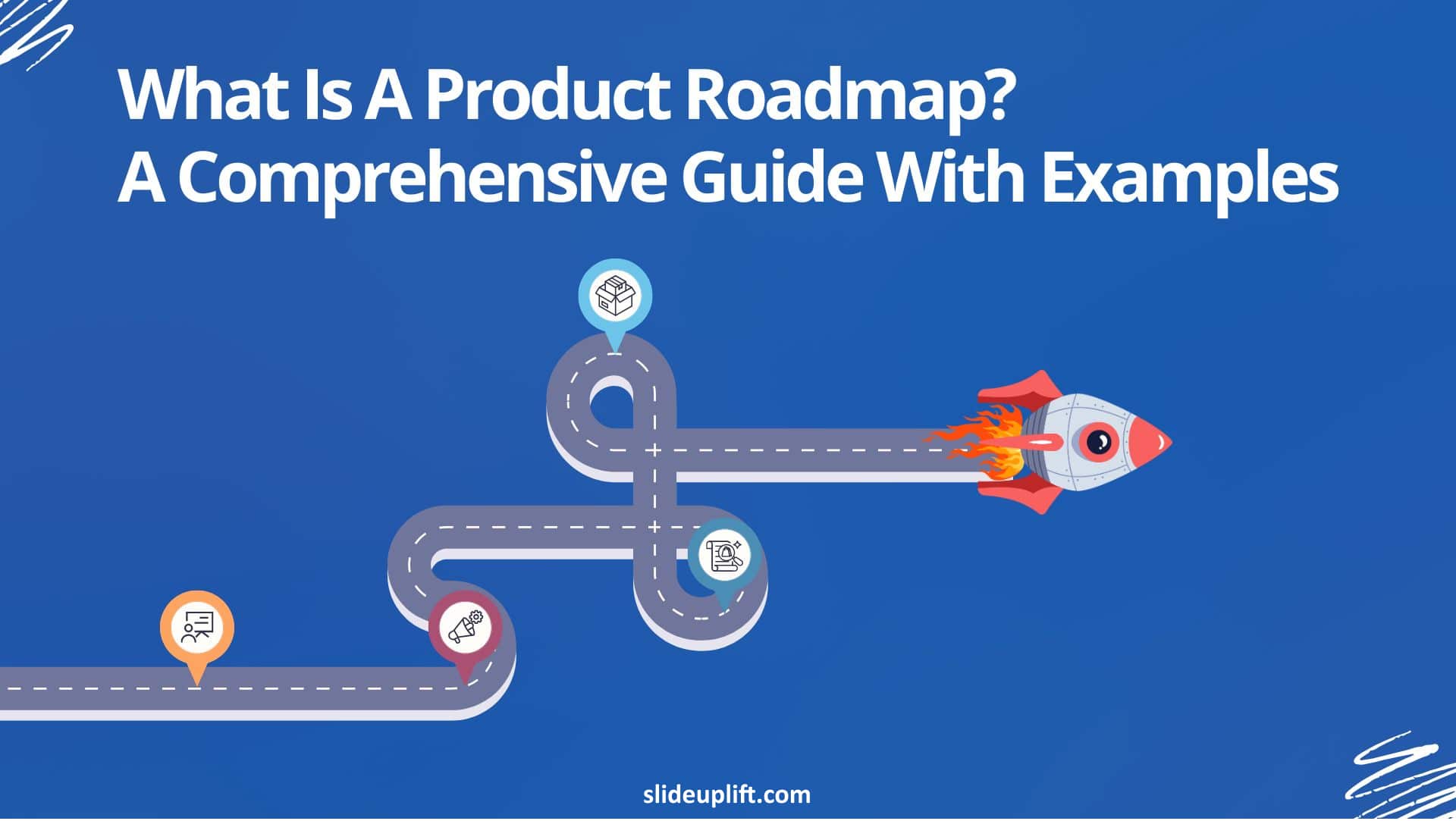
What Is a Product Roadmap? A Complete Guide With Types, Examples, and Templates
A product roadmap is a high-level strategic document that communicates a product’s vision, direction, priorities, and planned progress over time. It shows the product team and stakeholders what is being
27 Feb, 2026 | SlideUpLift
How To Broadcast a PowerPoint Presentation Online [6 Working Methods]
If you have been looking for a way to broadcast a PowerPoint presentation online to a remote audience, you have probably run into tutorials that tell you to click Slide
27 Feb, 2026 | SlideUpLift
How to Change Transparency in PowerPoint (Step-by-Step Guide)
Learn how to use transparency in Microsoft PowerPoint to adjust the opacity of images, shapes, and text for cleaner, more professional slide designs. This step-by-step guide explains how to change

24 Feb, 2026 | SlideUpLift
Which Program Is Used to Open PPTX Files: Complete Guide
This blog explains which program is used to open PPTX files and how to view or edit presentations on Windows, Mac, and mobile devices. It covers tools like Microsoft PowerPoint,
20 Feb, 2026 | SlideUpLift
How to Create Engaging Academic Presentations: 10 Expert Tips + Templates
This blog is a complete guide on how to create engaging academic presentations, offering 10 expert tips for structuring content, designing slides, and delivering with confidence. It covers common mistakes

20 Feb, 2026 | SlideUpLift
How to Make Google Slides Play Automatically On A Loop? (Step-by-Step Guide)
This blog explains how to make presentations in Google Slides play automatically and loop without manual clicks. It covers clear step-by-step methods using auto-advance timings and the Publish to Web
18 Feb, 2026 | SlideUpLift
How to Copy a Slide in Google Slides: Step-by-Step Guide
Learn how to duplicate, copy, and paste a slide in Google Slides using simple, step-by-step methods. This guide covers desktop shortcuts, right-click options, toolbar methods, and mobile steps for Android

17 Feb, 2026 | SlideUpLift
How to Round Corners in Google Slides: Complete Guide
Learn how to round corners in Google Slides using both the simple yellow handle method and the advanced Edit Points feature. This guide explains how to adjust the corner radius,
12 Feb, 2026 | SlideUpLift
How To Add plus or minus symbol in PowerPoint Presentations – Step-by-Step Guide
This blog explains how to add the plus or minus symbol (±) in Microsoft PowerPoint using keyboard shortcuts (Windows & Mac), the Symbols menu, equation tools, and copy-paste methods. It

10 Feb, 2026 | SlideUpLift
How To Convert Google Slides Into PDF: Quick & Easy Guide
This guide explains how to convert Google Slides into a PDF quickly and without formatting issues. It covers saving slides with or without speaker notes and methods for desktop and

6 Feb, 2026 | SlideUpLift
How To Make A Professional PowerPoint Presentation With Practical Tips
This blog shows how to make professional presentations with clear structure, engaging visuals, and effective delivery. It highlights using AI tools like ChatGPT and Copilot with ready-made templates to quickly

4 Feb, 2026 | SlideUpLift
How to Write a Sales Pitch That Captures Attention and Converts Leads
This SlideUpLift guide explains how to write an effective sales pitch by identifying your target audience, highlighting your unique value, focusing on benefits over features, and structuring a persuasive presentation

30 Jan, 2026 | SlideUpLift
Sales Presentation: A Complete Guide to Structure, Examples, and Best Practices
This blog is a complete guide to building a high-impact sales presentation, covering everything from structure and slide selection to delivery and follow-up. It explains what makes sales presentations effective,
28 Jan, 2026 | SlideUpLift
Types of Slides That Make Presentations Clear, Engaging, and Impactful
This blog explains why choosing the right slide types is essential for clear, engaging presentations. It covers the most important PowerPoint slide types, when to use them, and how they
23 Jan, 2026 | SlideUpLift
How to Rotate a Slide in PowerPoint: Complete Guide
This blog explains how to rotate slides in PowerPoint using all practical methods, including changing slide orientation, rotating objects, and handling single-slide workarounds. It also covers professional solutions for mixing
21 Jan, 2026 | SlideUpLift
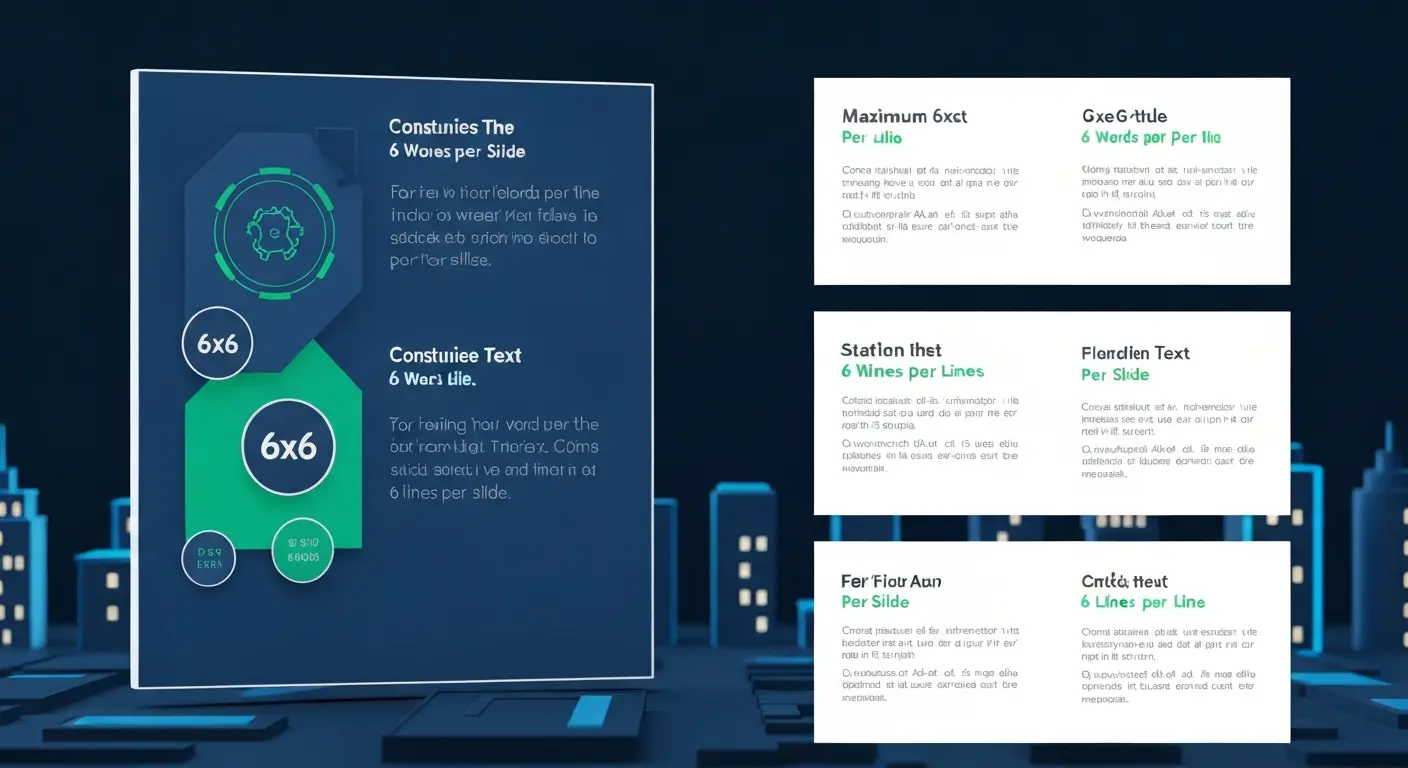
What Is 6×6 Rule in PowerPoint? Complete Guide To Improve Slides
This blog explains what is 6x6 Rule in PowerPoint and how it improves slide clarity and readability. It shows how to apply the rule, avoid common mistakes, and compare it
19 Jan, 2026 | SlideUpLift
How to Add Footnotes in PowerPoint: A Step-by-Step Guide
Adding footnotes in PowerPoint helps you cite sources and add context without overcrowding your slides. Since PowerPoint doesn’t offer an automatic footnote feature, footnotes are created manually using text boxes

16 Jan, 2026 | SlideUpLift
How To Merge PowerPoint Presentations Using Simple Methods and a Free Tool
Learn how to merge PowerPoint presentations quickly and easily using manual methods or a free merge PPT tool. Keep slides, formatting, animations, and transitions intact while creating polished, professional decks.

14 Jan, 2026 | SlideUpLift
How to Add a Timer to Google Slides: Step-by-Step Guide
This blog walks you through how to add a timer to Google Slides using simple, practical methods that actually work. It covers Auto-play timing, visible countdown timers, videos, and add-ons,

8 Jan, 2026 | SlideUpLift
How to Prepare for a Presentation: A Simple Guide for Beginners
This blog explains how to prepare for a presentation step by step. It covers goal setting, content structuring, slide design, practice, and handling questions. Beginners can also learn common challenges,

6 Jan, 2026 | SlideUpLift
Presentation Tips for Structuring Messages and Effective Storytelling
This blog breaks down practical presentation tips to help you plan, design, and deliver slides that truly stand out. It covers how to simplify text, use visuals effectively, and maintain

9 Dec, 2025 | SlideUpLift
How to Change a PowerPoint Template – Quick Step-by-Step Guide
This blog shows how to change or update a PowerPoint template to give your slides a fresh, professional design without losing your content. It walks through step-by-step actions in the

4 Dec, 2025 | SlideUpLift
The 5-5-5-Rule-of-PowerPoint: Your Guide to Effective Design
Introduction Have you ever seen a PowerPoint presentation with too much information on the slide? The problem with today’s presentations is that they draw attention away from the actual content,

12 Nov, 2025 | SlideUpLift
How to Create a Heat Map in PowerPoint: Beginner-Friendly Guide
Heat maps are one of the easiest ways to turn rows of numbers into visuals people understand quickly. In this blog, you will learn what a heat map is, in
6 Nov, 2025 | SlideUpLift
How to Add Transitions in PowerPoint: Complete Step-by-Step Guide
Do you want to create a seamless flow in your PowerPoint slides and make a strong impression? While adding transitions to PowerPoint slides might seem obvious, transitions are the key

4 Nov, 2025 | SlideUpLift
How to Use Morph in PowerPoint: The Ultimate Guide to Smooth Transitions
If you’ve ever watched a presentation where shapes flow smoothly, images glide effortlessly, and text elegantly shifts between slides, you’ve witnessed the power of Morph in PowerPoint. This feature is
30 Oct, 2025 | SlideUpLift
How To Make A Graph In PowerPoint: Step-by-Step Guide
The goal of impactful graphs is not simply to convey data; rather, it is to tell a story with data that has meaning to the audience. Graphs and charts can

13 Oct, 2025 | SlideUpLift
How to Write a Business Case: A Beginner’s Guide + Examples
Every project needs a passport to get through executive approval. Without it, even the best plans can get grounded before taking off. This very piece of evidence holds the power

10 Oct, 2025 | SlideUpLift
What Is A Project Charter? Definition, Examples & Best Practices
Launching a project without adequate planning can result in confusion, delays, and misaligned expectations. A project charter is a key document in the project documentation process that lays the groundwork

8 Oct, 2025 | SlideUpLift
How to Insert Emoji in Google Slides & PowerPoint for Fun, Eye-Catching Slides
Have you ever thought about how a simple emoji can change the mood or tone of your presentation? You could use a smiley face 😊, that would certainly lighten the

1 Oct, 2025 | SlideUpLift
Insert Calendar In PowerPoint And Google Slides: Quick Guide For Smarter Planning.
Do you want your presentations to be more organized, attractive, and professional? Learning how to add a calendar in PowerPoint or Google Slides will take boring schedules and deadlines and
26 Sep, 2025 | SlideUpLift
What Is a PPTX File? Think of It as PowerPoint 2.0
PowerPoint presentations are everywhere — from boardrooms to classrooms — and behind every great slide deck is the PPTX file. It’s not just some random presentation software and powerpoint file

17 Sep, 2025 | SlideUpLift
Google Slides Strikethrough: Cross Out The Old And Spotlight The New
Ever wished you could just cross something out instead of deleting it? You know, like putting a big line through “boring idea” and replacing it with “brilliant plan”. That’s the
12 Sep, 2025 | SlideUpLift
What is KPI? Step-by-Step Guide with KPIs Examples That Work
Is it hard for you to know if your business is getting to the level it should be? That's where key performance indicators (KPIs) come into play. KPIs indicate how

10 Sep, 2025 | SlideUpLift
Best Fonts For PowerPoint Presentation: The Runway Of Letters
Imagine this: your presentation is a red-carpet event. Your slides are the guests, the content is the message, and the font? That is the outfit; the one builds up the

10 Sep, 2025 | SlideUpLift
Advantages and Disadvantages of Microsoft PowerPoint: Pros, Cons, and AI Features Explained
PowerPoint has been the go-to tool for presentations for decades—but is it keeping up with today’s fast-paced, AI-driven world? PowerPoint makes it easy to take ideas to slides, whether you're

5 Sep, 2025 | SlideUpLift
10 Virtual Meeting Etiquette Rules for Professionals
Introduction Virtual meetings and online meetings are the new normal for remote work teams everywhere. Whether you're chatting with co-workers, giving a client presentation, or taking part in a hybrid

3 Sep, 2025 | SlideUpLift
How to Add Watermark in PPT Like a Pro: Step-by-Step Tutorial
Every presentation tells a story, but it should also say who it belongs to, right? And if we tell you that there is a way to stamp your identity on

29 Aug, 2025 | SlideUpLift
50 ChatGPT Prompts for Presentations (Copy-Paste Ready, Categorized for Professionals)
Most professionals don’t have a ChatGPT problem. They have a prompt problem. If you’ve ever asked ChatGPT to “make me a presentation on quarterly sales” and watched it spit out

29 Aug, 2025 | SlideUpLift
Microsoft Copilot vs ChatGPT-4 Showdown: Who’s Got the Edge?
Not long ago, making a presentation meant spending hours and hours writing content, formatting slides, finding visuals, and tweaking layouts. Tools like PowerPoint and Google Slides gave us templates, but

29 Aug, 2025 | SlideUpLift
10 Best Presentation Software: In-Depth Comparison Guide
The fact is, giving a great presentation is not only about how you choose your words, but rather involves expressing those very words. With the right PowerPoint presentation software, you

28 Aug, 2025 | SlideUpLift
Password Protect PPT: How To Secure Your Presentations (Easy Guide)
Have you ever shared a PowerPoint and then worried, “What if someone changes my slides?”, or even worse, “What if the wrong person opens it and leaks the content?”. Frustrating,

26 Aug, 2025 | SlideUpLift
Track Changes In PowerPoint And Keep Your Team In Sync
Ever spent hours perfecting a PowerPoint, way too much time that you then forget to track who made what change? You aren't alone. Unfortunately, unlike Word or Gmail slides, PowerPoint
14 Aug, 2025 | SlideUpLift
Curved Arrow PowerPoint: How to Make, Draw, and Customise Arrows Step by Step
Quick Answer: To make a curved arrow in PowerPoint, go to Insert > Shapes > Block Arrows, select a curved arrow shape, and drag to draw it on your slide.

13 Aug, 2025 | SlideUpLift
How To Create Infographics In PowerPoint For Smarter Visual Storytelling?
As a professional, you might have to host meetings and deliver presentations to your stakeholders and team members. As a host, it's crucial to deliver presentations in a way that

6 Aug, 2025 | SlideUpLift
How To Edit Footer In PowerPoint For Consistent Presentation Design
Footers are an important part of a PowerPoint presentation. They give the same footer text, like the date or slide numbers, on all slides. This helps people understand the talk

31 Jul, 2025 | SlideUpLift
Google Slides vs PowerPoint: A Complete Comparison Guide
Introduction Stuck deciding between Google Slides and PowerPoint for your next big presentation? Yeah, we've been there too. Both pack a punch with features, leaving you wondering: "Which one will

25 Jul, 2025 | SlideUpLift
How Many Slides For A 30 Minute Presentation? Timing, Tips, and Structure
One of the biggest challenges in presentations is staying on time. Whether it’s 5 minutes or 45, running over means rushing key points or losing your audience. Here’s the good

21 Jul, 2025 | SlideUpLift
PowerPoint Slide Size 101: Why It Matters More Than You Think
Imagine crafting the perfect slide, visuals on point, text crisp, animations smooth. But when you present, the content looks off. Cropped images, awkward white spaces, or text running off the

15 Jul, 2025 | SlideUpLift
Google Slides Shortcuts Cheat Sheet To Boost Workflow
Google Slides is already a go-to tool for everything. From classroom projects to business decks and online workshops. It is a one-stop platform to create and share your ideas, thoughts,

7 Jul, 2025 | SlideUpLift
PowerPoint Shortcuts: The Beginner-to-Pro Keyboard Cheat Sheet
PowerPoint is one of the most powerful tools for creating presentations. However, working in PowerPoint can become time-consuming, especially when you have to click through menus for every small task.

4 Jul, 2025 | SlideUpLift
Why Your Conclusion Slide Matters—And How To Get It Right
Picture this: You've delivered an amazing presentation. Great start solid middle... but then... the ending just... flops. The energy drains. People shuffle out, already thinking about lunch. Sad, isn't it?
3 Jul, 2025 | SlideUpLift
How to Change Text Color in Google Slides for Maximum Impact – Quick Guide
Using Google Slides to build presentations is now widely practiced across the digital world. It is clean, collaborative, and performs its tasks fairly well. Be it a business pitch, a

30 Jun, 2025 | SlideUpLift
A Simple Guide On How To Change Margins In PowerPoint
Margins—those often-overlooked borders framing your slides—play a crucial role in creating polished, professional presentations. Adjusting margins helps you control your layout. This is important for printed handouts and projections. It

13 Jun, 2025 | SlideUpLift
How to Make an Org Chart in PowerPoint: Step-by-Step Guide [+ Templates]
Without a clear org chart, even small teams feel messy. People start asking: “Who’s responsible for what?” Whether you are a manager, HR professional, or team lead, explaining the team

12 Jun, 2025 | SlideUpLift
How to Make an Org Chart in Google Slides: A Step-by-Step Guide
Want to map out any type of organizational structure—whether it's a company, project team, or even a hierarchy? An org chart helps visualize relationships between roles, departments, or functions in

28 May, 2025 | SlideUpLift
Beginner’s Guide: How To Make A Venn Diagram In Powerpoint
What Is A Venn Diagram? In today’s fast-paced business world, clarity is currency, and Venn diagrams deliver just that. Whether you're analyzing market segments, comparing competitors, or aligning team strategies,

27 May, 2025 | SlideUpLift
How to Create a Roadmap Diagram in PowerPoint? (Step-by-Step Guide)
Need to build a professional roadmap slide for your next presentation? You are in the right place. This tutorial walks you through every method for creating a roadmap diagram in

14 May, 2025 | SlideUpLift
How To Crop A Picture Into A Circle In The Presentation: Step-By-Step Guide
Ever found the perfect image for your presentation, but it just doesn’t look right in that boring rectangle frame? We’ve all been there. Whether you're trying to make your slides

6 May, 2025 | SlideUpLift
VBA in PowerPoint: How to Automate Your Slides
Quick answer: VBA (Visual Basic for Applications) is the programming language built into PowerPoint. You use it to write macros that automate repetitive tasks — formatting every slide, inserting logos,

2 May, 2025 | SlideUpLift
150+ Informative Speech Topics for 2026 (Students, College & Work)
Picking the right informative speech topic is half the battle: it decides how easy your research will be, how confident you'll sound, and whether your audience leans in or checks

22 Apr, 2025 | SlideUpLift
18 Timeline Examples for Presentations (+ Free Templates)
Quick answer: A timeline is a visual that shows events in chronological order, making milestones, schedules, and progress easy to follow at a glance. Presenters use them for project plans,

28 Mar, 2025 | SlideUpLift
Can ChatGPT Make a PowerPoint Presentation? Step-by-Step Guide
Quick Answer Yes — ChatGPT can make a PowerPoint presentation, and as of May 2026 it can do it in two ways. You can use ChatGPT inside your browser to

10 Dec, 2024 | SlideUpLift
How to Make a PowerPoint Presentation Attractive: 11 Design Techniques (2026)
Quick Answer: Making a PowerPoint attractive comes down to a set of repeatable layout techniques — visual bullets, split layouts, chunking, full-bleed images with overlays, icon systems, focal points, and

22 Nov, 2024 | SlideUpLift
Personal Timeline Examples: 15+ Ideas to Map Your Life Story
Quick Answer A personal timeline is a visual map of the key moments in your life — births, milestones, achievements, and turning points — arranged in chronological order. People use
5 Aug, 2024 | SlideUpLift
Org Chart Examples: 12 Real Examples by Type & Industry [+ Free Templates]
An organizational chart (org chart) is a diagram that shows a company's internal structure — who reports to whom, how teams are grouped, and where each role sits in the

24 Jul, 2024 | SlideUpLift
SWOT Analysis: The Complete Guide to Strengths, Weaknesses, Opportunities & Threats
One of the biggest challenges professionals face is a lack of structured thinking when strategizing plans, conducting competitor analysis, or evaluating current strategies. This often leads to wasted time, inconsistent

25 Jun, 2024 | SlideUpLift
Best PowerPoint Color Palettes for 2026 (Trends, Examples & Psychology)
This blog covers the best PowerPoint color palettes and how the right colors boost clarity, engagement, and professionalism. It includes ready-to-use palettes with Hex codes for different presentation types. The

24 Apr, 2024 | SlideUpLift
How to Create a Project Timeline: Steps, Types & Examples
Quick Answer A project timeline is a visual schedule that lays out a project’s phases, tasks, milestones, and deadlines in chronological order, so your team can see what’s due and

19 Apr, 2024 | SlideUpLift
How To Make A Flow Chart In Google Slides [Step-by-Step Guide]
If you have been manually sketching process flows or copying shapes one by one, there is a faster way. Google Slides has everything you need to build a clean, professional

19 Mar, 2024 | SlideUpLift
How To Make A Flow Chart in PowerPoint Presentation?
To make a flowchart in PowerPoint, go to Insert → SmartArt → Process, select a layout, click OK, fill in your steps, and apply a color scheme under SmartArt Design.

5 Mar, 2024 | SlideUpLift
SWOT Analysis Examples: Real-World Examples for Business, Projects & Products
The fastest way to understand a SWOT analysis is to see completed ones. Below are five detailed SWOT examples — two well-known companies, a small business, a project, and a

4 Mar, 2024 | SlideUpLift
5 Whys Root Cause Analysis: How It Works (With Examples)
Quick Answer 5 Whys root cause analysis is a problem-solving technique developed at Toyota that asks “why” repeatedly (typically five times) to trace a problem from its symptoms back to

29 Feb, 2024 | SlideUpLift
How to Create Harvey Balls in PowerPoint: A Complete Step-by-Step Guide
Quick Answer: What Are Harvey Balls and How Do You Create Them? Harvey Balls are circular ideograms — partially filled circles — used to represent qualitative data such as project

20 Feb, 2024 | SlideUpLift
Start Stop Continue Retrospective: A Complete Guide With Examples, Templates & Exercises
A Start Stop Continue retrospective is a team reflection exercise where each member names one thing the team should start doing, one it should stop, and one it should continue.

9 Feb, 2024 | SlideUpLift
60+ Best Business Presentation Topics to Captivate Your Audience (2026)
Imagine standing in front of a room full of people waiting to hear what you have to say. Instead of feeling nervous, you feel confident and prepared — because you

24 Jan, 2024 | SlideUpLift
How to Make a Roadmap Presentation That Wins Buy-In
Quick answer: To make a roadmap presentation that lands, tailor it to your audience, build it around a narrative instead of a list of dates, present at the right level

24 Jan, 2024 | SlideUpLift
How to Make a Business Plan Presentation: Guide, Examples & Free Template
Quick Answer A business plan presentation is a concise, visual slide deck — usually 10 to 12 slides — that communicates a company's business model, market analysis, competitive position, marketing

24 Jan, 2024 | SlideUpLift
What Is a Project Roadmap? A Complete Guide With Examples and Free Templates
A project roadmap is a high-level visual plan that shows a project’s goals, major milestones, key deliverables, and timeline at a glance. Unlike a detailed project plan that tracks tasks
21 Dec, 2023 | SlideUpLift
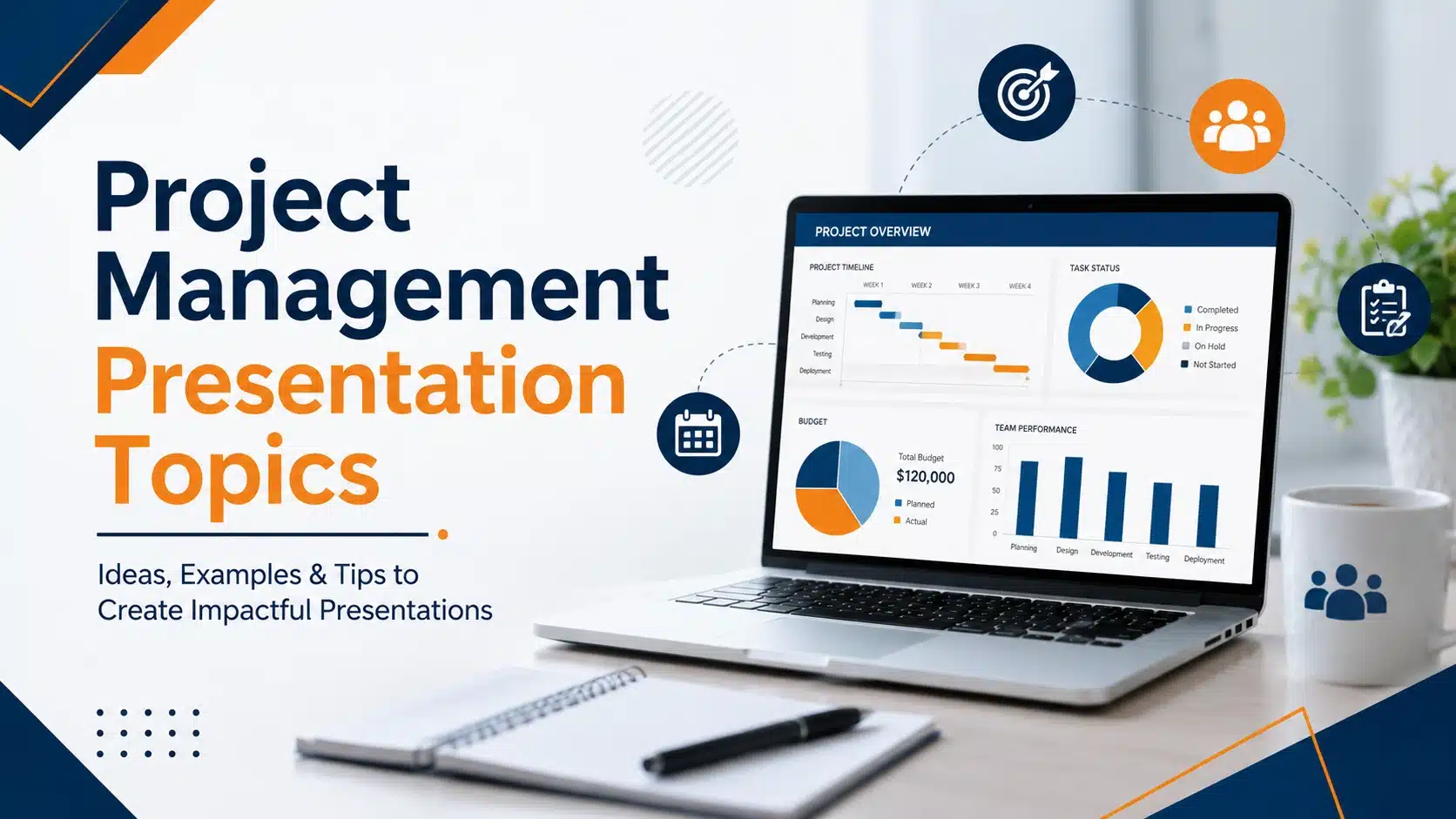
25+ Project Management Presentation Topics for 2026
Project management presentation topics span everything it takes to deliver work successfully — planning methods, team collaboration, risk management, leadership, and the trends reshaping how projects get done. Whether you're

18 Dec, 2023 | SlideUpLift
Project Proposal Presentation: How to Make One That Gets Approved
Quick Answer: A project proposal presentation is a slide deck that pitches a project to decision-makers — investors, management, or stakeholders — to win approval, funding, or resources. It covers

20 Nov, 2023 | SlideUpLift
How to Add Superscript and Subscript in Google Slides
Quick Answer: To add a superscript in Google Slides: Click inside a text box and type your full expression (e.g., x2). Highlight only the character to raise (e.g., the 2).
18 Nov, 2023 | SlideUpLift
How to Insert Icons in Google Slides Presentations
Quick Answer There are 5 ways to insert icons in Google Slides quickly and effectively: Install the Flaticon or Noun Project add-on via Extensions > Add-ons > Get add-ons Use
12 Oct, 2023 | SlideUpLift
How to Do Hanging Indent on Google Slides: 4 Easy Methods (Complete Guide)
Have you ever tried to format citations or multi-line bullet points in Google Slides, only to end up with text that wraps messily back to the left edge? You are

28 Feb, 2023 | SlideUpLift
Gardner’s Theory of Multiple Intelligences: All 8 Types Explained
Quick Answer: Gardner's Theory of Multiple Intelligences proposes that intelligence is not one fixed ability but a set of at least eight distinct types — linguistic, logical-mathematical, spatial, bodily-kinesthetic, musical,

21 Feb, 2023 | SlideUpLift
PowerPoint Design Ideas: Layouts, Colors, Charts & the Design Ideas Feature (2026)
A great message can still fail on a bad slide. Design is what carries your idea from your head into your audience's — the color choices, the layout, the way

8 Sep, 2022 | SlideUpLift
How to Add Background Music in PowerPoint: The Complete Guide (All Versions)
You've spent hours building the perfect presentation — your slides are polished, your data is solid, your design is on point. But something still feels flat. That missing ingredient? Background
1 Sep, 2022 | SlideUpLift
How To Group & Ungroup In Google Slides (Step-by-Step Guide)
This blog walks you through how to group and ungroup elements in Google Slides in a simple, practical way. It covers grouping images, shapes, text boxes, and objects, along with

25 Oct, 2021 | SlideUpLift
How To Make a Quiz in Google Slides? (Step-by-Step Guide)
Quick Answer: To make a quiz in Google Slides, create a question slide with answer options, then build separate “Correct Answer” and “Wrong Answer” feedback slides. Use Insert → Link
6 Jan, 2021 | SlideUpLift
Mastering Zoom in PowerPoint: Tips for Engaging Presentations
Quick Answer 1: How to use the PowerPoint Zoom navigation feature Go to Insert tab → Links group → Zoom Choose Slide Zoom, Section Zoom, or Summary Zoom Select your
17 Feb, 2020 | SlideUpLift
PowerPoint Arrows: How to Make an Arrow Diagram in PowerPoint | Step-by-Step Tutorial
Quick Answer — How to Insert Arrow in PowerPoint To insert arrow in PowerPoint and build a diagram: Go to Insert > Shapes and select a Rectangle. Duplicate it (Ctrl+D)

4 Dec, 2019 | SlideUpLift
How to Do Hanging Indent on PowerPoint: 5 Easy Methods (Windows & Mac)
Whether you're formatting an APA reference list on a slide, polishing multi-line bullet points, or creating a clean agenda, knowing how to do a hanging indent in PowerPoint is one

25 Mar, 2019 | SlideUpLift
15 PowerPoint Hacks You Didn’t Know for More Effective Presentations
Quick Answer: The most useful PowerPoint hacks include playing a video continuously behind your content, using Sections and Summary Zoom for smooth navigation, applying Morph transitions, embedding fonts before sharing,