
 Fall Sale
  Flat 40% off on our Unlimited Access Yearly Membership plan!


PowerPoint Chart Templates For Efficient Data Visualization
Free PowerPoint Chart Templates


The Marketing Budget Pie Chart PowerPoint Template is a resource for visually organizing and presenting the marketing budget, aiding in analysis,....


Elevate your meetings with this captivating dashboard crafted for presenting data ! The template showcases a color palette that boosts clarity an....

Engage your audience from the get go using this eye catchingFree bar chart presentation template that features a gradient blue design scheme! Th....
Charts and Graphs Templates

Use this Charts Infographics template to create visually appealing presentations in any professional setting. Its minimalistic design and ready-t....

Create a story using this eye catching donut chart design tailored for competitive analysis purposes This template is great, for professionals an....

This Sales Business Review Dashboard Template is designed for businesses to present their analytical data and study. The template has many graphs....
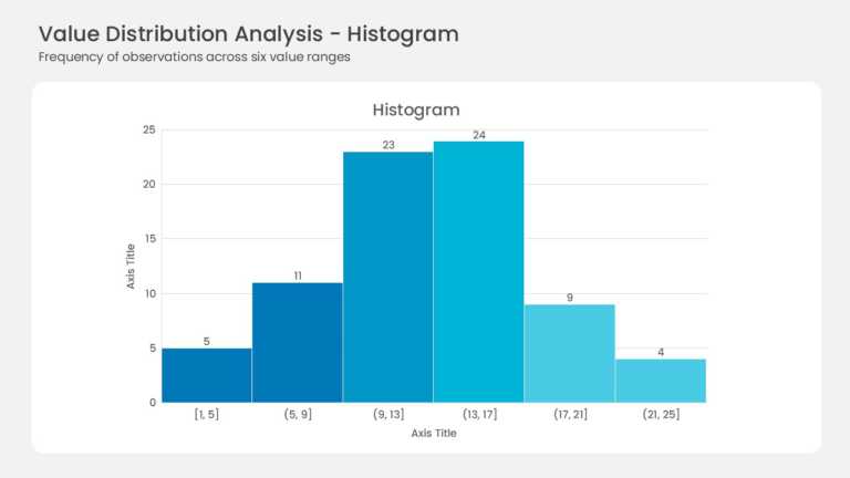
Six adjacent bars form the histogram with no gaps between them. Bin ranges run from [1, 5] up to (21, 25] along the horizontal axis. Frequencies ....
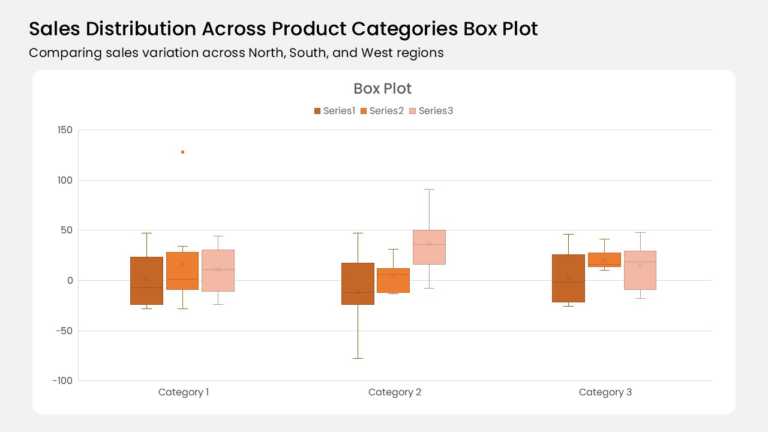
Three category groups anchor this box plot, and each group holds three color-coded boxes. A burnt orange, mid orange, and pale peach series run l....
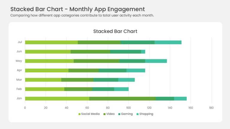
Seven horizontal bars stack four data series across the months January through July. Yellow-green, medium green, teal, and mint segments mark Soc....
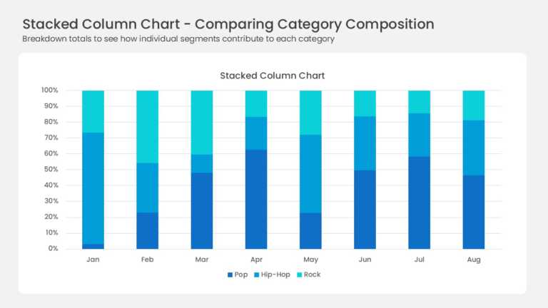
Eight full-height columns run from January to August, each one normalized to 100 percent. Three blue series divide every column: deep navy Pop, b....
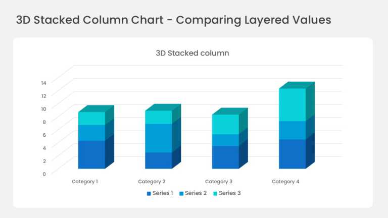
Four three-dimensional columns sit on a perspective floor with gridlines running back into the wall. Each column stacks three series in deep blue....
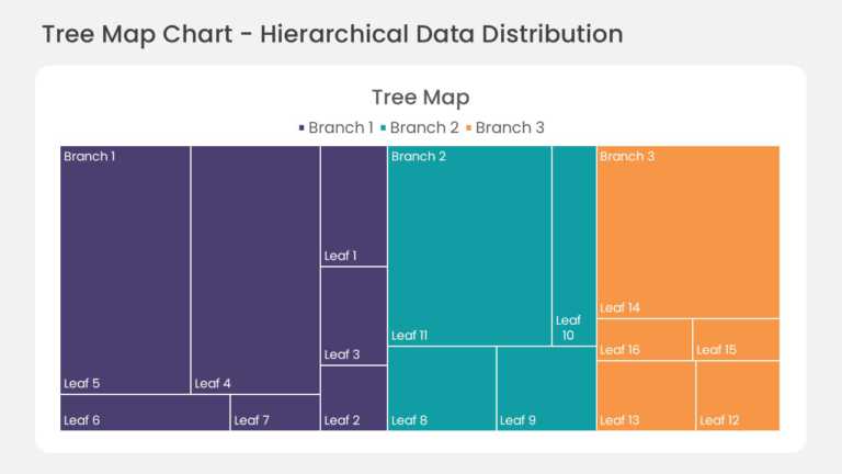
This hierarchical treemap chart divides the slide area into nested rectangles, with each rectangle sized by its share of the total value. Child s....
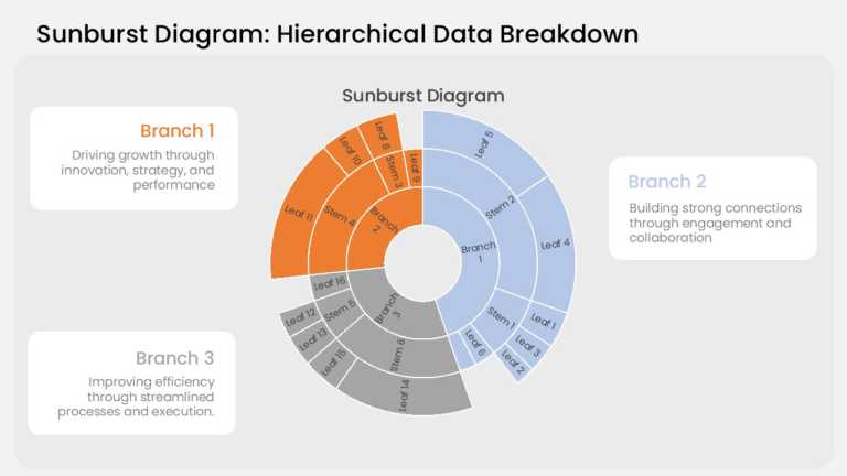
This sunburst chart arranges hierarchical data in three concentric rings. The inner ring holds the top-level categories, the middle ring breaks e....
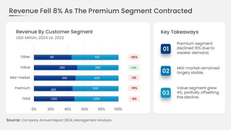
This slide combines a revenue chart broken down by business segment with a dedicated key takeaways panel. The chart area shows the revenue contri....
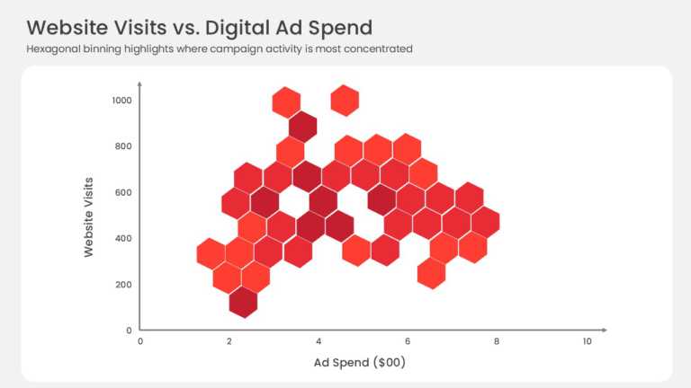
This hexbin scatter plot replaces individual data points with a grid of hexagonal bins plotted against X and Y axes. Color intensity indicates ho....
Related Presentations
-

Bar Chart
74 templates>
-

Pie Chart
47 templates>
-

Bubble Chart
4 templates>
-

Line Chart
12 templates>
-

Gauge Chart
30 templates>
Key Benefits of Using SlideUpLift’s Charts & Diagrams Templates
- Converts Complex Data into Easy-to-Understand Visuals: It presents the data in the form of graphs and diagrams to help the reader easily understand the analysis. It shows numbers in bar graphs pie charts, and other infographics so your audience can better grasp your analysis. Perfect for using data to back up your point and making it more accessible and convincing for your audience to understand.
- Time-Saving Tool: Editable and Professionally Designed Charts: You should not have to spend your time and energy developing the elements of the template from the beginning. We give you the templates of the professional layouts to use. Within minutes, you can change the colors, fonts, and data to get a cleaner result than if you had done it all yourself. You shouldn’t worry about the charts and diagrams you use; the focus should be on the message you have to deliver.
- Boosts Engagement and Improves Memory Retention during Presentations: Images effectively capture and retain audience attention, enhancing engagement during presentations. Our dynamic PowerPoint charts and diagrams will help to keep your audience engaged and interested in the information you are presenting. According to SSRN, visuals can improve retention by 65%, so using chart template PowerPoint or Google Slides chart templates will be more impactful.
- Can be Used For Various Business Purposes and Across Different Industries: The templates are versatile and can be used for all kinds of businesses, including healthcare, finance, education, technology, and others like sales, operations, or HR. No matter if you need financial reports or marketing analytics, these templates were created for your particular needs.
- Compatible with PowerPoint, Google Slides & Keynote: We have made sure that each of our chart PPT templates is fully compatible with Google Slides and Keynote. You can simply upload, edit, and work on files and not have to worry about the formatting. Whether you are using PowerPoint, Google Slides, or Keynote, our templates ensure that you get a harmonized and effective working environment.
Types of Charts & Diagrams PPT Templates Available on SlideUpLift
At SlideUpLift, we offer a wide range of Charts & Diagrams PPT Templates designed to meet diverse business needs. Whether you’re presenting financial data, project updates, or market trends, our templates ensure clarity and professionalism. Here’s a list of some of the most popular types:
- Business Review Templates: These templates are perfect for quarterly or annual business performance reports. They include:
- Sales Growth Charts: Display revenue graphs over time.
- KPI Dashboards: Monitor customer frequency and retention and other key performance indicators.
- Profit & Loss statements: Present the financial status simply and clearly.
These templates are ideal for executives and managers to share business performance information effectively.
- Bell Curve Templates: The bell curve charts are very useful in statistical analysis and performance appraisal. Our templates include:
- Employee Performance Grading: Display employee ratings and distributions.
- Data Distribution Analysis: Show trends and anomalies in the data set.
- Project Risk Assessment: Determine the likelihood of various project results.
These templates are used widely in the HR, education, and project management domains.
- Charts and Graphs for Financial Reports: To present financial information, our templates include:
- Revenue Breakdown Pie Charts: Display income sources at a glance.
- Expense Tracking Bar Graphs: Compares costs against categories or time frames.
- Investment Growth Line Charts: Depicts the Return on Investment and growth trends.
Well suited for the use of CFOs, financial analysts, and entrepreneurs planning to raise funds from investors.
- Marketing Analytics Templates: These chart PPT templates for marketing are designed for marketers to present campaign performance and customer insights. They include:
- Customer Segmentation Charts: Divide the target audiences into segments.
- Conversion Funnel Diagrams: Measures the customer journey through stages.
- Social Media Metrics: Presents information on engagement, reach, and return on investment.
A must-have for marketing teams and agencies that develop marketing strategies and plans.
- Project Management Diagrams: For project updates and planning, the PPT graph templates we provide include:
- Gantt Charts: Monitor project time and events.
- Flowcharts: Describe processes and workflows.
- Resource Allocation Charts: Illustrate the distribution of teams and budget.
Recommended for use by project managers and consultants. A project manager presenting to executives can use a PowerPoint Gantt chart to illustrate timelines, objectives, and key achievements, helping secure funding and stakeholder support.
- Infographic Templates: These chart PPT templates and Google Slides chart templates are crafted to showcase Infographics as a type of visual representation that explains information most simply and appealingly. Our ppt graph templates include:
-
- Timeline Infographics: A historical event or project phase tracker.
- Comparison Infographics: Shows the contrast between two or more products, services, or strategies.
- Statistical Infographics: Shows survey results or research findings.
Useful for educators, consultants, and content marketers.
- Templates for Special Industries: We also provide chart PPT templates tailed to particular industries, including:
- Healthcare: Patient historical data, effects of treatment, and resources management.
- Education: Performance of students and development of curriculum.
- Technology: Product development cycle and user adoption.
These templates provide industry relevance and accuracy for industry-focused presentations. A good chart template for PowerPoint is one designed with all these elements in mind.
How to Pick the Right Chart or Diagram for Your Presentation?
Choosing the right chart or diagram is crucial for delivering a clear and impactful presentation. Here’s a concise guide to help you make the best choice:
- Defining Your Objective: Data Visualization vs. Process Explanation: This depends on the purpose of the chart. For instance, to compare values and show trends or differences between variables, then you should use bar charts, line charts, or pie charts. To explain a process, you would use flowcharts, timelines, or cycle diagrams to depict the workflows or project phases. To avoid confusion, make sure the type of chart template for PowerPoint you use is suitable for the purpose you have in mind.
- Understanding Your Audience: Analytical vs. Visual Learners: You should tailor your charts according to the type of people you are going to present the data to. For instance, analytic audiences such as executives and analysts prefer the graphical representation of the data, like scatter plots or stacked bar charts. Other audiences, known as visual learners, include the general public, who can be easily captured with simpler visuals like infographics and donut charts. You should check that the visuals you use are understandable for the target audience and the way they receive information to attract their attention.
- Industry-Specific Considerations: Finance, Tech, Marketing, Education, etc.: Not all charts are the same; some are used more in certain industries than others. Waterfall charts or revenue breakdowns are most frequently used in finance, while flowcharts or roadmaps are commonly used in tech, and funnel charts or customer journey maps are commonly used in marketing. In the education sector, timelines or comparison charts are most preferred. Use PPT graph templates or Google Slides chart templates that are popular in your industry and acceptable to your audience.
- Choosing Between Static vs. Animated Charts for Maximum Impact: Carefully analyze what to Use When To Make Your Presentation Most Effective.
- Aligning Colors & Fonts with Your Branding & Presentation Theme So They Complement Your Brand and Presentation Theme.
Finally, avoid using too many animations in your presentation, and only keep them for important parts of the presentation. Also, only use animation if it is necessary to help convey the information that you are presenting.
You surely don’t want to waste time creating such intricate templates yourself, explore our highly customizable and meticulously designed PowerPoint Templates to satisfy all your presentation needs.