Best PowerPoint Color Palettes for 2026 (Trends, Examples & Psychology)
This blog covers the best PowerPoint color palettes and how the right colors boost clarity, engagement, and professionalism. It includes ready-to-use palettes with Hex codes for different presentation types. The guide also shares simple tips to apply and customize color themes in PowerPoint.
Introduction
In 2026, the best PowerPoint color palettes are designed to feel calm, clear, and credible—not loud or decorative. Business professionals are moving away from harsh contrasts, neon tones, and overly busy slides, and instead choosing balanced neutrals, nature-inspired hues, and well-placed accent colors that make content easier to read and data easier to understand. When color is used intentionally, it quietly builds trust and keeps your audience focused on what matters.
This guide walks you through the best PowerPoint color palettes you can use today, along with the thinking behind them. You’ll learn how many colors to use, why accessibility and contrast matter more than ever, and how different and best color palette for business presentation work for pitch decks, QBRs, executive reviews, training sessions, and virtual presentations. We’ll also cover 2026 color trends, basic color psychology, and practical tips—plus exactly how to apply these palettes in PowerPoint—so your slides don’t just look good, they work in real business settings.
Note: If you’re creating pitch decks, QBRs, strategy decks, or executive presentations, these palettes are designed to work in real business settings—not just look good.
The 10 Best PowerPoint Color Palettes
Every presentation needs you to use colors according to the type of presentation it will be. For example, if you are going to pitch a project to investors, you need your colors to be full of energy. Still, in retrospect, if you are presenting in front of a room full of professionals on a topic they know about, you need colors that ooze professionalism and are cool colors!
To help you find a color palette that fits your energy needs, we have created a list of the ten best PowerPoint color palettes with their hex codes!

1. Energizing Presentation Color Palette
Color Code: 06BEE1, #1768AC, #2541B2, #03256C

One presentation color palette that you should keep handy when creating any slideshow that requires you to portray energy is the orange, blue, black, and white combo! The orange color helps promote energy and create an upbeat feel to the presentation, while the blue helps keep your audience engaged during a long presentation.
The ice-white and pitch-black color combo also helps keep your text readable and crisp. This scheme is best for when you want to have a pitch meeting.
2. Reliable Color Palette For Presentations
Color Code: #05668D, #028090, #00A896, #02C39A

Blue is one of the most commonly used colors in businesses as it screams out ‘trustworthy and calming, yet it’s so monotone. But, when combined with yellow and a companion darker blue color, you end up creating a reliable PowerPoint color palette that you will keep on going back to when you need a color scheme to fall back on. This color scheme can be used for purposes like branding and marketing.
3. Confident PowerPoint Color Palette
Color Code: F8275B, #FF574A, #FF737D, #3D2F68
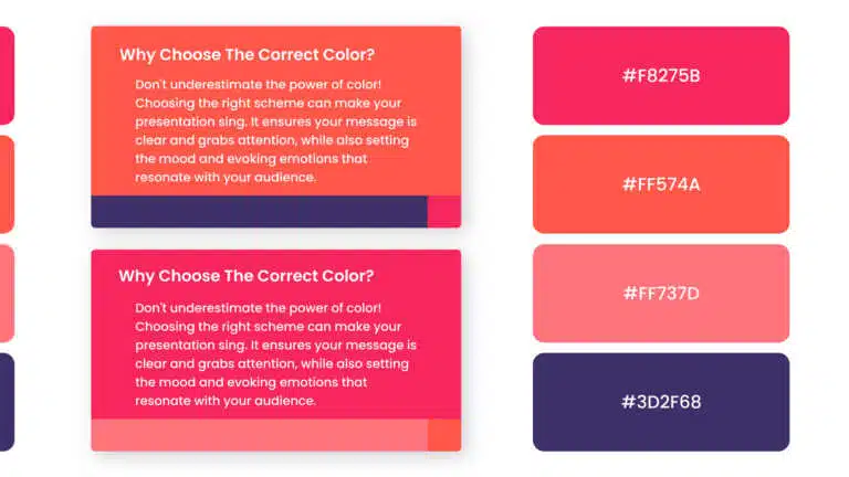
To boost confidence within your audience while presenting, you must use this color scheme that contains the color red!
When using red in presentations, one thing to keep in mind is that red is a very aggressive color when alone; that’s why you should pair it with softer colors, like a softer tone of orange, pink, and fuchsia.
4. Fun Corporate Presentation Color Scheme
Color Code: #ECE2D0, #D5B9B2, #A26769, #6D2E46

All of us can agree that corporate presentations can be a bore, especially when with all the boring gray and dark colors. To create a corporate slideshow that is also fun at the same time, you should add bright colors, like orange, to your gray-tone colored presentation.
The bright color helps add a pop to your presentation and keep it serious, enabling you to keep your audience engaged and attentive!
5. High-End Color Palette For Presentations
Color Code: #1C7293, #065A82, #1B3B6F, #21295C
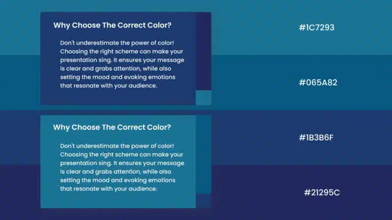
One of the best themes to use for your presentation has to be the vintage color schemes! This 1930s color scheme uses colors such as dark brick red, copper, olive green, and wine red to give your presentation an elegant mood that makes your slideshow look expensive. This color scheme is best suited for luxury goods presentations!
6. Modern Palette For Presentations
Color Code: #8FAF9A, #1F5E63, #E8E6DF

When talking about good color palettes for presentations, the modern color palette is among the first to come to mind. The palette uses bright colors like red over muted colors like dark and light cyan.
The bright color adds a pop to your slides, which helps keep the audience refreshed throughout the presentation. This color scheme is best used to create a presentation that balances business and energy with modernity.
7. Calming Presentation Color Scheme
Color Code: #A3C9A8, #84B59F, #69A297, #50808E
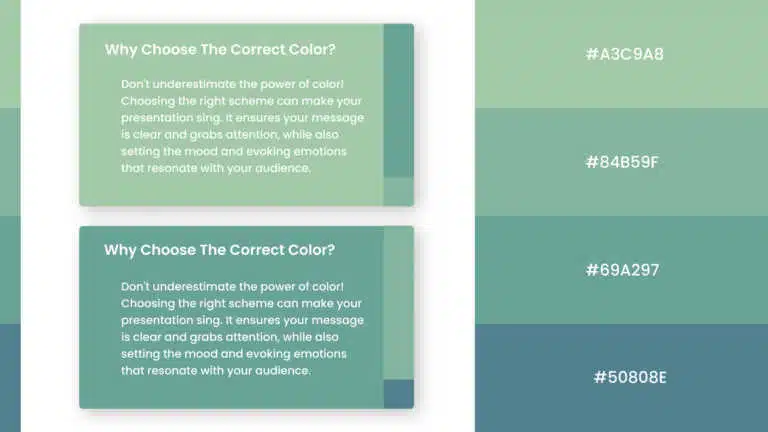
When creating a calming presentation, one thing to keep in mind is to use colors that help soothe your audience. You can use colors that are found in nature, like spring green, blue-gray, terracotta, and mulberry purple, to help create that soothing effect, as shown below!
This color scheme is best suited for health and mental well-being presentations; it can be used by hospitals and companies present in the health sector.
8. Professional Presentations Color Palette
Color Code: #A68A64, #936639, #7F4F24, #582F0E
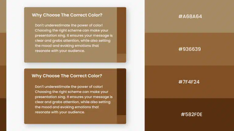
Make your presentation look professional while keeping it refreshing and fresh using this professional color scheme. This palette combines dark and desaturated blue with a lemon-like yellow.
The yellow adds a fresh look to your slides, while the blue colors help keep your presentation looking professional. These colors suit slides requiring you to break important news or build trust with your audience.
While talking about professional slides, if you find it difficult to create visually appealing slides, check out our professional PowerPoint templates that are 100% customizable, enabling you to edit the template according to your requirements.
9. Creative PowerPoint Color Schemes
Color Code: #A3BAC3, #007090, #01A7C2

Add a bit of creativity to your presentations with the help of bright colors that help catch your attention and invoke the feeling of experimentation. It creates a fun and creative color palette when combined with tropical colors.
Bright colors, like orange and pink, help bring a warm tone to your presentation, while tropical colors, like viridian green and blue, help keep your presentation creative! This color scheme is best suited for brainstorming sessions.
10. Warm Presentation Color Palette
Color Code: #918868, #CBD081, #D2E59E, #DCEDB9
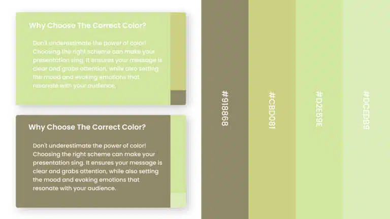
Last but not least, we have the warm color scheme on our list of the best presentation color schemes! Best suited for cosmetics and fashion sector presentations, this palette uses warm neutral colors, like different light and dark tones of red. Using neutral colors allows your slides to be versatile and can be paired up with almost anything, and warm neutral colors help keep your presentation looking sophisticated and warm.
These were some of the best color schemes that you should use for your next presentation. It’s finally time to say goodbye to plain slideshows and wow your audience with the perfect color palette. If you are trying to experiment with the color palettes, check our blog on the one color never to use in presentations to ensure you are doing everything correctly when creating your own scheme.
How to Add These Hex Codes to PowerPoint (Step-by-Step)?
Don’t waste time manually changing every shape. Here is how to set a global theme for your entire deck:
- Go to the Design tab in the top ribbon.
- Click the arrow next to Variants.
- Hover over Colors and select Customize Colors… at the bottom.
- Paste the Hex Codes from the list below into the “Accent 1-6” slots.
- Click Save. Now, every chart and shape you create will automatically use your new professional palette!

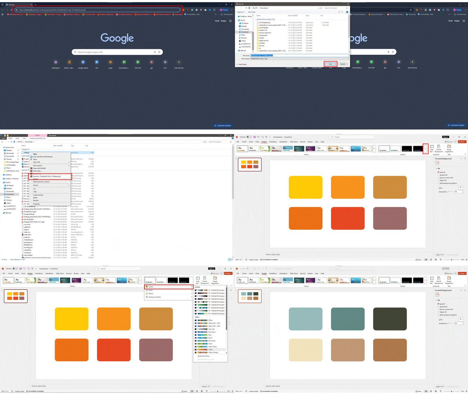
PowerPoint Theme File. It contains all 10 color schemes pre-loaded. Simply double-click to install them into your PowerPoint “Design” tab. [Download 10 Color Themes Pack (Free)]
How to Install These Palettes:
- Download and unzip the file.
- Open PowerPoint and go to the Design tab.
- Click the arrow next to Variants > Colors > Customize Colors.
Which Presentation Color Palette Is Right for You in 2026?
Stuck choosing a PPT color palette? You’re not alone. The right presentation colors depend less on trends—and more on who you’re presenting to and what you want them to feel.
Use this table as a quick shortcut. Find your audience, match your presentation type, and you’ll know exactly which color direction works best in 2026.
The Easiest Way to Pick the Right Presentation Color Palette
| Who You’re Presenting To | What You’re Creating | Go With This Palette Style | What It Looks Like | Why It Works |
| Investors or Customers | Pitch decks, sales decks, product launches | Energizing or Creative | Dark neutral backgrounds, one bold accent (blue, teal, orange), high-contrast charts | Keeps people alert, makes numbers pop, and adds momentum to your story |
| Your Boss or the Board | QBRs, strategy decks, executive reviews | Reliable or Professional | Light neutral backgrounds, conservative accent colors, minimal gradients | Sends a clear signal: this is safe, credible, and well thought out |
| A General Audience | Training sessions, internal presentations | Calming and Readable | Softer color palettes, fewer harsh contrasts, no pure black backgrounds | Easier on the eyes and much better for longer presentations |
| Corporate Leaders | Annual reports, leadership updates | Clean Neutrals | Whites, greys, muted blues with subtle highlights | Feels polished, serious, and executive-ready |
| Educators or Trainers | Courses, workshops, learning decks | Soft and Balanced | Pastels, mid-tone neutrals, limited accent use | Helps people focus without visual fatigue |
| Marketing or Creative Teams | Brand stories, campaign decks | Bold and Expressive | Vibrant accents, strong contrast, modern gradients (used carefully) | Boosts emotional impact and brand recall |
Quick PPT Color Palette Tips for 2026 (Before You Decide)
- If your slides are data-heavy, focus on contrast—not more colors
- If you’re presenting to leadership, lower saturation = higher trust
- If it’s a long session, comfort beats drama every time
- Stick to one main color, one accent, and clean neutrals
- Always test your palette on charts and tables, not just title slides
Think of color like body language for your slides— When it’s right, everything feels effortless.
How to Choose the Right Presentation Color Palette for Your PowerPoint Slides?
Follow these 5 rules used by professional presentation designers:
A great color palette for presentation supports your message. It should never compete with it.
How to Test Color Combinations for Accessibility?
Did you know that up to 8% of the audience is color blind? If your chart relies solely on Red vs. Green to show “Good vs. Bad,” a significant portion of your audience might miss the point.
3 Rules for Inclusive Design:
- The Squint Test: Squint at your slide. If the text blends into the background, the contrast is too low.
- Use Patterns, Not Just Colors: When making charts, use striped or dotted textures for data bars in addition to color.
- Check Your Contrast Ratio: Ensure your text has a contrast ratio of at least 4.5:1. (All the palettes listed above have been tested for high contrast.)
Conclusion
Choosing the right PowerPoint presentation color palette in 2026 is less about trends and more about intention. Calm neutrals, nature-inspired tones, and dark-mode–friendly palettes help your message feel clear, credible, and easy to follow. When you limit your colors, use contrast wisely, and match your palette to your audience, your slides instantly feel more professional.
Remember, great presentation colors shouldn’t draw attention to themselves. They should guide the eye, reduce fatigue, and quietly support your story—whether it’s a pitch deck, QBR, or training session. Start simple, test for readability and accessibility, and let your colors do their job in the background while your ideas take center stage.
FAQs
-
What is the best PPT color palette for professional presentations?
For most business presentations, neutral backgrounds paired with blue, green, or teal accents work best. These colors feel calm, trustworthy, and easy to read—especially in meetings with executives, clients, or investors. They keep the focus on your message instead of distracting from it.
-
How many colors should a PowerPoint color palette have?
Less is more. A strong PowerPoint palette usually sticks to 3–5 colors total. This keeps your slides clean and consistent while still giving you enough flexibility for highlights, charts, and emphasis.
-
Are dark backgrounds good for PowerPoint slides?
Yes—dark backgrounds can work really well, especially for virtual meetings, tech demos, or screen-heavy presentations. The key is contrast. As long as your text and charts clearly stand out, dark slides can look modern and polished.
-
How to change color palette in PowerPoint?
Here’s a simple, step-by-step way to change the color palette in PowerPoint:
- Open your presentation and go to the Design tab.
- Click the arrow next to Variants.
- Hover over Colors and select Customize Colors at the bottom.
- Paste your chosen hex color codes into the Accent slots.
- Click Save—PowerPoint will apply the new palette to all slides, charts, and shapes.
This sets a global theme, so every new slide automatically follows your color palette for presentations.
-
Can color palettes improve presentation engagement?
Absolutely. The right PPT color palette makes slides easier to read, reduces eye strain, and helps your audience stay focused. When colors are used thoughtfully, your presentation feels more professional—and people are more likely to remember what you said.
-
What are some tips for selecting colors that work well together in a presentation?
- Stick to 2–3 base colors and one accent to keep slides clean
- Use high contrast between text and background for readability
- Choose colors with a similar tone or temperature for harmony
- Test colors on charts and tables, not just title slides
- Avoid using multiple bright colors at once—one pop is enough
- Make sure colors work for color-blind and low-light viewing
These simple checks help your presentation look polished and professional.
-
Which color schemes are trending for presentation slides in 2025?
Color Trend Key Look Best For Calm Neutrals + Bold Accent Neutral base with one strong pop Professional & executive decks Trust-Focused Blues Blue tones with warm highlights Corporate, leadership presentations Muted Base + Energy Accent Soft colors with a bright touch Modern business & startup decks Nature-Inspired Palettes Greens, blues, earthy tones Wellness, ESG, strategy slides Warm Neutrals Soft, warm shades Fashion, lifestyle, brand storytelling -
How do I apply a chosen color palette in PowerPoint or Google Slides?
- In PowerPoint: Go to Design → Variants → Colors → Customize Colors, paste your hex codes, and save to apply the palette across the deck.
- In Google Slides: Open Theme builder, update theme colors, and apply them to text, shapes, and charts.
- Set your background color first, then apply accent colors to headings, charts, and highlights.
- Use the saved theme so new slides stay consistent automatically.
- Always preview slides on screen to check contrast and readability.
-
What are light color palettes that look good as backgrounds in presentations?
- Off-white and soft gray – clean, professional, and easy on the eyes
- Warm beige or ivory – adds warmth without distracting from content
- Light blue or pale teal – calm and trustworthy for business slides
- Soft sage or muted green – soothing and modern
- Very light pastels (used sparingly) – fresh look with good readability
Tip: Pair light backgrounds with dark text and one clear accent color for the best contrast.


