
How to Create a Heat Map in PowerPoint: Beginner-Friendly Guide
Heat maps are one of the easiest ways to turn rows of numbers into visuals people understand quickly. In this blog, you will learn what a heat map is, in addition to ways it is helpful, and how to use shapes of heat maps and this type of heat map in unique ways to reach your presentation goals. We are covering popular shapes of heat maps that are easily understood by U.S. audiences and outlining how to plan your slide with the right data, shapes, and regions. These basics help build the foundations for our larger work when planning to design.
You will also learn how to create a heat map in PowerPoint using built-in tools alongside easy steps to import a heat map from Excel and Google Sheets. This tutorial describes step set a heat map that is dynamic so it updates automatically and suggests options to alter colors, fonts, and spacing while still looking neat and clear. These steps will lead to a heat map PowerPoint that emphasizes your patterns, supports your decisions, and makes it easy for the audience to understand your takeaway.
What is a Heat Map and Why is it Useful?
Think of a heat map as your data’s mood ring—it uses colors to convey what’s happening at a glance. Instead of staring at endless rows of numbers until your eyes glaze over, you get a color-coded picture that actually makes sense. The brighter or darker the color, the bigger the number. Simple as that.
It’s like having a highlighter that automatically marks the important stuff for you. You can spot patterns, see where things cluster together, and catch problems before they blow up. No more hunting through spreadsheets—look and you’ll get it.
If you’re looking to visualize data geographically, heat map PowerPoint templates are available for various regions or countries. These templates make it easy to display regional trends and insights without needing advanced design skills.
Why Should You Care?
Because nobody has time to decode spreadsheets all day, heat maps let you compare anything—sales across regions, website traffic over time, team performance—all in one easy view.
They’re perfect for when you need to tell a story with your data. Drop one into a presentation and watch people actually get what you’re saying. Your boss can instantly identify the hot spots and cold zones, which means faster decisions and fewer “can you explain this again?” emails.
What are Popular Types of Heat Maps for Presentations and Their Common Uses?
Heatmap PowerPoint comes in different styles, and each one helps show data in a simple visual form. The table below lists popular types, what they display, and where they are most useful for U.S. audiences.
| Type of Heatmap PowerPoint | What It Shows | Common U.S. Applications |
| Geographic Heat Map | Color-based data across regions | Sales by state, election results, and customer density |
| Calendar Heat Map | Data changes over days or months | Employee attendance, website traffic trends, and seasonality analysis |
| Matrix Heat Map | Values compared in rows and columns | Performance reviews, project tracking, and KPI comparison |
| Website Heat Map | User activity on webpages | Click behavior, scroll depth, and UX testing |
| Correlation Heat Map | Relationship strength between variables | Market research, financial analysis, product insights |
| Risk Heat Map | Levels of risk or impact | Compliance reporting, safety planning, risk assessment |
| Resource Heat Map | Usage or load across teams or tools | Workforce planning, capacity analysis, workload distribution |
These heat maps make information easier to understand and share. They help highlight patterns, compare values, and support clearer decisions in presentations.
How Should You Plan Your HeatMap PowerPoint?
- Deciding on the Data to Visualize: Select data that actually holds meaning. If the numbers don’t show a clear pattern or support your point, they’re just noise.
- Choosing a Suitable Template or Layout: Go for clean and simple. Give your colors and text some space to breathe—cramped designs can be visually overwhelming and cause eye strain.
- Selecting the Right Geographic or Risk Region: Use regions your audience knows. If they work with U.S. markets, show U.S. states. Don’t make them work to understand the basics.
- Setting a Clear Color Scale: Pick colors that don’t look identical. And stick with the same scale throughout—switching it up mid-presentation just confuses everyone.
- Labeling Important Areas: Mark the key areas. A quick label helps people know exactly where to look, rather than having to guess.
- Keeping the Slide Balanced: Don’t stuff everything onto one slide. Give it room. A clean design conveys your point more effectively than a busy one.
- Checking Data Accuracy: Check your numbers twice. One wrong figure can tank your credibility faster than anything else.
- Testing Visibility on Different Screens: Pull it up on a projector before your meeting. What looks fine on your laptop may be impossible to read on a large screen.
How Can You Create and Manage Heat Maps in PowerPoint?
Creating and managing heat maps in PowerPoint is easier when you use the right tools and methods. You can build heat maps directly in PowerPoint, import ready-made ones from Excel or Google Sheets, and even set up dynamic versions that update automatically. Each option helps you present data clearly and keep your slides accurate. This section walks you through all three approaches step by step.
How to Create a Heat Map in PowerPoint Using Built-In Tools?
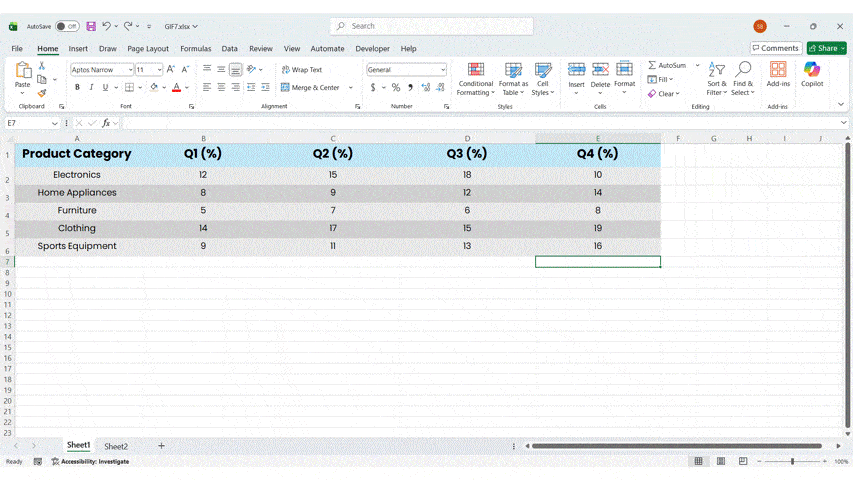
- Step 1: Prepare Your Data: Write your numbers in a simple table, either in PowerPoint or Excel. Keep your rows and columns clear.
- Step 2: Insert a Table or Grid: Go to Insert → Table and add a table that matches your data layout.
- Step 3: Apply Color Formatting: Select the cells → Home → Conditional Formatting (opens in Excel). Choose a Color Scale that fits your slide theme, or consider using a gradient fill for enhanced visual appeal.
- Step 4: Bring It Back to PowerPoint: If you formatted in Excel, copy the heat-colored table and paste it into PowerPoint. Select “Keep Source Formatting” to keep the colors.
- Step 5: Adjust the Layout: Resize the table so each cell is easy to see. Keep margins wide so the heat map looks clean and allows for adding data points if necessary.
- Step 6: Add a Legend: Insert a small shape or text box that explains the color meaning. Simple labels like “High,” “Medium,” and “Low” work well.
- Step 7: Add a Slide Title: Use a short title that tells viewers what the map shows. For example: “Sales Performance by Region.”
- Step 8: Check Visibility: Make sure colors look clear on both light and dark backgrounds. Adjust the palette if contrast is low.
- Step 9: Keep It Consistent: Use the same color scale across all related slides. This helps the audience follow your story.
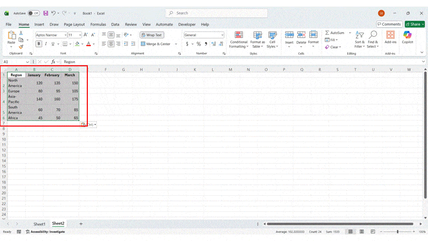
How Do You Import Heat Maps from Excel or Google Sheets?
A more efficient method for creating a complex PowerPoint heatmap is to build it in Excel or Google Sheets first and then import it into your PowerPoint presentation. This approach is particularly useful when you have a large dataset, as spreadsheets offer powerful tools for data manipulation and visualization.
- Create your heat map: Build the heat map in Excel or Google Sheets using Conditional Formatting.
- Apply a clear color scale: Choose colors that show differences clearly and match your slide theme.
- Select and copy the cells: Highlight the heat-colored cells and copy them.
- Paste into PowerPoint: Use “Keep Source Formatting” to keep the colors and layout intact.
- Resize the table if needed: Adjust the size so each cell is easy to read on the slide.
- Use the paste link for live updates: If you want automatic updates from your sheet, paste as a linked table.
- Check the colors on your slide: Make sure the heat map looks clear against your background.
How Can You Automatically Generate Dynamic Heat Maps?
- Use linked Excel data: Connect your PowerPoint table to an Excel file so updates change the heat map automatically.
- Apply Conditional Formatting in Excel: Set color rules once, and Excel will refresh the heat map whenever the data changes.
- Paste as a linked object: Use “Paste Link” in PowerPoint to keep the heat map synced with the source file.
- Set up consistent color scales: Use the same color rules for all metrics so updates stay clean and readable.
- Automate data imports in Excel: Pull data from databases or sheets into Excel to refresh the heat map with one click.
- Use formulas for live calculations: Let Excel handle averages, scores, and comparisons automatically before generating the heat map.
- Refresh links before presenting: Update all links in PowerPoint to ensure you show the most recent numbers.
How Can You Customize the Visual Design of Your Heatmap in PowerPoint?
A well-designed heat map is easier to read and makes your data more meaningful. With a few simple design choices, you can create a heatmap in PowerPoint that is clear, consistent, and visually strong.
- Select a strong and meaningful color palette: Use colors that clearly separate high, medium, and low values. Avoid palettes that blend together or look too similar.
- Adjust color intensity for better clarity: Increase the contrast between shades to help viewers spot patterns more easily. Keep the scale smooth and easy to follow.
- Add a simple and well-placed legend: Include short labels that explain what each color represents. Place the legend close to the heat map for quick reference.
- Use clean and readable text styles: Stick to simple fonts and large sizes so labels are clear on all screens. Consistent typography keeps your slide professional.
- Reduce visual clutter on the slide: Remove heavy borders, extra icons, or unnecessary shapes. A clean layout keeps all attention on the data.
- Space and align elements evenly: Balanced spacing helps your heat map breathe and makes patterns easier to see. Group related items neatly.
- Match the design with your presentation theme: Pick colors and styles that fit your overall slide deck. This keeps your visuals polished and consistent.
- Ensure accessibility for all viewers: Choose colors that remain visible for colorblind users. Test your palette to avoid red-green confusion.
- Add light outlines for structure: Thin borders around cells can help separate values without distracting from the map.
- Preview the slide on different screens: Test the design on laptops, projectors, and large displays to confirm clarity in every setting.
Conclusion
In conclusion, mastering the art of designing effective PowerPoint heatmap slides can significantly enhance your presentations, allowing you to convey complex data in a clear and engaging manner. By understanding the types of heat maps, choosing the right data to visualize, and customizing their design, including animations, you can create impactful visuals that resonate with your audience. Remember to prioritize best practices for clarity and interactivity, ensuring your heat maps serve their purpose effectively. If you’re ready to elevate your presentation skills further, don’t hesitate to get a free trial or consultation with our experts to explore additional resources and tools tailored just for you!
FAQs
-
Are there free downloadable heat map template for PowerPoint?
Yes, there are plenty of free heat map templates out there for PowerPoint, and honestly, they’re a lifesaver. Why build everything from scratch when you don’t have to?
SlideUpLift has a bunch of free PowerPoint templates and more that you can grab and customize in just a few minutes. They come with clean designs, colors already set up, and formatting that actually looks professional. It’s a quick way to get something polished without spending hours tweaking every little detail.
-
How can I use add-ons or tools to create interactive heat maps?
- Grab a PowerPoint add-on that lets you create interactive charts or maps.
- Load your data into the add-on—it usually has a simple interface for this.
- Pick an interactive heat map style that fits what you need.
- Tweak the colors, labels, and hover effects until it looks right.
- Drop the finished heat map into your PowerPoint slide.
- Click around and test it out to make sure everything actually works.
-
What steps should I follow to customize a US region heat map slide?
- Choose a U.S. map template that matches your slide style.
- Add your state or region data to the map layout.
- Apply a clear color scale to show high and low values.
- Adjust colors, borders, and labels for better clarity.
- Add a small legend explaining what each color represents.
- Review spacing, alignment, and contrast to keep the slide clean.
-
How can I create a heat map in PowerPoint for my presentation?
- Start by adding a table or just grab your data from Excel.
- In Excel, use Conditional Formatting to color your cells based on the numbers—it does the work for you.
- Copy that table and drop it into PowerPoint. When it asks, click “Keep Source Formatting” so your colors don’t disappear.
- Make it bigger if people will struggle to see it, and space things out so it doesn’t look squished.
- Toss in a quick legend and title so everyone knows what the colors actually mean.
- Take a step back and check if the colors stand out and the whole thing looks clean—not too busy, not too bland.
-
Can I automatically generate a heat map in PowerPoint from my data?
Yes, you can set up a heat map in PowerPoint that updates itself when your data changes. Here’s how:
- Build your heat map in Excel first, using Conditional Formatting to add the colors.
- Copy those colored cells and paste them into PowerPoint as a linked table—not just a regular paste.
- Whenever your numbers change, just update them in Excel.
- PowerPoint will pull in those changes and refresh your heat map automatically.
- Pretty handy when you’re dealing with data that keeps changing.
-
Where can I download a risk heat map PowerPoint template?
You can grab a ready-made risk heat map template from SlideUpLift. They’ve got professional designs that show probability and impact using color scales—so you can visualize risks without starting from scratch.
The best part? Everything’s editable. You can tweak the colors, change the labels, and adjust categories to fit your specific project or industry. Just head to SlideUpLift’s Heat Map or Risk Management section, pick a template that works for you, and download it. Then drop it into your presentation and you’re good to go.
-
How do I use heat map data visualizations effectively in a PowerPoint presentation?
Here are simple steps to use heat map data visualizations effectively in a PowerPoint presentation:
- Start with clear and accurate data that highlights real patterns.
- Keep your color scale simple so viewers can compare values quickly.
- Add a short title and legend to explain what the colors represent.
- Avoid clutter and leave enough space around the heat map.
- Focus on the key insight you want your audience to notice first.
- Use consistent colors across all slides to keep your story clear.
-
How do I customize the color scheme on a PowerPoint heat map?
Here’s a simple set of steps to customize the color scheme on a PowerPoint heat map:
- Select the table or chart you’re using as your heat map.
- Open it in Excel if it uses Conditional Formatting.
- Go to Conditional Formatting → Color Scale and choose a new palette.
- Adjust the minimum, midpoint, and maximum colors for clearer contrast.
- Apply your brand colors if needed, but keep the scale easy to read.
- Paste the updated heat map back into PowerPoint and check visibility on the slide.
Table Of Content


Related posts from the same category

26 Mar, 2026 | SlideUpLift
How to Curve Text in Google Slides (5 Methods That Actually Work)
Introduction Can you curve text in Google Slides? It is one of the most common questions people ask when trying to make their presentations look more polished and designed. The

24 Mar, 2026 | SlideUpLift
How to Wrap Text in Google Slides — 4 Methods That Actually Work
Learn how to wrap text in Google Slides with simple step-by-step methods to align text around images and create clean, professional layouts. This guide explains practical workarounds since Google Slides

20 Mar, 2026 | SlideUpLift
How to Add Annotations in PowerPoint: The Complete Step-by-Step Guide
This blog explains how to add real-time annotations in PowerPoint presentations using tools like the pen, highlighter, and laser pointer to make slides more interactive and engaging. It provides step-by-step

17 Mar, 2026 | SlideUpLift
How to Create a Project Presentation That Gets Stakeholder Approval
In any business environment, the ability to create a project presentation that actually moves people — securing approvals, aligning teams, and building client confidence — is one of the most
16 Mar, 2026 | SlideUpLift
How to Convert PowerPoint to Google Slides?
This blog explains how to convert PowerPoint to Google Slides using simple step-by-step methods like uploading PPT files to Google Drive or importing them directly into Slides. It helps users

13 Mar, 2026 | SlideUpLift
How to Play Video in PowerPoint Across Single and Multiple Slides
This blog explains how to play a single video across multiple slides in PowerPoint using simple animation and playback settings. It walks through the step-by-step process of inserting the video,

11 Mar, 2026 | SlideUpLift
How to Hide a Slide in Google Slides: Complete Guide
Learn how to hide and unhide slides in Google Slides without deleting them in this step-by-step guide. The blog explains simple methods like using the Skip Slide option, toolbar, and

9 Mar, 2026 | SlideUpLift
How to Hide and Unhide Slides in PowerPoint (Complete Guide)
This blog explains how to hide and unhide slides in Microsoft PowerPoint so you can skip certain slides during a presentation without deleting them. It covers why the hide slide

5 Mar, 2026 | SlideUpLift
Quarterly Business Review (QBR): What It Is, Examples & How to Present One
A QBR, or quarterly business review, is a strategic meeting held every three months to evaluate business performance, review key metrics, and align on goals for the next quarter. QBRs
4 Mar, 2026 | SlideUpLift
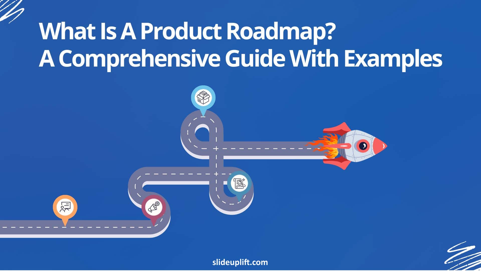
What Is a Product Roadmap? A Complete Guide With Types, Examples, and Templates
Every product starts with an idea. Turning that idea into a shipped, successful product requires coordination across design, engineering, marketing, sales, and leadership. A product roadmap is the strategic tool
27 Feb, 2026 | SlideUpLift
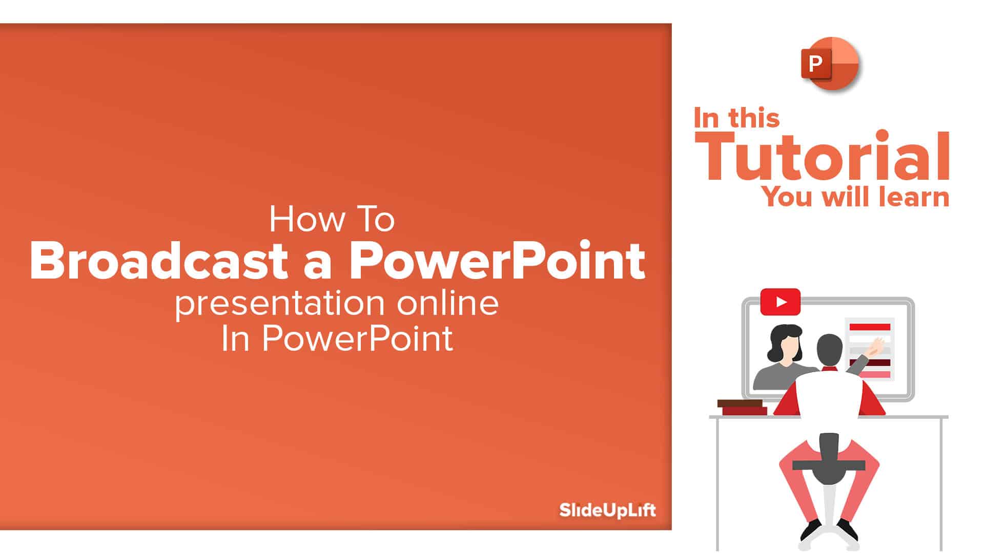
How To Broadcast a PowerPoint Presentation Online [6 Working Methods]
If you have been looking for a way to broadcast a PowerPoint presentation online to a remote audience, you have probably run into tutorials that tell you to click Slide

27 Feb, 2026 | SlideUpLift
How to Change Transparency in PowerPoint (Step-by-Step Guide)
Learn how to use transparency in Microsoft PowerPoint to adjust the opacity of images, shapes, and text for cleaner, more professional slide designs. This step-by-step guide explains how to change

24 Feb, 2026 | SlideUpLift
Which Program Is Used to Open PPTX Files: Complete Guide
This blog explains which program is used to open PPTX files and how to view or edit presentations on Windows, Mac, and mobile devices. It covers tools like Microsoft PowerPoint,

20 Feb, 2026 | SlideUpLift
How to Create Engaging Academic Presentations: 10 Expert Tips + Templates
This blog is a complete guide on how to create engaging academic presentations, offering 10 expert tips for structuring content, designing slides, and delivering with confidence. It covers common mistakes

20 Feb, 2026 | SlideUpLift
How to Make Google Slides Play Automatically On A Loop? (Step-by-Step Guide)
This blog explains how to make presentations in Google Slides play automatically and loop without manual clicks. It covers clear step-by-step methods using auto-advance timings and the Publish to Web

18 Feb, 2026 | SlideUpLift
How to Copy a Slide in Google Slides: Step-by-Step Guide
Learn how to duplicate, copy, and paste a slide in Google Slides using simple, step-by-step methods. This guide covers desktop shortcuts, right-click options, toolbar methods, and mobile steps for Android

17 Feb, 2026 | SlideUpLift
How to Round Corners in Google Slides: Complete Guide
Learn how to round corners in Google Slides using both the simple yellow handle method and the advanced Edit Points feature. This guide explains how to adjust the corner radius,
12 Feb, 2026 | SlideUpLift
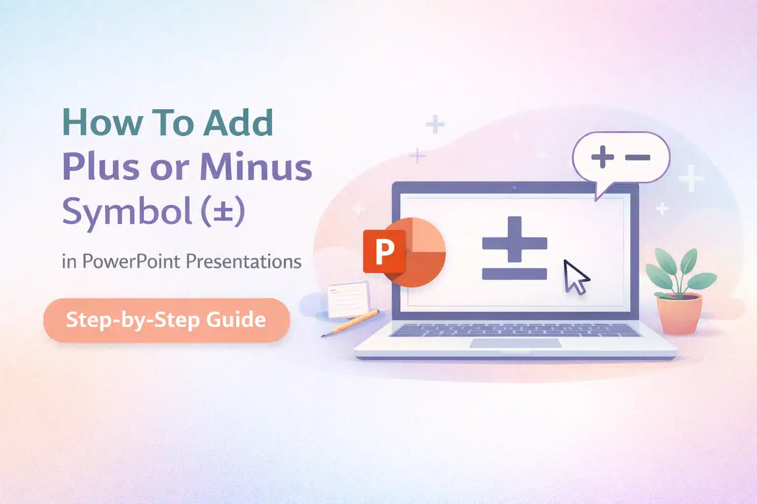
How To Add plus or minus symbol in PowerPoint Presentations – Step-by-Step Guide
This blog explains how to add the plus or minus symbol (±) in Microsoft PowerPoint using keyboard shortcuts (Windows & Mac), the Symbols menu, equation tools, and copy-paste methods. It

10 Feb, 2026 | SlideUpLift
How To Convert Google Slides Into PDF: Quick & Easy Guide
This guide explains how to convert Google Slides into a PDF quickly and without formatting issues. It covers saving slides with or without speaker notes and methods for desktop and

6 Feb, 2026 | SlideUpLift
How To Make A Professional PowerPoint Presentation With Practical Tips
This blog shows how to make professional presentations with clear structure, engaging visuals, and effective delivery. It highlights using AI tools like ChatGPT and Copilot with ready-made templates to quickly

4 Feb, 2026 | SlideUpLift
How to Write a Sales Pitch That Captures Attention and Converts Leads
This SlideUpLift guide explains how to write an effective sales pitch by identifying your target audience, highlighting your unique value, focusing on benefits over features, and structuring a persuasive presentation

30 Jan, 2026 | SlideUpLift
Sales Presentation: A Complete Guide to Structure, Examples, and Best Practices
This blog is a complete guide to building a high-impact sales presentation, covering everything from structure and slide selection to delivery and follow-up. It explains what makes sales presentations effective,
28 Jan, 2026 | SlideUpLift
Types of Slides That Make Presentations Clear, Engaging, and Impactful
This blog explains why choosing the right slide types is essential for clear, engaging presentations. It covers the most important PowerPoint slide types, when to use them, and how they
23 Jan, 2026 | SlideUpLift
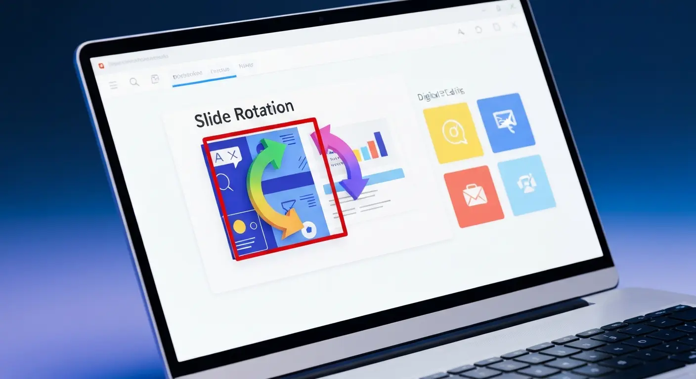
How to Rotate a Slide in PowerPoint: Complete Guide
This blog explains how to rotate slides in PowerPoint using all practical methods, including changing slide orientation, rotating objects, and handling single-slide workarounds. It also covers professional solutions for mixing
21 Jan, 2026 | SlideUpLift
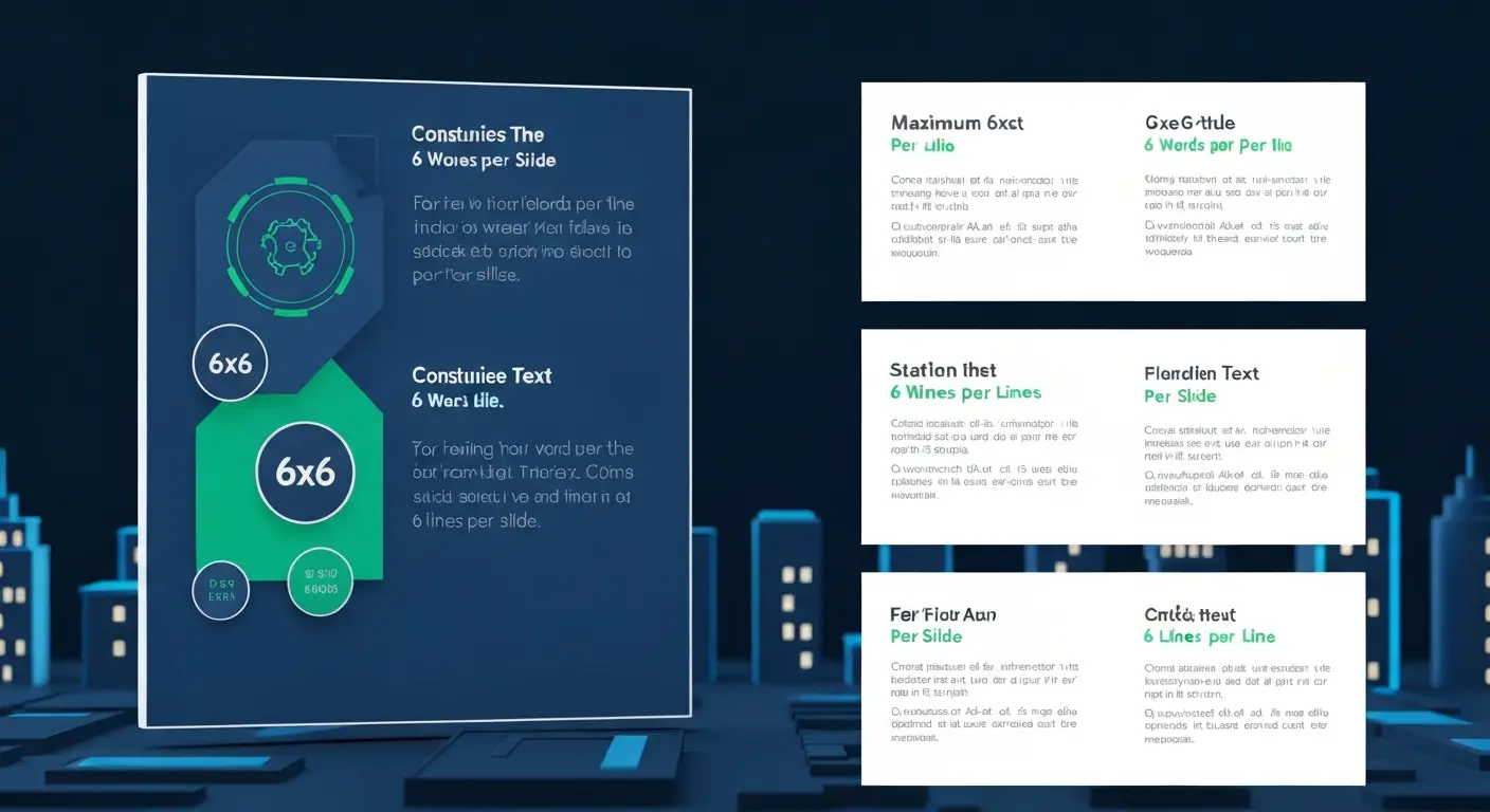
What Is 6×6 Rule in PowerPoint? Complete Guide To Improve Slides
This blog explains what is 6x6 Rule in PowerPoint and how it improves slide clarity and readability. It shows how to apply the rule, avoid common mistakes, and compare it
19 Jan, 2026 | SlideUpLift
How to Add Footnotes in PowerPoint: A Step-by-Step Guide
Adding footnotes in PowerPoint helps you cite sources and add context without overcrowding your slides. Since PowerPoint doesn’t offer an automatic footnote feature, footnotes are created manually using text boxes

16 Jan, 2026 | SlideUpLift
How To Merge PowerPoint Presentations Using Simple Methods and a Free Tool
Learn how to merge PowerPoint presentations quickly and easily using manual methods or a free merge PPT tool. Keep slides, formatting, animations, and transitions intact while creating polished, professional decks.

14 Jan, 2026 | SlideUpLift
How to Create a McKinsey-Style Presentation: The Complete Guide (2026)
Creating presentations that rival McKinsey's legendary clarity and impact isn't about copying slides—it's about mastering a communication philosophy that transforms complex ideas into actionable insights. Whether you're pitching to executives,

14 Jan, 2026 | SlideUpLift
How to Add a Timer to Google Slides: Step-by-Step Guide
This blog walks you through how to add a timer to Google Slides using simple, practical methods that actually work. It covers Auto-play timing, visible countdown timers, videos, and add-ons,

8 Jan, 2026 | SlideUpLift
How to Prepare for a Presentation: A Simple Guide for Beginners
This blog explains how to prepare for a presentation step by step. It covers goal setting, content structuring, slide design, practice, and handling questions. Beginners can also learn common challenges,

6 Jan, 2026 | SlideUpLift
Presentation Tips for Structuring Messages and Effective Storytelling
This blog breaks down practical presentation tips to help you plan, design, and deliver slides that truly stand out. It covers how to simplify text, use visuals effectively, and maintain

9 Dec, 2025 | SlideUpLift
How to Change a PowerPoint Template – Quick Step-by-Step Guide
This blog shows how to change or update a PowerPoint template to give your slides a fresh, professional design without losing your content. It walks through step-by-step actions in the

4 Dec, 2025 | SlideUpLift
The 5-5-5-Rule-of-PowerPoint: Your Guide to Effective Design
Introduction Have you ever seen a PowerPoint presentation with too much information on the slide? The problem with today’s presentations is that they draw attention away from the actual content,
6 Nov, 2025 | SlideUpLift
How to Add Transitions in PowerPoint: Complete Step-by-Step Guide
Do you want to create a seamless flow in your PowerPoint slides and make a strong impression? While adding transitions to PowerPoint slides might seem obvious, transitions are the key

4 Nov, 2025 | SlideUpLift
How to Use Morph in PowerPoint: The Ultimate Guide to Smooth Transitions
If you’ve ever watched a presentation where shapes flow smoothly, images glide effortlessly, and text elegantly shifts between slides, you’ve witnessed the power of Morph in PowerPoint. This feature is
30 Oct, 2025 | SlideUpLift
How To Make A Graph In PowerPoint: Step-by-Step Guide
The goal of impactful graphs is not simply to convey data; rather, it is to tell a story with data that has meaning to the audience. Graphs and charts can

13 Oct, 2025 | SlideUpLift
How to Write a Business Case: A Beginner’s Guide + Examples
Every project needs a passport to get through executive approval. Without it, even the best plans can get grounded before taking off. This very piece of evidence holds the power

10 Oct, 2025 | SlideUpLift
What Is A Project Charter? Definition, Examples & Best Practices
Launching a project without adequate planning can result in confusion, delays, and misaligned expectations. A project charter is a key document in the project documentation process that lays the groundwork

8 Oct, 2025 | SlideUpLift
How to Insert Emoji in Google Slides & PowerPoint for Fun, Eye-Catching Slides
Have you ever thought about how a simple emoji can change the mood or tone of your presentation? You could use a smiley face 😊, that would certainly lighten the
1 Oct, 2025 | SlideUpLift
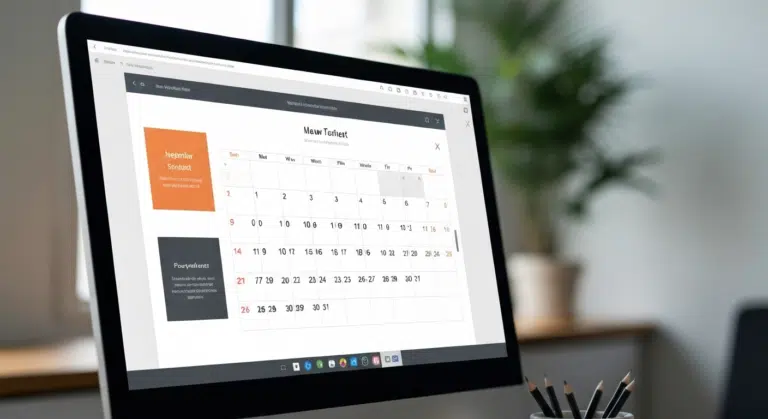
Insert Calendar In PowerPoint And Google Slides: Quick Guide For Smarter Planning.
Do you want your presentations to be more organized, attractive, and professional? Learning how to add a calendar in PowerPoint or Google Slides will take boring schedules and deadlines and

26 Sep, 2025 | SlideUpLift
What Is a PPTX File? Think of It as PowerPoint 2.0
PowerPoint presentations are everywhere — from boardrooms to classrooms — and behind every great slide deck is the PPTX file. It’s not just some random presentation software and powerpoint file

17 Sep, 2025 | SlideUpLift
Google Slides Strikethrough: Cross Out The Old And Spotlight The New
Ever wished you could just cross something out instead of deleting it? You know, like putting a big line through “boring idea” and replacing it with “brilliant plan”. That’s the

12 Sep, 2025 | SlideUpLift
What is KPI? Step-by-Step Guide with KPIs Examples That Work
Is it hard for you to know if your business is getting to the level it should be? That's where key performance indicators (KPIs) come into play. KPIs indicate how

10 Sep, 2025 | SlideUpLift
Best Fonts For PowerPoint Presentation: The Runway Of Letters
Imagine this: your presentation is a red-carpet event. Your slides are the guests, the content is the message, and the font? That is the outfit; the one builds up the

10 Sep, 2025 | SlideUpLift
Advantages and Disadvantages of Microsoft PowerPoint: Pros, Cons, and AI Features Explained
PowerPoint has been the go-to tool for presentations for decades—but is it keeping up with today’s fast-paced, AI-driven world? PowerPoint makes it easy to take ideas to slides, whether you're

5 Sep, 2025 | SlideUpLift
10 Virtual Meeting Etiquette Rules for Professionals
Introduction Virtual meetings and online meetings are the new normal for remote work teams everywhere. Whether you're chatting with co-workers, giving a client presentation, or taking part in a hybrid

3 Sep, 2025 | SlideUpLift
How to Add Watermark in PPT Like a Pro: Step-by-Step Tutorial
Every presentation tells a story, but it should also say who it belongs to, right? And if we tell you that there is a way to stamp your identity on

29 Aug, 2025 | SlideUpLift
30+ ChatGPT Presentation Prompts To Create Impactful Presentations
Creating presentations can be challenging. It takes a lot of time and effort to conduct research, write the text, format the slides, add photos, and practice. But, what if AI

29 Aug, 2025 | SlideUpLift
Microsoft Copilot vs ChatGPT-4 Showdown: Who’s Got the Edge?
Not long ago, making a presentation meant spending hours and hours writing content, formatting slides, finding visuals, and tweaking layouts. Tools like PowerPoint and Google Slides gave us templates, but

29 Aug, 2025 | SlideUpLift
10 Best Presentation Software: In-Depth Comparison Guide
The fact is, giving a great presentation is not only about how you choose your words, but rather involves expressing those very words. With the right PowerPoint presentation software, you

28 Aug, 2025 | SlideUpLift
Password Protect PPT: How To Secure Your Presentations (Easy Guide)
Have you ever shared a PowerPoint and then worried, “What if someone changes my slides?”, or even worse, “What if the wrong person opens it and leaks the content?”. Frustrating,

26 Aug, 2025 | SlideUpLift
Track Changes In PowerPoint And Keep Your Team In Sync
Ever spent hours perfecting a PowerPoint, way too much time that you then forget to track who made what change? You aren't alone. Unfortunately, unlike Word or Gmail slides, PowerPoint
14 Aug, 2025 | SlideUpLift
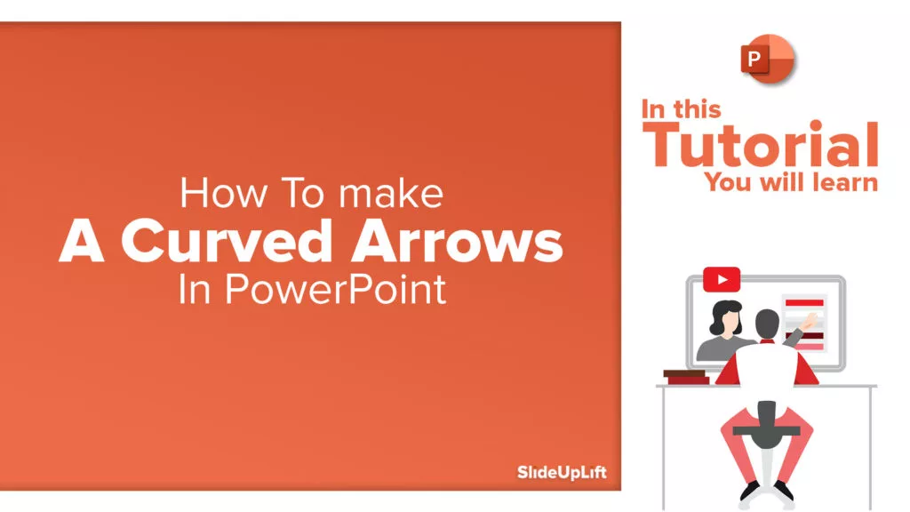
How to Make a Curved Arrow in PowerPoint? A Detailed Guide
Think of your presentation as a journey. On a slide, you have the ideas stacked up, but there is no way you are understanding what is connected to the next.

13 Aug, 2025 | SlideUpLift
How To Create Infographics In PowerPoint For Smarter Visual Storytelling?
As a professional, you might have to host meetings and deliver presentations to your stakeholders and team members. As a host, it's crucial to deliver presentations in a way that

6 Aug, 2025 | SlideUpLift
How To Edit Footer In PowerPoint For Consistent Presentation Design
Footers are an important part of a PowerPoint presentation. They give the same footer text, like the date or slide numbers, on all slides. This helps people understand the talk

31 Jul, 2025 | SlideUpLift
Google Slides vs PowerPoint: A Complete Comparison Guide
Introduction Stuck deciding between Google Slides and PowerPoint for your next big presentation? Yeah, we've been there too. Both pack a punch with features, leaving you wondering: "Which one will

25 Jul, 2025 | SlideUpLift
How Many Slides For A 30 Minute Presentation? Timing, Tips, and Structure
One of the biggest challenges in presentations is staying on time. Whether it’s 5 minutes or 45, running over means rushing key points or losing your audience. Here’s the good

21 Jul, 2025 | SlideUpLift
PowerPoint Slide Size 101: Why It Matters More Than You Think
Imagine crafting the perfect slide, visuals on point, text crisp, animations smooth. But when you present, the content looks off. Cropped images, awkward white spaces, or text running off the

15 Jul, 2025 | SlideUpLift
Google Slides Shortcuts Cheat Sheet To Boost Workflow
Google Slides is already a go-to tool for everything. From classroom projects to business decks and online workshops. It is a one-stop platform to create and share your ideas, thoughts,

7 Jul, 2025 | SlideUpLift
PowerPoint Shortcuts You’ll Wish You Knew Sooner (Beginner to Pro Guide)
PowerPoint is one of the most powerful tools for creating presentations. However, working in PowerPoint can become time-consuming, especially when you have to click through menus for every small task.

4 Jul, 2025 | SlideUpLift
Why Your Conclusion Slide Matters—And How To Get It Right
Picture this: You've delivered an amazing presentation. Great start solid middle... but then... the ending just... flops. The energy drains. People shuffle out, already thinking about lunch. Sad, isn't it?
3 Jul, 2025 | SlideUpLift
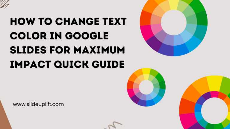
How to Change Text Color in Google Slides for Maximum Impact – Quick Guide
Using Google Slides to build presentations is now widely practiced across the digital world. It is clean, collaborative, and performs its tasks fairly well. Be it a business pitch, a

30 Jun, 2025 | SlideUpLift
A Simple Guide On How To Change Margins In PowerPoint
Margins—those often-overlooked borders framing your slides—play a crucial role in creating polished, professional presentations. Adjusting margins helps you control your layout. This is important for printed handouts and projections. It

13 Jun, 2025 | SlideUpLift
Org Chart in PowerPoint: Simplify Complex Team Structures with Smart Visuals
Without a clear org chart, even small teams feel messy. People start asking: “Who’s responsible for what?” Whether you are a manager, HR professional, or team lead, explaining the team

12 Jun, 2025 | SlideUpLift
Create An Org Chart in Google Slides: A Step-by-Step Guide
Want to map out any type of organizational structure—whether it's a company, project team, or even a hierarchy? An org chart helps visualize relationships between roles, departments, or functions in

28 May, 2025 | SlideUpLift
Beginner’s Guide: How To Make A Venn Diagram In Powerpoint
What Is A Venn Diagram? In today’s fast-paced business world, clarity is currency, and Venn diagrams deliver just that. Whether you're analyzing market segments, comparing competitors, or aligning team strategies,

27 May, 2025 | SlideUpLift
How to Create a Roadmap Diagram in PowerPoint? (Step-by-Step Guide)
Need to build a professional roadmap slide for your next presentation? You are in the right place. This tutorial walks you through every method for creating a roadmap diagram in

14 May, 2025 | SlideUpLift
How To Crop A Picture Into A Circle In The Presentation: Step-By-Step Guide
Ever found the perfect image for your presentation, but it just doesn’t look right in that boring rectangle frame? We’ve all been there. Whether you're trying to make your slides

25 Jun, 2024 | SlideUpLift
Best PowerPoint Color Palettes for 2026 (Trends, Examples & Psychology)
This blog covers the best PowerPoint color palettes and how the right colors boost clarity, engagement, and professionalism. It includes ready-to-use palettes with Hex codes for different presentation types. The

24 Jan, 2024 | SlideUpLift
What Is a Project Roadmap? A Complete Guide With Examples and Free Templates
This blog explains what a project roadmap is and how it helps define goals, timelines, and key milestones. It covers different roadmap types and how to create them. The guide
1 Sep, 2022 | SlideUpLift
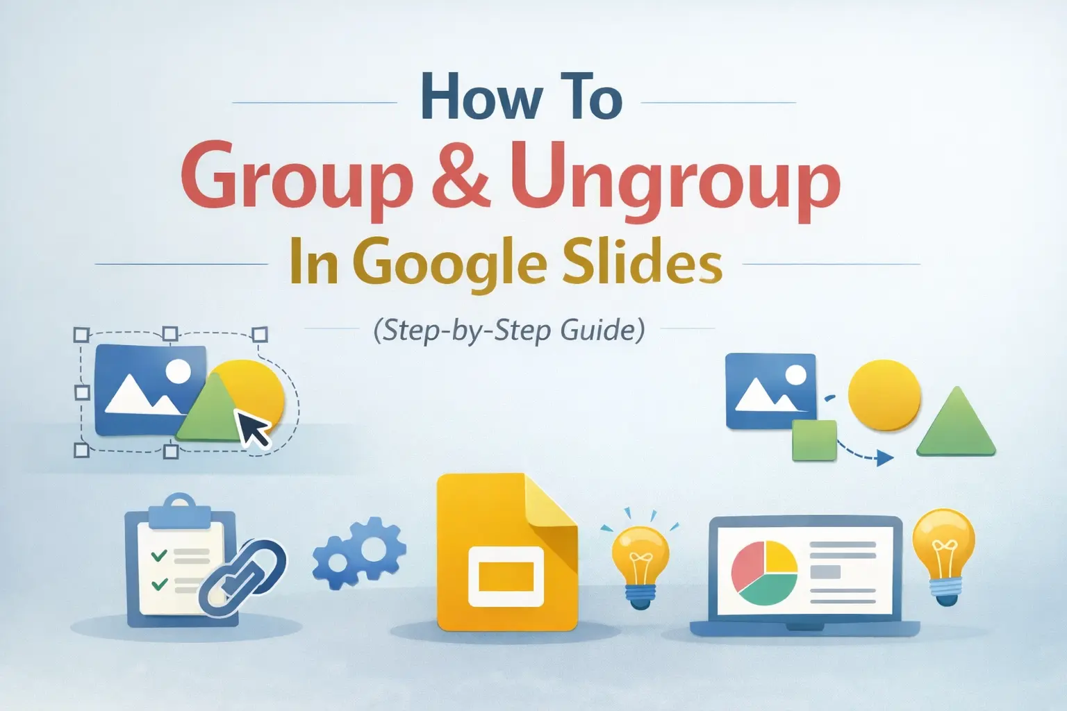
How To Group & Ungroup In Google Slides (Step-by-Step Guide)
This blog walks you through how to group and ungroup elements in Google Slides in a simple, practical way. It covers grouping images, shapes, text boxes, and objects, along with