

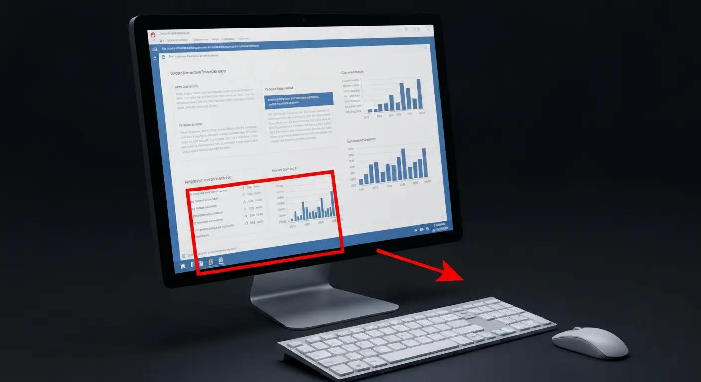
How To Make A Graph In PowerPoint: Step-by-Step Guide
The goal of impactful graphs is not simply to convey data; rather, it is to tell a story with data that has meaning to the audience. Graphs and charts can show trends, performance, and market share—all in very helpful ways that help our audiences move through the data quickly with visuals. Being able to choose the right graph, edit data, and change style (with Excel) can turn complex data into engaging visual representations.
In this guide, you will learn how to make a graph in powerpoint, how to get the data into a PPT slide (Paste Special), and link the data whenever you update your data in Excel. There is also an element of design when you present data —not just the data itself —and you want your graphs to match your presentation’s overall theme. You will see how to use color and fonts — and how to make charts and graphs in PowerPoint —to give your data representation a stronger, more flexible leg—while being very effective and helpful.
We love to teach you how to update the data and how to format the data representations for even greater visuals. You will see how to have great accuracy along with stunning visuals. Are you ready to learn how to make a really great data representation that is way out in front of the rest? Let’s get started!
How Can You Prepare Your Data for PowerPoint Graphs?
Before jumping into how to create a graph in PowerPoint, it is important to prepare your data accurately using Microsoft Excel. Organizing your data well and ensuring it is relevant will ensure your visuals convey the message clearly and support your goals in the presentation.
Choosing the Right Chart Type for Your Presentation
Choosing the right type of chart will be dependent upon the kind of data you are presenting and the story you want to tell. Each type of chart has a particular function:
- Column & bar charts – These bar charts are best to compare quantities among categories, i.e., sales performance by region and/or product.
- Line charts – These work well for indicating trends or changes over time, i.e., Monthly revenue growth, or user engagement rates.
- Pie charts – These are used to visually indicate proportions or percentage parts of a whole, i.e., percentage of market share.
- Area charts – These can indicate trend and volume over time, and are useful for displaying cumulative totals over time.
- Scatter and bubble charts – These charts do a good job of establishing a correlation or relationship between two or more points of data. Often used in research or financial analysis.
Selecting the correct chart type will help your audience understand your intended key points quickly, without confusion.
Importing Data from Excel into PowerPoint
If your data is already in Excel, you can directly import it into your PowerPoint slides using it:
- Insert a Chart: Go to Insert→Chart. PowerPoint will now open a small Excel window containing sample data.
- Copy and Paste Your Data: Now, just take your actual dataset from Excel and replace the existing data with it. You can copy the data directly from the Excel spreadsheet and then paste it into the PowerPoint Excel data table.
- Link Your Data (this is optional): If you want your chart to automatically update when the data from Excel changes, then you select the Link Data. This is helpful if you are building interactive business documents, such as reports or performance dashboards.
- Format Your Graph: After you import the data, you can now change the chart title, labels, colors, and/or legends to match the presentation style and organizational brand.
Preparing and anticipating the charts you wish to use provides you with the foundation to easily create and improve your professionalism and impact when creating data-driven visuals in PowerPoint that seek intended educator, administrator, and student understanding.
How To Create a Graph in PowerPoint? Step-by-Step Guide
Creating a graph in Microsoft PowerPoint is simple when you use the built-in Insert Chart feature. Follow these step-by-step instructions to add and design different types of graphs — Line, Pie, and Bar charts.
How Can You Use the Insert Chart Feature in PowerPoint?
- Step 1: Open your PowerPoint presentation and go to the Insert tab on the top menu.
- Step 2: Click on Chart under the Illustrations group.
- Step 3: A pop-up window will appear showing different chart types — Column, Line, Pie, Bar, and more.
- Step 4: Select your preferred chart type and click OK.
- Step 5: PowerPoint will automatically open an Excel sheet with sample data.
- Step 6: Replace the sample data with your own values.
- Step 7: Close the Excel window — your chart will automatically update in PowerPoint.
Tip: Use “Chart Design” and “Format” tabs to adjust chart layout, color, and style.
How Do You Add a Line Chart in PowerPoint?
- Step 1: Go to the Insert tab → click Chart.
- Step 2: In the chart selection box, choose Line from the left panel.
- Step 3: Pick a style — simple line, stacked line, or line with markers — and click OK.
- Step 4: Enter your data (e.g., months vs. sales figures) in the Excel window.
- Step 5: Close the Excel window to update your chart.
- Step 6: Go to the Chart Design tab to customize line color, thickness, and labels.
Use line charts to show trends or changes over time.
How Do You Add a Pie Chart in PowerPoint?
- Step 1: Click on the Insert tab → select Chart.
- Step 2: Choose Pie from the chart list on the left.
- Step 3: Pick your preferred style — 2D Pie, 3D Pie, or Doughnut.
- Step 4: Replace the sample data in Excel with your categories and values.
- Step 5: Close the Excel sheet to view your updated chart.
- Step 6: Go to Chart Design → Add Chart Element → Data Labels to show percentages.
- Step 7: Use bright, contrasting colors to make each slice stand out.
Pie charts are great for showing proportions or percentages.
How To Create a Bar Graph in PowerPoint?
- Step 1: Open the Insert tab and click Chart.
- Step 2: Choose Bar or Column from the left-hand chart options.
- Step 3: Click OK to insert the chart into your slide.
- Step 4: Replace the sample data in the Excel sheet with your own values.
- Step 5: Close the Excel window to see the updated chart.
- Step 6: Use Chart Design → Switch Row/Column if your data is reversed.
- Step 7: Customize the chart colors, axis labels, and data values for clarity.
Bar charts are ideal for comparing categories or performance results.

How to Create a Graph in PowerPoint Using Neo AI Presentation Maker?
Creating a graph in PowerPoint is now easier and faster with Neo AI Presentation Maker. You can design professional-looking charts in minutes just by using simple prompts. Follow these steps to get started:
- Step 1: Visit Neo and Start a New Presentation: Go to Neo and click on Create Presentation with Neo. This will open the AI-powered presentation builder.
- Step 2: Click on “Start Creating”: Select Start Creating and make sure the Neo AI button is active. This enables AI features for building charts automatically.
- Step 3: Explore Graph and Chart Options: On the left sidebar, scroll down to find the Graphs and Charts section. Neo offers multiple visual options to match your data needs.
- Step 4: Choose a Chart Type: Neo will show several chart options, like line, bar, and pie charts. Select the one that best fits your data story.
- Step 5: Describe Your Chart Using a Prompt: Type a short description of your chart in the Neo AI prompt box. Example Prompt: “Showcase sales forecasting for 2025, 2026, and 2027 with values 200k, 350k, and 400k.” Neo will automatically generate a chart based on your input.
- Step 6: Insert and Customize Your Chart: Once your chart is ready, insert it into your presentation. You can edit any element — titles, labels, or visuals — to match your style.
- Step 7: Use Inline Editing for Quick Changes: Need to adjust text, colors, or titles? Simply use inline editing to modify content directly on your slide.
- Step 8: Sync with OneDrive for Easy Editing: If you prefer working in PowerPoint, use the OneDrive option. Edit your slides in PowerPoint and sync back to Neo — your changes will update automatically.
- Step 9: Change the Theme and Colors: Personalize your presentation by changing the theme and color palette. Choose shades that reflect your brand or presentation tone.
- Step 10: Download Your Finished Presentation: Once satisfied, click Download to save your presentation. You can now present or share your Neo-created PowerPoint with a professional, AI-enhanced look.
Tip: Experiment with different prompts and chart styles — Neo adapts instantly, giving you creative freedom with your data visuals.
How Can You Customize and Format Your PowerPoint Graph?
After you have inserted a graph into PowerPoint, it is time to stylize it and make it fit your PowerPoint presentation. Here are the main steps to customize and style your chart:
- Select the Chart: Click on your chart, and it will open the Chart Design and Format tabs with editing options.
- Select Chart Style: Select Chart Design – Chart Styles, and select a chart style appropriate for a clean and modern layout that fits your theme.
- Select Chart Colors: Go to Change Colors under Chart Design and experiment with your brand colors or custom colors.
- Select Chart Elements: Use Add Chart Elements to help customize the chart with titles, axis labels, data labels, and legends to encourage clarity.
- Select Fonts or Text: Use the format tab to customize the font type, size, and color of the text on both axes and data labels to improve readability.
- Resize or Move the Graph: Click on the corner of the chart while dragging the graph with your mouse and reposition the chart to fit your slides and align with the text on the slide.
- Add Simple Animations: Select simple yet smooth animations, such as Fade or Wipe, in the Animations tab to draw focus to the data.
- Save Chart Design: You can still right-click on your chart and select Save Chart as Template if you want to reuse your chart later.
How Can You Edit and Update Data in PowerPoint Graphs?
- Open the Chart’s Data Sheet: Click on your chart, then select Chart Design → Edit Data to open the linked Excel window.
- Update Your Data Values: Edit the numbers or categories directly in the Excel sheet — changes reflect instantly on the chart.
- Add or Remove Data Series: To include new data, extend the range in Excel; to remove, delete unwanted rows or columns.
- Refresh Linked Excel Data: If your chart is linked to an external Excel file, use Refresh Data to sync the latest updates.
- Adjust Chart Layout After Editing: After updating data, review chart elements like titles, legends, and colors for accurate presentation.
- Save and Recheck Your Chart: Once done, close the Excel sheet and ensure your graph correctly displays all the latest data.
Tips for Making Your Graphs Visually Appealing
- Keep It Straightforward: Don’t overdo it: only present the information necessary for the viewer to comprehend and interpret your graph.
- Use Similar Colors: Use your branding colors or simply use opposing colors to easily identify the major details.
- Use Easy-To-Read Fonts: Stick to clean, professional fonts and pay attention to the size of the text to allow the viewers to read them from a distance.
- Use Visual Cues for Importance: Use bold colors, outlines, and/or labels to give cues for the most important figures.
- Leave Some Space: Give your chart some room and white space so it does not look overcrowded.
- Add Simple Animations: Use simple movement effects (like Appear or Fade) to enhance engagement, but don’t overdo it and distract your viewers.
- Use a Neutral Background: Avoid heavy colors in your background — a light colored graph is better against a dark slide and a dark slide against a light slide.
- Stay Consistent: Use the same chart style and color scheme throughout the entire presentation.
Conclusion
In summary, effective PowerPoint charts and graphs start with effective data selection, thoughtful design, and updating. The success of turning complicated data into a clearer visualization depends on several factors, including choosing the best chart type made for visually communicative data selection; customizing the given visuals to fit the context and aesthetic; and keeping your data as current as possible. These steps aid in the creation of a visually appealing, professional presentation, conveying and communicating your information to your audience while keeping them engaged throughout.
FAQs
-
Can I use my own Excel data to create a graph in PowerPoint?
- You can quickly use your own Excel data to generate graphs in PowerPoint.
- All you have to do is go to Insert → Chart, then when Excel opens, you will simply replace the sample data with your data.
- You can also link your chart to an external Excel file, so that any updates made in Excel automatically populate your data into your chart in PowerPoint.
-
What shortcuts can help me create graphs quickly in PowerPoint?
- Alt + N + C: Open the Insert Chart dialog at once.
- Ctrl + C / Ctrl + V: Copy, then paste charts from one slide to another, or copy and paste from Excel.
- Ctrl + 1: Open the Format Chart Area panel for fast styling.
- Ctrl + Shift + G: Group chart elements and ungroup them for ease of editing.
- F11 (in Excel): Create a chart from selected data quickly before importing into PowerPoint.
-
How do I choose the best graph type for different data sets?
- Bar/Column Chart: Compare values across categories (e.g., sales by region).
- Line Chart: Show trends or changes over time (e.g., monthly growth).
- Pie Chart: Display proportions or percentages of a whole (e.g., market share).
- Scatter Chart: Show relationships or correlations between variables.
- Area Chart: Highlight cumulative data or total change over time.
Tip: Choose the chart that best matches the story you want your data to tell.
-
How to insert a graph in PowerPoint?
- Navigate to the Insert tab and click Chart.
- Select your preferred type of chart (Line, Bar, Pie, etc.).
- Click ok, and an Excel sheet with sample data will show up.
- Replace that sample data with your own data to generate your graph.
- If you are finished with your graph, simply exit the Excel sheet. At this point, the graph on your slide displays your data.
Hint: Try using the Chart Design tab to quickly style and format your graph.
-
Can you explain how to customize chart colors and styles in PowerPoint?
- Select your chart, and choose the Chart Design tab.
- Select Change Colors to apply either a preset color theme or a custom color theme.
- Use Chart Styles to apply a modern, minimal style quickly.
- To edit chart elements in great detail, open the Format tab to make adjustments to fonts and borders, or apply effects.
Tip: Using brand colors, as well as consistent styles throughout, will make for a more polished and professional look.
-
How can I add or edit data in a PowerPoint graph?
- Click on your chart and go to Chart Design → Edit Data.
- An Excel window will open with your chart’s data.
- Add new values, change existing numbers, or update labels directly in Excel.
- Close the Excel sheet — your chart will update automatically.
Tip: Use Edit Data in Excel if your chart is linked to an external file for easy updates.
-
How do I insert a line chart specifically in PowerPoint?
- Go to the Insert tab and click Chart.
- In the chart options, select Line from the left panel.
- Choose your preferred line style (simple, stacked, or with markers).
- Click OK, and an Excel sheet will appear — replace the sample data with your own.
- Close Excel, and your line chart will update automatically.
Tip: Use the Chart Design tab to customize colors, line thickness, and labels for clarity.
-
What tips help make graphs in PowerPoint more visually appealing?
- Keep It Simple: Avoid clutter—focus on key data points only.
- Use Consistent Colors: Stick to your brand palette or clear contrasts.
- Choose Readable Fonts: Make labels easy to read, even from a distance.
- Highlight Key Data: Use bold colors or data labels for emphasis.
Add Subtle Animations: Use smooth effects like Fade or Wipe for engagement.
-
How do I format data labels on PowerPoint graphs?
- Click on your chart, then select Add Chart Element → Data Labels from the Chart Design tab.
- Choose where you want labels to appear (inside, outside, or centered).
- Right-click any label and select Format Data Labels to change font, color, or number style.
- Use Value, Percentage, or Category Name options to control what’s displayed.
-
What are common mistakes to avoid when creating graphs in PowerPoint?
- Overloading Data: Avoid adding too many data points—keep it clear and focused.
- Inconsistent Colors: Don’t mix random colors; use a consistent palette.
- Unreadable Text: Make sure labels and titles are large and legible.
- Incorrect Chart Type: Choose a chart that fits your data story, not just aesthetics.
- Lack of Context: Always include titles, axis labels, and legends for clarity.
Table Of Content


Related posts from the same category
28 Jan, 2026 | SlideUpLift
Types of Slides That Make Presentations Clear, Engaging, and Impactful
This blog explains why choosing the right slide types is essential for clear, engaging presentations. It covers the most important PowerPoint slide types, when to use them, and how they
23 Jan, 2026 | SlideUpLift
How to Rotate a Slide in PowerPoint: Complete Guide
This blog explains how to rotate slides in PowerPoint using all practical methods, including changing slide orientation, rotating objects, and handling single-slide workarounds. It also covers professional solutions for mixing

21 Jan, 2026 | SlideUpLift
What Is 6×6 Rule in PowerPoint? Complete Guide To Improve Slides
This blog explains what is 6x6 Rule in PowerPoint and how it improves slide clarity and readability. It shows how to apply the rule, avoid common mistakes, and compare it
19 Jan, 2026 | SlideUpLift
How to Add Footnotes in PowerPoint: A Step-by-Step Guide
Adding footnotes in PowerPoint helps you cite sources and add context without overcrowding your slides. Since PowerPoint doesn’t offer an automatic footnote feature, footnotes are created manually using text boxes

16 Jan, 2026 | SlideUpLift
How To Merge PowerPoint Presentations Using Simple Methods and a Free Tool
Learn how to merge PowerPoint presentations quickly and easily using manual methods or a free merge PPT tool. Keep slides, formatting, animations, and transitions intact while creating polished, professional decks.

14 Jan, 2026 | SlideUpLift
How to Create a McKinsey-Style Presentation: The Complete Guide (2026)
Creating presentations that rival McKinsey's legendary clarity and impact isn't about copying slides—it's about mastering a communication philosophy that transforms complex ideas into actionable insights. Whether you're pitching to executives,

14 Jan, 2026 | SlideUpLift
How to Add a Timer to Google Slides: Step-by-Step Guide
This blog walks you through how to add a timer to Google Slides using simple, practical methods that actually work. It covers Auto-play timing, visible countdown timers, videos, and add-ons,

8 Jan, 2026 | SlideUpLift
How to Prepare for a Presentation: A Simple Guide for Beginners
This blog explains how to prepare for a presentation step by step. It covers goal setting, content structuring, slide design, practice, and handling questions. Beginners can also learn common challenges,

6 Jan, 2026 | SlideUpLift
Presentation Tips for Structuring Messages and Effective Storytelling
This blog breaks down practical presentation tips to help you plan, design, and deliver slides that truly stand out. It covers how to simplify text, use visuals effectively, and maintain

9 Dec, 2025 | SlideUpLift
How to Change a PowerPoint Template – Quick Step-by-Step Guide
This blog shows how to change or update a PowerPoint template to give your slides a fresh, professional design without losing your content. It walks through step-by-step actions in the

4 Dec, 2025 | SlideUpLift
The 5-5-5-Rule-of-PowerPoint: Your Guide to Effective Design
Introduction Have you ever seen a PowerPoint presentation with too much information on the slide? The problem with today’s presentations is that they draw attention away from the actual content,

12 Nov, 2025 | SlideUpLift
How to Create a Heat Map in PowerPoint: Beginner-Friendly Guide
Heat maps are one of the easiest ways to turn rows of numbers into visuals people understand quickly. In this blog, you will learn what a heat map is, in
6 Nov, 2025 | SlideUpLift
How to Add Transitions in PowerPoint: Complete Step-by-Step Guide
Do you want to create a seamless flow in your PowerPoint slides and make a strong impression? While adding transitions to PowerPoint slides might seem obvious, transitions are the key

4 Nov, 2025 | SlideUpLift
How to Use Morph in PowerPoint: The Ultimate Guide to Smooth Transitions
If you’ve ever watched a presentation where shapes flow smoothly, images glide effortlessly, and text elegantly shifts between slides, you’ve witnessed the power of Morph in PowerPoint. This feature is

13 Oct, 2025 | SlideUpLift
How to Write a Business Case: A Beginner’s Guide + Examples
Every project needs a passport to get through executive approval. Without it, even the best plans can get grounded before taking off. This very piece of evidence holds the power

10 Oct, 2025 | SlideUpLift
What Is A Project Charter? Definition, Examples & Best Practices
Launching a project without adequate planning can result in confusion, delays, and misaligned expectations. A project charter is a key document in the project documentation process that lays the groundwork

8 Oct, 2025 | SlideUpLift
How to Insert Emoji in Google Slides & PowerPoint for Fun, Eye-Catching Slides
Have you ever thought about how a simple emoji can change the mood or tone of your presentation? You could use a smiley face 😊, that would certainly lighten the

1 Oct, 2025 | SlideUpLift
Insert Calendar In PowerPoint And Google Slides: Quick Guide For Smarter Planning.
Do you want your presentations to be more organized, attractive, and professional? Learning how to add a calendar in PowerPoint or Google Slides will take boring schedules and deadlines and

26 Sep, 2025 | SlideUpLift
What Is a PPTX File? Think of It as PowerPoint 2.0
PowerPoint presentations are everywhere — from boardrooms to classrooms — and behind every great slide deck is the PPTX file. It’s not just some random presentation software and powerpoint file

17 Sep, 2025 | SlideUpLift
Google Slides Strikethrough: Cross Out The Old And Spotlight The New
Ever wished you could just cross something out instead of deleting it? You know, like putting a big line through “boring idea” and replacing it with “brilliant plan”. That’s the

12 Sep, 2025 | SlideUpLift
What is KPI? Step-by-Step Guide with KPIs Examples That Work
Is it hard for you to know if your business is getting to the level it should be? That's where key performance indicators (KPIs) come into play. KPIs indicate how

10 Sep, 2025 | SlideUpLift
Best Fonts For PowerPoint Presentation: The Runway Of Letters
Imagine this: your presentation is a red-carpet event. Your slides are the guests, the content is the message, and the font? That is the outfit; the one builds up the

10 Sep, 2025 | SlideUpLift
Advantages and Disadvantages of Microsoft PowerPoint: Pros, Cons, and AI Features Explained
PowerPoint has been the go-to tool for presentations for decades—but is it keeping up with today’s fast-paced, AI-driven world? PowerPoint makes it easy to take ideas to slides, whether you're

5 Sep, 2025 | SlideUpLift
10 Virtual Meeting Etiquette Rules for Professionals
Introduction Virtual meetings and online meetings are the new normal for remote work teams everywhere. Whether you're chatting with co-workers, giving a client presentation, or taking part in a hybrid

3 Sep, 2025 | SlideUpLift
How to Add Watermark in PPT Like a Pro: Step-by-Step Tutorial
Every presentation tells a story, but it should also say who it belongs to, right? And if we tell you that there is a way to stamp your identity on

29 Aug, 2025 | SlideUpLift
30+ ChatGPT Presentation Prompts To Create Impactful Presentations
Creating presentations can be challenging. It takes a lot of time and effort to conduct research, write the text, format the slides, add photos, and practice. But, what if AI

29 Aug, 2025 | SlideUpLift
Microsoft Copilot vs ChatGPT-4 Showdown: Who’s Got the Edge?
Not long ago, making a presentation meant spending hours and hours writing content, formatting slides, finding visuals, and tweaking layouts. Tools like PowerPoint and Google Slides gave us templates, but

29 Aug, 2025 | SlideUpLift
10 Best Presentation Software: In-Depth Comparison Guide
The fact is, giving a great presentation is not only about how you choose your words, but rather involves expressing those very words. With the right PowerPoint presentation software, you

28 Aug, 2025 | SlideUpLift
Password Protect PPT: How To Secure Your Presentations (Easy Guide)
Have you ever shared a PowerPoint and then worried, “What if someone changes my slides?”, or even worse, “What if the wrong person opens it and leaks the content?”. Frustrating,

26 Aug, 2025 | SlideUpLift
Track Changes In PowerPoint And Keep Your Team In Sync
Ever spent hours perfecting a PowerPoint, way too much time that you then forget to track who made what change? You aren't alone. Unfortunately, unlike Word or Gmail slides, PowerPoint
14 Aug, 2025 | SlideUpLift
How to Make a Curved Arrow in PowerPoint? A Detailed Guide
Think of your presentation as a journey. On a slide, you have the ideas stacked up, but there is no way you are understanding what is connected to the next.

13 Aug, 2025 | SlideUpLift
How To Create Infographics In PowerPoint For Smarter Visual Storytelling?
As a professional, you might have to host meetings and deliver presentations to your stakeholders and team members. As a host, it's crucial to deliver presentations in a way that

6 Aug, 2025 | SlideUpLift
How To Edit Footer In PowerPoint For Consistent Presentation Design
Footers are an important part of a PowerPoint presentation. They give the same footer text, like the date or slide numbers, on all slides. This helps people understand the talk

31 Jul, 2025 | SlideUpLift
Google Slides vs PowerPoint: A Complete Comparison Guide
Introduction Stuck deciding between Google Slides and PowerPoint for your next big presentation? Yeah, we've been there too. Both pack a punch with features, leaving you wondering: "Which one will

25 Jul, 2025 | SlideUpLift
How Many Slides For A 30 Minute Presentation? Timing, Tips, and Structure
One of the biggest challenges in presentations is staying on time. Whether it’s 5 minutes or 45, running over means rushing key points or losing your audience. Here’s the good

21 Jul, 2025 | SlideUpLift
PowerPoint Slide Size 101: Why It Matters More Than You Think
Imagine crafting the perfect slide, visuals on point, text crisp, animations smooth. But when you present, the content looks off. Cropped images, awkward white spaces, or text running off the

15 Jul, 2025 | SlideUpLift
Google Slides Shortcuts Cheat Sheet To Boost Workflow
Google Slides is already a go-to tool for everything. From classroom projects to business decks and online workshops. It is a one-stop platform to create and share your ideas, thoughts,

7 Jul, 2025 | SlideUpLift
PowerPoint Shortcuts You’ll Wish You Knew Sooner (Beginner to Pro Guide)
PowerPoint is one of the most powerful tools for creating presentations. However, working in PowerPoint can become time-consuming, especially when you have to click through menus for every small task.

4 Jul, 2025 | SlideUpLift
Why Your Conclusion Slide Matters—And How To Get It Right
Picture this: You've delivered an amazing presentation. Great start solid middle... but then... the ending just... flops. The energy drains. People shuffle out, already thinking about lunch. Sad, isn't it?

3 Jul, 2025 | SlideUpLift
How to Change Text Color in Google Slides for Maximum Impact – Quick Guide
Using Google Slides to build presentations is now widely practiced across the digital world. It is clean, collaborative, and performs its tasks fairly well. Be it a business pitch, a

30 Jun, 2025 | SlideUpLift
A Simple Guide On How To Change Margins In PowerPoint
Margins—those often-overlooked borders framing your slides—play a crucial role in creating polished, professional presentations. Adjusting margins helps you control your layout. This is important for printed handouts and projections. It

13 Jun, 2025 | SlideUpLift
Org Chart in PowerPoint: Simplify Complex Team Structures with Smart Visuals
Without a clear org chart, even small teams feel messy. People start asking: “Who’s responsible for what?” Whether you are a manager, HR professional, or team lead, explaining the team

12 Jun, 2025 | SlideUpLift
Create An Org Chart in Google Slides: A Step-by-Step Guide
Want to map out any type of organizational structure—whether it's a company, project team, or even a hierarchy? An org chart helps visualize relationships between roles, departments, or functions in

28 May, 2025 | SlideUpLift
Beginner’s Guide: How To Make A Venn Diagram In Powerpoint
What Is A Venn Diagram? In today’s fast-paced business world, clarity is currency, and Venn diagrams deliver just that. Whether you're analyzing market segments, comparing competitors, or aligning team strategies,

27 May, 2025 | SlideUpLift
The Ultimate Guide on How to Create a Roadmap Diagram in PowerPoint
Turning a great idea into action takes more than just enthusiasm; it requires a clear plan. That’s where a roadmap leads. It lets you organize your ideas, see the big

14 May, 2025 | SlideUpLift
How To Crop A Picture Into A Circle In The Presentation: Step-By-Step Guide
Ever found the perfect image for your presentation, but it just doesn’t look right in that boring rectangle frame? We’ve all been there. Whether you're trying to make your slides

25 Jun, 2024 | SlideUpLift
Best PowerPoint Color Palettes for 2026 (Trends, Examples & Psychology)
This blog covers the best PowerPoint color palettes and how the right colors boost clarity, engagement, and professionalism. It includes ready-to-use palettes with Hex codes for different presentation types. The