 Fall Sale
  Flat 40% off on our Unlimited Access Yearly Membership plan!


This cover slide opens a market expansion strategy deck with a prominent title area, a subtitle line, and space for presenter or date details. Th....


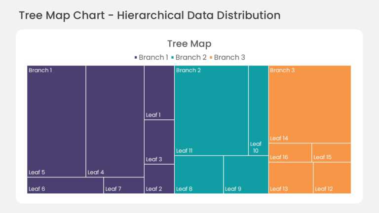
This hierarchical treemap chart divides the slide area into nested rectangles, with each rectangle sized by its share of the total value. Child s....

This section tracker slide lists the main sections of a presentation in sequence and highlights the section currently in progress. Visual markers....
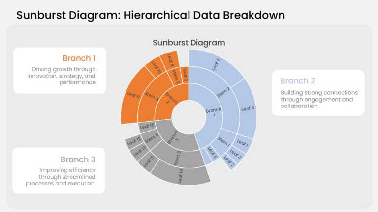
This sunburst chart arranges hierarchical data in three concentric rings. The inner ring holds the top-level categories, the middle ring breaks e....
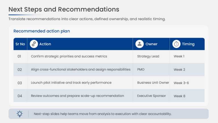
This project action plan uses a structured table with columns for action items, responsible owners, due dates, and status. Each row represents on....
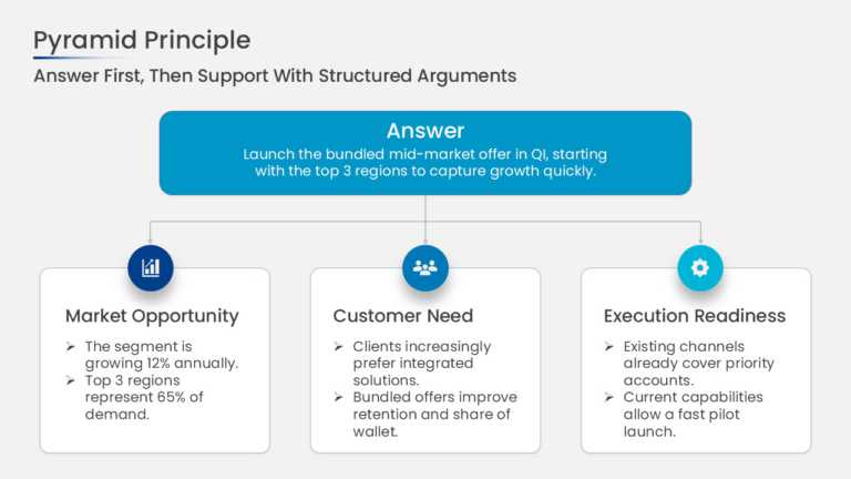
This pyramid principle slide places a single governing thought at the top of the structure with 3 supporting arguments arranged beneath it. Conne....
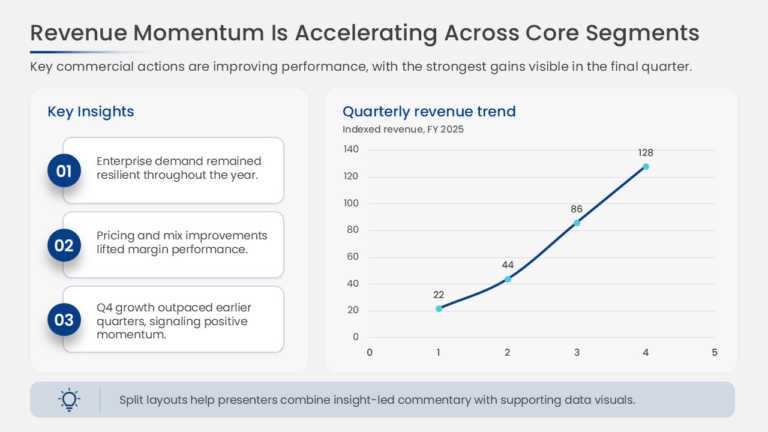
This slide charts revenue across quarters to show period-over-period growth and pairs the chart with insight callouts that explain the drivers be....
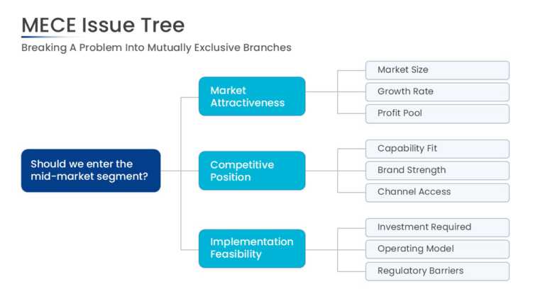
This MECE issue tree starts with a root problem statement on the left and splits it into 3 primary branches. Each branch extends into sub-issues,....
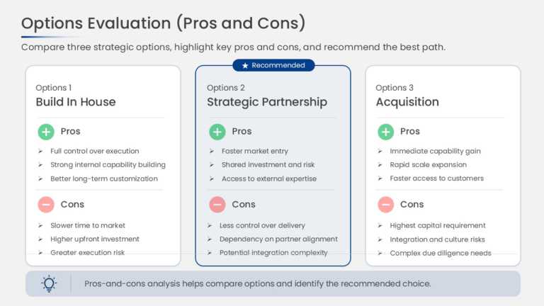
This comparison slide presents strategic options side by side, with separate pros and cons sections for each option. The parallel column structur....
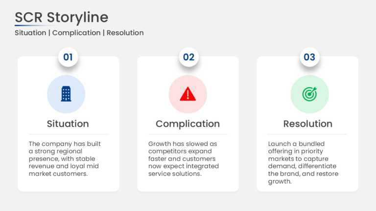
This SCR framework slide presents Situation, Complication, and Resolution as 3 cards arranged in sequence. Each card holds a heading and a short ....
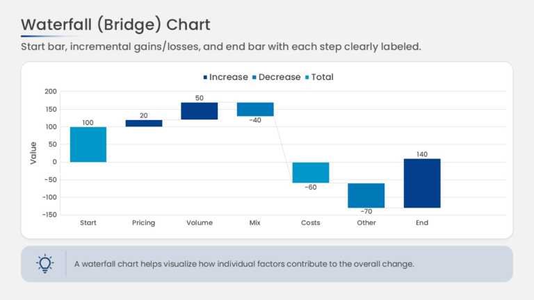
This waterfall chart bridges a starting value to an ending value through a series of floating bars. Increases and decreases are shown as separate....
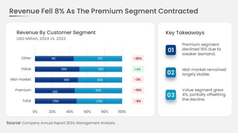
This slide combines a revenue chart broken down by business segment with a dedicated key takeaways panel. The chart area shows the revenue contri....
Related Presentations
-

Simple
120 templates>
-

Best
507 templates>
-

Backgrounds
347 templates>
-

PowerPoint Themes
246 templates>
-

Professional
8,172 templates>