 Fall Sale
  Flat 40% off on our Unlimited Access Yearly Membership plan!

Professional Slides Templates
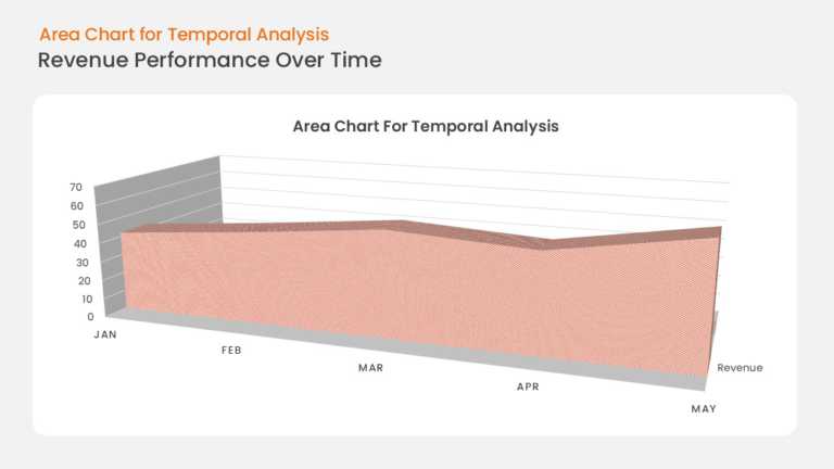
This area chart plots business growth along a time-based X axis, with the region under the trend line filled to emphasize volume and momentum. Ax....


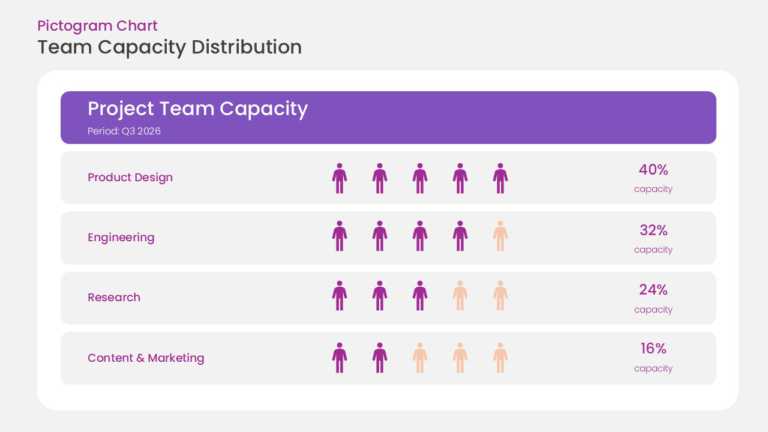
This pictogram chart uses rows of repeated person icons to represent resource capacity. Filled icons indicate allocated resources and unfilled ic....
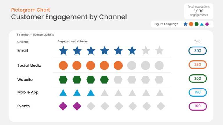
This data pictogram chart expresses values as rows of repeated icons, with filled icons showing the measured share and unfilled icons showing the....
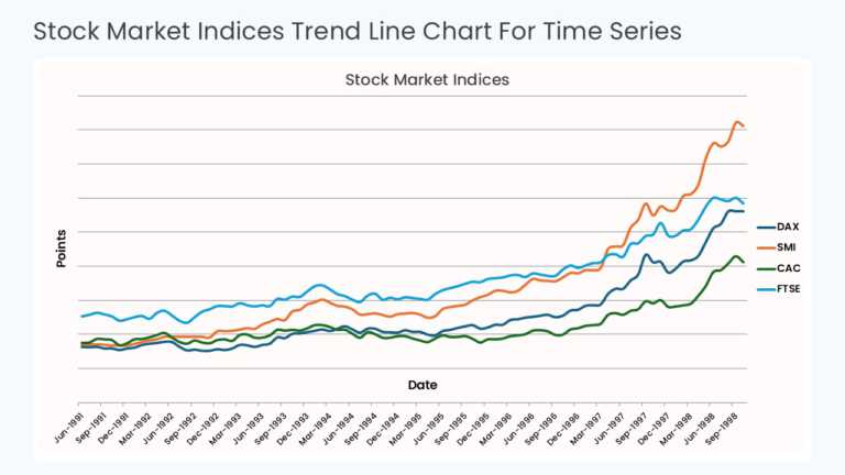
This time series chart plots values against sequential time periods on the X axis, with a trend line connecting each data point. Gridlines and ax....
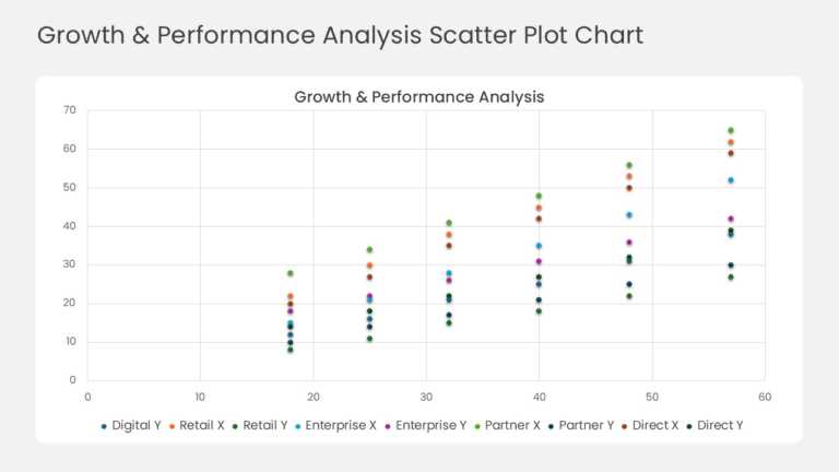
This scatter plot maps business units, products, or regions as individual data points across two performance metrics on the X and Y axes. The lay....

This cover slide opens a market expansion strategy deck with a prominent title area, a subtitle line, and space for presenter or date details. Th....
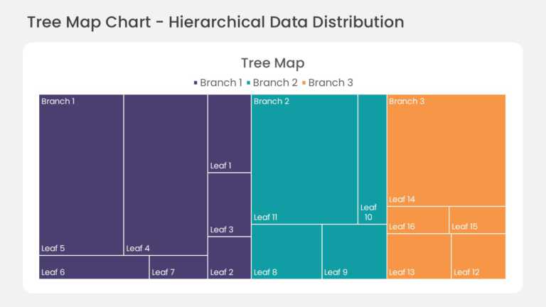
This hierarchical treemap chart divides the slide area into nested rectangles, with each rectangle sized by its share of the total value. Child s....

This section tracker slide lists the main sections of a presentation in sequence and highlights the section currently in progress. Visual markers....
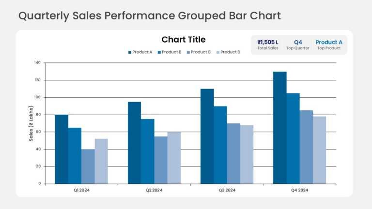
Grouped columns compare quarterly sales across several product lines, with one column per product in each quarter. KPI callout cards above the ch....
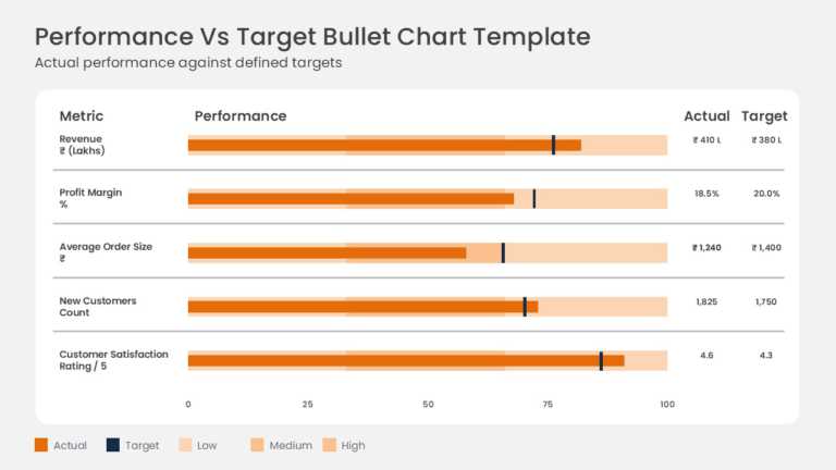
Actual results are measured against targets on horizontal bullet charts for metrics such as gross sales and operating margin. Each row combines a....
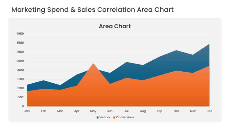
Overlapping area series compare marketing spend with sales revenue over consecutive periods. Translucent fills keep both series visible where the....
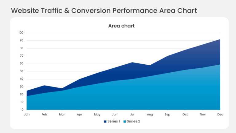
Layered bands in a monthly stacked area chart show website traffic by acquisition channel. The top edge tracks total visitors, and each colored b....
Related Presentations
-

Project Management
1,634 templates>
-

Marketing
2,027 templates>
-

Human Resource
1,014 templates>
-

Business
6,533 templates>
-

Finance
466 templates>